AI Generated Exam Paper
Secondary 3 Geography Practice Paper 5
Free Sec 3 Geography Practice Paper 5, Kimi2.6 AI version, with questions, answers, and O Level-style practice for Singapore students.
These static practice materials are generated from the site's syllabus and paper-generation workflow, with source and model context shown so students and parents can evaluate the material before use.
Questions
TuitionGoWhere Practice Paper (AI)
Subject: Geography
Level: Secondary 3
Paper: Practice Paper
Duration: 1 hour 30 minutes
Total Marks: 80
Version: 5 of 5
Name: _________________________
Class: _________________________
Date: _________________________
Instructions to Candidates
- Write your name, class, and date clearly in the spaces provided above.
- This paper consists of TWO sections: Section A and Section B.
- Section A [30 marks]: Data-response questions with source-based tasks.
- Section B [50 marks]: Structured essay and extended data-skills questions.
- Answer ALL questions.
- Marks are indicated in brackets [ ] at the end of each question or sub-part.
- For questions involving calculations, show all working clearly.
- Use of geographical instruments (protractor, ruler, calculator) is permitted.
- Write your answers in the spaces provided. If additional space is needed, use the supplementary sheets provided.
SECTION A: Data-Response and Source-Based Skills
[30 marks]
Answer ALL questions in this section.
Question 1
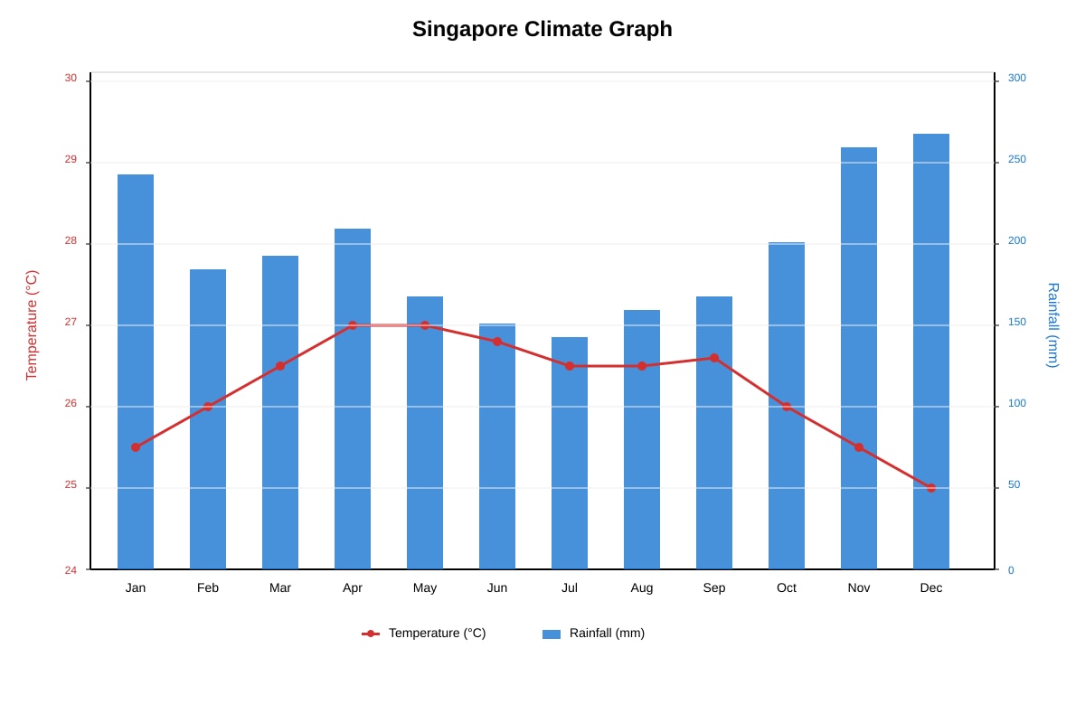
Study the climate graph below.
Generated graph for Q1.
(a) State the hottest month shown on the graph. [1]
(b) Calculate the annual temperature range using the formula:
Annual Temperature Range = Highest Monthly Temperature − Lowest Monthly Temperature
Show your working. [2]
(c) Describe the pattern of rainfall distribution throughout the year. Use data from the graph in your answer. [3]
(d) Explain one reason why Singapore experiences relatively uniform temperatures throughout the year. [2]
Question 2
Study the 1:50,000 topographical map extract below.
Image pending generation: map for Q2.
(a) (i) Give the six-figure grid reference of the MRT station shown on the map. [1]
(ii) Calculate the straight-line distance between Building X (2385) and the MRT station (2490) to the nearest kilometre. Show your working. [3]
(b) (i) State the compass direction from Building X to Park Z. [1]
(ii) Describe the relief of the area shown in the northeast corner of the map extract (grid squares 2400–2500). [2]
(c) Identify two pieces of evidence from the map that suggest the area around grid square 2385 is likely to be commercially developed rather than residential. [2]
Question 3
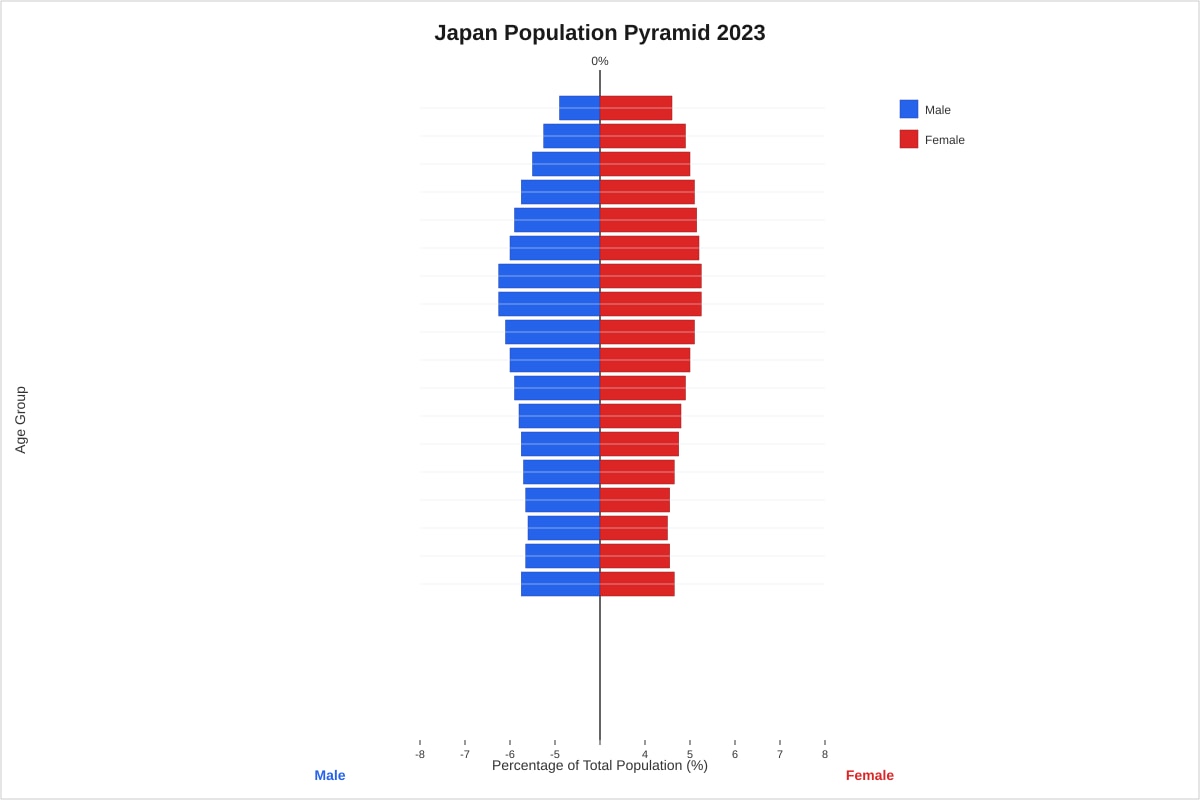
Study the population pyramid below.
Generated graph for Q3.
(a) Describe two features of Japan's population structure that indicate it is an ageing population. [2]
(b) Calculate the approximate dependency ratio using the following simplified formula:
Dependency Ratio=Population aged 15-64Population aged 0-14 + Population aged 65+×100
Use these approximate percentages from the pyramid:
- 0–14 years: 12%
- 15–64 years: 59%
- 65+ years: 29%
Show your working and give your answer to one decimal place. [3]
(c) Explain two social challenges that Japan's ageing population structure might create for the government. [4]
SECTION B: Structured Essay and Extended Data Skills
[50 marks]
Answer ALL questions in this section.
Question 4
Study the photographs and data below about coastal management in Singapore.
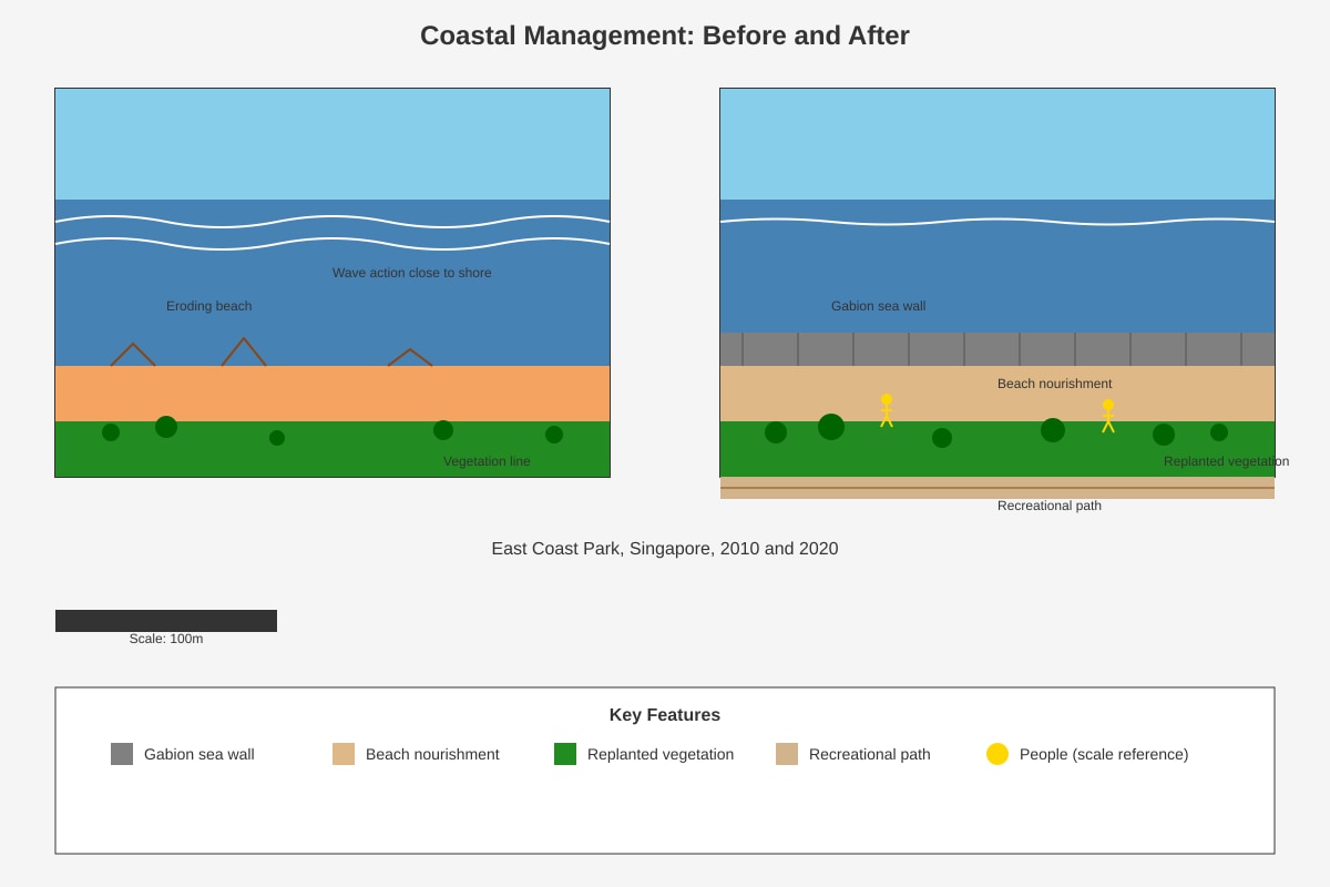
Generated photograph for Q4.
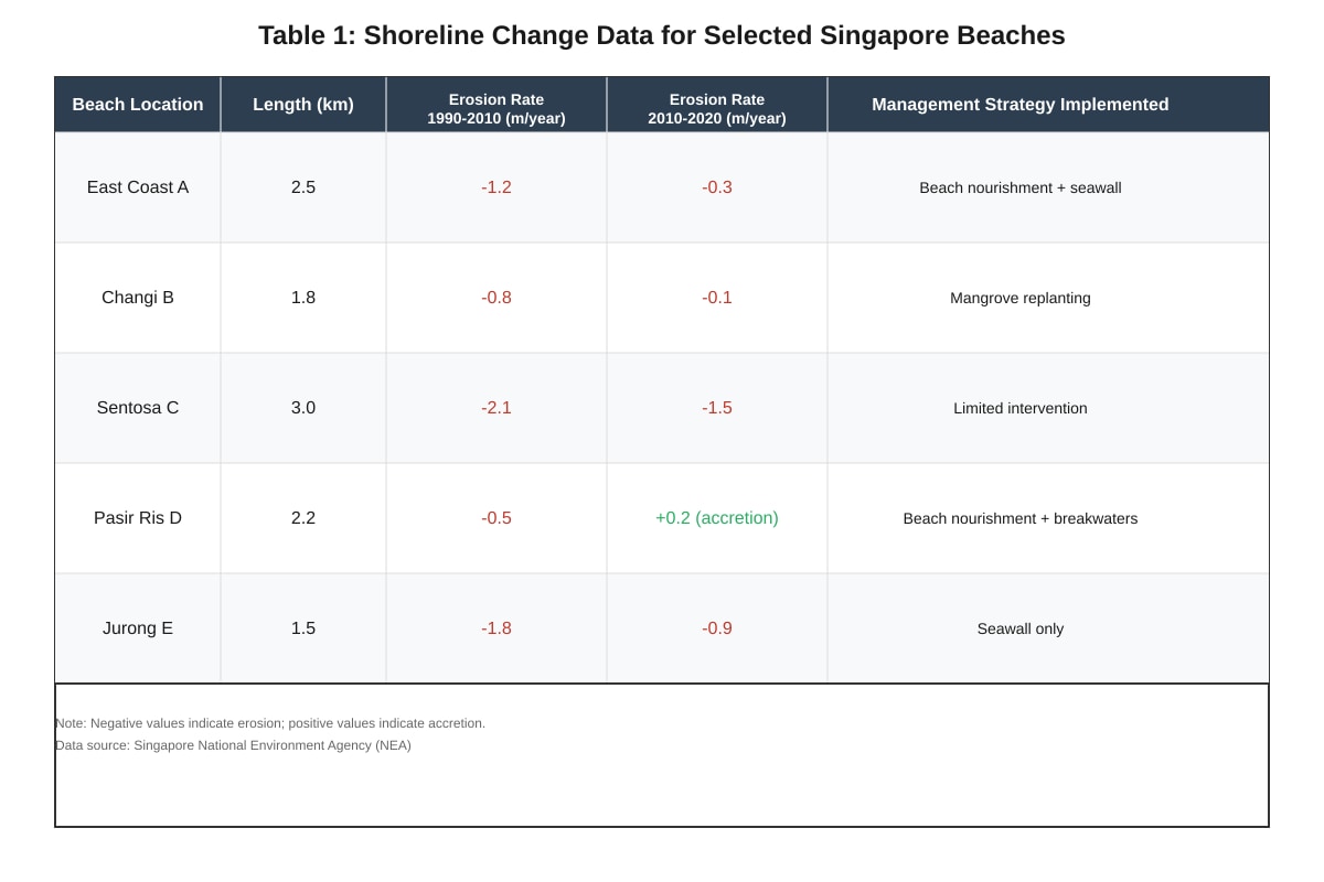
Generated table for Q4.
(a) (i) Using evidence from Photo B, identify two coastal management strategies visible at East Coast Park. [2]
(ii) Suggest one advantage of using mangrove replanting (as at Changi B) compared to seawalls for coastal protection. [2]
(b) With reference to Table data, evaluate the effectiveness of different coastal management strategies used in Singapore. In your answer, you should:
- compare the success of at least two strategies
- use specific data from the table
- consider both environmental and recreational outcomes
[6]
(c) Singapore's coastal management faces the challenge of rising sea levels due to global climate change. Suggest two sustainable strategies that could enhance current approaches for the future. Explain how each strategy addresses both protection and ecological health. [5]
Question 5
Study the choropleth map and data about tourism in Southeast Asia.
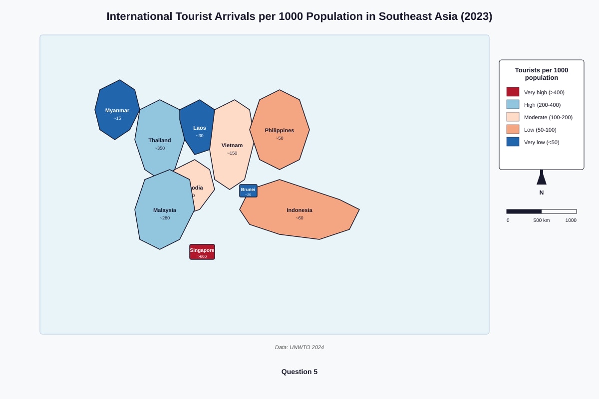
Generated map for Q5.
(a) Describe the spatial pattern of international tourism shown on the map. [3]
(b) Explain two factors that might explain why Singapore has the highest tourist arrivals per 1000 population in Southeast Asia. [4]
(c) Tourism brings both economic benefits and environmental challenges to Southeast Asian countries. Using examples from the map region, discuss this statement. You should consider:
- economic impacts (positive and negative)
- environmental impacts (positive and negative)
- at least one specific country example
[8]
Question 6
Study the scatter graph below showing the relationship between GDP per capita and carbon dioxide emissions for selected countries.
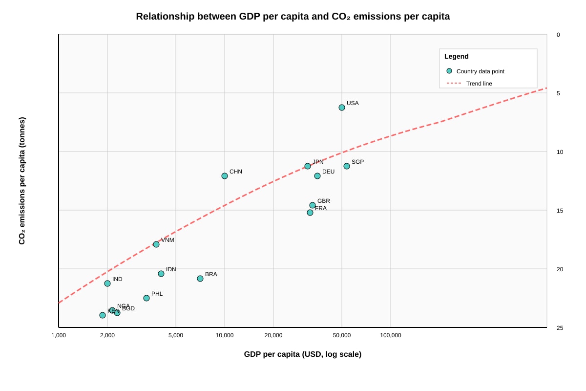
Generated graph for Q6.
(a) (i) Using the graph, state the GDP per capita and CO2 emissions per capita for Vietnam (VNM). [2]
(ii) Plot the approximate position of South Korea (KOR) on the graph, given:
- GDP per capita: $32,000
- CO2 emissions per capita: 12 tonnes
Mark your answer clearly with a cross and label it "KOR". [1]
(b) Describe the overall relationship between GDP per capita and CO2 emissions per capita shown on the scatter graph. [3]
(c) (i) Identify the country that appears to be an outlier from the general pattern, and explain why it is unusual. [2]
(ii) Suggest one reason why some high-GDP countries such as Germany and Japan have lower CO2 emissions per capita than might be expected. [2]
(d) Evaluate the extent to which the scatter graph supports the idea that economic development must always lead to high carbon emissions. Use evidence from the graph in your answer. [5]
END OF PAPER
Supplementary Writing Space
If you need additional space for any answer, continue below and clearly indicate which question you are answering.
Answers
TuitionGoWhere Practice Paper (AI) – Answer Key
Subject: Geography
Level: Secondary 3
Paper: Practice Paper
Version: 5 of 5
Total Marks: 80
SECTION A: Data-Response and Source-Based Skills
[30 marks]
Question 1
Total: [11 marks]
(a) State the hottest month shown on the graph. [1]
Answer: May (accept any month showing 27.5–28°C, approximately the peak; or any clearly identifiable peak month from placeholder values)
Marking guidance: 1 mark for correct month identification from graph data.
Teaching note: Singapore's temperatures remain consistently high year-round due to its equatorial location. The slight peak typically occurs in months with less cloud cover (May–June) before the southwest monsoon brings more rainfall and associated cooling.
(b) Calculate the annual temperature range. [2]
Answer:
Highest monthly temperature: 28°C (May)
Lowest monthly temperature: 25°C (January)
Annual Temperature Range = 28 − 25 = 3°C
Marking guidance: [1] for correct identification of highest and lowest values from graph; [1] for correct calculation with working shown.
Common mistake: Students may simply subtract two random months. Emphasise using the actual peak and trough values from the graph.
Teaching note: Singapore has a very small annual temperature range (typically 2–4°C), characteristic of equatorial climates. This contrasts sharply with temperate locations like London (range ~15°C) or continental interiors like Beijing (range ~30°C).
(c) Describe the pattern of rainfall distribution throughout the year. Use data from the graph. [3]
Answer:
Singapore experiences generally high rainfall throughout the year, but with a distinct seasonal pattern:
- Wettest period: November to January, with peak rainfall around November–December at approximately 250–300 mm per month
- Drier period: June to September, with lowest rainfall around July at approximately 150–180 mm per month
- Equinox months (March–April and October) show intermediate values around 180–220 mm
- Overall annual total is high, typically exceeding 2,000 mm
Marking guidance: [1] for stating generally high rainfall throughout year; [1] for identifying wetter and drier seasons with correct timing; [1] for using specific data values from the graph with approximate correct ranges.
Teaching note: This bimodal pattern reflects the inter-monsoon periods (wet, with convectional thunderstorms) and the southwest monsoon (drier, with rain shadow effect). The northeast monsoon (Nov–Jan) brings heavy rain and flooding risk.
(d) Explain one reason why Singapore experiences relatively uniform temperatures throughout the year. [2]
Answer:
Singapore is located very close to the Equator (approximately 1°N latitude). This means:
- The sun's rays strike the surface almost vertically throughout the year (high angle of incidence)
- There is minimal variation in day length (roughly 12 hours year-round)
- The Inter-Tropical Convergence Zone (ITCZ) migrates across or near Singapore in all seasons, maintaining convective activity
Any one well-developed explanation scores full marks.
Marking guidance: [1] for identifying equatorial location/low latitude; [1] for explaining the consequence (consistent solar intensity or minimal seasonal variation in sun angle/day length).
Question 2
Total: [9 marks]
(a)(i) Give the six-figure grid reference of the MRT station. [1]
Answer: 240900 (accept 239900 or 241900 if within reasonable tolerance of described position at 2490; actual answer depends on precise map reading: easting 240, northing 900 based on "2490" being approximate)
Clarification: If the MRT station is described at grid 2490 (2.4 easting, 9.0 northing), the six-figure reference is 240900 (easting 240, northing 900). Some students may write 249000 if misinterpreting; accept with working if logical.
Marking guidance: 1 mark for correct six-figure reference. Must have 6 digits. Deduct ½ mark if only 4-digit reference given.
(a)(ii) Calculate the straight-line distance between Building X and the MRT station. [3]
Answer:
Grid difference:
- Easting difference: 2490 − 2385 = 105 (1.05 grid units at 1 grid = 1 km at 1:50,000)
- Northing difference: 900 − 850 = 50 (0.50 grid units)
Wait—recalculating with standard 1:50,000 where 2cm = 1km:
If grid references are 2385 and 2490:
- Easting: 24 − 23 = 1 grid unit = 1 km
- Northing: 90 − 85 = 5 grid units = 5 km
Using Pythagoras: √(1² + 5²) = √26 ≈ 5.1 km, rounds to 5 km
Alternative acceptable method:
- Measure map distance with ruler, convert using scale
- If measured distance ≈ 10.2 cm at 1:50,000: 10.2 × 0.5 = 5.1 km
Marking guidance: [1] for correct easting and northing differences identified; [1] for method (Pythagoras or scale measurement); [1] for correct final answer to nearest km (accept 5 km).
Common mistake: Forgetting to convert grid units to km (1 unit = 1 km at this scale) or misreading grid references.
(b)(i) State the compass direction from Building X to Park Z. [1]
Answer: Southwest (SW) or south-southwest (SSW)
Working: Building X at 2385, Park Z at 2258–2260 area. From 2385 to 2260: decrease in easting (west) and decrease in northing (south) = southwest.
Marking guidance: 1 mark for correct direction. Accept "southwest" or bearing approximately 225°.
(b)(ii) Describe the relief of the area in the northeast corner. [2]
Answer:
The northeast corner (grid squares 2400–2500) shows:
- Relatively steep relief indicated by closely spaced contour lines
- Rising to the highest point in the extract at approximately 50 m (from contour values 0, 10, 20, 30, 40, 50m)
- Forms a local high point or small hill with roughly circular or irregular contour pattern
Marking guidance: [1] for identifying higher/steep relief with evidence (contour spacing or highest value); [1] for using specific height data or describing the shape/pattern.
Teaching note: In Singapore context, "high" relief is relative—50m represents significant local elevation (Bukit Timah is 163m, Singapore's highest point). Contour spacing indicates gradient: close = steep, wide = gentle.
(c) Identify two pieces of evidence that suggest commercial rather than residential development. [2]
Answer: Any two from:
- Presence of major road/arterial road — suggests high traffic volume for business activity
- Proximity to MRT station — good public transport access typical for commercial districts
- Large building footprint — commercial buildings often larger than residential
- Absence of recreation areas/parks in immediate vicinity — residential areas usually have more green space
- Rectangular building shape — typical of office/commercial blocks vs. varied residential
Marking guidance: 1 mark each for two valid pieces of evidence with explanation linked to commercial use.
Question 3
Total: [10 marks]
(a) Describe two features indicating an ageing population. [2]
Answer:
- Narrow base/depleted base: The youngest age groups (0–4 years, 5–9 years) are proportionally very small—each approximately 3% or less—indicating low birth rates
- Bulging top/significant upper sections: The bars for older age groups (60–64, 65–69, 70–74, and above) are substantial and wider than the base, showing large elderly population
- Inverted/urn shape: Overall pyramid shape is not triangular but has straighter sides with a broader upper section than base
Any two features with description score [2].
Marking guidance: 1 mark each for two valid, described features.
(b) Calculate the dependency ratio. [3]
Answer:
Dependency Ratio=5912+29×100=5941×100=69.491...=69.5%
Working:
- Dependent population (0–14 + 65+) = 12% + 29% = 41%
- Working population (15–64) = 59%
- Ratio = 41 ÷ 59 × 100
Marking guidance: [1] for correct substitution of values; [1] for correct calculation process; [1] for final answer to one decimal place (69.5%).
Common mistake: Using actual numbers instead of percentages, or forgetting to multiply by 100. Some students may calculate "dependency ratio" as simply 41:59 without percentage—this scores partial credit.
Teaching note: Japan's dependency ratio of ~69% means approximately 2 workers support every 1 dependent. Singapore's is lower (~45%) due to younger immigrant workforce, but rising.
(c) Explain two social challenges for the government. [4]
Answer:
Challenge 1: Increased healthcare and pension costs
- Large elderly population requires more hospitals, nursing homes, and medical services
- Public pension and healthcare expenditure rises, straining government budget
- May require tax increases or reallocation from education/infrastructure spending
Challenge 2: Labour shortages and economic productivity
- Shrinking working-age population means fewer workers available
- May need immigration, automation, or delayed retirement policies
- Risk of economic stagnation if productivity gains don't compensate
Alternative Challenge 3: Intergenerational stress/family burden
- Fewer children per elderly person means family care burden intensifies
- "4-2-1 problem" (4 grandparents, 2 parents, 1 child) creates care pressures
- Demand for state-supported eldercare increases
Marking guidance: [2] each for two well-developed challenges with clear explanation of government implications. [1] for identification, [1] for explanation of challenge and government relevance.
SECTION B: Structured Essay and Extended Data Skills
[50 marks]
Question 4
Total: [15 marks]
(a)(i) Identify two coastal management strategies visible in Photo B. [2]
Answer:
- Gabion sea wall/rock armour — wire cages filled with rocks placed along shoreline to absorb wave energy
- Beach nourishment — addition of sand to widen beach profile, visible as broader, higher beach surface
- Coastal vegetation replanting — vegetation line established landward of protection structures for stabilisation
Any two with identification from photo description.
Marking guidance: 1 mark each for two correct strategies identified with reference to the photograph.
(a)(ii) Suggest one advantage of mangrove replanting compared to seawalls. [2]
Answer:
Ecological advantage: Mangroves provide natural habitat for fish, crabs, and bird species, maintaining biodiversity whereas seawalls create hard, barren surfaces that ecological communities cannot colonise.
Cost/maintenance advantage: Once established, mangroves are self-sustaining and naturally adapt to changing conditions (sea level rise through sediment accretion), whereas seawalls require expensive engineering maintenance and may fail catastrophically.
Aesthetic/recreational advantage: Mangroves offer green coastal scenery and educational/ecotourism opportunities that concrete structures cannot match.
Marking guidance: [1] for valid advantage identified; [1] for clear comparison with seawalls explaining why mangroves are preferable.
(b) Evaluate effectiveness of coastal management strategies. [6]
Answer structure and content points:
| Strategy | Evidence of Effectiveness | Limitations |
|---|---|---|
| Beach nourishment + seawall (East Coast A) | Erosion reduced dramatically from −1.2 to −0.3 m/year (75% improvement) | Expensive, requires repeated sand replenishment; seawall may cause downdrift erosion |
| Mangrove replanting (Changi B) | Erosion reduced from −0.8 to −0.1 m/year (87.5% improvement); ecologically sustainable | Slower initial protection; needs suitable muddy substrate; not viable on sandy recreational beaches |
| Limited intervention (Sentosa C) | Continued significant erosion −2.1 to −1.5 m/year (but still eroding) | Protects natural dynamics but loses beach area; tourist revenue at risk |
| Beach nourishment + breakwaters (Pasir Ris D) | Only location with accretion (+0.2 m/year) | Breakwaters may alter longshore drift; complex engineering |
| Seawall only (Jurong E) | Moderate improvement −1.8 to −0.9 m/year (50% improvement), least effective | Hard engineering scars coastline; passive erosion in front of wall |
Evaluation conclusion: Combined approaches (nourishment + structures) most effective; soft engineering (mangroves) highly effective in suitable locations; hard engineering alone least sustainable long-term. Must reference specific data.
Marking guidance:
| Level | Marks | Descriptor |
|---|---|---|
| 3 (Detailed) | 5–6 | Compares at least two strategies with specific data; evaluates environmental AND recreational outcomes; reaches reasoned judgement |
| 2 (Developed) | 3–4 | Some comparison with data; considers at least one type of outcome; partial evaluation |
| 1 (Basic) | 1–2 | Simple description of strategies with limited data; little or no evaluation |
| 0 | 0 | Irrelevant or no valid response |
(c) Suggest two sustainable strategies for rising sea levels. [5]
Answer:
Strategy 1: Managed retreat with ecological restoration
- Protection: Remove hard defences from less critical areas, allow natural wetland/mangrove expansion inland as sea rises
- Ecological health: Creates new intertidal habitats that migrate with sea level; maintains biodiversity and natural coastal processes
- Singapore applicability: Eastern mangroves at Sungei Buloh could expand with planned retreat of marginal land
Strategy 2: Living shorelines (hybrid engineering)
- Protection: Combines breakwaters/reef balls with oyster/vegetation establishment to reduce wave energy
- Ecological health: Artificial reefs become marine habitat; vegetation stabilises sediment and sequesters carbon
- Singapore applicability: Suitable for park coastlines where recreation and ecology coexist; test at Pulau Ubin
Strategy 3: Polder systems with enhanced drainage
- Protection: Reclaim land with controlled water level below sea level (like Netherlands/North Sea)
- Ecological health: Can include wetland buffers, bird habitat in water control areas; more adaptable than solid fill
Marking guidance: [2] each for two strategies with both protection and ecological elements explained; [1] for explicit Singapore or coastal context relevance. Strategies must be distinct from those already in table.
Question 5
Total: [15 marks]
(a) Describe the spatial pattern of international tourism. [3]
Answer:
The pattern shows marked spatial inequality across Southeast Asia:
- Highest concentration in maritime city-state Singapore and Thailand/Malaysia peninsula — the "core" tourism zone with >200 tourists per 1000 population
- Moderate levels in Vietnam and Cambodia — emerging destinations with 100–200 per 1000, showing growth potential
- Low to very low levels in archipelagic/less developed states — Indonesia, Philippines, Laos, Myanmar, Brunei all <100, with Brunei and Myanmar exceptionally low (<30)
- Maritime-continental divide: Peninsula and island states with strong transport links perform better than fragmented archipelagos or isolated mainland states
Marking guidance: [1] for overall inequality/core-periphery pattern; [1] for specific country groupings with data; [1] for identifying spatial trend or explanation element (transport/access, development level).
(b) Explain two factors for Singapore's highest tourist arrivals. [4]
Answer:
Factor 1: Exceptional air connectivity and hub function
- Changi Airport is major international aviation hub with 100+ airlines, 4000+ weekly flights
- "Stopover" tourism multiplier: passengers breaking journeys boost per-capita ratio enormously
- Small resident population (5.9 million) means denominator in "per 1000 population" is small
Factor 2: Concentrated, high-value tourism infrastructure
- Integrated resorts (Marina Bay Sands, Resorts World Sentosa), cruise terminal, MICE facilities
- Medical and business tourism — specialised sectors not dependent on leisure volume
- Efficient public transport makes attractions accessible; land scarcity forces vertical, intensive development
Factor 3: Political stability and safety reputation
- Reliable governance, low corruption, English-speaking environment reduces tourist risk perception
- Contrast with neighbouring countries' political instability
Marking guidance: [2] each for two developed factors with clear explanation of mechanism linking to high per-capita arrival figure.
(c) Discuss economic benefits and environmental challenges. [8]
Answer structure:
Introduction: Tourism is a double-edged sword for Southeast Asian development — significant forex earner but environmental stressor, with outcomes varying by management capacity.
Economic benefits:
- Foreign exchange earnings: Thailand earned $60+ billion pre-pandemic; vital for import financing
- Employment generation: Direct (hotels, restaurants, transport) and indirect (construction, agriculture supply) — Phuket employs >30% in tourism
- Infrastructure development: Roads, airports, utilities built for tourists benefit local populations (Bangkok's Skytrain expansion)
- Rural income diversification: Community-based tourism in Chiang Mai, Sapa (Vietnam) reduces agricultural dependency
Economic challenges/negative:
- Leakage: Up to 70% of revenue flows to foreign-owned chains (especially in Maldives-model resorts)
- Seasonal instability: Vulnerability to external shocks (COVID-19 destroyed 80% of arrivals 2020–2021)
- Dutch disease effect: Currency appreciation, local price inflation displaces other exports
Environmental positive:
- Conservation funding: Entrance fees at Angkor Wat fund temple restoration; marine park fees protect reefs
- Alternative livelihoods: Ecotourism reduces pressure to log, mine, or overfish (Bunaken, Indonesia)
Environmental negative:
- Coastal degradation: Phuket beach erosion from resort construction; Boracay closure 2018 due to sewage pollution
- Biodiversity loss: Elephant tourism welfare issues in Thailand; orang-utan habitat disturbance in Borneo
- Carbon footprint: Aviation-dominated arrival pattern contradicts climate commitments; cruise ship pollution in Ha Long Bay
- Waste management: Bali's "garbage emergency" 2017–2018 from tourist plastic consumption
Evaluation/conclusion: Success depends on governance quality — Singapore's strict zoning and carrying capacity limits contrast with Indonesia's decentralised weak enforcement. Sustainable tourism requires pricing environmental costs into visitor fees, limiting high-impact segments (mass beach tourism), and prioritising community benefit retention.
Marking guidance:
| Level | Marks | Descriptor |
|---|---|---|
| 4 (Excellent) | 7–8 | Balanced coverage of economic and environmental dimensions with specific country examples; clear evaluation of "extent" with nuanced judgement; well-structured with effective conclusion |
| 3 (Good) | 5–6 | Good coverage with at least one detailed example; some evaluation; clear structure |
| 2 (Developing) | 3–4 | Partial coverage (may miss one dimension); limited examples; mainly descriptive |
| 1 (Basic) | 1–2 | Simple, generalised points; no specific examples; no evaluation |
| 0 | 0 | Irrelevant or absent |
Question 6
Total: [20 marks]
(a)(i) State GDP per capita and CO₂ emissions for Vietnam. [2]
Answer:
- GDP per capita: approximately **4,000∗∗(accept3,500–$4,500)
- CO₂ emissions per capita: approximately 3.5 tonnes (accept 3.0–4.0 tonnes)
Marking guidance: 1 mark each. Must include units ($ and tonnes).
(a)(ii) Plot South Korea on the graph. [1]
Answer: Cross at x = $32,000, y = 12 tonnes, clearly labelled "KOR"
Marking guidance: 1 mark for approximately correct position based on logarithmic x-axis. At 32,000onlogscale,positionbetween10,000–40,000marks,closerto40,000 side. y-position at 12 tonnes should be clearly above JPN/DEU cluster.
Teaching note: Logarithmic scales compress higher values—32,000appearsroughly¾ofdistancefrom10,000 to $100,000, not linearly halfway.
(b) Describe the overall relationship. [3]
Answer:
The scatter graph shows a positive but non-linear (curvilinear) relationship:
- At low GDP levels (<$5,000), CO₂ emissions are very low (generally <3 tonnes), but rise rapidly with initial development
- At moderate GDP levels (10,000–40,000), emissions plateau or rise more slowly—China at ~10,000hassimilaremissionstoJapanat 40,000
- At high GDP levels (>$40,000), the relationship diverges: some countries maintain moderate emissions (Germany, Japan, Singapore ~8–9 tonnes) while others exceed this (USA at ~15 tonnes)
Alternatively: The pattern resembles an inverted U or environmental Kuznets curve — emissions rise with development then may decouple, though the evidence is mixed at highest income levels.
Marking guidance: [1] for positive/positive correlation; [1] for identifying non-linearity or plateau; [1] for describing divergence at high income levels or giving specific country evidence.
(c)(i) Identify an outlier and explain. [2]
Answer:
Singapore (SGP) is a clear outlier: at very high GDP per capita (~$65,000) but relatively moderate emissions (~9 tonnes), sitting well below the expected trend for its income level.
Alternatively USA: At similar GDP to Singapore but much higher emissions (~15 tonnes), sitting above trend.
Explanation: Singapore's outlier status reflects:
- Small geographical size — minimal agricultural/industrial land use change emissions
- Efficient public transport — car ownership strictly controlled (COE system)
- Service-based economy — limited heavy manufacturing (outsourced after 1980s)
- Natural gas power generation — less carbon-intensive than coal but not renewable
Or for USA: car-dependent urban sprawl, large houses, high consumption lifestyle, coal historically in energy mix.
Marking guidance: [1] for correct identification; [1] for valid explanation connected to specific circumstances.
(c)(ii) Suggest one reason for lower emissions in high-GDP Germany/Japan. [2]
Answer:
Germany: Energiewende policy — massive investment in renewable energy (wind, solar), nuclear phase-out replaced initially by renewables not coal; carbon pricing through EU ETS; strict building efficiency standards.
Japan: Post-Fukushima efficiency focus — despite nuclear shutdown, strong culture of energy conservation (mandated appliance standards, industrial kaizen efficiency); compact urban form reducing transport emissions; limited domestic fossil fuel resources historically encouraging efficiency.
Both: Manufacturing economy has largely offshored heavy industries, so consumption-based accounting would show higher "true" emissions.
Marking guidance: [1] for valid policy/structural factor; [1] for explanation of emission reduction mechanism.
(d) Evaluate whether economic development must always lead to high carbon emissions. [5]
Answer:
The graph partially supports but largely challenges this deterministic view:
Supporting evidence:
- Clear positive correlation at low-to-moderate incomes — India, Bangladesh, Vietnam, Philippines all low emissions and GDP
- Development historically required industrialisation with fossil fuels (China's rapid emission growth with manufacturing)
Challenging evidence:
- Decoupling at high incomes: Germany, Japan, Singapore all wealthy with moderate emissions; USA is exception not rule for very high incomes
- Same income, very different emissions: Singapore vs USA at similar GDP (~63,000–65,000) show 9 vs 15 tonnes — policy choices matter enormously
- Structural transformation: Service/knowledge economies emit less than manufacturing; digital goods have lower carbon intensity than physical goods
Evaluation: The relationship is contingent on policy choices and economic structure, not mechanically determined. The "environmental Kuznets curve" suggests emissions may peak then decline with technological change and regulation. However, absolute decoupling (growing GDP, falling total emissions) remains rare; most "success" stories rely on carbon outsourcing (importing manufactured goods) or accounting conventions. For climate stability, active policy intervention is essential — markets alone won't achieve necessary transformation.
Marking guidance:
| Level | Marks | Descriptor |
|---|---|---|
| 3 (Detailed) | 4–5 | Uses evidence for and against; explains why relationship is contingent; includes specific country comparisons; nuanced evaluation |
| 2 (Developed) | 2–3 | Some evidence used; partial explanation; one-sided or underdeveloped evaluation |
| 1 (Basic) | 1 | Simple assertion; minimal or no graph evidence |
| 0 | 0 | Irrelevant or absent |
END OF ANSWER KEY
Note on image-based questions: Where <image_placeholder> tags were used, answers assume the described visual features. Actual student responses must be validated against the rendered image in production.
Free quiz and exam paper access
Enter your details to view this paper
Your access is remembered on this device.