AI Generated Exam Paper
Secondary 3 Geography Practice Paper 4
Free Sec 3 Geography Practice Paper 4, HY3 AI version, with questions, answers, and O Level-style practice for Singapore students.
These static practice materials are generated from the site's syllabus and paper-generation workflow, with source and model context shown so students and parents can evaluate the material before use.
Questions
TuitionGoWhere Practice Paper - Geography Secondary 3
TuitionGoWhere Practice Paper (AI)
Version: 4 of 5
Subject: Geography
Level: Secondary 3
Paper: Practice Paper (Topic: Map Graph Data Skills)
Duration: 1 hour 15 minutes
Total Marks: 40
Name: ________________________
Class: ____________
Date: ____________
Instructions:
- This practice paper tests map, graph, and data skills based on the Secondary 3 Geography syllabus.
- Answer all questions.
- Use the provided data, maps, and graphs to support your answers.
- Section A: 10 short questions (1 mark each). Section B: 6 data-response questions (2–4 marks). Section C: 4 applied questions (3 marks each).
- Total marks = 40. Manage your time with a short review at the end.
Section A: Basic Map and Graph Reading (Questions 1–10, 1 mark each, Total 10 marks)
-
On a topographic map, a contour line joining points of equal height is used to show ______________.
-
A bar graph shows the number of tourists visiting Singapore from 2019 to 2023. The bar for 2020 is much shorter than 2019. This suggests ______________.
-
In a line graph of temperature over a day, the x-axis usually represents ______________.
-
A pie chart showing land use in a town has 3 slices: residential 50%, industrial 30%, green space 20%. The largest land use is ______________.
-
A map scale of 1:50 000 means 1 cm on the map equals ______________ in real life.
-
A climate graph shows monthly rainfall bars and temperature line. The month with the highest bar indicates ______________.
-
On a grid map, coordinates (3, 4) mean move 3 units ______________ and 4 units up.
-
A scatter plot of rainfall vs crop yield shows points rising together. This suggests a ______________ correlation.
-
A table shows population density (people/km²) for 3 towns. Town B has 1200, Town A 800, Town C 1500. The highest density is ______________.
-
A proportional symbol map uses circle size to show city population. A bigger circle means ______________.
Section B: Data Interpretation (Questions 11–16, Total 16 marks)
-
Study the bar graph below showing monthly visitor arrivals to a Singapore attraction (in thousands): Jan 20, Feb 25, Mar 30, Apr 28, May 35, Jun 40. (a) Which month had the highest arrivals? [1] (b) Calculate the range of arrivals. [1] (c) Suggest one reason for the June peak. [2]
-
The table below shows temperature (°C) and rainfall (mm) for 4 months: | Month | Temp | Rain | |-------|------|------| | Jan | 27 | 200 | | Feb | 28 | 150 | | Mar | 29 | 100 | | Apr | 28 | 180 | (a) Which month had the highest temperature? [1] (b) Describe the relationship between temperature and rainfall. [2] (c) Calculate mean rainfall. [1]
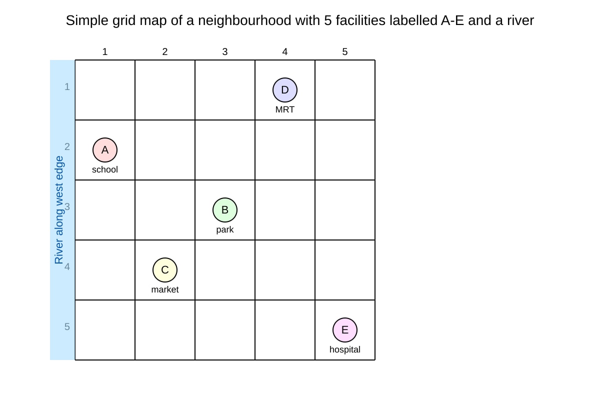
Image pending generation: map for Q13.
Using the map, (a) name the facility at (4,1). [1] (b) Which two facilities are closest to the river? [1] (c) Explain why the park location may benefit residents. [2]
-
A line graph shows Singapore's water usage (million gallons) from 2010 (400) to 2020 (600) increasing steadily. (a) State the trend. [1] (b) Calculate the average increase per year. [2] (c) Suggest a sustainable action to reduce usage. [1]
-
The pie chart shows energy sources: Solar 20%, Gas 50%, Coal 30%. (a) Which source is most used? [1] (b) Calculate the angle for Solar. [2] (c) Explain one environmental benefit of increasing Solar. [1]
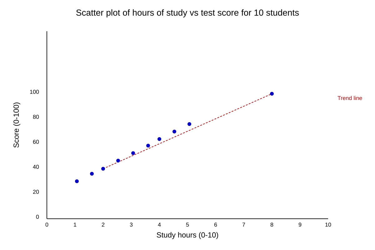
Image pending generation: graph for Q16.
(a) State the correlation type. [1] (b) Estimate score for 5 hours. [1] (c) Explain limitation of using this graph for prediction. [2]
Section C: Applied Map-Graph Questions (Questions 17–20, 3 marks each, Total 12 marks)
-
A town plan map shows residential areas near a factory. Using map evidence, explain how graph data of air quality could show impact. [3]
-
Given a table of tourist arrivals by country (Malaysia 30%, China 25%, India 15%, Others 30%), draw a pie chart plan and state what a bar graph would add. [3]
-
A climate graph shows wet season May–Sep (rain >150mm) and dry Dec–Feb (<50mm). Describe how this helps plan tourism activities. [3]
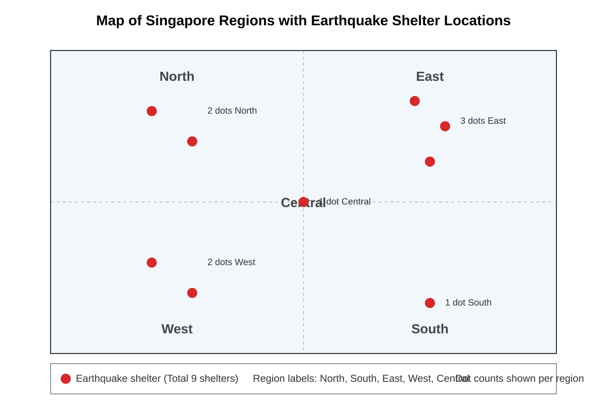
Image pending generation: map for Q20.
Using the map, calculate percentage of shelters in East and suggest equity issue. [3]
Answers
TuitionGoWhere Practice Paper - Geography Secondary 3 (Version 4) Answer Key
Total Marks: 40
Section A (1 mark each)
- height / elevation [1]
Teaching: Contour lines connect equal heights; used to read terrain on topographic maps. - a large drop / decline in tourists in 2020 [1]
Teaching: Shorter bar = fewer arrivals; likely COVID-19 context but any valid drop reason accepted. - time [1]
Teaching: Line graphs of daily temp use x-axis as time (hours), y-axis as °C. - residential [1]
Teaching: 50% is largest slice; residential land use dominates. - 50 000 cm (or 500 m) [1]
Teaching: Scale 1:50 000 → 1 cm map = 50 000 cm real = 0.5 km. - highest rainfall month [1]
Teaching: In climate graph, rainfall bars height = monthly total; tallest = wettest. - right (east) [1]
Teaching: Grid coordinates (x,y): x right, y up. - positive [1]
Teaching: Points rise together → as one increases other increases = positive correlation. - Town C [1]
Teaching: 1500 is greatest density. - larger population [1]
Teaching: Proportional symbols size = value; bigger = more.
Section B
- [4] (a) Jun [1] (b) Range = 40 – 20 = 20 thousand [1] (c) School holidays / good weather in June [2] – any reasoned seasonal factor.
- [4] (a) Mar (29°C) [1] (b) Higher temp months (Feb, Mar) have lower rain; not strict but inverse-ish [2] (c) Mean = (200+150+100+180)/4 = 630/4 = 157.5 mm [1]
- [4] (a) D (MRT) [1] (b) A and B (west edge near river) [1] (c) Park provides green space, cooling, recreation near homes [2]
- [4] (a) Steady increase [1] (b) (600-400)/10 = 20 million gallons/year [2] (c) Use less water / recycle [1]
- [4] (a) Gas [1] (b) 20% of 360° = 72° [2] (c) Solar lowers emissions [1]
- [4] (a) Positive [1] (b) ~62 (midway 55–70) [1] (c) Small sample, correlation not cause [2]
Section C (3 marks each)
- [3] Mark descriptors: Map shows residential near factory (1). Graph of air quality would show higher pollutants nearby (1). Link: map+graph evidence supports health impact (1).
- [3] Pie plan: 4 slices with % (1). Bar graph adds exact comparison / ranking (1). State clarity (1).
- [3] Wet season limits outdoor (1), dry season good for tours (1), plan accordingly (1).
- [3] East = 3/9 = 33.3% [1]. Equity: East has more than others, uneven distribution [2].
Image notes:
Q13 map: grid with A-E and river; answers based on positions.
Q16 graph: scatter with upward trend; estimate from points.
Q20 map: region dots; count used for %.
Free quiz and exam paper access
Enter your details to view this paper
Your access is remembered on this device.