AI Generated Exam Paper
Secondary 3 Geography Practice Paper 2
Free Sec 3 Geography Practice Paper 2, HY3 AI version, with questions, answers, and O Level-style practice for Singapore students.
These static practice materials are generated from the site's syllabus and paper-generation workflow, with source and model context shown so students and parents can evaluate the material before use.
Questions
TuitionGoWhere Practice Paper - Geography Secondary 3
TuitionGoWhere Practice Paper (AI)
Version: 2 of 5
Subject: Geography
Level: Secondary 3
Paper: Practice Paper (Topic: Map Graph Data Skills)
Duration: 45 minutes
Total Marks: 40
Name: ________________________
Class: ____________
Date: ____________
Instructions:
- This practice paper tests skills in reading and interpreting maps, graphs, and data tables.
- Answer all 20 questions in the spaces provided.
- Section A: 10 short questions (1 mark each). Section B: 6 data-response questions (2 marks each). Section C: 4 extended questions (5 marks each).
- Use the extracts, tables, and figures provided to support your answers.
- Marks for each question are shown in brackets [ ].
Section A: Basic Map and Graph Reading (10 marks)
Answer all questions. 1 mark each.
1. On a topographic map, a contour line joining points of equal height is used to show ______________. [1]
2. A bar graph shows the number of tourists visiting a place each month. Which axis should have the months listed? [1]
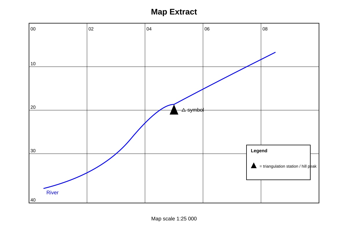
3. Look at the map below. The symbol △ usually represents ______________. [1]
Image pending generation: map for Q3.
4. In a pie chart showing energy use, the largest slice represents the ______________ source of energy. [1]
5. A line graph with a steep upward slope from 2010 to 2020 shows ______________ over time. [1]
6. On a climate graph, the red line normally shows ______________ and the blue bars show ______________. [1]
7. A map with a scale of 1:50 000 means 1 cm on the map equals ______________ m on the ground. [1]
8. A data table shows rainfall (mm) for five months. To find the average, you should ______________ all values and divide by five. [1]
9. A scatter graph is best used to show the relationship between ______________ variables. [1]
10. A north arrow on a map shows the direction of ______________. [1]
Section B: Data Interpretation (12 marks)
Answer all questions. 2 marks each.
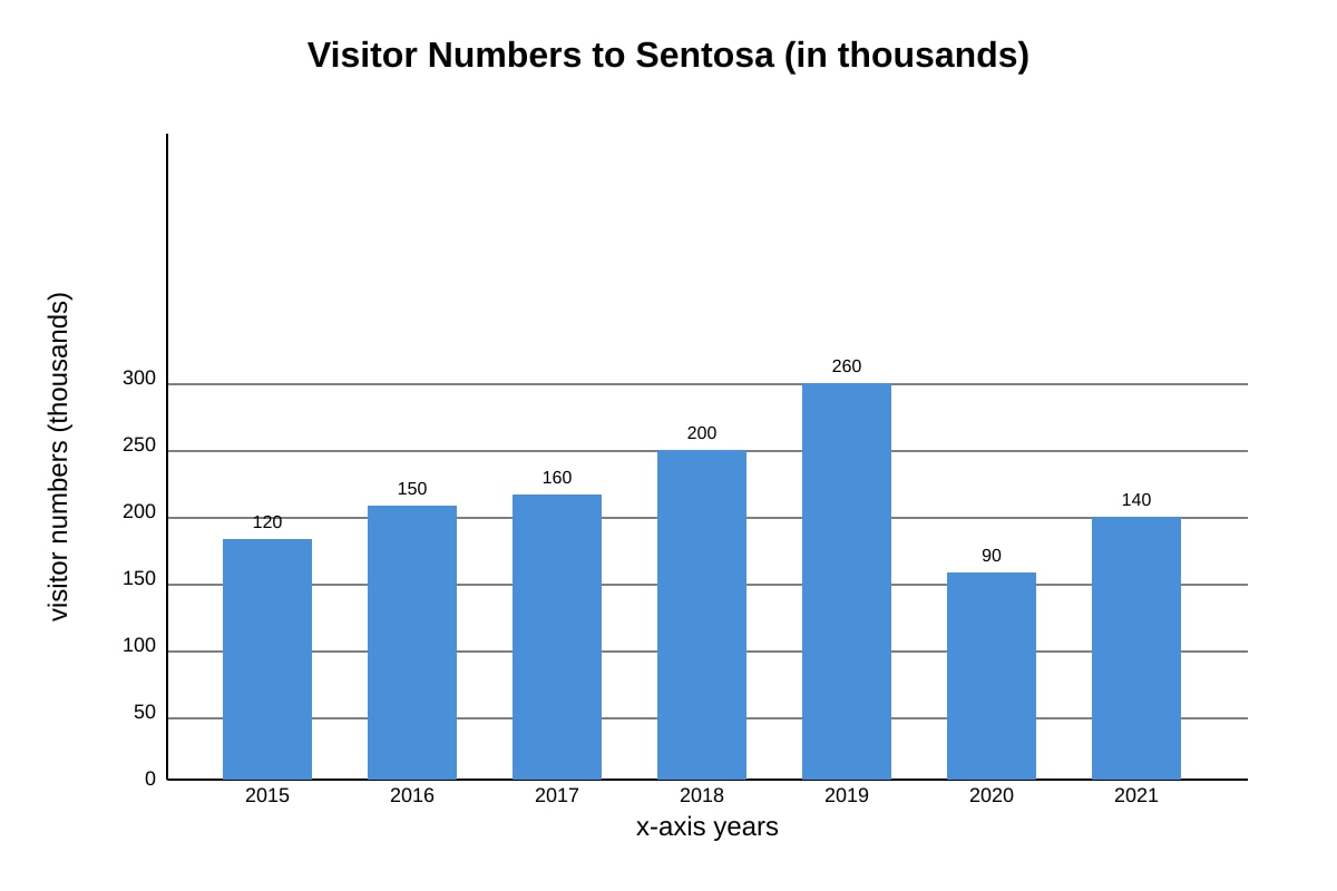
11. Study the bar graph below. Between which two years was the increase in visitor numbers greatest? Give the value of the increase. [2]
Image pending generation: graph for Q11.
12. The table below shows temperature and rainfall for a town. Describe one pattern you can see. [2]
| Month | Jan | Apr | Jul | Oct |
|---|---|---|---|---|
| Temp (°C) | 27 | 28 | 27 | 27 |
| Rain (mm) | 250 | 180 | 150 | 220 |
13. A map extract has a scale of 1:10 000. Two points are 5 cm apart on the map. Calculate the actual distance in metres. Show your working. [2]
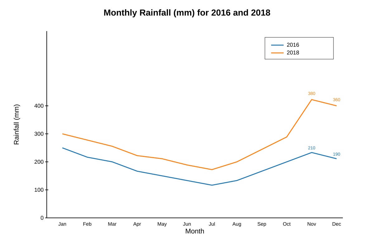
14. Look at the line graph of rainfall below. Explain why 2018 had a higher total than 2016. [2]
Image pending generation: graph for Q14.
15. A pie chart shows land use: Forest 40%, Urban 35%, Agriculture 25%. If the total area is 200 km², calculate the urban area in km². [2]
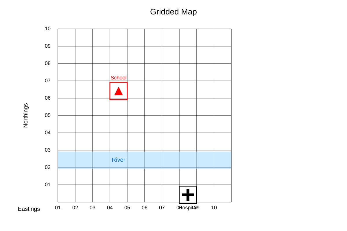
16. Study the map below. Give the four-figure grid reference of the school symbol. [2]
Image pending generation: map for Q16.
Section C: Extended Data Response (20 marks)
Answer all questions. 5 marks each.
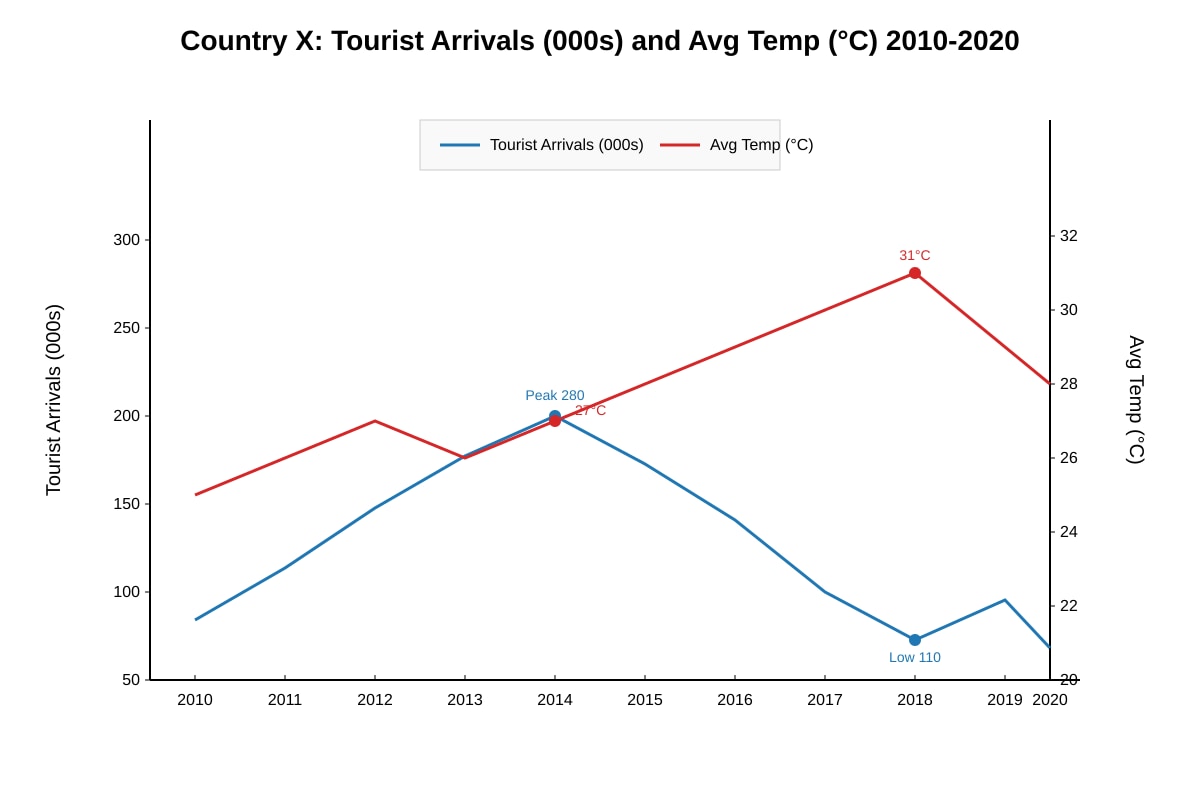
17. The graph below shows tourist arrivals and average temperature for Country X from 2010 to 2020. Using the graph and your geographical knowledge, explain how temperature may influence tourism in Country X. [5]
Image pending generation: graph for Q17.
18. A fieldwork group collected data on litter count along a 100 m transect at a beach. The table shows results.
| Distance (m) | 0 | 25 | 50 | 75 | 100 |
|---|---|---|---|---|---|
| Litter (items) | 12 | 8 | 5 | 3 | 1 |
(a) Plot the data on a line graph. [2]
(b) Describe the trend and suggest one reason. [3]
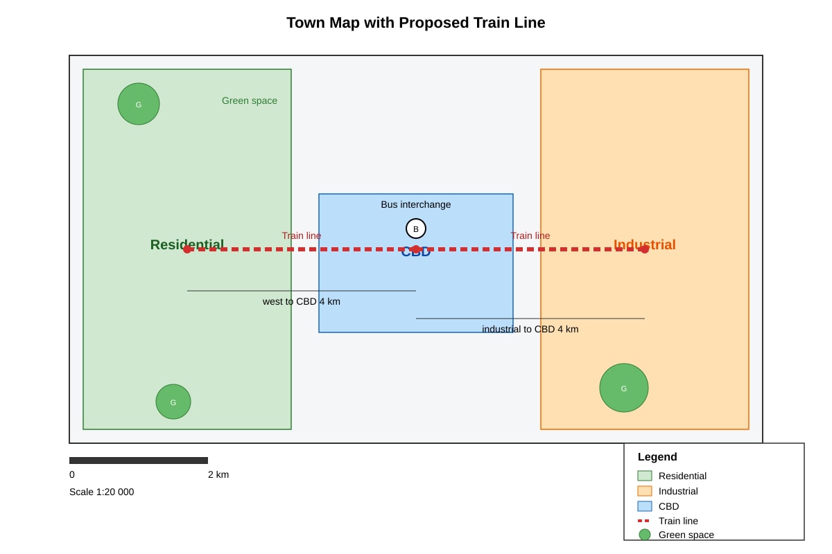
19. The map below shows a proposed new train line. Using evidence from the map, explain two ways this line could help sustainable development in the town. [5]
Image pending generation: map for Q19.
20. The data table shows population and waste recycled for 4 towns.
| Town | Pop (000s) | Recycled (tonnes) |
|---|---|---|
| A | 120 | 480 |
| B | 80 | 400 |
| C | 200 | 500 |
| D | 150 | 450 |
(a) Calculate recycling rate per 1000 people for each town. [3]
(b) Identify the most efficient town and explain why. [2]
End of Paper
Answers
TuitionGoWhere Practice Paper - Geography Secondary 3 (Answers)
Version: 2 of 5
Total Marks: 40
Section A: Basic Map and Graph Reading (10 marks)
1. [1] equal height / height above sea level.
Teaching note: Contour lines connect points at the same elevation; they show relief on maps.
2. [1] x-axis (horizontal axis).
Teaching note: Categories like months go on the x-axis; values on y-axis.
3. [1] a triangulation station / hill peak.
Teaching note: On the map legend (Q3-fig1), △ means triangulation station or hill top.
4. [1] largest / greatest.
Teaching note: Largest pie slice = biggest share of total.
5. [1] rapid increase / growth.
Teaching note: Steep slope = fast change; upward = increase.
6. [1] temperature; rainfall.
Teaching note: Climate graphs use red line for temp, blue bars for rain.
7. [1] 500 m.
Working: 1:50 000 → 1 cm = 50 000 cm = 500 m.
8. [1] add.
Teaching note: Mean = sum ÷ count.
9. [1] two.
Teaching note: Scatter graphs show correlation between two variables.
10. [1] north.
Teaching note: North arrow points to map north.
Section B: Data Interpretation (12 marks)
11. [2] Greatest increase: 2018 to 2019 (from 200 to 260 = +60 thousand).
Marking: 1 mark identify years, 1 mark value. From Q11-fig1, 2018→2019 is +60; next is 2015→2016 (+30).
12. [2] Example: Temperature is fairly constant (~27-28°C) while rainfall is highest in Jan (250 mm) and lowest in Jul (150 mm).
Marking: 1 mark pattern in temp, 1 mark pattern in rain. Accept any valid description from table.
13. [2] 5 cm × 10 000 = 50 000 cm = 500 m.
Working: Scale 1:10 000 → 1 cm = 100 m. 5 cm × 100 = 500 m. 1 mark calc, 1 mark answer.
14. [2] 2018 had higher Nov-Dec rainfall (380+360=740) than 2016 (210+190=400).
Marking: 1 mark use of values, 1 mark correct comparison from Q14-fig1.
15. [2] Urban = 35% of 200 = 0.35 × 200 = 70 km².
Working: 35/100 × 200 = 70. 1 mark method, 1 mark answer.
16. [2] Grid reference 0407 (easting 04, northing 07).
Marking: 1 mark easting, 1 mark northing from Q16-fig1.
Section C: Extended Data Response (20 marks)
17. [5] Mark scheme:
- State pattern: arrivals high when temp 26-28°C, fall when >30°C. [1]
- Use data: 2014 peak (27°C, 280k), 2018 low (31°C, 110k). [1]
- Explain: moderate temp = comfortable tourism; high temp discourages visitors. [2]
- Conclude: temperature is a pull factor within limits. [1]
Teaching note: Show link between graph lines and tourist comfort.
18. [5]
(a) [2] Graph: x-axis distance, y-axis litter; points plotted at (0,12)(25,8)(50,5)(75,3)(100,1); line joins points. 1 mark points, 1 mark line.
(b) [3] Trend: litter decreases with distance from start (12→1). [1] Reason: e.g. more human use near entrance; wind blows litter to start. [2]
Teaching note: Transect shows spatial pattern.
19. [5] Mark scheme (any two):
- Reduces car use: connects residential to industrial via CBD, lowering emissions. [2]
- Supports public transport use, less congestion. [2]
- Preserves green spaces by concentrating travel. [1]
Teaching note: Use map labels from Q19-fig1 (train line, CBD, green space).
20. [5]
(a) [3] Rates per 1000: A=480/120=4.0; B=400/80=5.0; C=500/200=2.5; D=450/150=3.0 tonnes per 1000. 1 mark each correct (3 marks).
(b) [2] Town B most efficient (5.0 per 1000). Explain: highest rate relative to population. [2]
End of Answer Key
Free quiz and exam paper access
Enter your details to view this paper
Your access is remembered on this device.