AI Generated Quiz
Secondary 1 Geography Map Graph Data Skills Quiz
Free Sec 1 Geography Map Graph Data Skills quiz, Nemo3 AI version, with questions, answers, and syllabus-aligned practice for Singapore students.
These static practice materials are generated from the site's syllabus and paper-generation workflow, with source and model context shown so students and parents can evaluate the material before use.
Questions


Free quiz and exam paper access
Enter your details to view this paper
Your access is remembered on this device.
Answers
Secondary 1 Geography Quiz - Map Graph Data Skills (Answer Key)
Total Marks: 40
Section A: Map Skills (12 marks)
1. 4-figure grid reference of the school [1]
Answer: 3063 (or equivalent based on map extract)
Marking: 1 mark for correct 4-figure grid reference (eastings first, then northings).
Explanation: To read a 4-figure grid reference, first read the eastings (vertical grid lines, left to right) then the northings (horizontal grid lines, bottom to top). The reference refers to the bottom-left corner of the grid square containing the symbol. For example, if the school symbol lies in the square bounded by easting 30 and northing 63, the reference is 3063.
Common mistake: Reversing the order (writing northings first) or using the wrong corner of the grid square.
2. 6-figure grid reference of the water tank [1]
Answer: 284618 (or equivalent based on map extract)
Marking: 1 mark for correct 6-figure grid reference.
Explanation: A 6-figure grid reference divides each grid square into 10 tenths both horizontally and vertically. Estimate the position within the square:
- Eastings: 28 (grid line) + 4 tenths = 284
- Northings: 61 (grid line) + 8 tenths = 618
Result: 284618. Always read eastings first, then northings.
Common mistake: Reversing order; miscounting tenths (e.g., reading 5 tenths as 0.5 instead of 5).
3. Straight-line distance between school and water tank [2]
Answer: ~2.1 km (accept 2.0–2.2 km depending on exact positions)
Marking:
- 1 mark for correct measurement on map (e.g., 4.2 cm)
- 1 mark for correct conversion using scale (e.g., 1:50,000 → 4.2 cm = 2.1 km)
Working:
- Measure straight-line distance on map between the two symbols using a ruler.
Example: 4.2 cm - Apply map scale (assume 1:50,000 for this map):
(Divide by 100,000 to convert cm to km)
Note: If scale is 1:25,000, answer would be 1.05 km. Always check the map scale.
4. Relief of grid square 2962 [3]
Answer:
The area in grid square 2962 is hilly with a steep slope. Contour lines are closely spaced, indicating a steep gradient. The contour values increase from 20 m in the west to 60 m in the east, showing a hill rising towards the east. The highest point is around 60 m.
Marking:
- 1 mark for identifying relief type (hill / steep slope)
- 1 mark for using contour evidence (close spacing / contour values)
- 1 mark for describing trend (rising eastward / height range)
Explanation: Contour lines connect points of equal elevation. Close spacing = steep slope; wide spacing = gentle slope. V-shaped contours pointing uphill = valleys; pointing downhill = spurs/ridges. Closed loops = hills or depressions.
5. Walk from school to water tank along main road [3]
(a) General direction [1]
Answer: South-west (SW)
Marking: 1 mark for correct cardinal/intercardinal direction.
Explanation: Use the north arrow on the map. If the water tank is to the lower-left of the school, the direction is south-west.
(b) Advantage of following main road [2]
Answer:
Following the main road is safer and easier because it provides a defined path, avoids steep/rough terrain (e.g., dense vegetation, streams, steep slopes shown by contours), and may be shorter in travel time despite being longer in distance.
Marking: 1 mark for valid advantage (safety / accessibility / avoids obstacles); 1 mark for map evidence (e.g., "avoids steep slope in grid square 2962" or "crosses river at bridge").
Explanation: Straight-line distance is shortest but may cross impassable features. Roads are built to negotiate terrain at manageable gradients.
Section B: Graph & Data Interpretation (12 marks)
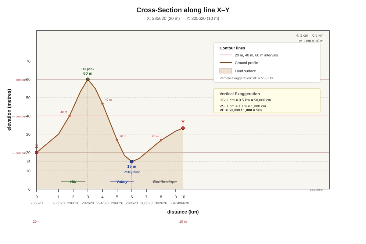
6. Cross-section X–Y [4]
(a) Vertical Exaggeration (VE) [2]
Answer: VE = 50 times (or 50×)
Marking:
- 1 mark for correct formula: (both as representative fractions)
- 1 mark for correct calculation and answer
Working: - Vertical Scale: 1 cm = 10 m → 1 cm = 1,000 cm → RF 1:1,000
- Horizontal Scale: 1 cm = 0.5 km = 50,000 cm → RF 1:50,000
Note: Award full marks for correct method even if arithmetic error.
(b) Landform at 292620 [2]
Answer: Hill (or knoll); height 60 m above sea level.
Marking: 1 mark for landform; 1 mark for height.
Explanation: At 292620, the cross-section shows a peak with contours closing at 60 m. Closed contour loops with increasing values inward indicate a hill. The highest contour is 60 m.
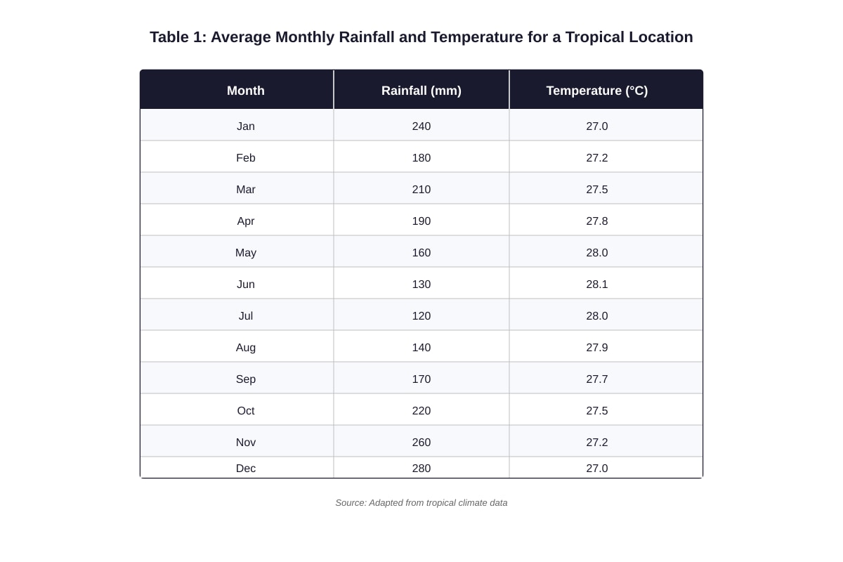
7. Climate data (Table 1) [4]
(a) Highest rainfall month [1]
Answer: December (280 mm)
Marking: 1 mark for correct month.
(b) Annual temperature range [1]
Answer: 1.1°C
Working: Highest temp = 28.1°C (June); Lowest temp = 27.0°C (Jan/Dec)
Range = 28.1 – 27.0 = 1.1°C
Marking: 1 mark for correct calculation.
(c) Relationship between rainfall and temperature [2]
Answer:
There is a weak inverse relationship — months with higher rainfall (Nov–Jan, ~240–280 mm) tend to have slightly lower temperatures (~27.0–27.2°C), while drier months (Jun–Aug, ~120–140 mm) have slightly higher temperatures (~27.9–28.1°C). However, the temperature range is very small (1.1°C), typical of tropical climates.
Marking: 1 mark for identifying pattern (inverse / higher rain → lower temp); 1 mark for data support or noting small range.
Explanation: In equatorial regions, heavy cloud cover and rain reduce daytime heating, leading to slightly cooler temperatures during wetter months.
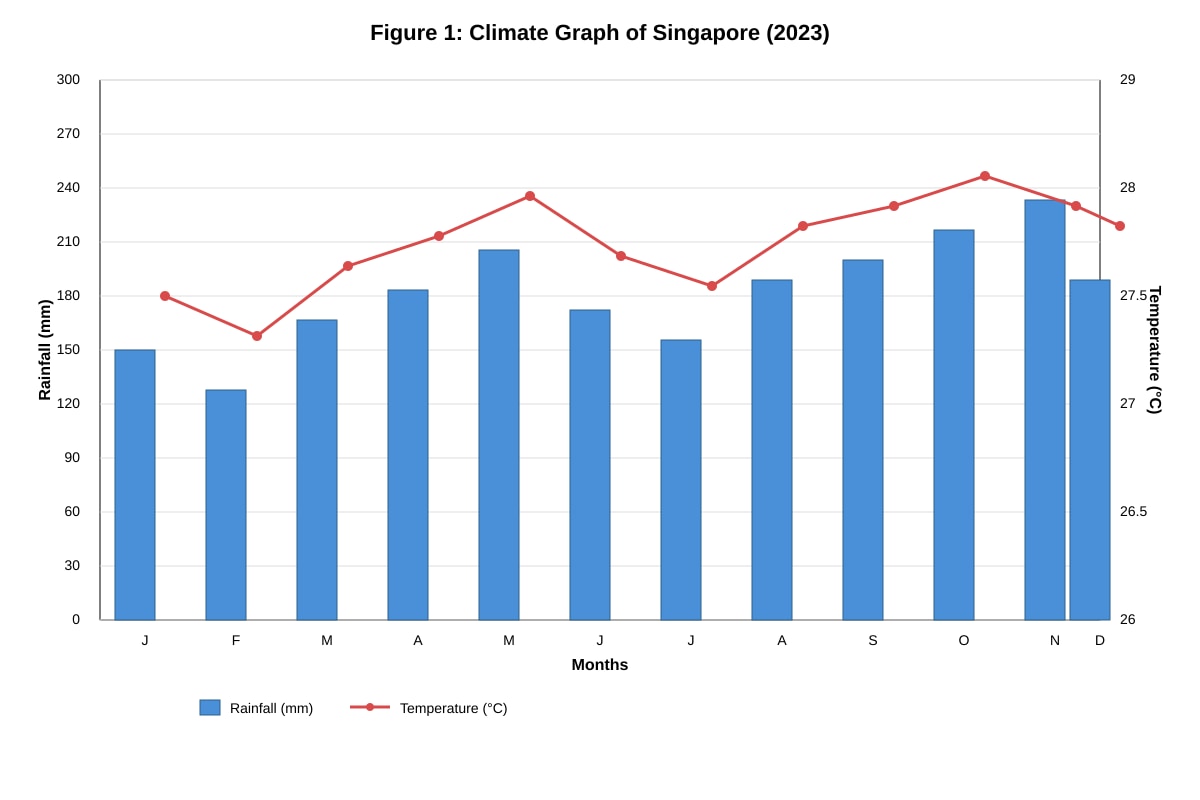
8. Climate graph scale reading [2]
Answer: 28.0°C
Working:
- Baseline = 26°C
- Scale: 1 cm = 0.5°C
- Graph height for May = 4 cm above baseline
- Temperature increase = 4 cm × 0.5°C/cm = 2.0°C
- Actual temperature = 26.0 + 2.0 = 28.0°C
Marking: 1 mark for correct method (scale × distance); 1 mark for correct answer.
Check: Table 1 shows May = 28.0°C ✓
9. Population pyramid (Country X) [5]
(a) Shape [1]
Answer: Expansive / broad-based / pyramidal shape — wide base, narrowing steadily towards the top.
Marking: 1 mark for accurate description.
(b) Birth rate and death rate [2]
Answer:
The broad base (large 0–4 age group) indicates a high birth rate. The steady narrowing and very small elderly cohorts (80+ < 1%) suggest a high death rate (especially infant/child mortality) and low life expectancy.
Marking: 1 mark for high birth rate + evidence (broad base); 1 mark for high death rate / low life expectancy + evidence (rapid narrowing, small top).
(c) Challenge in 20 years [2]
Answer:
Youth bulge entering workforce — large cohorts aged 0–19 now will be 20–39 in 20 years, creating pressure for job creation, housing, and infrastructure. If economy cannot absorb them, unemployment and social unrest may result.
Marking: 1 mark for identifying challenge (jobs / housing / services); 1 mark for linking to population structure (large young cohorts aging up).
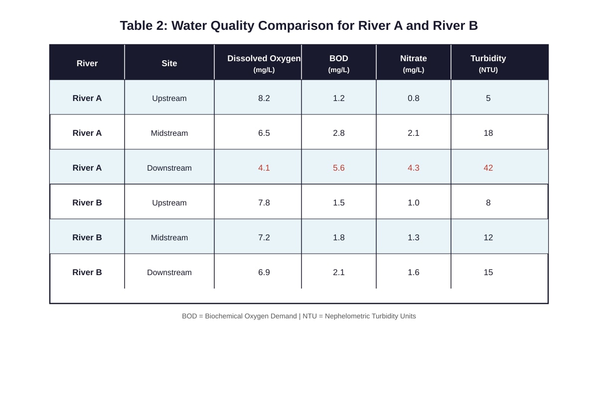
10. Water quality comparison (Table 2) [5]
(a) River with greater deterioration [3]
Answer: River A shows greater deterioration.
Evidence 1: DO drops sharply from 8.2 mg/L (upstream) to 4.1 mg/L (downstream) (Δ = –4.1), while River B drops only from 7.8 to 6.9 (Δ = –0.9).
Evidence 2: BOD rises from 1.2 to 5.6 mg/L (Δ = +4.4) in River A, vs. 1.5 to 2.1 (Δ = +0.6) in River B.
Marking: 1 mark for correct river; 1 mark each for two distinct pieces of comparative evidence with data.
(b) Why DO decreases and BOD increases downstream in River A [2]
Answer:
Downstream, organic pollution (e.g., sewage, industrial waste) increases. Decomposers (bacteria) break down this organic matter, consuming oxygen (lowering DO). The Biochemical Oxygen Demand (BOD) rises because more oxygen is required to decompose the higher organic load.
Marking: 1 mark for linking pollution → decomposition → DO drop; 1 mark for linking organic load → higher BOD.
Section C: Data Skills & Geographical Inquiry (10 marks)
11. Traffic count investigation [6]
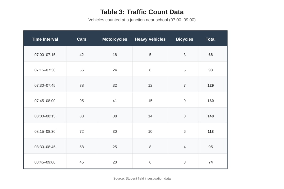
(a) Percentage of heavy vehicles (07:30–07:45) [2]
Answer: 9.3%
Working:
Heavy vehicles = 12; Total = 129
(1 d.p.)
Marking: 1 mark for correct values; 1 mark for correct calculation and rounding.
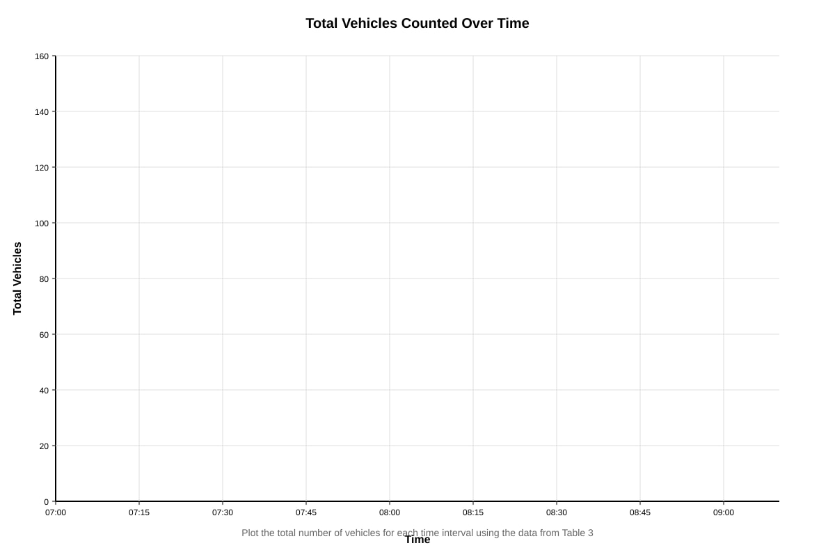
(b) Line graph of total vehicles [3]
Marking:
- 1 mark: Axes labelled correctly with units (Time / Total Vehicles) and appropriate scale
- 1 mark: All 8 points plotted accurately
- 1 mark: Points connected with straight lines; title included
Expected graph: Peaks at 07:45–08:00 (160), symmetric rise and fall.
(c) Reason for peak 07:45–08:00 [1]
Answer: Morning rush hour — parents dropping children at school / commuters heading to work before 8 am start.
Marking: 1 mark for valid reason linked to time context.
12. Surface runoff investigation [5]
(a) Hypothesis [1]
Answer: Impermeable surfaces (concrete, tiles) produce more surface runoff than permeable surfaces (grass).
Marking:
<stage5_quiz_answers_md>
Secondary 1 Geography Quiz - Map Graph Data Skills (Answer Key)
Total Marks: 40
Section A: Map Skills (12 marks)
1. 4-figure grid reference of the school in the north-eastern part
Answer: 3063 (or equivalent based on map extract)
Marking: 1 mark for correct 4-figure GR (eastings first, then northings).
2. 6-figure grid reference of the water tank at the road junction in the south-west
Answer: 284612 (or equivalent based on map extract)
Marking: 1 mark for correct 6-figure GR (eastings 3 digits, northings 3 digits).
3. Straight-line distance between school (Q1) and water tank (Q2)
Working:
- Measure distance on map between the two grid references (e.g., 4.2 cm).
- Map scale: 1 : 25,000 (1 cm = 0.25 km).
- Distance = 4.2 cm × 0.25 km/cm = 1.05 km (accept 1.0–1.1 km depending on measurement).
Marking: 1 mark for correct measurement/working, 1 mark for correct answer with unit (km).
4. Relief of grid square 2962 with contour evidence
Answer:
The area in grid square 2962 is hilly with a steep slope.
Evidence: Contour lines are closely spaced (e.g., 20 m, 40 m, 60 m contours within a short distance), indicating a steep gradient. The highest contour in the square is 60 m, showing a hill.
Marking: 1 mark for relief description (hilly/steep), 1 mark for "closely spaced contours", 1 mark for quoting contour values (e.g., 20 m to 60 m).
5. Walk from school to water tank along main road
(a) General direction: South-west (or SW)
Marking: 1 mark for correct cardinal/intercardinal direction.
(b) Advantage of following main road:
The main road provides a paved, even surface which is easier and safer to walk on compared to undeveloped land which may have uneven terrain, dense vegetation, or steep slopes (as shown by closely spaced contours), making progress slower and more difficult.
Marking: 1 mark for identifying road condition (paved/flat), 1 mark for contrasting with difficulties of undeveloped land (steep/vegetation/uneven).
Section B: Graph & Data Interpretation (12 marks)
6. Cross-section X–Y (Map 2)
(a) Vertical Exaggeration (VE)
Working:
- Horizontal scale: 1 cm = 0.5 km = 50,000 cm → 1 : 50,000
- Vertical scale: 1 cm = 10 m = 1,000 cm → 1 : 1,000
- VE = Horizontal Scale / Vertical Scale = 50,000 / 1,000 = 50 times (or 50×)
Marking: 1 mark for correct scale conversion, 1 mark for correct VE calculation and unit (times/×).
(b) Landform at 292620
Answer: Hill (or knoll/summit), height 60 m above sea level.
Marking: 1 mark for landform, 1 mark for height with unit.
7. Table 1: Climate Data
(a) Highest rainfall month: December (280 mm)
Marking: 1 mark.
(b) Annual temperature range:
Max temp = 28.1°C (June), Min temp = 27.0°C (Jan/Dec)
Range = 28.1 – 27.0 = 1.1°C
Marking: 1 mark for correct calculation and unit.
(c) Relationship between rainfall and temperature:
There is no strong correlation; temperature remains relatively constant (27.0–28.1°C) throughout the year, while rainfall fluctuates (120–280 mm) with higher rainfall in Nov–Jan and Mar, and lower rainfall in Jun–Aug.
Marking: 1 mark for noting constant temperature, 1 mark for describing rainfall pattern/fluctuation.
8. Climate Graph (Figure 1) – May Temperature
Working:
- Baseline = 26°C
- Scale: 1 cm = 0.5°C
- Graph height = 4 cm
- Temperature increase = 4 cm × 0.5°C/cm = 2.0°C
- Actual temperature = 26°C + 2.0°C = 28.0°C
Marking: 1 mark for working, 1 mark for correct answer with unit.
9. Population Pyramid (Figure 2) – Country X
(a) Shape: Expansive / broad-based pyramid (wide base, narrow top, concave sides).
Marking: 1 mark.
(b) Birth rate and death rate:
The broad base indicates a high birth rate. The rapid narrowing and small top suggest a high death rate (especially infant/child mortality) and low life expectancy.
Marking: 1 mark for high birth rate linked to broad base, 1 mark for high death rate/low life expectancy linked to narrow top.
(c) Challenge in next 20 years:
Youth bulge entering workforce → pressure to create sufficient jobs, expand education/training, and provide housing/infrastructure; risk of unemployment and social unrest if economy cannot absorb young population.
Marking: 1 mark for identifying challenge (e.g., job creation, education pressure), 1 mark for explanation linked to population structure.
10. Water Quality (Table 2) – River A vs River B
(a) River with greater deterioration: River A
Evidence 1: Dissolved Oxygen (DO) drops sharply from 8.2 mg/L (upstream) to 4.1 mg/L (downstream) (Δ = –4.1), while River B drops only from 7.8 to 6.9 (Δ = –0.9).
Evidence 2: BOD rises from 1.2 to 5.6 mg/L (Δ = +4.4) in River A, compared to 1.5 to 2.1 (Δ = +0.6) in River B. (Nitrate and turbidity also show larger increases in River A.)
Marking: 1 mark for identifying River A, 1 mark each for two distinct pieces of evidence with data.
(b) Why DO decreases and BOD increases downstream in River A:
Organic pollution (e.g., sewage, agricultural runoff) enters the river downstream. Decomposers (bacteria) break down this organic matter, consuming oxygen (lowering DO) and increasing Biological Oxygen Demand (BOD) as more oxygen is required for decomposition.
Marking: 1 mark for organic pollution/decomposers, 1 mark for linking to DO decrease and BOD increase.
Section C: Data Skills & Geographical Inquiry (10 marks)
11. Traffic Count (Table 3)
(a) % Heavy vehicles at 07:30–07:45
Heavy vehicles = 12, Total = 129
% = (12 / 129) × 100 = 9.3% (to 1 d.p.)
Marking: 1 mark for correct values, 1 mark for correct calculation and rounding.
(b) Line Graph – Total Vehicles vs Time
Requirements for full marks (3):
- Title: "Total Vehicles at Junction (07:00–09:00)"
- X-axis: Time (07:00 to 09:00, 15-min intervals labelled)
- Y-axis: Total Vehicles (0–180, appropriate scale e.g., 1 cm = 20 vehicles)
- 8 points plotted accurately, connected with straight lines
- Axes labelled with units
Marking: 1 mark for axes/labels/scale, 1 mark for accurate plotting, 1 mark for title and line connection.
(c) Reason for peak 07:45–08:00:
Morning rush hour – parents dropping children at school / commuters heading to work before 8 am start.
Marking: 1 mark for valid reason linked to time.
12. Land Use & Surface Runoff Investigation
(a) Hypothesis:
"Surface runoff is highest on impermeable surfaces (concrete/tiled) and lowest on permeable surfaces (grass)."
Marking: 1 mark for testable, directional hypothesis.
(b) Variables:
- Independent: Type of land surface (grass, concrete, tiles)
- Dependent: Volume/rate of surface runoff (e.g., mm or L/min)
Marking: 1 mark each.
(c) Controlled variables (any two):
- Rainfall intensity/amount (same simulator, duration, pressure)
- Slope/gradient of test plots
- Soil moisture content before test (pre-wet equally)
- Plot size/area
- Time of measurement after rainfall starts
Marking: 1 mark each (max 2).
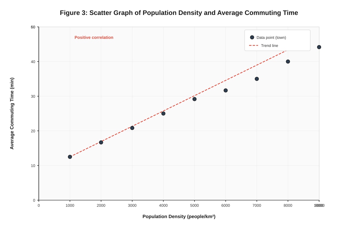
13. Scatter Graph (Figure 3) – Population Density vs Commuting Time
(a) Relationship:
Positive correlation – as population density increases, average commuting time increases. The trend is non-linear (steeper at higher densities).
Marking: 1 mark for positive correlation, 1 mark for non-linear/steepening description.
(b) Estimated commuting time at 5,500 people/km²:
From trend line: ~36–37 minutes (accept 35–38 min).
Marking: 1 mark for reasonable estimate.
(c) Reason for longer commuting times at higher density:
Traffic congestion – more people and vehicles in a smaller area lead to slower traffic speeds and longer delays on roads.
Marking: 1 mark for congestion/road capacity explanation.
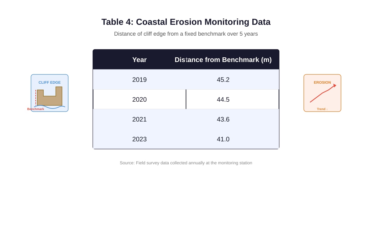
14. Coastal Erosion (Table 4)
(a) Average annual erosion rate:
Total erosion = 45.2 – 41.0 = 4.2 m over 4 years (2019–2023)
Rate = 4.2 m / 4 yr = 1.05 m/yr
Marking: 1 mark for total erosion/time span, 1 mark for rate with unit.
(b) Year cliff reaches coastal path (35.0 m):
Distance to erode = 41.0 – 35.0 = 6.0 m (from 2023 position)
Years needed = 6.0 m / 1.05 m/yr ≈ 5.7 years
Year = 2023 + 5.7 ≈ 2029 (accept 2028–2029)
Marking: 1 mark for distance calculation, 1 mark for year.
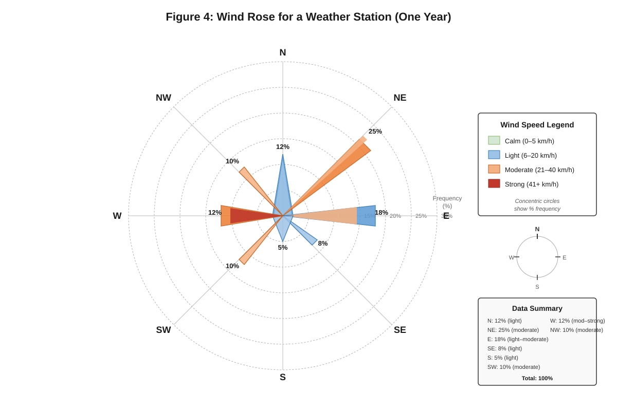
15. Wind Rose (Figure 4)
(a) Most frequent wind direction: NE (25%)
Marking: 1 mark.
(b) Combined % from northerly quadrants (NW, N, NE):
NW 10% + N 12% + NE 25% = 47%
Marking: 1 mark for correct sum.
(c) Influence on coastal processes:
Dominant NE winds drive longshore drift in a south-westerly direction (assuming northern hemisphere), transporting sediment along the coast. Moderate/strong W/NW winds (22% combined) can generate larger waves causing erosion on west-facing cliffs. Low frequency from S/SE means less sediment input from that direction, potentially leading to net erosion on south-facing sections.
Marking: 1 mark for longshore drift direction linked to dominant wind, 1 mark for erosion/deposition impact linked to wind speed/frequency.
End of Answer Key