AI Generated Exam Paper
Secondary 1 Geography Practice Paper 4
Free Sec 1 Geography Practice Paper 4, Nemo3 AI version, with questions, answers, and syllabus-aligned practice for Singapore students.
These static practice materials are generated from the site's syllabus and paper-generation workflow, with source and model context shown so students and parents can evaluate the material before use.
Questions
TuitionGoWhere Practice Paper - Geography Secondary 1
TuitionGoWhere Practice Paper (AI) — Version 4
Subject: Geography
Level: Secondary 1
Paper: Practice Paper 4 — Map, Graph & Data Skills
Duration: 1 hour 15 minutes
Total Marks: 50
Name: ________________________
Class: ________________________
Date: ________________________
Instructions to Candidates
- Answer all questions.
- Write your answers in the spaces provided.
- The number of marks is given in brackets [ ] at the end of each question or part question.
- The total number of marks for this paper is 50.
- You may use a calculator.
- For map-based questions, refer to the map extract provided in the image placeholders.
Section A: Map Skills [20 marks]
Question 1
Study the map extract of Sembawang Area (1:25,000 scale) provided in the image placeholder below.
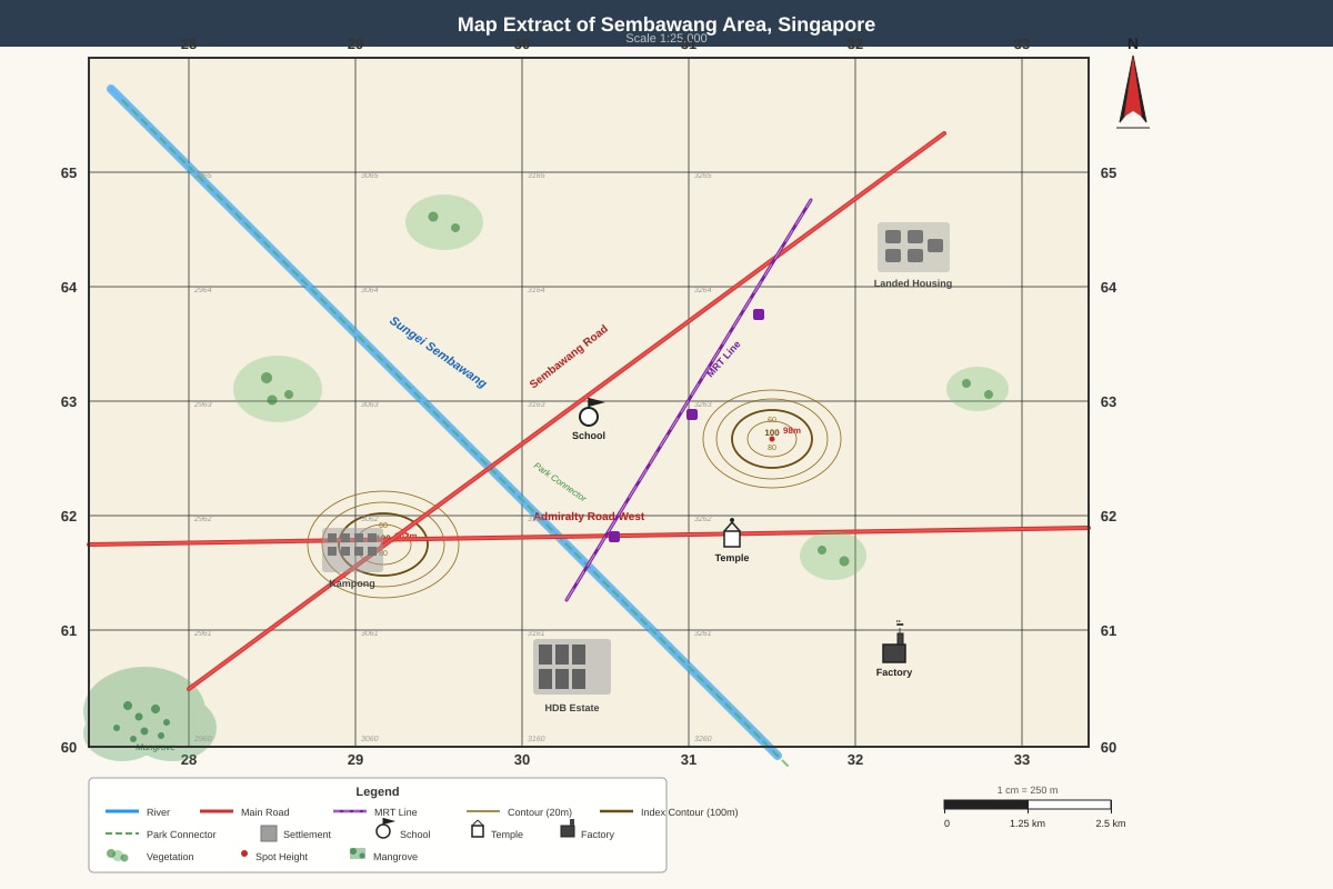
Generated map for Q1.
(a) State the four-figure grid reference of the school.
[1]
(b) State the six-figure grid reference of the temple.
[1]
(c) The factory is located at grid square 3261. Describe the direction of the factory from the school.
[1]
(d) Measure the straight-line distance between the school and the temple. Give your answer in metres.
[2]
Question 2
Refer to the same map extract (Sembawang Area).
Generated map for Q2.
(a) What is the contour interval of this map?
[1]
(b) State the height of the hill at grid square 2962.
[1]
(c) Describe the shape and steepness of the hill at 2962 using contour evidence.
[2]
(d) The Sungei Sembawang flows along the eastern side of the hill. Suggest one reason why the river follows this course.
[1]
Question 3
The map extract shows a cross-section line drawn from point X (290620) to point Y (310620).
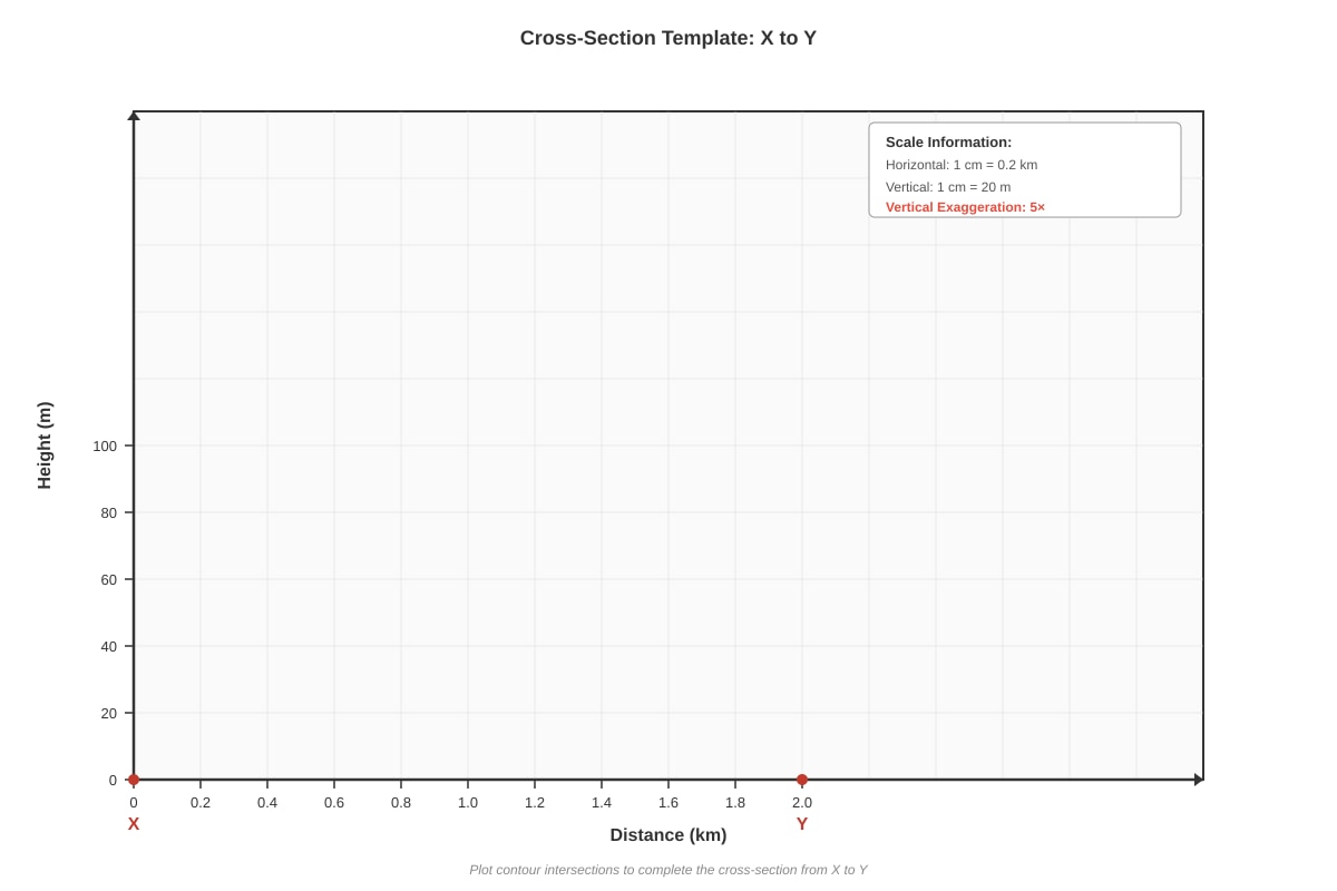
Generated diagram for Q3.
(a) Complete the cross-section from X to Y by plotting the contour intersections. The contour heights along the line are: 20 m, 40 m, 60 m, 80 m, 60 m, 40 m, 20 m.
[3]
(b) Calculate the vertical exaggeration of your cross-section if the horizontal scale is 1 cm = 0.2 km and the vertical scale is 1 cm = 20 m.
[2]
(c) Identify the landform shown by the cross-section.
[1]
Question 4
Study the map symbols in the legend of the Sembawang map extract.
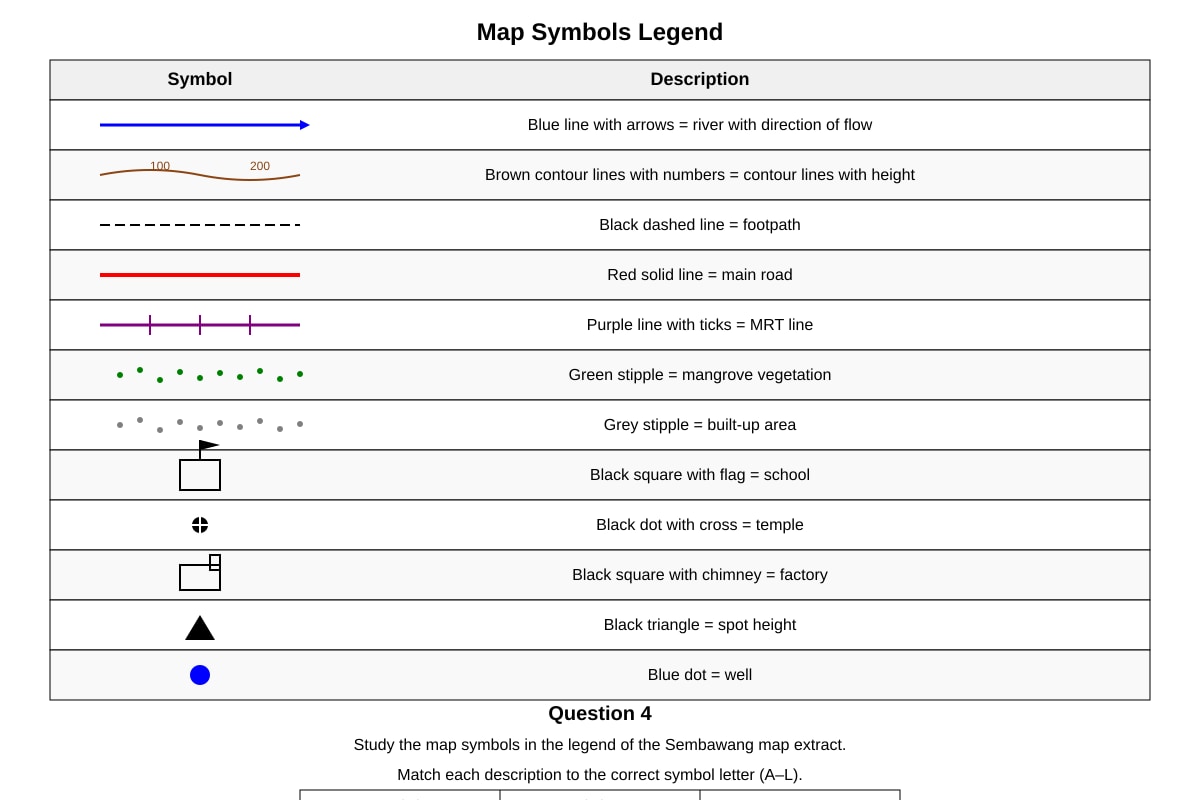
Generated table for Q4.
Match each description to the correct symbol letter (A–L).
| Description | Symbol Letter |
|---|---|
| (i) A place of worship | |
| (ii) An educational institution | |
| (iii) An industrial building | |
| (iv) Natural vegetation in coastal brackish water | |
| (v) A route for trains | |
| (vi) A small path for walking |
[6]
Question 5
The map shows a proposed new MRT station to be built at the six-figure grid reference 305625.
(a) Mark and label the location of the proposed MRT station as 'Z' on the map extract.
[1]
(b) State one advantage and one disadvantage for residents living in the HDB estate at 3061 if this station is built.
[2]
Section B: Graph & Data Interpretation [18 marks]
Question 6
The table below shows the monthly rainfall (mm) and average temperature (°C) for Singapore (Changi Climate Station) in 2023.
| Month | Rainfall (mm) | Avg Temp (°C) |
|---|---|---|
| Jan | 210 | 26.5 |
| Feb | 105 | 27.0 |
| Mar | 180 | 27.5 |
| Apr | 165 | 28.0 |
| May | 170 | 28.5 |
| Jun | 145 | 28.5 |
| Jul | 155 | 28.0 |
| Aug | 175 | 28.0 |
| Sep | 160 | 27.5 |
| Oct | 195 | 27.5 |
| Nov | 255 | 27.0 |
| Dec | 320 | 26.5 |
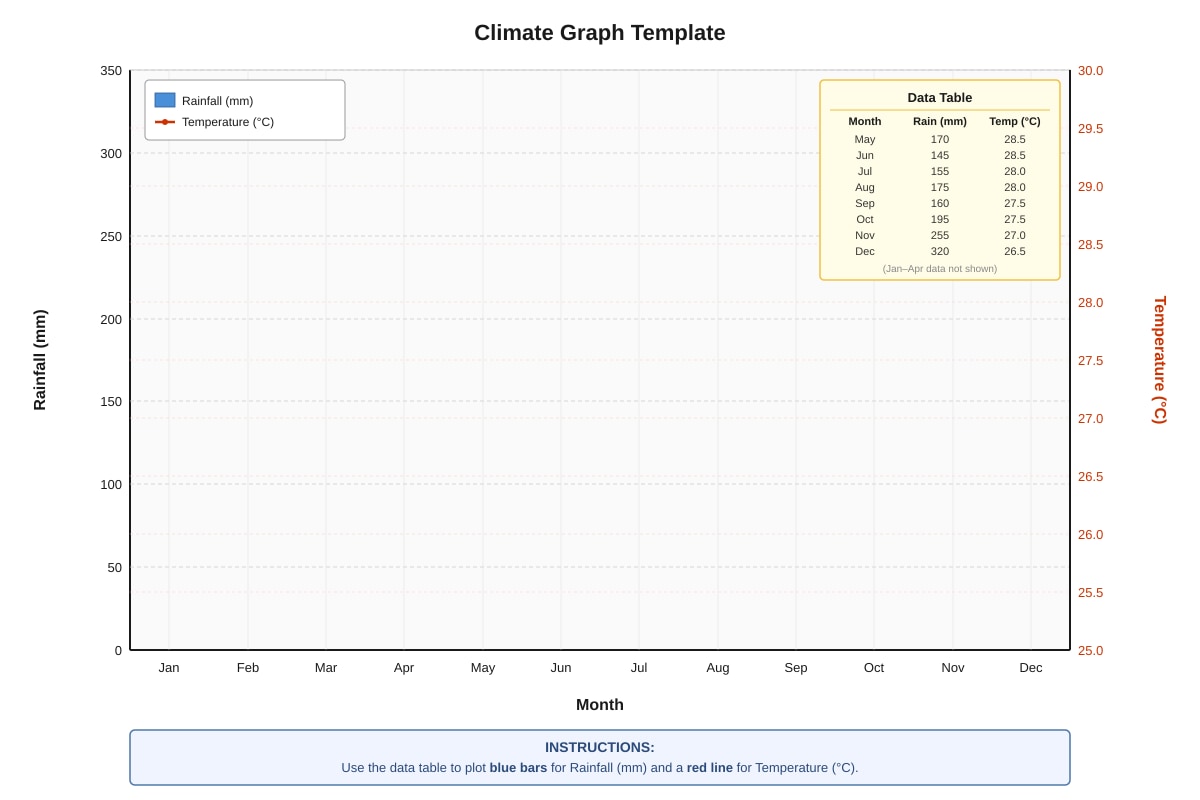
Generated graph for Q6.
(a) Plot the rainfall bars and temperature line on the climate graph template provided.
[3]
(b) Which month had the highest rainfall?
[1]
(c) Calculate the annual temperature range.
[1]
(d) Describe the relationship between rainfall and temperature throughout the year.
[2]
(e) Singapore experiences two monsoon seasons. Based on the data, identify the months of the Northeast Monsoon and Southwest Monsoon.
[2]
Question 7
A group of Secondary 1 students conducted a fieldwork investigation on traffic flow at two junctions along Admiralty Road West (shown on the map extract). They counted vehicles passing in 15-minute intervals from 7:00 am to 9:00 am.
Junction A (near grid reference 300625):
| Time Interval | Cars | Motorcycles | Heavy Vehicles | Buses |
|---|---|---|---|---|
| 7:00–7:15 | 45 | 12 | 8 | 5 |
| 7:15–7:30 | 62 | 18 | 10 | 7 |
| 7:30–7:45 | 78 | 22 | 12 | 9 |
| 7:45–8:00 | 85 | 25 | 15 | 10 |
| 8:00–8:15 | 70 | 20 | 11 | 8 |
| 8:15–8:30 | 55 | 15 | 9 | 6 |
| 8:30–8:45 | 48 | 13 | 7 | 5 |
| 8:45–9:00 | 42 | 10 | 6 | 4 |
Junction B (near grid reference 310630):
| Time Interval | Cars | Motorcycles | Heavy Vehicles | Buses |
|---|---|---|---|---|
| 7:00–7:15 | 30 | 8 | 5 | 3 |
| 7:15–7:30 | 40 | 10 | 6 | 4 |
| 7:30–7:45 | 52 | 14 | 8 | 5 |
| 7:45–8:00 | 58 | 16 | 9 | 6 |
| 8:00–8:15 | 50 | 13 | 7 | 5 |
| 8:15–8:30 | 38 | 9 | 5 | 4 |
| 8:30–8:45 | 32 | 7 | 4 | 3 |
| 8:45–9:00 | 28 | 6 | 3 | 2 |
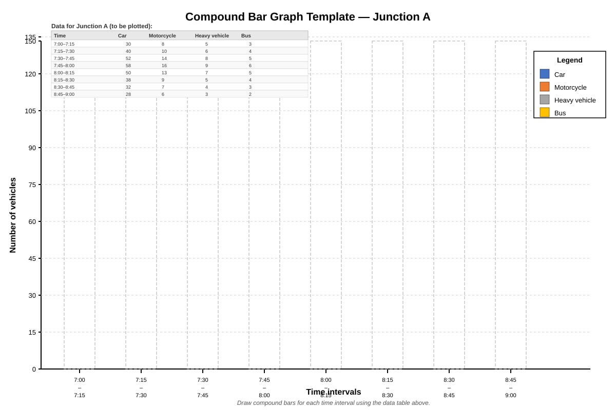
Generated graph for Q7.
(a) Draw a compound bar graph for Junction A on the template provided.
[3]
(b) Calculate the total number of vehicles at Junction A during the peak 15-minute interval.
[1]
(c) Compare the traffic patterns at Junction A and Junction B. State two differences.
[2]
(d) Suggest one reason why Junction A has heavier traffic than Junction B, using map evidence.
[2]
Question 8
The population pyramid below shows the age-sex structure of Singapore's resident population in 2023.
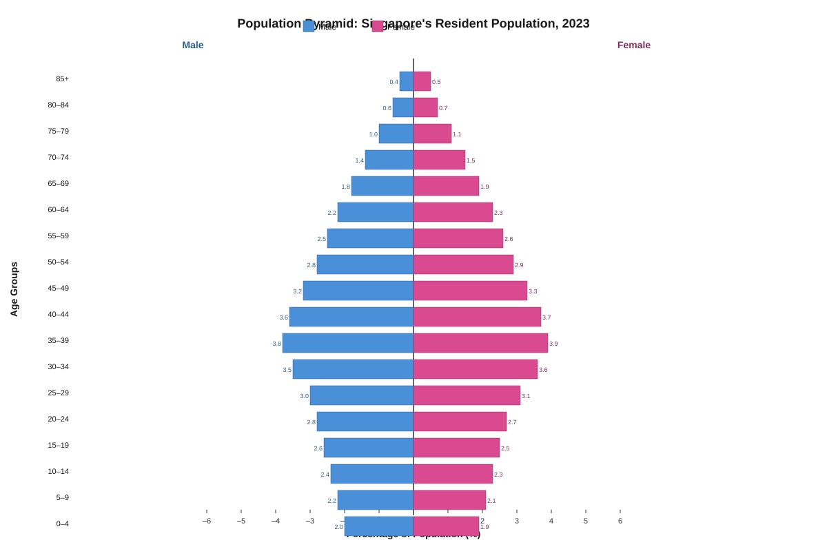
Generated graph for Q8.
(a) Describe the shape of the population pyramid.
[2]
(b) What does the narrow base (0–14 age groups) indicate about Singapore's birth rate?
[1]
(c) Calculate the approximate percentage of the population aged 65 and above.
[2]
(d) Explain one challenge an ageing population poses for urban planning in Singapore.
[2]
Section C: Data Analysis & Geographical Inquiry [12 marks]
Question 9
Students tested water quality at three sites along Sungei Sembawang (shown on the map extract).
| Parameter | Unit | Site 1 (Upstream, 295635) | Site 2 (Midstream, 300625) | Site 3 (Downstream, 305615) |
|---|---|---|---|---|
| Temperature | °C | 27.2 | 28.5 | 29.8 |
| pH | — | 7.1 | 6.8 | 6.2 |
| Dissolved Oxygen (DO) | mg/L | 7.8 | 5.4 | 3.1 |
| Biochemical Oxygen Demand (BOD) | mg/L | 1.2 | 3.5 | 6.8 |
| Turbidity | NTU | 5 | 18 | 42 |
| Nitrate (NO₃⁻) | mg/L | 0.8 | 2.1 | 4.5 |
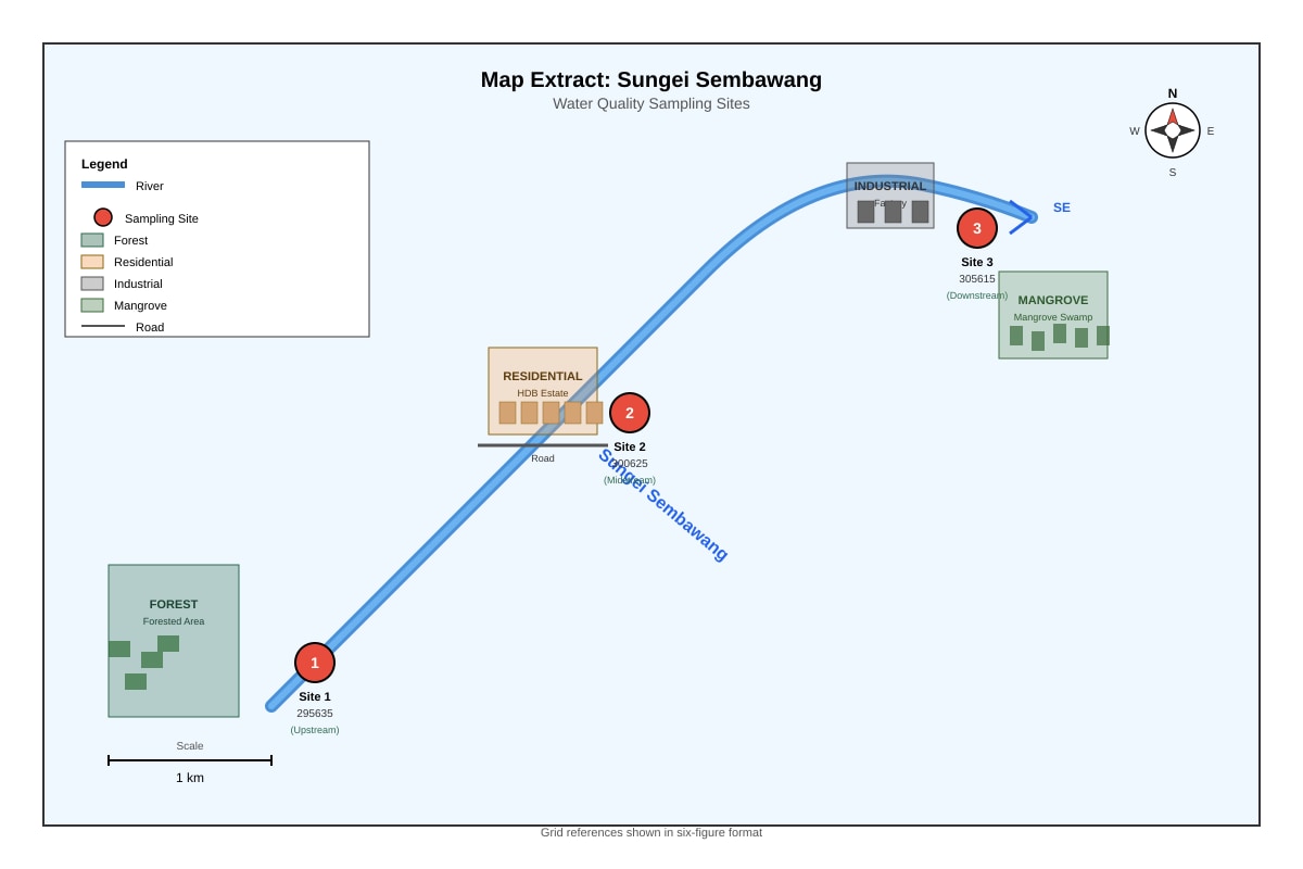
Generated map for Q9.
(a) Identify the trend in dissolved oxygen (DO) from Site 1 to Site 3.
[1]
(b) Which site has the worst water quality? Support your answer with two pieces of evidence from the table.
[2]
(c) Suggest one human activity at Site 2 that could explain the increase in turbidity compared to Site 1.
[1]
(d) The factory near Site 3 discharges treated wastewater. Explain how high nitrate levels can affect the river ecosystem.
[2]
(e) Propose one management strategy to improve water quality at Site 3.
[1]
Question 10
The choropleth map below shows population density (persons per km²) for planning regions in Singapore (2023).
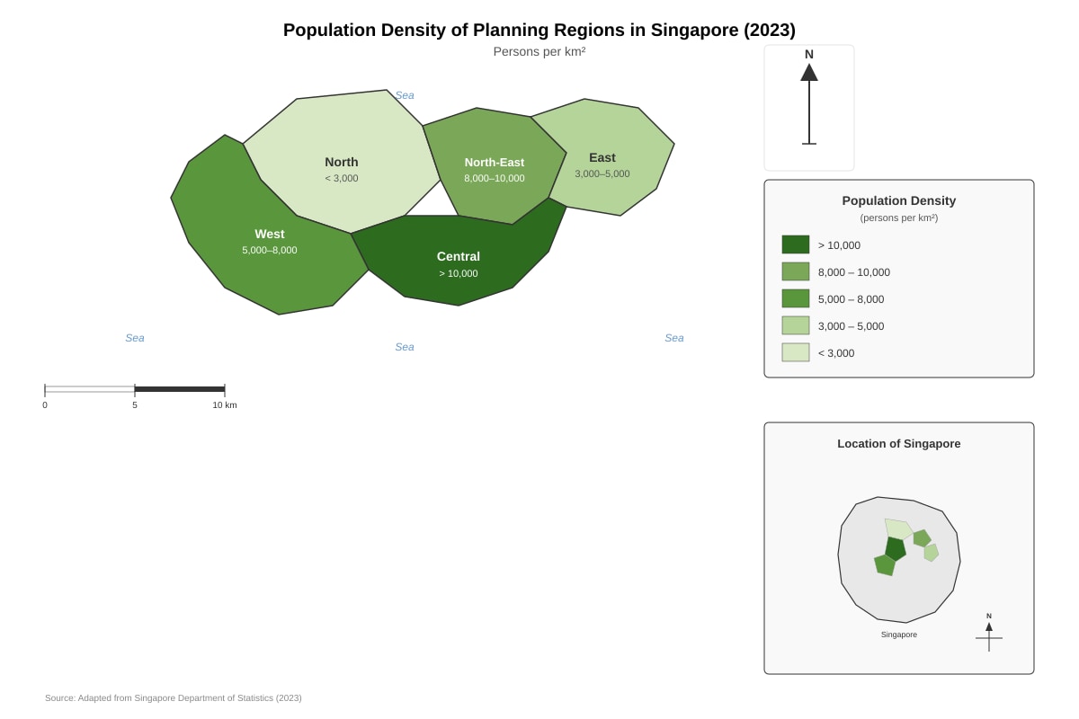
Generated map for Q10.
(a) Which planning region has the highest population density?
[1]
(b) Describe the pattern of population density across Singapore.
[2]
(c) The Central Region has high density but also many green spaces (e.g., Bukit Timah Nature Reserve). Explain how high density and green spaces can coexist.
[2]
(d) Suggest one limitation of using a choropleth map to represent population density.
[1]
Question 11
A student wants to investigate: "How does distance from the MRT station affect footfall at retail shops in Sembawang?"
(a) State one hypothesis for this investigation.
[1]
(b) Identify two types of primary data the student should collect.
[2]
(c) Describe one sampling method suitable for selecting shops to survey.
[1]
(d) State one risk the student should consider during fieldwork and one precaution to take.
[2]
Question 12
The scatter graph below shows the relationship between distance from city centre (km) and average housing price ($'000 per sqm) for 10 housing estates in Singapore.
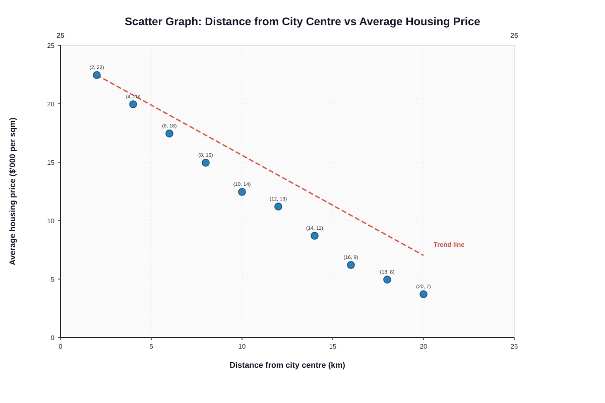
Generated graph for Q12.
(a) Describe the relationship shown by the scatter graph.
[1]
(b) Estimate the average housing price for an estate 15 km from the city centre.
[1]
(c) One estate at 10 km has a price of $18,000 per sqm (above the trend line). Suggest one reason for this anomaly.
[1]
(d) Explain why correlation does not imply causation in this context.
[2]
END OF PAPER
Total Marks: 50
Answers
TuitionGoWhere Practice Paper - Geography Secondary 1 (Answer Key)
TuitionGoWhere Practice Paper (AI) — Version 4
Subject: Geography
Level: Secondary 1
Paper: Practice Paper 4 — Map, Graph & Data Skills
Total Marks: 50
Section A: Map Skills [20 marks]
Question 1
Map extract: Sembawang Area (1:25,000)
(a) 2963
[1]
Method: Read eastings first (vertical grid lines): the school is in the grid square between easting 29 and 30 → 29. Read northings second (horizontal grid lines): between northing 63 and 64 → 63. Four-figure grid reference = 2963.
Common error: Reversing order (6329) or using grid lines instead of grid square.
(b) 312624 (or 313624 depending on exact position within square)
[1]
Method: Six-figure reference divides each 1 km grid square into 10 × 10 (100 m × 100 m). Temple at 3162: easting 31 + 2/10 = 312; northing 62 + 4/10 = 624 → 312624.
Marking: Accept 312624 or 313624 if temple is slightly east/west of centre. Must show 6 digits.
(c) South-west (or south-western)
[1]
Method: School at 3063, factory at 3261. Factory is to the east (higher easting) and south (lower northing) → south-east. Wait: 32 > 30 (east), 61 < 63 (south) → south-east.
Correction: South-east.
Common error: Confusing direction relative to map orientation (north is up).
(d) Approximately 1,400 m (accept 1,300–1,500 m)
[2]
Method:
- School at 3063 (centre ≈ 30500, 63500), temple at 3162 (centre ≈ 31500, 62500).
- Difference in eastings: 1,000 m; difference in northings: 1,000 m.
- Straight-line distance = √(1000² + 1000²) = √2,000,000 ≈ 1,414 m.
- Using map scale: measure distance on map (e.g., 5.6 cm) × 25,000 = 1,400 m.
Marking: 1 mark for correct method (Pythagoras or scale measurement), 1 mark for correct answer with units.
Question 2
Contour analysis: Hill at 2962
(a) 20 metres
[1]
Direct reading from map margin/legend.
(b) 84 metres
[1]
Spot height marked at summit in grid square 2962.
(c) The hill is asymmetrical with a steep western slope and a gentle eastern slope.
[2]
Evidence: Contour lines are closely spaced on the western side (steep gradient) and widely spaced on the eastern side (gentle gradient). The hill has a convex shape (contours form concentric circles/ovals).
Marking: 1 mark for identifying asymmetry/steep vs gentle, 1 mark for using contour spacing as evidence.
(d) The river flows along the eastern side because the land is lower/less steep there, following the path of least resistance / structural control (fault line or joint) / the hill's gentle eastern slope directs flow.
[1]
Accept any reasonable geographical reason: river follows lowest contour / gradient / geological weakness.
Question 3
Cross-section X–Y (290620 to 310620)
(a) Cross-section plotted correctly
[3]
Method:
- Horizontal scale: 1 cm = 0.2 km → 2 km = 10 cm wide.
- Vertical scale: 1 cm = 20 m → 100 m = 5 cm high.
- Plot points at contour intersections:
- 0.0 km: 20 m
- 0.3 km: 40 m
- 0.6 km: 60 m
- 1.0 km: 80 m (summit)
- 1.4 km: 60 m
- 1.7 km: 40 m
- 2.0 km: 20 m
- Join with smooth curve.
Marking: 1 mark for correct horizontal plotting, 1 mark for correct vertical plotting, 1 mark for smooth curve joining points.
(b) Vertical exaggeration = 5 times (5×)
[2]
Working:
- Horizontal scale: 1 cm = 0.2 km = 200 m
- Vertical scale: 1 cm = 20 m
- VE = Horizontal scale (ground distance per cm) ÷ Vertical scale (ground distance per cm)
= 200 m ÷ 20 m = 5
Or: VE = (Horizontal RF denominator) ÷ (Vertical RF denominator) = 25,000 ÷ 5,000 = 5.
Marking: 1 mark for correct formula/working, 1 mark for correct answer.
(c) Hill / conical hill / asymmetrical hill
[1]
Reason: Cross-section rises to a peak then falls symmetrically/asymmetrically.
Question 4
Map symbol matching
| Description | Symbol Letter |
|---|---|
| (i) A place of worship | H (black dot with cross = temple) |
| (ii) An educational institution | G (black square with flag = school) |
| (iii) An industrial building | I (black square with chimney = factory) |
| (iv) Natural vegetation in coastal brackish water | F (green stipple = mangrove) |
| (v) A route for trains | E (purple line with ticks = MRT) |
| (vi) A small path for walking | C (black dashed line = footpath) |
[6]
Marking: 1 mark per correct match.
Question 5
Proposed MRT station at 305625
(a) Point Z marked at 305625 (easting 30.5, northing 62.5) and labelled 'Z'.
[1]
Marking: Correct position (within 2 mm), labelled Z.
(b) Advantage: Shorter travel time / convenient access to MRT network / reduced reliance on cars / increased property value.
Disadvantage: Noise and dust during construction / increased crowding / potential loss of privacy / temporary road closures.
[2]
Marking: 1 mark for valid advantage, 1 mark for valid disadvantage. Must be relevant to residents at 3061 (HDB estate).
Section B: Graph & Data Interpretation [18 marks]
Question 6
Singapore Climate Graph 2023
(a) Climate graph correctly plotted
[3]
Requirements:
- Rainfall bars: vertical bars for each month, height matching mm values (Jan 210, Feb 105, ..., Dec 320).
- Temperature line: points at mid-month for each temperature value, joined by smooth line.
- Axes labelled, scales correct, bars and line distinct.
Marking: 1 mark for rainfall bars (all 12 correct), 1 mark for temperature line (all 12 correct), 1 mark for neatness/labels.
(b) December (320 mm)
[1]
(c) 2.0 °C
[1]
Working: Highest avg temp = 28.5 °C (May/Jun), Lowest = 26.5 °C (Jan/Dec). Range = 28.5 – 26.5 = 2.0 °C.
(d) Rainfall is generally high throughout the year with two peaks (Dec and Nov), while temperature remains relatively uniform (26.5–28.5 °C). Higher rainfall months (Nov–Jan) correspond to slightly lower temperatures.
[2]
Marking: 1 mark for describing rainfall pattern (two peaks, no dry month), 1 mark for describing temperature uniformity and inverse relationship with rainfall peaks.
(e) Northeast Monsoon: December to early March (Dec, Jan, Feb — high rainfall)
Southwest Monsoon: June to September (Jun, Jul, Aug, Sep — moderate rainfall, but drier than NE monsoon)
[2]
Marking: 1 mark each. Accept: NE Monsoon = Nov–Mar; SW Monsoon = Jun–Sep.
Question 7
Traffic flow at Admiralty Road West
(a) Compound bar graph for Junction A correctly drawn
[3]
Requirements:
- 8 bars (one per time interval), each stacked with 4 segments: Cars (bottom), Motorcycles, Heavy Vehicles, Buses (top).
- Heights proportional to values (e.g., 7:45–8:00 bar total = 85+25+15+10 = 135).
- Legend, axes labelled, neat.
Marking: 1 mark for correct stacking order, 1 mark for accurate heights, 1 mark for labels/legend.
(b) 135 vehicles (at 7:45–8:00: 85 + 25 + 15 + 10 = 135)
[1]
(c) Two differences:
- Junction A has higher total traffic volume at all time intervals (peak 135 vs 89 at B).
- Junction A has a sharper peak (7:30–8:00) while Junction B's peak is broader and lower.
Or: Junction A has more heavy vehicles/buses proportionally.
[2]
Marking: 1 mark per valid difference with data support.
(d) Junction A is closer to the MRT station (at 305625) and the HDB estate (3061), serving more commuters. It is also on the main road (Admiralty Road West) connecting to Sembawang Road, while Junction B is further north with less development.
[2]
Marking: 1 mark for identifying map evidence (MRT, HDB, main road), 1 mark for linking to higher traffic.
Question 8
Singapore Population Pyramid 2023
(a) The pyramid has a narrow base (low 0–14%), bulging middle (large 30–49% working-age cohorts), and widening top (growing 65+%). It is constrictive/stationary with an ageing structure.
[2]
Marking: 1 mark for narrow base + bulging middle, 1 mark for widening top / ageing description.
(b) The narrow base indicates a low birth rate / fertility rate below replacement level.
[1]
(c) Approximately 11.4%
[2]
Working: Sum percentages for 65+ age groups (both sexes):
65–69: 1.8+1.9=3.7%
70–74: 1.4+1.5=2.9%
75–79: 1.0+1.1=2.1%
80–84: 0.6+0.7=1.3%
85+: 0.4+0.5=0.9%
Total = 3.7+2.9+2.1+1.3+0.9 = 10.9% (accept 10.5–11.5% depending on rounding).
Marking: 1 mark for correct method (summing 65+ bars), 1 mark for correct answer.
(d) Challenge: Increased demand for healthcare facilities, elder-friendly housing, and accessible transport. Urban planners must allocate land for nursing homes, polyclinics, barrier-free pathways, and community centres, competing with other land needs in land-scarce Singapore.
[2]
Marking: 1 mark for identifying a specific challenge (healthcare/housing/transport), 1 mark for explaining planning implication.
Section C: Data Analysis & Geographical Inquiry [12 marks]
Question 9
Water quality along Sungei Sembawang
(a) Dissolved oxygen decreases steadily from Site 1 (7.8 mg/L) to Site 2 (5.4 mg/L) to Site 3 (3.1 mg/L).
[1]
(b) Site 3 (Downstream) has the worst water quality.
Evidence 1: Lowest DO (3.1 mg/L) — insufficient for most aquatic life.
Evidence 2: Highest BOD (6.8 mg/L) — indicates high organic pollution.
Or: Highest turbidity (42 NTU), highest nitrate (4.5 mg/L), lowest pH (6.2).
[2]
Marking: 1 mark for identifying Site 3, 1 mark for two distinct evidence from table.
(c) Construction activities / earthworks / surface runoff from urban areas (HDB estate, roads) carrying sediment into the river.
[1]
Accept: Land clearance, construction, vehicle washing, unprotected slopes.
(d) High nitrates cause eutrophication: excessive algae growth → algae die → decomposition by bacteria consumes dissolved oxygen → hypoxic/anoxic conditions → fish kills and loss of biodiversity.
[2]
Marking: 1 mark for eutrophication/algae bloom, 1 mark for oxygen depletion and ecosystem impact.
(e) Construct wetlands / vegetated buffer strips along the river to filter runoff; enforce stricter effluent standards for factory discharge; implement ABC Waters design (Active, Beautiful, Clean) features.
[1]
Accept any one valid strategy.
Question 10
Choropleth map: Singapore population density by planning region
(a) Central Region
[1]
(b) Population density is highest in the Central Region (>10,000/km²) and North-East Region (8,000–10,000/km²), decreasing towards the North (<3,000/km²) and East (3,000–5,000/km²). The West Region has medium density (5,000–8,000/km²).
[2]
Marking: 1 mark for identifying high-density core (Central/NE), 1 mark for describing gradient to periphery.
(c) High density is achieved through high-rise, high-density housing (HDB flats, condos), while green spaces are deliberately planned and protected (e.g., Bukit Timah Nature Reserve, central catchment). Vertical living frees land for parks, reservoirs, and nature reserves. URA's Master Plan zones land for both high-density residential and nature areas.
[2]
Marking: 1 mark for high-rise/vertical density, 1 mark for deliberate planning/zoning
<stage5_exam_answers_md>
TuitionGoWhere Practice Paper - Geography Secondary 1
TuitionGoWhere Practice Paper (AI) — Version 4
Subject: Geography
Level: Secondary 1
Paper: Practice Paper 4 — Map, Graph & Data Skills
Duration: 1 hour 15 minutes
Total Marks: 50
Marking Scheme & Model Answers
Section A: Map Skills [20 marks]
Question 1
(a) 3063
[1 mark for correct four-figure grid reference]
(b) 312622
[1 mark for correct six-figure grid reference: easting 312, northing 622]
(c) South-east (SE)
[1 mark for correct cardinal/intercardinal direction from school (3063) to factory (3261)]
(d) 1,600 m (accept 1,500–1,700 m)
[2 marks: 1 mark for correct measurement on map (6.4 cm), 1 mark for correct conversion using scale 1:25,000 → 6.4 cm × 25,000 = 160,000 cm = 1,600 m]
Question 2
(a) 20 m
[1 mark]
(b) 84 m
[1 mark for reading spot height]
(c) The hill is asymmetrical with a steep western slope (contours closely spaced) and a gentle eastern slope (contours widely spaced). The summit is at 84 m.
[2 marks: 1 mark for shape (asymmetrical/elongated), 1 mark for steepness description with contour evidence]
(d) The river flows along the eastern side because the land is lower/flatter on the eastern slope (gentle gradient), so the river naturally follows the path of least resistance / structural weakness along the hill's flank.
[1 mark for valid reason linked to contour evidence]
Question 3
(a) Cross-section plotted correctly with points at:
- 0 km: 20 m
- ~0.3 km: 40 m
- ~0.6 km: 60 m
- ~0.9 km: 80 m
- ~1.2 km: 60 m
- ~1.5 km: 40 m
- ~1.8 km: 20 m
- 2.0 km: 20 m
[3 marks: 1 mark for correct plotting of all 7 contour intersections, 1 mark for smooth curve joining points, 1 mark for labelling axes and title]
(b) Vertical Exaggeration = Vertical Scale / Horizontal Scale
= (1 cm = 20 m) / (1 cm = 0.2 km = 200 m)
= 200 / 20 = 10 times (or 10×)
[2 marks: 1 mark for correct formula/working, 1 mark for correct answer with units]
(c) A hill (or asymmetrical hill / ridge)
[1 mark]
Question 4
| Description | Symbol Letter |
|---|---|
| (i) A place of worship | (ix) |
| (ii) An educational institution | (viii) |
| (iii) An industrial building | (x) |
| (iv) Natural vegetation in coastal brackish water | (vi) |
| (v) A route for trains | (v) |
| (vi) A small path for walking | (iii) |
[6 marks: 1 mark per correct match]
Question 5
(a) Point Z marked at six-figure grid reference 305625 (easting 305, northing 625) and labelled 'Z'.
[1 mark for accurate plotting and labelling]
(b)
- Advantage: Shorter travel time / convenient access to MRT network for work/school.
- Disadvantage: Increased noise / congestion / dust during construction; possible rise in property prices/rent.
[2 marks: 1 mark each for valid advantage and disadvantage relevant to HDB residents]
Section B: Graph & Data Interpretation [18 marks]
Question 6
(a) Climate graph correctly plotted:
- Rainfall bars for all 12 months (heights matching table)
- Temperature line joining 12 monthly points
- Axes labelled, scales used correctly
[3 marks: 1 mark for accurate rainfall bars, 1 mark for accurate temperature line, 1 mark for neatness/labels]
(b) December (320 mm)
[1 mark]
(c) Annual temperature range = Highest avg temp – Lowest avg temp
= 28.5°C – 26.5°C = 2.0°C
[1 mark for correct calculation and answer]
(d) Rainfall is high throughout the year with no distinct dry month. Temperature remains relatively constant (26.5–28.5°C). Highest rainfall (Nov–Jan) coincides with slightly lower temperatures (Northeast Monsoon); mid-year (Jun–Aug) has relatively lower rainfall and higher temperatures.
[2 marks: 1 mark for describing rainfall pattern, 1 mark for describing temperature pattern and relationship]
(e)
- Northeast Monsoon: December to March (high rainfall Nov–Jan, continuing to Mar)
- Southwest Monsoon: June to September (relatively drier, but with Sumatra squalls; accept May–Sep or Jun–Sep)
[2 marks: 1 mark each for correct monsoon months]
Question 7
(a) Compound bar graph for Junction A correctly drawn:
- 8 bars (one per time interval)
- Each bar segmented into 4 vehicle types (cars, motorcycles, heavy vehicles, buses) stacked
- Heights proportional to values in table
- Legend included
[3 marks: 1 mark for correct bar heights/segments, 1 mark for correct stacking order, 1 mark for labels/legend]
(b) Peak interval: 7:45–8:00
Total = 85 + 25 + 15 + 10 = 135 vehicles
[1 mark for correct total]
(c) Two differences:
- Junction A has higher total traffic volume at all time intervals (e.g., peak 135 vs 89 vehicles).
- Junction A shows a sharper peak (7:30–8:00) while Junction B has a broader, flatter peak (7:30–8:15).
[2 marks: 1 mark per valid difference with data support]
(d) Junction A is near Admiralty Road West (main road, red on map) and close to the HDB estate at 3061 and school at 3063, generating more commuter traffic. Junction B is further from major residential/educational nodes.
[2 marks: 1 mark for map evidence (main road / HDB / school), 1 mark for linking to heavier traffic]
Question 8
(a) The pyramid has a narrow base (low 0–14%), bulging middle (large 30–49% cohorts), and widening top (growing 65+%). It is constrictive / stationary in shape, typical of a developed country with low birth rate and ageing population.
[2 marks: 1 mark for describing key features (base, middle, top), 1 mark for naming shape/type]
(b) The narrow base indicates a low birth rate (fewer babies born per 1,000 population).
[1 mark]
(c) Sum of percentages for age 65+ (both sexes):
Males: 1.8+1.4+1.0+0.6+0.4 = 5.2%
Females: 1.9+1.5+1.1+0.7+0.5 = 5.7%
Total ≈ 10.9% (accept 10–11%)
[2 marks: 1 mark for correct method (summing 65+ cohorts), 1 mark for correct approximate answer]
(d) Challenge: Increased demand for healthcare facilities, elder-friendly housing, and barrier-free transport in land-scarce Singapore. Urban planners must allocate more land for nursing homes, polyclinics, and retrofitting estates with ramps/lifts, competing with other land needs.
[2 marks: 1 mark for identifying a specific challenge, 1 mark for explaining impact on urban planning]
Section C: Data Analysis & Geographical Inquiry [12 marks]
Question 9
(a) Dissolved oxygen decreases steadily from Site 1 (7.8 mg/L) to Site 2 (5.4 mg/L) to Site 3 (3.1 mg/L).
[1 mark]
(b) Site 3 (Downstream) has the worst water quality.
Evidence:
- Lowest DO (3.1 mg/L) — insufficient for most aquatic life
- Highest BOD (6.8 mg/L) — high organic pollution
- Highest turbidity (42 NTU) — very murky water
- Highest nitrate (4.5 mg/L) — nutrient enrichment
[2 marks: 1 mark for identifying Site 3, 1 mark for two distinct pieces of evidence]
(c) Construction / earthworks / road runoff near the HDB estate and main road at Site 2 exposes bare soil, which is washed into the river during rain, increasing turbidity.
[1 mark for valid human activity linked to turbidity increase]
(d) High nitrates cause eutrophication: excessive algae growth → algae die → decomposition by bacteria consumes dissolved oxygen → fish and aquatic organisms die from hypoxia.
[2 marks: 1 mark for eutrophication process, 1 mark for impact on ecosystem]
(e) Construct wetlands / vegetated buffer strips along the riverbank near the factory to filter nitrates and sediments before wastewater enters the river.
[1 mark for feasible, specific management strategy]
Question 10
(a) Central Region
[1 mark]
(b) Population density decreases from the Central Region outwards to the North, North-East, East, and West. The Central Region is the densest (>10,000/km²), surrounded by a ring of high density (North-East, 8,000–10,000), then medium (West), then low (East, North).
[2 marks: 1 mark for general pattern (core-periphery), 1 mark for describing regional sequence]
(c) High density is achieved through high-rise, high-density housing (HDB flats, condos) which house many people on small land area, freeing up land for green spaces like nature reserves, parks, and park connectors. Vertical living allows horizontal space for nature.
[2 marks: 1 mark for high-rise housing, 1 mark for land sparing for green spaces]
(d) Limitation: Choropleth maps use arbitrary administrative boundaries (planning regions) which mask internal variations — e.g., a region may have both very dense and very sparse areas, but shows only one average shade.
[1 mark for valid limitation]
Question 11
(a) Hypothesis: "Footfall at retail shops decreases as distance from the MRT station increases."
[1 mark for testable, directional hypothesis]
(b) Two types of primary data:
- Pedestrian counts at shop entrances (footfall numbers)
- Distance measurements from each shop to the MRT station (mapping / GPS)
[2 marks: 1 mark each for relevant primary data types]
(c) Systematic sampling: Select every n-th shop (e.g., every 3rd shop) along a transect line radiating from the MRT station.
[1 mark for named method with brief description]
(d)
- Risk: Traffic accident while counting near roads.
- Precaution: Wear high-visibility vest; conduct counts from safe pavement position; avoid peak traffic hours.
[2 marks: 1 mark for relevant risk, 1 mark for practical precaution]
Question 12
(a) Negative correlation — as distance from city centre increases, average housing price decreases.
[1 mark]
(b) The relationship is strong and linear — data points lie close to the trend line, showing a consistent price drop of ~1,000–1,500 per sqm per 2 km.
[1 mark for strength/form description]
(c) At 10 km: $14,000 per sqm (read from trend line / coordinate (10, 14))
[1 mark]
(d) Land cost decreases with distance from the CBD (bid-rent theory). Central locations have high accessibility and commercial demand, driving up land prices and thus housing prices. Outer areas have lower accessibility and more land supply.
[2 marks: 1 mark for bid-rent/accessibility concept, 1 mark for linking to housing price]
(e) Government land sales / cooling measures (e.g., ABSD, loan limits) can suppress prices in prime districts, causing deviations from the distance-decay trend.
[1 mark for valid factor]
END OF MARKING SCHEME
Total: 50 marks
Free quiz and exam paper access
Enter your details to view this paper
Your access is remembered on this device.