AI Generated Exam Paper
Secondary 1 Geography Practice Paper 4
Free Sec 1 Geography Practice Paper 4, Kimi2.6 AI version, with questions, answers, and syllabus-aligned practice for Singapore students.
These static practice materials are generated from the site's syllabus and paper-generation workflow, with source and model context shown so students and parents can evaluate the material before use.
Questions
TuitionGoWhere Practice Paper - Geography Secondary 1
TuitionGoWhere Practice Paper (AI) Version 4 of 5
| Subject: | Geography |
| Level: | Secondary 1 (G2/G3 Express/Normal Academic) |
| Paper: | Practice Paper |
| Duration: | 1 hour 30 minutes |
| Total Marks: | 70 |
| Name: | _________________________ |
| Class: | _________________________ |
| Date: | _________________________ |
INSTRUCTIONS TO CANDIDATES
- Write your name, class, and date in the spaces provided.
- This paper consists of THREE sections: A, B, and C.
- Answer ALL questions.
- Write your answers in the spaces provided. If more space is needed, use the additional pages at the end of this paper.
- For questions involving calculations, show all working clearly. Marks will be awarded for correct methods even if the final answer is incorrect.
- Maps, diagrams, and sketches should be drawn clearly using pencil.
- The use of calculators is NOT permitted.
| Section | Type | Marks | Suggested Time |
|---|---|---|---|
| A | Multiple Choice & Short Response | 20 marks | 20 minutes |
| B | Structured Data Response | 30 marks | 40 minutes |
| C | Map Interpretation & Application | 20 marks | 30 minutes |
| TOTAL | 70 marks | 90 minutes |
SECTION A: Multiple Choice & Short Response
20 marks
Answer ALL questions in this section.
Question 1 (1 mark)
What does the first number in a 4-figure grid reference represent?
- A) Northing
- B) Easting
- C) Altitude
- D) Scale
Answer: _______________________________________________
Question 2 (1 mark)
A student measures the straight-line distance between two points on a 1:50,000 map. The map distance is 8 cm. What is the actual ground distance?
Answer: _______________________________________________
Question 3 (1 mark)
State one advantage of using a bar scale instead of a representative fraction (RF) when reading a map that may be photocopied or resized.
Answer: _______________________________________________
Question 4 (2 marks)
The table below shows monthly rainfall data for Station X.
| Month | J | F | M | A | M | J | J | A | S | O | N | D | |:---|:---|:---|:---|:---|:---|:---|:---|:---|:---|:---|:---| | Rainfall (mm) | 285 | 260 | 240 | 180 | 120 | 90 | 85 | 100 | 140 | 195 | 250 | 280 |
Calculate the total annual rainfall for Station X.
Show your working in the space below.
Working:
Answer: _______________________________________________ mm
Question 5 (2 marks)
Using the data from Question 4, calculate the mean monthly rainfall for Station X.
Show your working in the space below.
Working:
Answer: _______________________________________________ mm
Question 6 (2 marks)
Explain why a climate graph is more useful than a simple table of raw data when comparing the climates of two different places.
Answer: _________________________________________________
Question 7 (2 marks)
The pie chart below shows land use in a rural area.
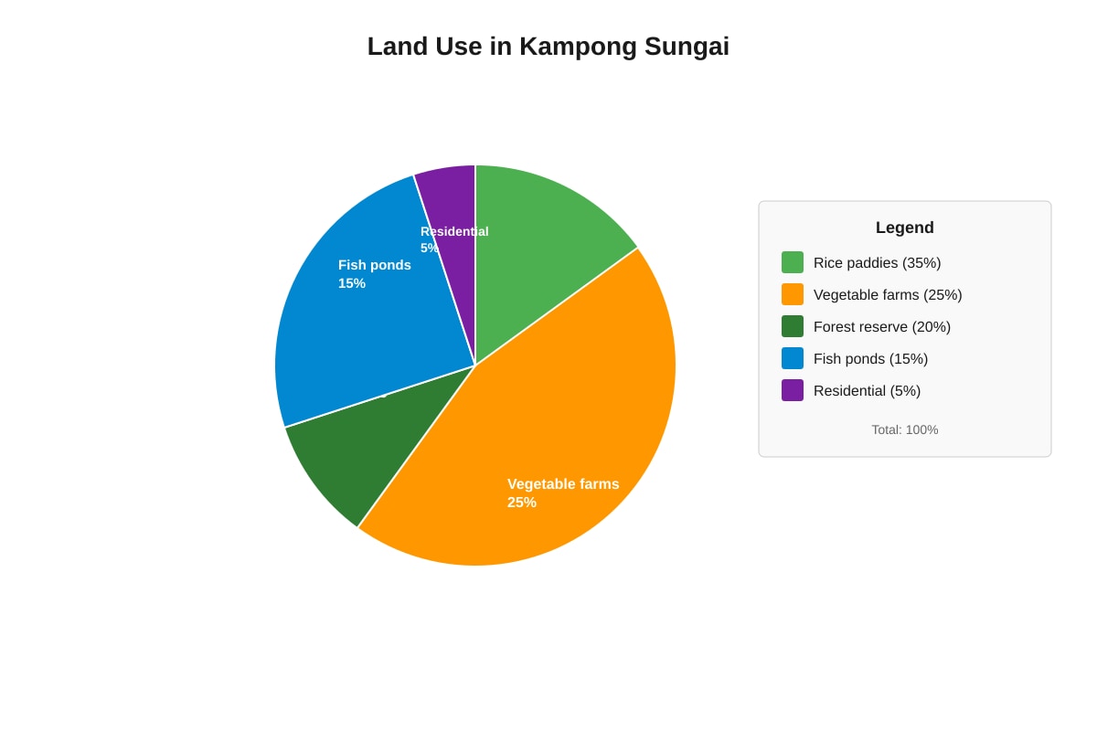
Generated pie_chart for Q7.
State the dominant land use and calculate the percentage of land used for agricultural purposes (rice paddies, vegetable farms, and fish ponds combined).
Dominant land use: _________________________________
Total agricultural land use: _________________________________ %
Question 8 (2 marks)
A map has a scale of 1:25,000. A rectangular field on the map measures 4 cm by 6 cm. Calculate the actual area of the field in square kilometres.
Show your working clearly.
Working:
Answer: _______________________________________________ km²
Question 9 (2 marks)
Distinguish between relief and drainage as shown on a topographical map.
Relief: _________________________________________________
Drainage: _________________________________________________
Question 10 (5 marks)
Study the table showing population data for three towns.
| Town | Population 2010 | Population 2020 | Area (km²) |
|---|---|---|---|
| A | 45,000 | 67,500 | 25 |
| B | 120,000 | 132,000 | 40 |
| C | 28,000 | 30,800 | 14 |
(a) Calculate the population density of Town B in 2020. Show your working. (2 marks)
Working:
Answer: _______________________________________________ persons/km²
(b) Which town experienced the highest percentage population growth between 2010 and 2020? Show your working to support your answer. (3 marks)
Working:
Answer: ____________________ with ________ % growth
Section A Total: 20 marks
SECTION B: Structured Data Response
30 marks
Answer ALL questions in this section.
Question 11 (8 marks)
Study the information below about water quality at three sampling sites along the Kallang River.
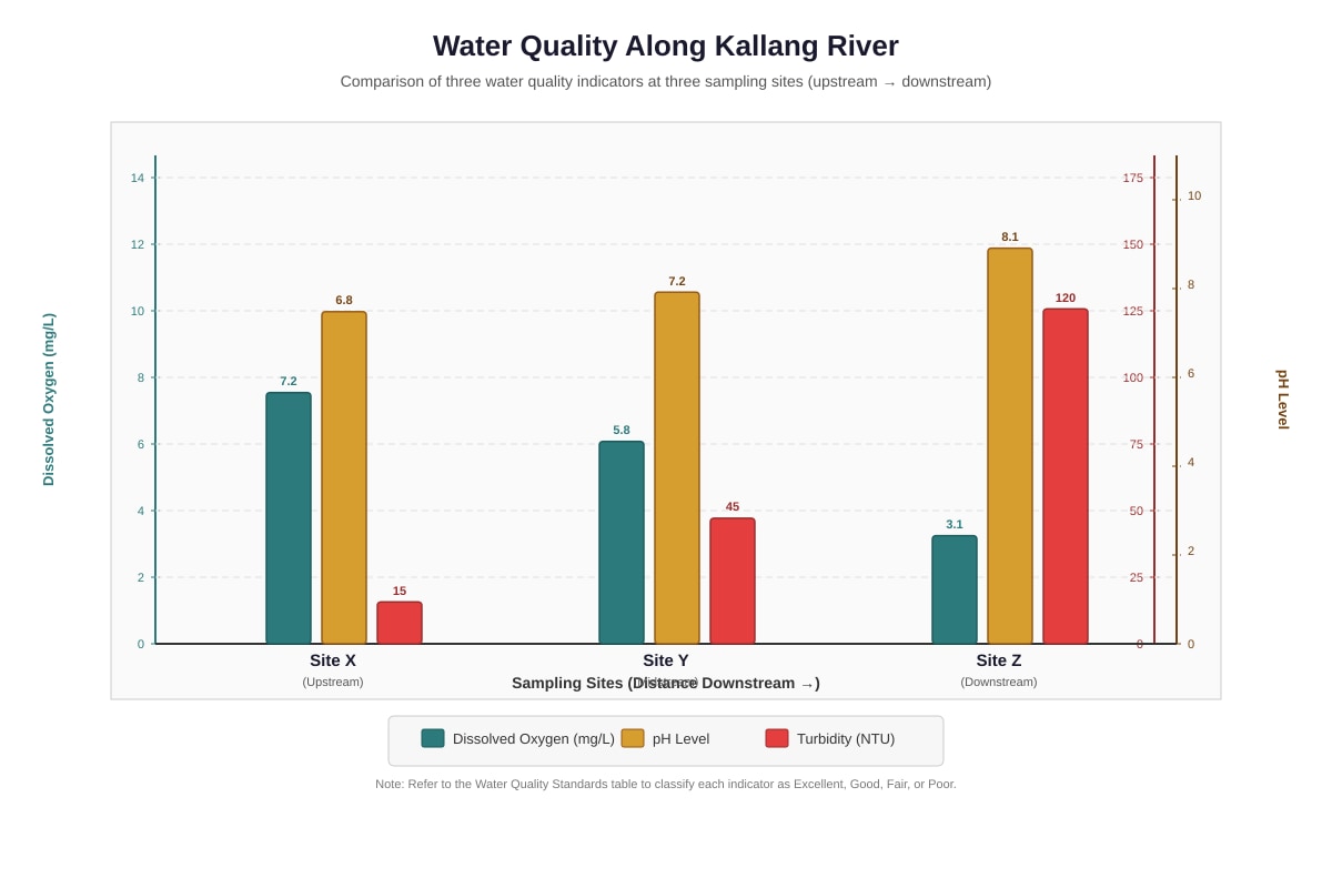
Generated graph for Q11.
Table: Water Quality Standards for Aquatic Life
| Indicator | Excellent | Good | Fair | Poor | |:---|:---|:---|:---| | Dissolved Oxygen | >7.0 mg/L | 5.0–7.0 | 3.0–5.0 | <3.0 | | pH | 6.5–8.5 | 6.5–8.5 | 5.5–6.4 or 8.6–9.0 | <5.5 or >9.0 | | Turbidity | <20 NTU | 20–50 | 51–100 | >100 |
(a) Describe the pattern of dissolved oxygen from Site X to Site Z. (2 marks)
(b) Using data from the graph and the table, compare the overall water quality at Site X and Site Z. (3 marks)
(c) Suggest two possible reasons why water quality deteriorates downstream, and explain how each reason affects the indicator shown in the graph. (3 marks)
Reason 1: _________________________________________________
Explanation: _________________________________________________
Reason 2: _________________________________________________
Explanation: _________________________________________________
Question 12 (10 marks)
Study the line graph showing temperature data for Singapore and London.
Generated line_graph for Q12.
(a) State the temperature range for Singapore and for London. Show how you calculated each. (2 marks)
Singapore: _______________ °C
London: _______________ °C
(b) Describe two differences in the temperature patterns shown by the two cities. Use data from the graph in your answer. (4 marks)
(c) Using your knowledge of latitude and the Earth's energy balance, explain why Singapore experiences less seasonal temperature variation than London. (4 marks)
Question 13 (12 marks)
Study the topographical map extract and photograph below.
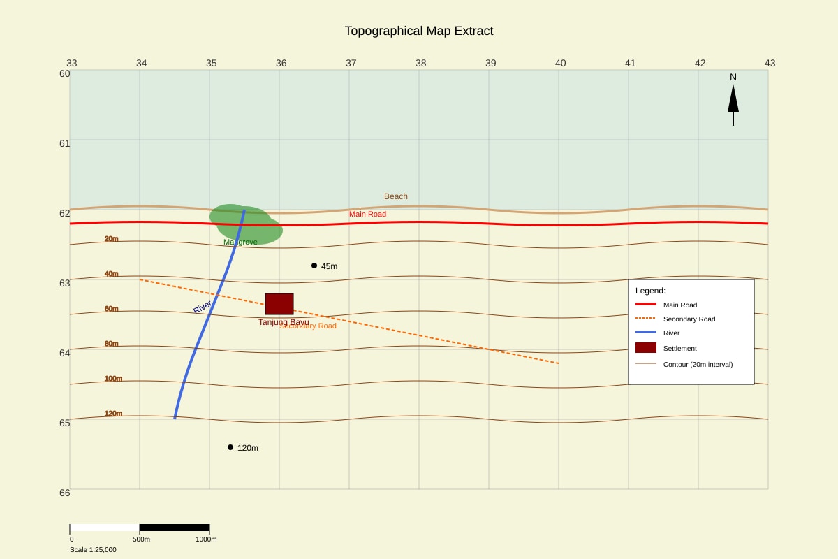
Generated map for Q13.
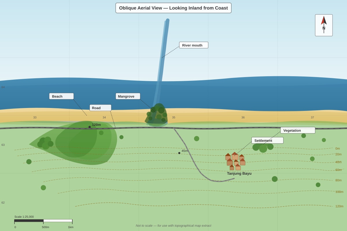
Generated source_image for Q13.
(a) State the 4-figure grid reference of the settlement of Tanjung Bayu. (1 mark)
Answer: _________________________________
(b) In which direction does the river flow? Explain how you used the contour lines to determine this. (2 marks)
Direction: _________________________________
Explanation: _________________________________________________
(c) Calculate the vertical interval (VI) shown by the contour lines on this map. (1 mark)
Answer: _________________________________ m
(d) Describe the relief of the area shown in the map extract. (3 marks)
(e) The photograph (Fig. Q13-2) and the map (Fig. Q13-1) show the same area but from different perspectives. Explain two advantages of using the map rather than the photograph for planning a hiking route from the beach to the 120 m spot height. (3 marks)
(f) Suggest one reason why the mangrove area shown in grid square 3563 is important to the local ecosystem, and one challenge in managing this area. (2 marks)
Importance: _________________________________________________
Challenge: _________________________________________________
Section B Total: 30 marks
SECTION C: Map Interpretation & Application
20 marks
Answer ALL questions in this section.
Question 14 (8 marks)
The scatter graph below shows the relationship between annual rainfall and average annual temperature for twelve cities around the world.
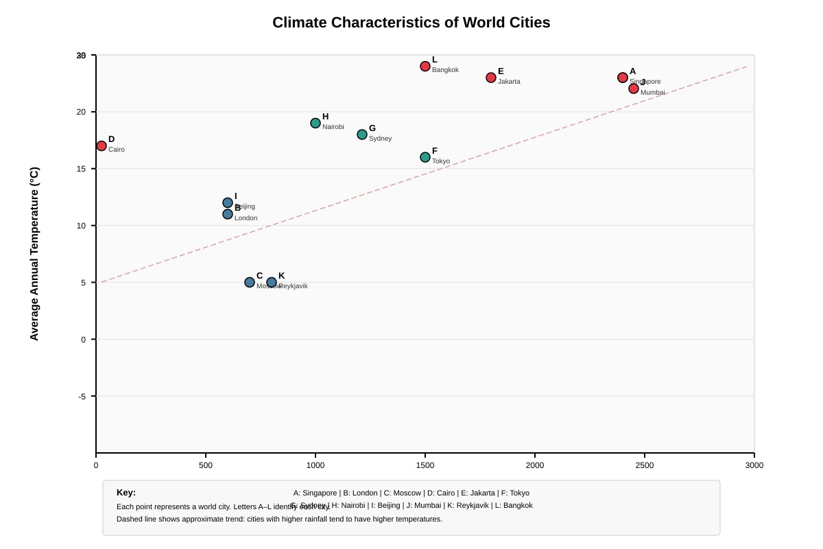
Generated scatter_graph for Q14.
(a) Identify the city that has:
- The highest annual temperature: ________ (1 mark)
- The lowest annual rainfall: ________ (1 mark)
(b) City D (Cairo) and City A (Singapore) have similar temperatures but very different rainfall amounts. Explain how this difference in rainfall affects the natural vegetation likely to be found in each location. (3 marks)
(c) A student concludes: "Cities with higher temperatures always receive more rainfall." Using evidence from the scatter graph, evaluate whether this statement is correct. (3 marks)
Question 15 (12 marks)
Study the composite map and data below about transport and accessibility in a residential area.
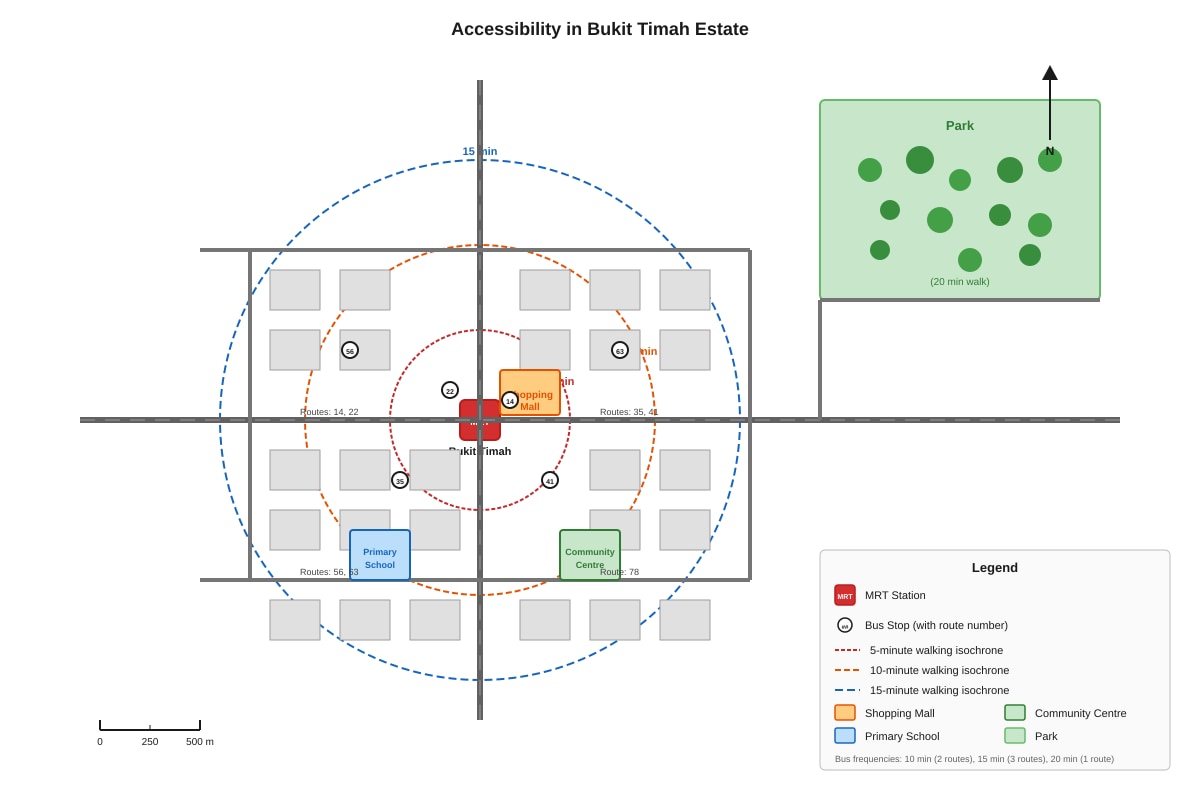
Generated map for Q15.
Table: Transport Mode Characteristics
| Mode | Average Speed | Cost per trip | Environmental impact |
|---|---|---|---|
| Walking | 5 km/h | Free | None |
| Bus | 20 km/h | $1.00 | Moderate emissions |
| MRT | 40 km/h | $1.50 | Low emissions (electric) |
| Private car | 30 km/h | $3.50 (fuel, parking) | High emissions |
(a) State two facilities that can be reached within a 10-minute walk from the MRT station. (2 marks)
(b) Using information from the map and the table, explain why a family living near the MRT station might choose to walk to the shopping mall rather than take the bus or MRT. (3 marks)
(c) The park is located outside the 15-minute isochrone from the MRT station. Suggest two ways the local authorities could improve accessibility to the park, and explain how each would help residents. (4 marks)
Suggestion 1: _________________________________________________
Explanation: _________________________________________________
Suggestion 2: _________________________________________________
Explanation: _________________________________________________
(d) Assess whether promoting public transport over private cars would be an effective strategy for making this residential area more sustainable. Use evidence from both the map and the table in your answer. (3 marks)
Section C Total: 20 marks
END OF PAPER
Paper Total: 70 marks
ADDITIONAL ANSWER SPACE
If you need more space for any answer, write the question number clearly and continue below.
Answers
TuitionGoWhere Practice Paper - Geography Secondary 1
Answer Key & Marking Scheme Version 4 of 5
SECTION A: Multiple Choice & Short Response
20 marks
Question 1 (1 mark)
Answer: B) Easting
Explanation: In any grid reference system, the first number is the easting (the horizontal value read from the bottom or top of the map, moving from west to east). The second number is the northing (the vertical value read from the side, moving from south to north). This "along the corridor, up the stairs" rule helps you remember: eastings first (horizontal, like a corridor), then northings (vertical, like stairs). A common mistake is to reverse these, ending up in completely the wrong grid square.
Question 2 (1 mark)
Answer: 4 km (or 4000 m)
Working shown for teaching:
- Map distance = 8 cm
- Scale = 1:50,000 means 1 cm on map = 50,000 cm on ground
- 1 cm = 50,000 cm = 500 m = 0.5 km
- 8 cm × 50,000 = 400,000 cm = 4,000 m = 4 km
Or using the unit conversion method:
- 8 × 50,000 = 400,000 cm
- ÷ 100 = 4,000 m
- ÷ 1,000 = 4 km
Marking note: Accept 4 km or 4000 m. Award mark for correct numerical answer; working not required for this 1-mark question but good practice for checking.
Question 3 (1 mark)
Answer: Any one valid advantage:
- A bar scale remains accurate even if the map is photocopied, resized, or printed at a different scale
- A bar scale allows direct measurement with a ruler without calculation
- A bar scale is easier to understand for users unfamiliar with representative fractions
- A bar scale automatically adjusts with the map image when digitally zoomed
Explanation: A representative fraction like 1:50,000 is a ratio relationship. If you copy or resize the map, the RF printed beside it does NOT change, so it becomes misleading. A bar scale is a visual line that scales proportionally with the map image, so measuring against it always gives the correct ground distance. This is especially important today when maps are frequently viewed on screens at different zoom levels.
Question 4 (2 marks)
Working: 285 + 260 + 240 + 180 + 120 + 90 + 85 + 100 + 140 + 195 + 250 + 280
Method:
- Group for easier addition: (285 + 260 + 240) + (180 + 120) + (90 + 85 + 100 + 140) + (195 + 250 + 280)
- = 785 + 300 + 415 + 725
- = 1,085 + 1,140 = 2,225 mm
Or step-by-step cumulative:
- Jan–Jun: 285 + 260 = 545; + 240 = 785; + 180 = 965; + 120 = 1,085; + 90 = 1,175
- Jul–Dec: 1,175 + 85 = 1,260; + 100 = 1,360; + 140 = 1,500; + 195 = 1,695; + 250 = 1,945; + 280 = 2,225 mm
Answer: 2,225 mm
Marking: [1] for correct method shown (adding all 12 values); [1] for correct final answer.
Question 5 (2 marks)
Working: Mean = Total annual rainfall ÷ 12 months = 2,225 ÷ 12 = 185.42 mm (or 185 mm to nearest whole number, or 185.4 mm to 1 decimal place)
Calculation:
- 12 × 180 = 2,160
- 2,225 – 2,160 = 65
- 65 ÷ 12 = 5 remainder 5, so 5.416...
- Therefore 185.416... ≈ 185.4 mm or 185 mm
Answer: 185.4 mm (accept 185 mm or 185.42 mm)
Marking: [1] for correct method (total ÷ 12); [1] for correct answer. Accept reasonable rounding.
Question 6 (2 marks)
Answer: Any two valid points, explained:
-
Visual comparison: A climate graph uses bars and lines to show temperature and rainfall patterns simultaneously, making it easier to see relationships (e.g., wet seasons vs. dry seasons, or how rainfall relates to temperature) at a glance without having to read across rows of numbers.
-
Pattern recognition: Graphs reveal trends, peaks, and troughs (e.g., identifying the wettest month, the temperature range) that are harder to spot in raw numerical tables.
-
Dual-variable display: Climate graphs typically show both temperature (line) and rainfall (bars) on the same chart, enabling direct comparison of when hot and wet conditions coincide—something a single table struggles to show clearly.
Marking: [1] for each valid, explained point; maximum [2].
Question 7 (2 marks)
Dominant land use: Rice paddies (1 mark)
Total agricultural land use: 75% (1 mark)
Working for teaching purposes:
- Rice paddies: 35%
- Vegetable farms: 25%
- Fish ponds: 15%
- Total agricultural = 35 + 25 + 15 = 75%
(Forest reserve 20% + Residential 5% = 25% non-agricultural)
Marking: [1] for "Rice paddies" (accept if spelled reasonably); [1] for "75%". Award [0] for just "75" without % symbol.
Question 8 (2 marks)
Working:
Step 1: Convert map dimensions to ground dimensions
- Scale 1:25,000 means 1 cm = 25,000 cm = 0.25 km = 250 m
- Length: 6 cm × 25,000 = 150,000 cm = 1,500 m = 1.5 km
- Width: 4 cm × 25,000 = 100,000 cm = 1,000 m = 1.0 km
Step 2: Calculate actual area
- Area = length × width = 1.5 km × 1.0 km = 1.5 km²
Alternative method using cm throughout then converting:
- Map area = 4 × 6 = 24 cm²
- Ground area = 24 × (25,000)² = 24 × 625,000,000 = 15,000,000,000 cm²
- Convert: ÷ (100,000)² = ÷ 10,000,000,000 = 1.5 km²
Or: 15,000,000,000 cm² = 1,500,000 m² = 1.5 km²
Answer: 1.5 km² (accept 1.50 km² or equivalent)
Marking: [1] for correct method (either dimension conversion or area scaling); [1] for correct final answer with units. Common error: Students who calculate 24 × 25,000 = 600,000 (forgetting to square the scale factor for area) should receive [1] max for method if working shown, [0] for answer.
Question 9 (2 marks)
Relief: The shape and height of the land surface, shown by contour lines, spot heights, and layer colouring on a map. It tells you whether the land is flat, hilly, or mountainous. (1 mark)
Drainage: The pattern of water bodies on the land, including rivers, streams, lakes, reservoirs, and swamps, shown by blue lines and areas on a map. (1 mark)
Key distinction: Relief is about the land itself; drainage is about water on or in the land. Contour lines = relief; rivers and blue features = drainage.
Question 10 (5 marks)
(a) Population density of Town B in 2020 (2 marks)
Working: Population density = Total population ÷ Total area = 132,000 ÷ 40 = 3,300 persons/km²
Answer: 3,300 persons/km² (accept "3300" or "3,300")
Marking: [1] for correct formula/setting up; [1] for correct calculation.
(b) Highest percentage population growth (3 marks)
Working for each town:
Town A: [(67,500 – 45,000) ÷ 45,000] × 100 = (22,500 ÷ 45,000) × 100 = 0.5 × 100 = 50%
Town B: [(132,000 – 120,000) ÷ 120,000] × 100 = (12,000 ÷ 120,000) × 100 = 0.1 × 100 = 10%
Town C: [(30,800 – 28,000) ÷ 28,000] × 100 = (2,800 ÷ 28,000) × 100 = 0.1 × 100 = 10%
Answer: Town A with 50% growth
Marking: [1] for correct formula applied to all three or clear method shown; [1] for all three calculations correct; [1] for correct identification of Town A and 50%.
Common error: Students who subtract without dividing by original population (absolute growth only: 22,500; 12,000; 2,800) would incorrectly choose Town A by even more—but for wrong reasoning. Award max [1] if method is absent.
Section A Total: 20 marks
SECTION B: Structured Data Response
30 marks
Question 11 (8 marks)
(a) Pattern of dissolved oxygen (2 marks)
Answer:
- Dissolved oxygen decreases from upstream to downstream / shows a downward trend from Site X to Site Z (1 mark)
- Specific data: from 7.2 mg/L at Site X (upstream) to 5.8 mg/L at Site Y (midstream) to 3.1 mg/L at Site Z (downstream) (1 mark)
Teaching note: The decline is substantial and crosses quality thresholds. Site X is "Excellent," Site Y is "Good," and Site Z borders "Fair" (just above 3.0 mg/L—the "Poor" threshold). Students should note both the direction of change and use data values.
(b) Compare overall water quality at Site X and Site Z (3 marks)
Answer structure:
| Aspect | Site X | Site Z |
|---|---|---|
| Dissolved Oxygen | 7.2 mg/L = Excellent | 3.1 mg/L = Fair/Poor border |
| pH | 6.8 = Good (within 6.5–8.5) | 8.1 = Good (within range) |
| Turbidity | 15 NTU = Excellent | 120 NTU = Poor |
Comparison points (need both for full marks):
- Site X has better overall water quality than Site Z (overall judgment, 1 mark)
- At Site X, all three indicators are at least "Good" (two "Excellent"); at Site Z, two indicators are problematic (Dissolved Oxygen borderline Fair/Poor, Turbidity Poor) (1 mark)
- The greatest contrast is in turbidity: 15 vs 120 NTU (8 times worse at Site Z) AND dissolved oxygen which supports aquatic life is nearly halved (1 mark)
Marking: [1] for explicit comparison statement; [1] for use of data from at least two indicators; [1] for interpreting against the quality table standards.
(c) Two reasons for deterioration downstream with explanations (3 marks)
Reason 1: Increased urban runoff / surface drainage from built-up areas
- Explanation: As the river flows downstream, more roads, housing, and industrial areas discharge stormwater runoff containing sediments, oil, and debris. This increases turbidity (shown by jump from 15 to 120 NTU) because suspended particles cloud the water. (1.5 marks)
Reason 2: Higher organic pollution / sewage discharge from urban areas
- Explanation: More people and businesses downstream mean more sewage and organic waste entering the river. Bacteria decompose this organic matter, using up dissolved oxygen in the process (shown by drop from 7.2 to 3.1 mg/L). This is called biochemical oxygen demand (BOD)—high BOD means low dissolved oxygen. (1.5 marks)
Alternative acceptable reasons:
- Industrial discharge adding chemicals/warm water (thermal pollution reduces oxygen solubility)
- Less vegetation/minimal riparian cover to filter pollutants upstream vs. downstream
- Slower water flow downstream allows sediment accumulation and reduces aeration
Marking: [1.5] for each valid reason (0.5 for identifying the source, 1 for linking correctly to the indicator and explaining the mechanism). Accept alternative valid reasons with correct scientific explanation.
Question 12 (10 marks)
(a) Temperature range calculation (2 marks)
Singapore:
- Highest: 28.5°C (April/May/June)
- Lowest: 26.5°C (December)
- Range = 28.5 – 26.5 = 2.0°C (accept 2°C) (1 mark)
London:
- Highest: 19°C (July)
- Lowest: 5°C (January)
- Range = 19 – 5 = 14.0°C (accept 14°C) (1 mark)
Marking: [1] for each correct answer with calculation shown. Deduct 0.5 if method correct but minor reading error.
(b) Two differences in temperature patterns (4 marks)
Difference 1: Seasonal variation / range
- Singapore has a very small temperature range (only 2°C between hottest and coldest months), showing equable temperatures year-round. London has a large range (14°C), with clearly distinct warm summers and cold winters. Data: Singapore all months 26.5–28.5°C vs London 5°C (Jan) to 19°C (Jul). (2 marks)
Difference 2: Timing of temperature peak / seasonal opposite
- Singapore's hottest months are April–June (28.5°C), related to the sun's overhead position and reduced cloudiness before the southwest monsoon; London's hottest month is July (19°C), a lag after the June solstice due to maritime influence. Alternatively: Singapore has no true "winter"—temperatures never drop below 25°C; London has a prolonged cool season (Nov–Mar all below 10°C). (2 marks)
Difference 3 (alternative): Absolute temperature levels
- Singapore is consistently hot (tropical, all months above 26°C); London is temperate/cool (most months 5–17°C, only brief summer warmth). (2 marks if fully developed with data)
Marking: [1] for each difference identified; [1] for supporting data. Two differences × [2] = 4 marks maximum.
(c) Why Singapore has less seasonal temperature variation than London (4 marks)
Key geographical concept: Singapore is near the Equator (approximately 1°N latitude); London is at 51°N—a mid-latitude location. This difference in latitude creates fundamentally different solar radiation inputs.
Explanation points:
-
Solar angle and intensity: Singapore receives high-angle sun (near overhead, 80–90°) throughout the year because the overhead sun shifts between the Tropics of Cancer and Capricorn. Day length varies little (roughly 12 hours year-round). The solar radiation per unit area is consistently high. London receives low-angle sun in winter (sun barely rises above the horizon in December, weak, diffuse radiation spread over larger surface area) and moderate angle in summer—the variation in solar intensity is huge. (1.5 marks)
-
Day length variation: Singapore's day length is almost constant (~12 hours), so daily heat input doesn't vary seasonally. London has very long summer days (up to 16+ hours in June) and very short winter days (8 hours in December), amplifying the seasonal contrast. (1 mark)
-
Atmospheric path length: When the sun is low in the sky (London winter), solar energy passes through more atmosphere, causing greater scattering and absorption, so less reaches the surface. Singapore's high sun means minimal atmospheric interference, consistent strong heating. (1 mark)
-
Maritime influence (secondary but relevant): Both are affected by seas, but Singapore's island location in warm equatorial waters means sea temperatures are also stable year-round, reinforcing the land temperature stability. London's maritime influence moderates extremes but cannot overcome the large solar variation inherent at 51°N. (0.5 mark, or use to develop another point)
Marking: [2] for clear explanation of equatorial vs. mid-latitude solar geometry; [1] for day length or atmospheric path component; [1] for logical structure and use of "solar radiation" or "Earth's energy balance" concepts. Maximum [4].
Question 13 (12 marks)
(a) 4-figure grid reference of Tanjung Bayu (1 mark)
Answer: 3462 or 3463 (depending on precise placement; accept either if justified from map)
Reasoning: Read eastings first (horizontal, "along the corridor" = 34), then northings (vertical, "up the stairs" = 62). The settlement occupies or is near the bottom-left corner of grid square 3462/3463.
Marking: [1] for correct 4-figure reference.
(b) Direction of river flow and explanation using contours (2 marks)
Direction: Southeast to Northwest / from right/east to left/west / inland toward the coast (1 mark)
Explanation: Contour lines form a V-shape pointing upstream (toward higher ground). The 120m spot height in grid 3364 is the highest point. The river cuts through contours that bend uphill, forming a V that points away from the sea—so water flows from higher elevation toward lower elevation, where the river meets the coast at the river mouth. (1 mark)
Alternative observation: The river mouth is at sea level (0m contour, grid 3563); the source area is near higher ground. Water flows downhill, so from inland (higher) to coast (lower).
Marking: [1] correct direction; [1] for correct use of contour evidence (V-shapes, height change, or slope direction).
(c) Vertical interval (VI) (1 mark)
Answer: 20 metres
Method: Spot the difference between adjacent labeled contours. From the data: 0, 20, 40, 60, 80, 100, 120 m. Between any two adjacent contours (e.g., 100m and 120m, or 0m and 20m), the difference is consistently 20 m.
Marking: [1] for "20 m" or "20 metres". Accept if units stated.
(d) Description of relief (3 marks)
Answer structure:
-
General: The area is low-lying near the coast with gentle to moderate slopes, rising inland toward the northwest/north. The coastal zone (grid squares in 60s and 50s) is near or below 20m elevation. (1 mark)
-
Specific landforms: There is a distinct hill or ridge marked by the 120m spot height in grid 3364, the highest point. The area between 0m and 120m shows a gradient (regular spacing of contours suggests fairly even slope; close spacing would indicate steeper slope). (1 mark)
-
Coastal feature: The mangrove swamp in the estuary (3563) indicates a low-energy, depositional coastline with flat, muddy ground near sea level—typical of areas where rivers meet the sea and deposit sediment. (1 mark)
Alternative valid points:
- Presence of interfluve/spur between river valleys
- River valley visible from contour bending
- Beach zone at 0m elevation
Marking: [1] for general altitude/trend; [1] for specific highest point/gradient; [1] for related feature (mangrove/beach/estuary context).
(e) Two advantages of using the map rather than the photograph for route planning (3 marks)
Advantage 1: Contour lines show exact elevation and slope steepness
- On the map, the evenly spaced 20m contour lines show exactly how steep the slope is and where it changes. The photograph shows hills in perspective but you cannot accurately judge slope gradient or elevation gain from a single oblique view. This matters for planning realistic hiking time and effort. (1.5 marks)
Advantage 2: Grid references and scale allow precise distance measurement
- The map has a scale bar (1:25,000) and grid lines, so you can measure exact map distance and convert to ground distance (e.g., using ruler or paper strip). The photograph has no scale, no grids, and perspective distortion means distances are compressed in the background and expanded in the foreground—you cannot measure reliable hiking distances. (1.5 marks)
Advantage 3 (alternative): Symbols show paths/roads clearly
- The map uses standard symbols to show whether roads, trails, or footpaths exist. The photograph may show tracks but not distinguish public paths from private land or impassable vegetation—you need the map's legend and symbol conventions. (1.5 marks)
Marking: [1.5] for each advantage with clear comparison to photograph's limitation. Must explicitly state what the map offers AND why the photograph falls short for that purpose.
(f) Importance of mangrove area and management challenge (2 marks)
Importance: Any valid ecological function:
- Nursery ground for fish and crustaceans—many commercial species breed in mangroves, supporting fisheries
- Coastal protection—roots stabilize sediment and reduce erosion from waves and currents
- Biodiversity hotspot—supports specialized species adapted to salty, waterlogged conditions
- Carbon sink—sequesters significant amounts of "blue carbon" from the atmosphere
- Water filtration—roots trap sediments and pollutants, improving coastal water quality (1 mark)
Challenge: Any valid management difficulty:
- Urban development pressure—land reclamation, housing, or port expansion encroaches on mangrove areas
- Pollution from upstream—industrial/agricultural runoff damages sensitive mangrove ecosystems
- Balancing conservation with public access—people want to use coasts for recreation, which can damage mangroves
- Climate change / sea level rise—mangroves need to migrate landward as seas rise, but seawalls or development may block this coastal squeeze (1 mark)
Marking: [1] each; must be specific, not generic "pollution" or "development" without linking to mangrove context.
Section B Total: 30 marks
SECTION C: Map Interpretation & Application
20 marks
Question 14 (8 marks)
(a) Identify cities (2 marks)
- Highest annual temperature: L (Bangkok at 28°C) or E/J/A (all at 27°C, but L is highest if exact); accept Bangkok or L (1 mark)
- Lowest annual rainfall: D (Cairo at 25 mm) (1 mark)
Note from expected visual: Singapore A and Mumbai J both at ~2400mm, 27°C; Bangkok L at 1500mm, 28°C. The highest temperature point is L at 28°C. If students identify A, E, or J at 27°C, accept as "among the highest" but L is strictly highest. Clarification: if graph shows exact values as stated in placeholder, L=28°C is highest.
Marking: [1] each; city letter or name acceptable.
(b) Effect of rainfall difference on natural vegetation (3 marks)
Cairo (D):
- Very low rainfall (~25 mm/year) = hyper-arid / desert climate
- Vegetation: scrub, desert shrubs, or very sparse xerophytic plants adapted to drought (e.g., cacti-like succulents, deep-rooted acacia in scattered locations)
- No continuous vegetation cover; bare rock and sand dominate
Singapore (A):
- Very high rainfall (~2400 mm/year) + high year-round temperature = tropical rainforest climate
- Vegetation: dense, layered tropical rainforest with high biodiversity, evergreen broadleaf trees, lianas, epiphytes
- Continuous vegetation cover; rapid decomposition and nutrient cycling
Comparison/explanation (required for full marks): Rainfall is the limiting factor for vegetation in Cairo—water stress means only drought-resistant plants survive. In Singapore, abundant moisture combined with heat supports luxuriant, diverse growth year-round without a dry season that would force dormancy or deciduous behavior.
Marking: [1] for Cairo vegetation type linked to low rainfall; [1] for Singapore vegetation type linked to high rainfall; [1] for explicit comparison of how rainfall amount controls vegetation structure/density.
(c) Evaluate the statement: "Cities with higher temperatures always receive more rainfall" (3 marks)
Answer: The statement is incorrect / only partially true.
Evidence against:
- Cairo (D) has high temperature (~22°C annual average) but extremely low rainfall (~25 mm)—this directly contradicts the statement (1 mark)
- Reykjavik (K) has low temperature (~5°C) but moderate rainfall (~800 mm), showing cool places can be wetter than warm places (1 mark)
- London (B) at 11°C and 600mm has more rainfall than Jakarta (E) at 27°C with 1800mm? No—wait, Jakarta is wetter. Better contrast: Moscow (C) 5°C, 700mm vs ** Bangkok (L)** 28°C, 1500mm—here warm IS wetter, but not always.
Evidence of complexity:
- The scatter graph shows no clear positive correlation: points are widely dispersed. Some hot cities are wet (Singapore, Mumbai, Jakarta ≈ 27°C, 1800–2400mm); some hot cities are relatively dry (Cairo, 22°C, 25mm is warm but not hot; no truly hot AND dry city except perhaps D). Actually the pattern shows temperature and rainfall are independent variables controlled by different factors: temperature by latitude, rainfall by pressure belts, prevailing winds, and distance from sea. (1 mark)
Better evaluation structure:
- Temperature is determined mainly by solar angle/latitude
- Rainfall is determined by atmospheric circulation (ITCZ, trade winds, monsoons), distance from sea, and ocean currents
- Therefore similar temperatures can have very different rainfalls; the two variables are not directly linked
Marking: [1] for judgment that statement is incorrect; [1] for specific counter-example from graph with data; [1] for explaining the independent controls on temperature vs. rainfall (or second counter-example).
Question 15 (12 marks)
(a) Two facilities within 10-minute walk (2 marks)
From the isochrone map: the 10-minute isochrone encloses the primary school and the community centre.
Answer: Any two of:
- Primary school
- Community centre
- Shopping mall (also within 10 minutes, in fact within 5)
- Two bus stops
Marking: [1] each; must be from the 10-minute zone (not 5-minute or 15-minute exclusively).
(b) Why walk to the shopping mall rather than take bus or MRT (3 marks)
Answer structure:
-
Distance/proximity: The shopping mall is within the 5-minute walking isochrone—extremely close to the MRT station and likely the residence. Walking is convenient and quick for such a short distance; waiting for a bus (10–15 minute frequency for some routes) or descending to MRT platform may take as long as or longer than the walk itself. (1 mark)
-
Cost: Walking is free; bus costs 1.00,MRT1.50 per trip. For a short, frequent trip like daily groceries, costs would accumulate significantly. (1 mark)
-
Environmental/health benefits: Walking produces zero emissions (better for sustainability goals) and provides physical exercise, contributing to personal health. The table shows walking has "None" environmental impact compared to "Moderate" or "Low" for motorised transport. (1 mark)
Alternative valid point: No need to wait for transport/timetable inflexibility; bus routes may not directly serve the mall entrance; combining trip with other errands on foot.
Marking: [1] each valid reason, explained with reference to map (distance) or table (cost/environment). Must integrate both sources.
(c) Two ways to improve park accessibility with explanations (4 marks)
Suggestion 1: Add a dedicated feeder bus route or extend existing bus route to the park entrance
- Explanation: Currently the park is beyond the 15-minute walk zone and on only one or no bus routes. A direct bus link would reduce travel time for residents without cars, especially elderly or those with young children. The table shows buses travel at 20 km/h—faster than walking 5 km/h—so the 20-minute walk could become a 5-minute bus ride. (2 marks)
Suggestion 2: Construct a pedestrian/cycling path or park connector linking residential areas to the park
- Explanation: A safe, shaded walking or cycling route would make the 20-minute journey more pleasant and perceived as shorter. The map shows all other facilities are well-connected; the park is the outlier. Encouraging active mobility (walking/cycling, zero cost, zero emissions from table) supports healthy lifestyles and sustainability. (2 marks)
Suggestion 3 (alternative): Relocate a bus stop or add a new bus stop nearer to the park
- Explanation: Currently the closest bus stops (within 10-minute zone) don't serve the park; extending one route by one stop would halve the walking distance from the bus to the park. (2 marks)
Suggestion 4 (alternative): Provide shuttle service from MRT at peak times
- Explanation: During weekends when families visit parks, a timed shuttle from the MRT directly to the park entrance overcomes the last-mile problem without requiring permanent expensive new bus infrastructure. (2 marks)
Marking: [1] for suggestion linked to map problem (park is isolated); [1] for explanation showing how it specifically helps residents and referencing data/table values. Two suggestions × [2] = 4 marks.
(d) Assess whether promoting public transport over private cars would make the area more sustainable (3 marks)
Answer: Generally yes, with some nuances.
Evidence supporting:
-
From the table: MRT has low emissions (electric-powered), bus has moderate emissions—both significantly better than private car's high emissions. Reducing cars cuts air pollution and carbon footprint, aligning with Singapore's sustainability goals. (1 mark)
-
From the map: The MRT station is centrally located with good walkable and bus connections to all major facilities. Most residents can reach daily destinations without needing a car, suggesting public transport infrastructure is already adequate to support car-free or car-lite living for many. (1 mark)
Evidence nuancing / limit:
- However, the park's poor accessibility by public transport (beyond 15-minute walk, no direct bus shown) means some recreational trips might still require cars or taxis. Promoting public transport alone without improving last-mile connectivity (as in part c) may not eliminate all car use. Also, families with young children or mobility-impaired residents may find buses/MRT less convenient than cars for certain journeys. (1 mark)
Sustainability definition reminder: Sustainability includes environmental (emissions), social (accessibility for all), and economic (affordability) dimensions. Public transport wins on environmental and economic (1.00–1.50 vs $3.50) but needs infrastructure support for social equity.
Marking: [1] for environmental comparison using table; [1] for spatial evidence from map showing existing network adequacy; [1] for balanced assessment recognizing limitation or need for complementary measures.
Section C Total: 20 marks
Paper Total: 70 marks
END OF ANSWER KEY
Free quiz and exam paper access
Enter your details to view this paper
Your access is remembered on this device.