AI Generated Exam Paper
Secondary 1 Geography Practice Paper 1
Free Sec 1 Geography Practice Paper 1, Nemo3 AI version, with questions, answers, and syllabus-aligned practice for Singapore students.
These static practice materials are generated from the site's syllabus and paper-generation workflow, with source and model context shown so students and parents can evaluate the material before use.
Questions
TuitionGoWhere Practice Paper - Geography Secondary 1
TuitionGoWhere Practice Paper (AI) — Version 1
Subject: Geography
Level: Secondary 1
Paper: Practice Paper 1 — Map, Graph & Data Skills
Duration: 50 minutes
Total Marks: 40
Name: ___________________________
Class: ___________________________
Date: ___________________________
Instructions to Candidates
- Answer all questions.
- Write your answers in the spaces provided.
- The number of marks is given in brackets [ ] at the end of each question or part question.
- The total number of marks for this paper is 40.
- You may use a calculator.
- For questions requiring map reading, refer to the map extract provided in the image placeholder.
Section A: Map Skills [15 marks]
Question 1
Study the map extract of Sungai Pebble provided.
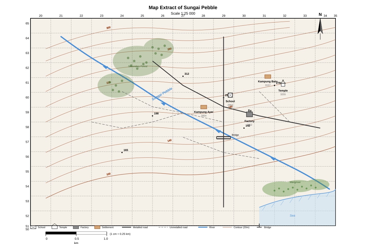
Generated map for Q1.
(a) State the four-figure grid reference of the school.
[1]
(b) State the six-figure grid reference of the temple.
[1]
(c) The factory is located at 3052. Give the four-figure grid reference of the settlement that is northwest of the factory.
[1]
(d) Measure the straight-line distance between the bridge (2956) and the temple (3255). Give your answer in kilometres to one decimal place.
[2]
Question 2
Refer to the same map extract of Sungai Pebble.
(a) Describe the relief of the area in grid square 3054. Use contour evidence to support your answer.
[3]
(b) State the direction of flow of the river in grid square 2956. Explain how you can tell this from the map.
[2]
(c) Calculate the average gradient of the river between the spot height 142 (at 3054) and the coast. The straight-line distance is 2.5 km. Show your working.
[2]
Question 3
The map shows two settlements: Kampung Ayer (2854) and Kampung Batu (3157).
(a) Compare the site of the two settlements with reference to water supply and relief.
[3]
(b) Suggest one reason why Kampung Batu may have developed as a larger settlement than Kampung Ayer.
[1]
Section B: Graph & Data Interpretation [15 marks]
Question 4
The table below shows the monthly rainfall (in mm) and average temperature (in °C) for Sungai Pebble in 2023.
| Month | Jan | Feb | Mar | Apr | May | Jun | Jul | Aug | Sep | Oct | Nov | Dec |
|---|---|---|---|---|---|---|---|---|---|---|---|---|
| Rainfall (mm) | 280 | 190 | 210 | 180 | 160 | 140 | 130 | 150 | 170 | 220 | 260 | 300 |
| Temperature (°C) | 26.5 | 27.0 | 27.5 | 28.0 | 28.5 | 28.0 | 27.5 | 27.5 | 27.0 | 27.0 | 26.5 | 26.0 |
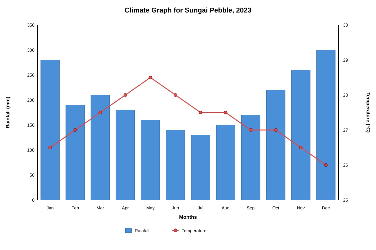
Generated graph for Q4.
(a) Which month had the highest rainfall?
[1]
(b) Calculate the annual range of temperature for 2023.
[1]
(c) Calculate the total annual rainfall for 2023.
[1]
(d) Describe the relationship between monthly rainfall and temperature shown by the data.
[2]
(e) The climate of Sungai Pebble is classified as tropical rainforest. Using evidence from the table, explain why this classification is appropriate.
[3]
Question 5
Students conducted a river velocity study at three sites along the Sungai Pebble. The results are shown below.
| Site | Distance from Source (km) | Channel Width (m) | Average Depth (m) | Float Time for 10 m (s) |
|---|---|---|---|---|
| A (Upper) | 2.0 | 4.5 | 0.6 | 25 |
| B (Middle) | 8.0 | 12.0 | 1.8 | 18 |
| C (Lower) | 15.0 | 25.0 | 3.2 | 12 |
(a) Calculate the velocity (in m/s) of the river at each site. Show your working for Site A.
[2]
(b) Plot a line graph to show how velocity changes with distance from source. Use the grid below.
[3]
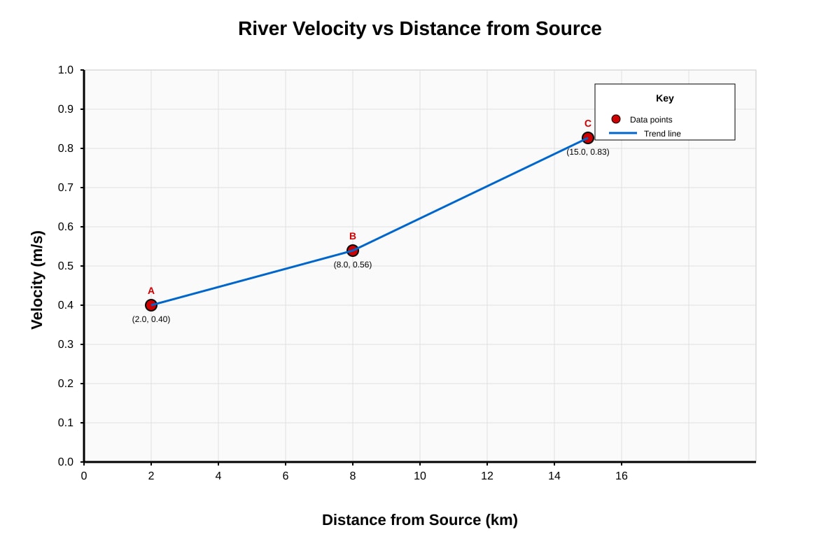
Generated graph for Q5.
(c) Describe the trend shown by your graph.
[1]
(d) Explain two physical factors that cause this trend in river velocity downstream.
[3]
(e) The students used a float method to measure velocity. State one limitation of this method and suggest one improvement.
[2]
Section C: Data Analysis & Geographical Inquiry [10 marks]
Question 6
A group of students investigated water quality at Sites A, B, and C along Sungai Pebble. They measured dissolved oxygen (DO) and biochemical oxygen demand (BOD). Results:
| Site | Dissolved Oxygen (mg/L) | BOD (mg/L) |
|---|---|---|
| A (Upper) | 8.2 | 1.5 |
| B (Middle) | 5.6 | 4.2 |
| C (Lower) | 3.1 | 8.7 |
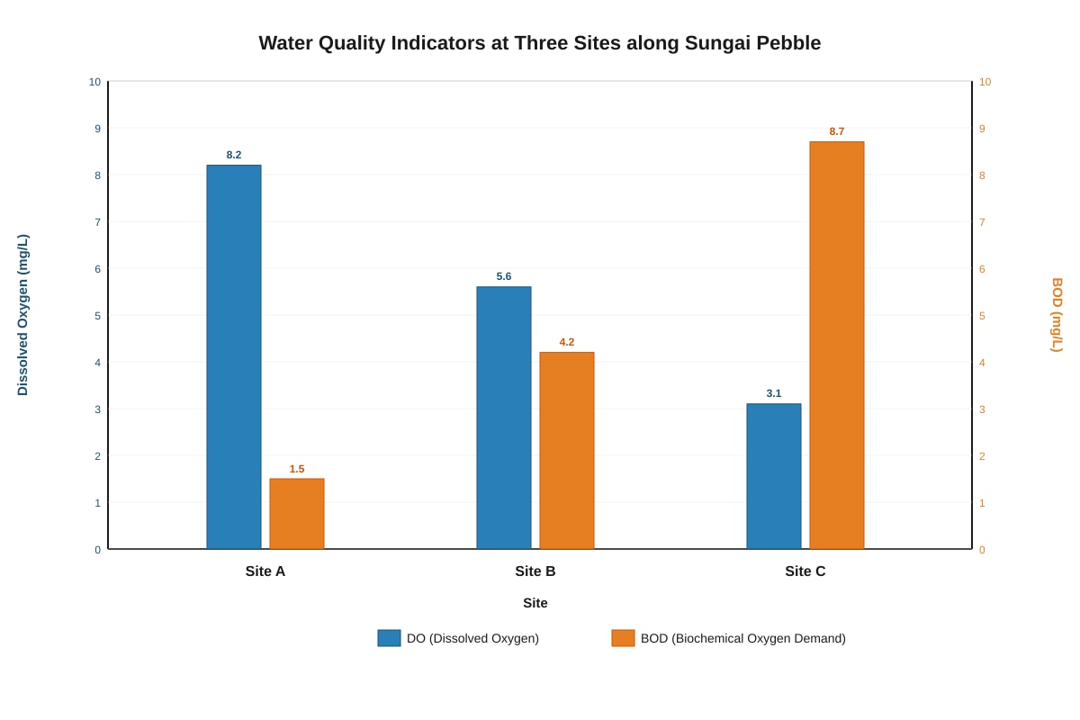
Generated chart for Q6.
(a) Which site has the best water quality? Support your answer with data from the table.
[2]
(b) Calculate the percentage decrease in dissolved oxygen from Site A to Site C.
[2]
(c) Explain the relationship between dissolved oxygen and BOD along the river.
[2]
(d) Human activities at Kampung Batu (near Site B) include farming and untreated sewage discharge. Explain how one of these activities could lead to the water quality pattern observed at Site B.
[2]
(e) Suggest one sustainable management strategy to improve water quality in the lower course of Sungai Pebble.
[2]
End of Paper
Answers
TuitionGoWhere Practice Paper - Geography Secondary 1 (Answer Key)
Subject: Geography
Level: Secondary 1
Paper: Practice Paper 1 — Map, Graph & Data Skills
Total Marks: 40
Section A: Map Skills [15 marks]
Question 1
(a) 2963
Method: Read eastings (horizontal) first: 29. Read northings (vertical) second: 63. The school symbol lies in the grid square bounded by eastings 29–30 and northings 63–64. The four-figure grid reference is the lower-left corner: 2963.
[1]
(b) 32555 (or 325555 if estimating tenths)
Method: For six-figure reference, divide the grid square into tenths. Temple at 3255 lies in square 3255. Estimate: 3/10 across (easting 32.3 → 323) and 5/10 up (northing 55.5 → 555). Six-figure reference: 323555.
Acceptable range: 322555 to 324555 depending on exact position.
[1]
(c) 2853
Method: Factory at 3052. Northwest means smaller easting (west) and larger northing (north). Check adjacent squares: 2953 (west), 3053 (north), 2952 (west-same northing). Kampung Ayer is at 2854 — northwest of factory. Four-figure reference: 2854.
Wait — recheck: Factory at 3052. Northwest = lower easting, higher northing. Kampung Ayer at 2854 (easting 28 < 30, northing 54 > 52). Correct: 2854.
[1]
(d) 2.8 km (accept 2.7–2.9 km)
Working:
- Map distance between bridge (2956) and temple (3255): measure with ruler.
- Grid difference: ΔE = 32 – 29 = 3 km; ΔN = 55 – 56 = –1 km (absolute 1 km).
- Straight-line distance on ground = √(3² + 1²) = √10 ≈ 3.16 km.
- But using map measurement: On 1:25,000 map, 1 cm = 0.25 km. If measured map distance = 11.2 cm → 11.2 × 0.25 = 2.8 km.
Marking: 1 mark for correct method (Pythagoras or map measurement), 1 mark for correct answer with unit.
[2]
Question 2
(a) Relief description: Grid square 3054 shows a hill with a gentle to moderate slope.
Evidence: Contour lines form closed loops with increasing values toward the centre (spot height 142 m at centre). Contours are evenly spaced (20 m interval), indicating uniform slope. No V-shaped valleys or cliff-like close spacing.
Marking: 1 mark for identifying landform (hill), 1 mark for contour evidence (closed loops, spot height 142), 1 mark for slope description (gentle/moderate, even spacing).
[3]
(b) Direction of flow: Southeast (SE)
Explanation: River flows from higher land to lower land. Contours show land height decreases toward the southeast (spot height 142 at 3054 → lower contours toward coast in SE). River crosses contours at right angles, flowing from higher to lower values.
Marking: 1 mark for correct direction (SE), 1 mark for valid explanation (contour values decrease / flows from high to low).
[2]
(c) Average gradient = 1 : 17.6 (or 5.7 m/km)
Working:
- Vertical drop = 142 m – 0 m (sea level at coast) = 142 m
- Horizontal distance = 2.5 km = 2500 m
- Gradient = Vertical drop / Horizontal distance = 142 / 2500 = 0.0568
- As ratio: 1 : (2500/142) = 1 : 17.6
- As m/km: 142 m / 2.5 km = 56.8 m/km → wait, 142/2.5 = 56.8 m/km.
Correction: 142 m drop over 2.5 km = 56.8 m/km or 1 : 17.6.
Marking: 1 mark for correct vertical drop (142 m), 1 mark for correct calculation and unit/ratio.
[2]
Question 3
(a) Comparison of site:
| Feature | Kampung Ayer (2854) | Kampung Batu (3157) |
|---|---|---|
| Water Supply | Near river (river flows through 2854) and coast (mangrove) | Near river (river bends near 3157) but further from coast |
| Relief | Low-lying, near sea level (coastal plain, mangrove) | Slightly higher, on gentle slope (contours ~20–40 m) |
Marking: 1 mark for water supply comparison (both near river; Ayer also coastal), 1 mark for relief comparison (Ayer low-lying/coastal, Batu higher/inland), 1 mark for using map evidence (grid refs, contours, river).
[3]
(b) Reason: Kampung Batu is located at a road junction (metalled roads meet) and on higher, well-drained ground (less flood risk), making it more accessible and suitable for expansion than Kampung Ayer, which is on low-lying coastal land prone to flooding and limited by mangrove.
Marking: 1 mark for valid reason (accessibility / drainage / flood risk / road junction) with map evidence.
[1]
Section B: Graph & Data Interpretation [15 marks]
Question 4
(a) December (300 mm)
[1]
(b) Annual temperature range = 2.5 °C
Working: Highest = 28.5 °C (May), Lowest = 26.0 °C (Dec). Range = 28.5 – 26.0 = 2.5 °C.
[1]
(c) Total annual rainfall = 2390 mm
Working: 280 + 190 + 210 + 180 + 160 + 140 + 130 + 150 + 170 + 220 + 260 + 300 = 2390 mm.
[1]
(d) Relationship: There is a general inverse relationship — months with higher temperature (Apr–Jun, ~28 °C) tend to have lower rainfall (130–180 mm), while cooler months (Nov–Jan, ~26–26.5 °C) have higher rainfall (260–300 mm). However, the relationship is not perfect (e.g., Mar 27.5 °C has 210 mm).
Marking: 1 mark for identifying inverse trend, 1 mark for supporting with data examples.
[2]
(e) Tropical rainforest climate evidence:
- High temperatures year-round: All months 26–28.5 °C, small annual range (2.5 °C) — no distinct winter.
- High annual rainfall: 2390 mm (>2000 mm), well-distributed — no dry month (all months >130 mm, most >150 mm).
- No distinct dry season: Every month receives significant rain; convectional rainfall from constant heating.
Marking: 1 mark for high constant temperature + evidence, 1 mark for high total rainfall + no dry month + evidence, 1 mark for linking to convectional rain / climate classification criteria.
[3]
Question 5
(a) Velocity calculations:
Formula: Velocity (m/s) = Distance (m) / Time (s)
- Site A: 10 m / 25 s = 0.40 m/s
- Site B: 10 m / 18 s = 0.56 m/s
- Site C: 10 m / 12 s = 0.83 m/s
Working for Site A shown: 10 ÷ 25 = 0.40 m/s.
Marking: 1 mark for correct formula/method, 1 mark for three correct velocities with units.
[2]
(b) Graph: See expected plot in image placeholder. Points: (2.0, 0.40), (8.0, 0.56), (15.0, 0.83). Line connecting points, axes labelled, title present.
Marking: 1 mark for correct axes labels and scales, 1 mark for three points plotted accurately, 1 mark for line and title.
[3]
(c) Trend: River velocity increases with distance from source (downstream).
[1]
(d) Two physical factors:
- Channel shape & size: Downstream, channel becomes wider and deeper (Site A: 4.5 m × 0.6 m → Site C: 25 m × 3.2 m), reducing wetted perimeter relative to cross-sectional area (hydraulic radius increases), so friction decreases and velocity increases.
- Discharge increases: More tributaries join downstream, increasing water volume (discharge), which increases velocity even if gradient decreases.
Marking: 1 mark per factor (max 2), 1 mark for linking to data (width/depth/discharge change).
[3]
(e) Limitation: Float method measures surface velocity only, which is higher than mean velocity (due to friction at bed/banks). It also does not account for cross-sectional area, so cannot calculate discharge directly.
Improvement: Use a flow meter (current meter) at multiple depths and across the channel to measure mean velocity, or use the float method with a correction factor (×0.8–0.9) and measure cross-section to calculate discharge.
Marking: 1 mark for valid limitation, 1 mark for valid improvement.
[2]
Section C: Data Analysis & Geographical Inquiry [10 marks]
Question 6
(a) Site A (Upper) has the best water quality.
Evidence: Highest dissolved oxygen (DO) = 8.2 mg/L (healthy >6 mg/L) and lowest BOD = 1.5 mg/L (clean <3 mg/L). High DO supports aquatic life; low BOD indicates little organic pollution.
Marking: 1 mark for correct site, 1 mark for using both DO and BOD data with interpretation.
[2]
(b) Percentage decrease in DO from A to C = 62.2%
Working:
- Decrease = 8.2 – 3.1 = 5.1 mg/L
- % decrease = (5.1 / 8.2) × 100 = 62.2% (accept 62%)
Marking: 1 mark for correct decrease (5.1), 1 mark for correct percentage calculation.
[2]
(c) Relationship: As BOD increases downstream (1.5 → 4.2 → 8.7 mg/L), DO decreases (8.2 → 5.6 → 3.1 mg/L). This is an inverse relationship. High BOD means more organic matter decomposing, which consumes oxygen, lowering DO.
Marking: 1 mark for stating inverse relationship, 1 mark for explaining mechanism (decomposition uses oxygen).
[2]
(d) Farming: Fertilisers (nitrates, phosphates) wash into river → eutrophication → algal bloom → algae die → decomposers break them down → high BOD → low DO (as seen at Site B: BOD 4.2, DO 5.6).
OR Untreated sewage: Organic waste + bacteria enter river → rapid decomposition → high BOD → oxygen depleted → low DO.
Marking: 1 mark for identifying activity, 1 mark for explaining link to BOD/DO change at Site B.
[2]
(e) Sustainable management strategy: Construct wetlands / vegetated buffer strips along riverbanks near Kampung Batu and farmland.
How it works: Plants absorb excess nutrients (N, P) from runoff before they enter river, reducing eutrophication. Wetlands also filter sediments and support biodiversity. Low-cost, nature-based, involves community.
Alternative: Centralised sewage treatment plant for Kampung Batu — treats waste before discharge, reducing BOD. Requires infrastructure investment.
Marking: 1 mark for valid strategy, 1 mark for explaining how it improves water quality sustainably.
[2]
Total: 40 marks
Free quiz and exam paper access
Enter your details to view this paper
Your access is remembered on this device.