From Real Exams Exam Paper
Secondary 1 Geography Semestral Assessment 2 (End of Year) Paper 5
Free Sec 1 Geography SA2 Paper 5, HY3 Exam version, with questions, answers, and syllabus-aligned practice for Singapore students.
These static practice materials are generated from the site's syllabus and paper-generation workflow, with source and model context shown so students and parents can evaluate the material before use.
Questions
Free quiz and exam paper access
Enter your details to view this paper
Your access is remembered on this device.
Answers
TuitionGoWhere Practice Paper - Geography Secondary 1 (Version 5) Answer Key
Total Marks: 60
Section A: Map Skills
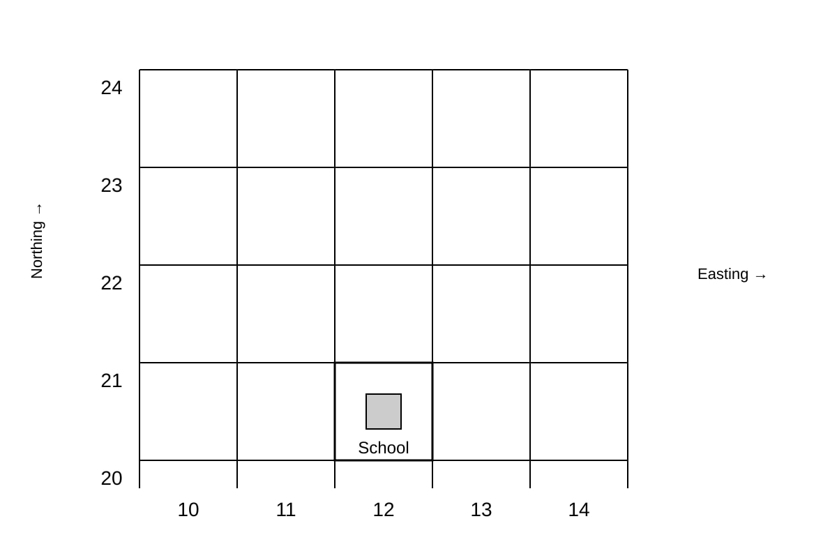
Q1. 1221 [1]
Teaching note: Read easting (horizontal, left to right) first = 12, then northing (vertical, bottom to top) = 21. Grid reference is the lower-left corner of the square containing the School.
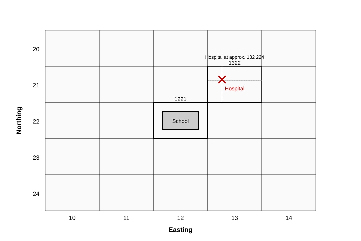
Q2. 132 224 (acceptable range 132 223–132 225) [1]
Teaching note: 4-figure = 1322. Subdivide square into 10×10. Hospital is ~3/10 across (easting 132) and ~4/10 up (northing 224).
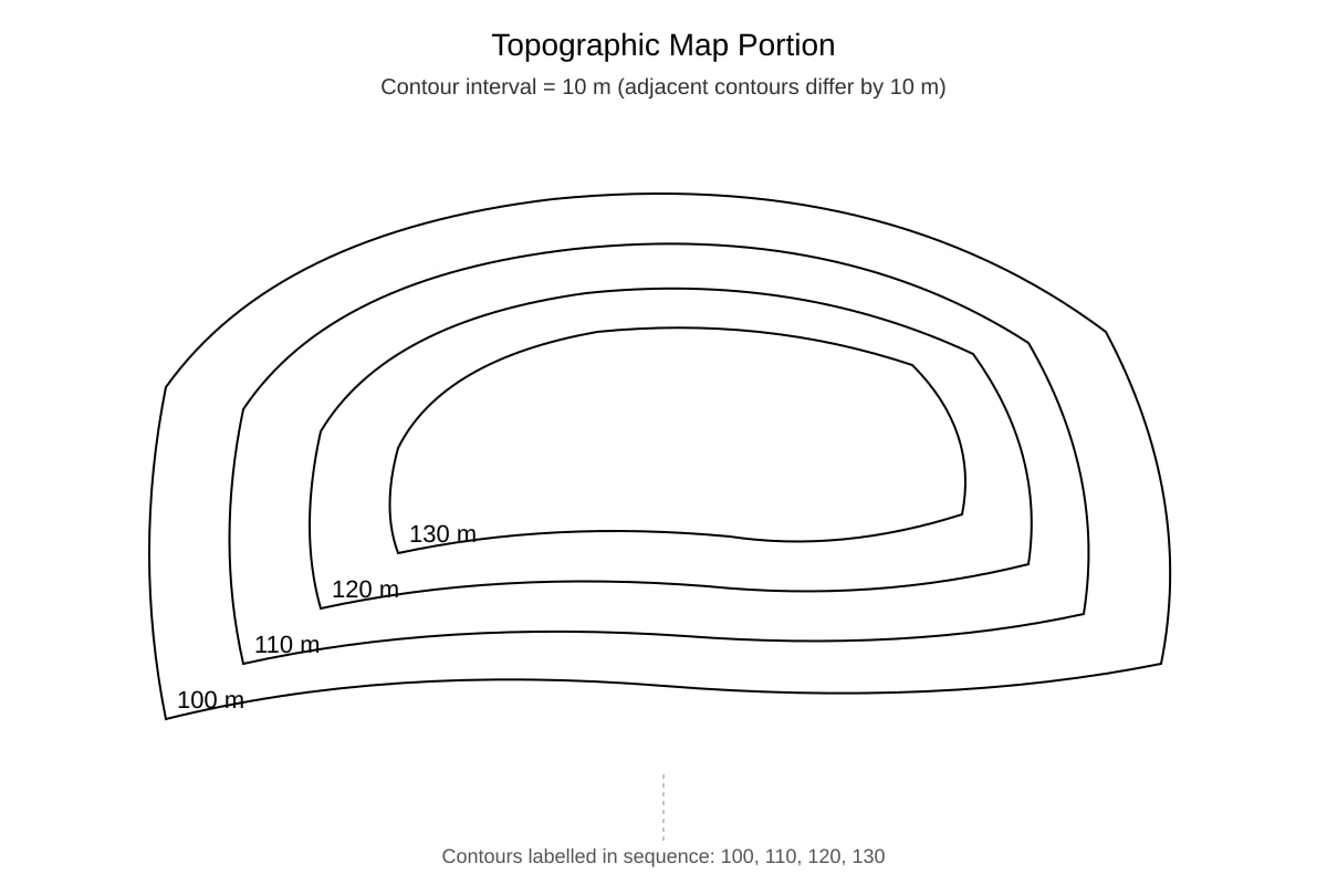
Q3. 10 m [1]
Teaching note: Contour interval = difference between adjacent labelled contours = 110 − 100 = 10 m.
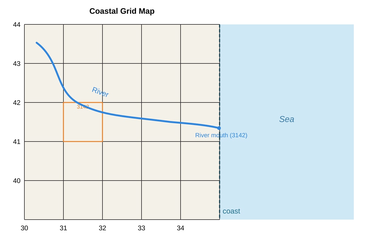
Q4. 3142 [1]
Teaching note: River mouth is at coast inside square with lower-left corner easting 31, northing 42.
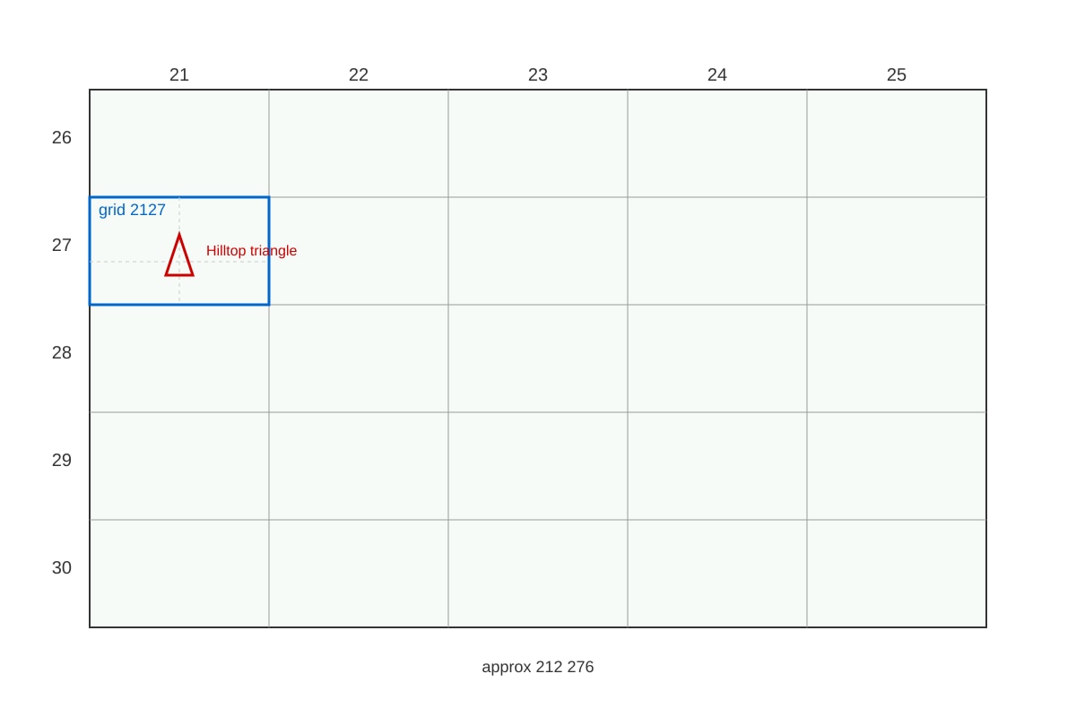
Q5. 212 276 (acceptable 212 275–212 277) [1]
Teaching note: Base 2127; hilltop at 5/10 across → 212, 6/10 up → 276.
Q6. [2]
Method:
Scale 1:50 000 means 1 cm on map = 50 000 cm actual.
Map distance = 8 cm.
Actual = 8 × 50 000 = 400 000 cm.
Convert to km: 400 000 cm ÷ 100 000 = 4 km.
Answer: 4 km [2 marks: 1 for correct multiplication, 1 for km conversion]
Q7. [2]
Any two of: buildings, roads, railway lines, schools, hospitals, boundaries. [1 each]
Teaching note: Human features are made by people, shown by point, line, or area symbols.
Q8. [2]
Explanation: Student reversed easting and northing (wrote 23 14 instead of 14 23) OR misread the grid lines. [2 for identifying reversal or misread with correct order]
Teaching note: Always easting then northing.
Section B: Graph & Data Interpretation
Q9. Highest: City D (3000 mm); Lowest: City C (800 mm) [1+1]
Teaching note: Scan table column for max and min values.
Q10. [2]
Difference = 2400 − 800 = 1600 mm [2]
Method: Subtract lowest from highest among named cities B and C.
Q11. [3]
Mark descriptors:
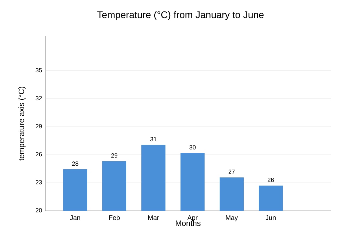
- States temperatures rise from Jan to Mar (28→31) [1]
- States fall from Mar to Jun (31→26) [1]
- Uses comparative language / overall pattern (peak in Mar, then decline) [1]
Teaching note: Describe trend using data points, not just list.
Q12. [3]
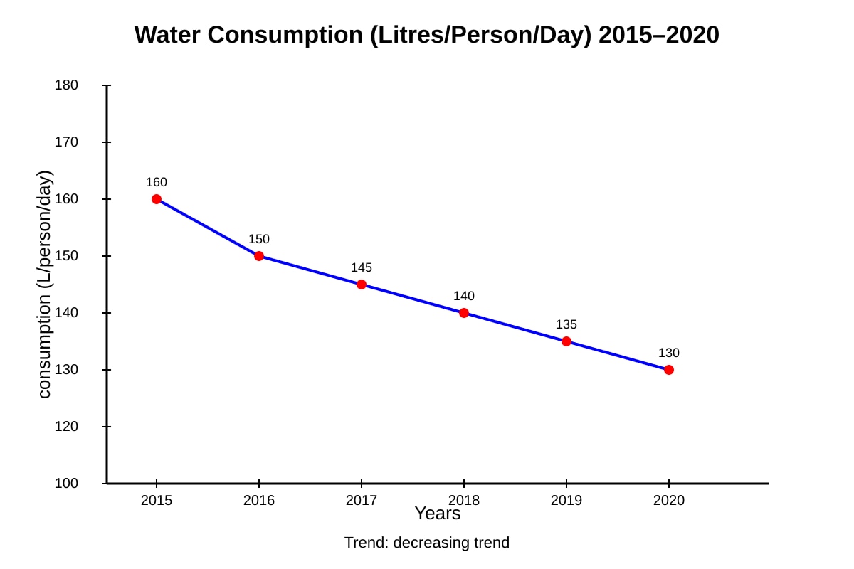
- Consumption decreased from 160 to 130 L/person/day [1]
- Steady fall each year [1]
- Total drop of 30 L [1]
Teaching note: Reference graph values; show pattern not just endpoints.
Q13. [3]
Healthier: Site X [1]
Reason: Higher dissolved oxygen (8.2 > 4.1) supports aquatic life; lower turbidity (2 < 9) means clearer water [2]
Teaching note: Good water = high DO, low turbidity.
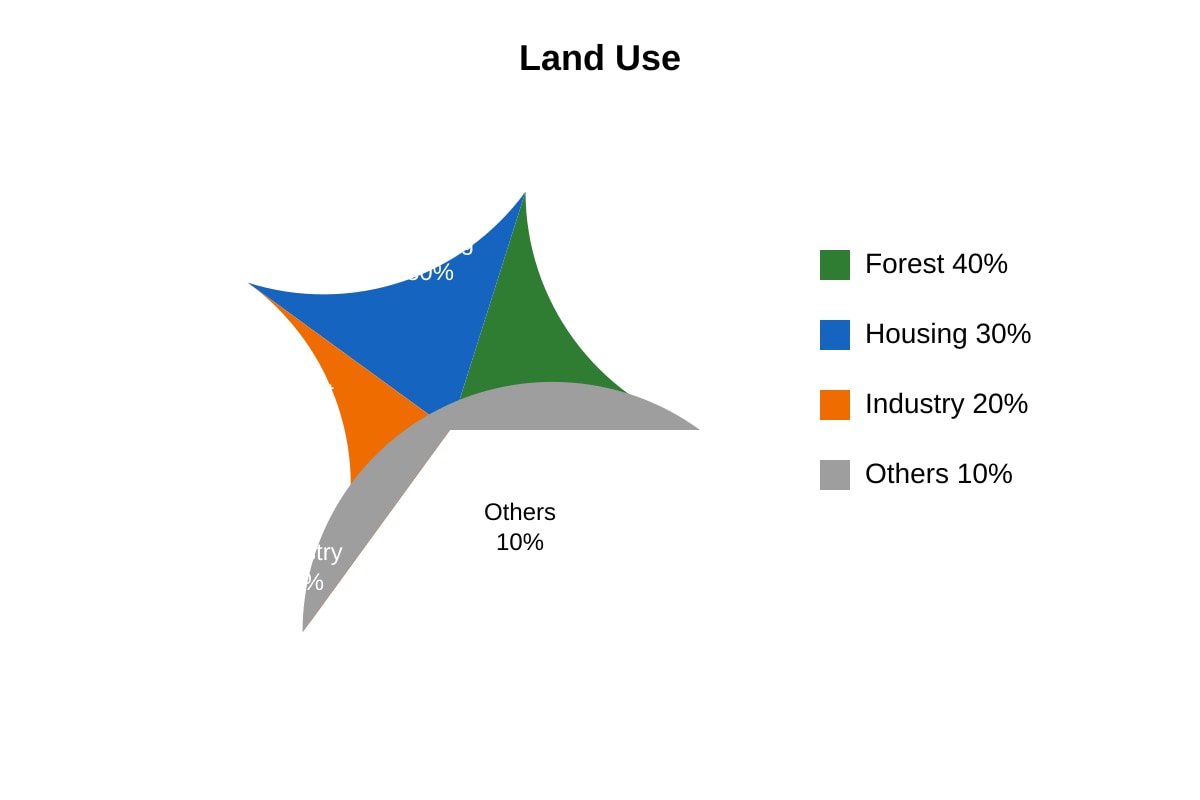
Q14. 30% + 20% = 50% [2]
Teaching note: Add housing and industry slices from pie chart.
Section C: Applied Data Skills
Q15. [2]
Actual = 5 cm × 25 000 = 125 000 cm = 1.25 km [2: 1 for calc, 1 for conversion]
Q16. Greatest: Q (2.5 m); Least: R (0.8 m) [1+1]
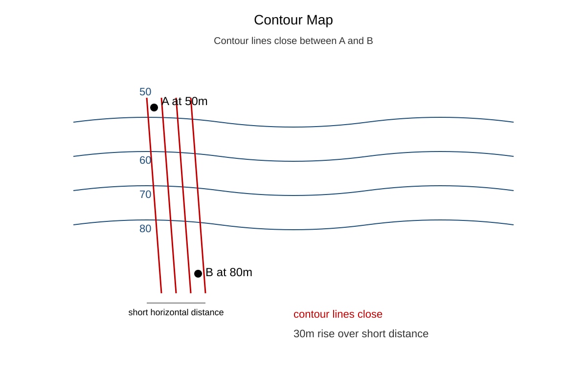
Q17. [3]
Slope: Steep [1]
Reason: Contours are close together, meaning 30 m rise over short distance [2]
Teaching note: Close contours = steep gradient.
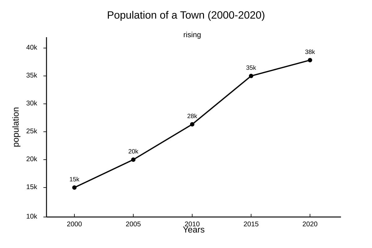
Q18. [3]
Trend: Population increased from 15k to 38k over 20 years [1], rapid growth especially 2005–2015 [1]
Reason: e.g., migration, new housing estates [1]
Teaching note: Use graph values; reason should link to human geography.
Q19. [2]
Error: Used 6 figures on a map that only shows 4-figure grids / invented extra digits [2]
Q20. [4]
Pattern: Recycling rate increased steadily by 5% each year [2: describes trend with data]
Total increase = 35% − 20% = 15% [2: correct subtraction]
Teaching note: Show both description and calculation for full marks.