From Real Exams Exam Paper
Secondary 1 Geography Semestral Assessment 2 (End of Year) Paper 3
Free Sec 1 Geography SA2 Paper 3, Nemo3 Exam version, with questions, answers, and syllabus-aligned practice for Singapore students.
These static practice materials are generated from the site's syllabus and paper-generation workflow, with source and model context shown so students and parents can evaluate the material before use.
Questions
TuitionGoWhere Practice Paper - Geography Secondary 1
TuitionGoWhere Secondary School (AI)
Subject: Geography
Level: Secondary 1
Paper: SA2 Version 3
Duration: 1 hour 15 minutes
Total Marks: 50
Name: ________________________
Class: ________________________
Date: ________________________
INSTRUCTIONS TO CANDIDATES
- Write your name, class, and date in the spaces provided above.
- Answer all questions.
- Write your answers in the spaces provided.
- The number of marks is given in brackets [ ] at the end of each question or part question.
- The total number of marks for this paper is 50.
- You may use a calculator.
- For map-based questions, refer to the map extract provided in the insert (Image Placeholder Q1-fig1).
SECTION A: MAP SKILLS [15 marks]
Answer all questions in this section. Refer to the map extract of Pulau Ubin (Image Placeholder Q1-fig1).
Image pending generation: map for Q1,Q2,Q3,Q4,Q5.
Question 1
Study the map extract of Pulau Ubin.
(a) State the four-figure grid reference of Ubin Jetty.
[1]
(b) State the six-figure grid reference of the summit of Puaka Hill.
[1]
(c) What is the direction of Pekan Quarry from Ubin Jetty?
[1]
Question 2
(a) Measure the straight-line distance between Ubin Jetty and Chek Jawa Visitor Centre. Give your answer in kilometres.
[2]
(b) A hiker walks from Ubin Jetty to Puaka Hill summit along the main road. Explain why the actual walking distance is longer than the straight-line distance.
[2]
Question 3
The contour lines on the map show the relief of Pulau Ubin.
(a) State the contour interval of this map.
[1]
(b) What is the height above sea level of the summit of Puaka Hill?
[1]
(c) Calculate the average gradient of the slope from the 20 m contour line near grid reference 305615 to the summit of Puaka Hill. The horizontal distance is 400 m. Express your answer as a ratio in the form 1 : n.
[2]
Question 4
Study the area around Chek Jawa (grid squares 3163 and 3263).
(a) Identify two types of natural vegetation shown in this area.
[2]
(b) Describe the distribution of mangrove vegetation in this area.
[2]
Question 5
(a) State the map scale as a representative fraction.
[1]
(b) On the map, a straight road measures 3.2 cm. Calculate the actual length of this road in kilometres.
[2]
SECTION B: GRAPH AND DATA INTERPRETATION [20 marks]
Answer all questions in this section.
Question 6
The table below shows the monthly rainfall (in mm) recorded at a weather station in Singapore for the year 2023.
| Month | Jan | Feb | Mar | Apr | May | Jun | Jul | Aug | Sep | Oct | Nov | Dec |
|---|---|---|---|---|---|---|---|---|---|---|---|---|
| Rainfall (mm) | 210 | 110 | 180 | 195 | 165 | 145 | 155 | 170 | 160 | 200 | 255 | 285 |
Generated graph for Q6.
(a) Using the graph paper provided (Image Placeholder Q6-fig1), plot a line graph to show the monthly rainfall for 2023. Use a scale of 1 cm to 50 mm on the vertical axis. The horizontal axis is already labelled.
[3]
(b) Which month received the highest rainfall?
[1]
(c) Calculate the annual total rainfall for 2023.
[2]
(d) The mean monthly rainfall for Singapore is approximately 200 mm. How many months in 2023 had rainfall above the mean?
[1]
(e) Suggest one reason why rainfall in December is typically higher than in February in Singapore.
[2]
Question 7
The compound bar graph below shows the water consumption by sector in Singapore for 2020 and 2030 (projected).
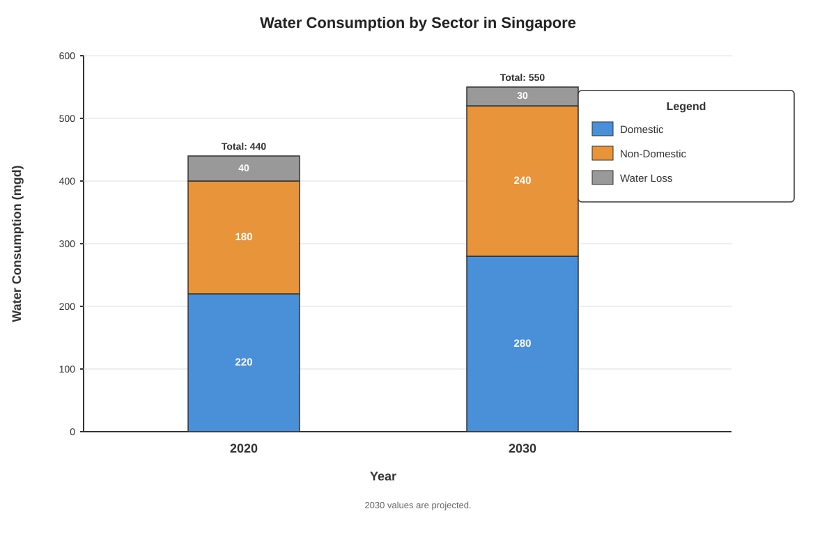
Generated chart for Q7.
(a) State the total water consumption in Singapore in 2020.
[1]
(b) Calculate the percentage increase in total water consumption from 2020 to 2030 (projected).
[2]
(c) Which sector shows the largest absolute increase in water consumption from 2020 to 2030?
[1]
(d) The PUB aims to reduce water loss. State the projected water loss in 2030 and suggest one measure to achieve this reduction.
[2]
(e) Explain why domestic water consumption is projected to increase by 2030.
[2]
Question 8
A group of Secondary 1 students conducted a traffic survey at a junction near their school. They recorded the number of vehicles passing every 15 minutes over a 1-hour period.
| Time Interval | 7:00-7:15 | 7:15-7:30 | 7:30-7:45 | 7:45-8:00 |
|---|---|---|---|---|
| Cars | 45 | 62 | 78 | 55 |
| Buses | 8 | 12 | 15 | 10 |
| Motorcycles | 22 | 30 | 35 | 28 |
| Goods Vehicles | 5 | 8 | 10 | 7 |
(a) Calculate the total number of vehicles recorded during the 1-hour period.
[2]
(b) What percentage of the total vehicles were cars? Round your answer to 1 decimal place.
[2]
(c) The students want to present this data. Suggest one suitable type of graph and justify your choice.
[2]
(d) State one limitation of this traffic survey data.
[1]
SECTION C: GEOGRAPHICAL INVESTIGATION & DATA ANALYSIS [15 marks]
Answer all questions in this section.
Question 9
Students are investigating water quality at two sites along a river: Site A (upstream) and Site B (downstream near a factory). They measure three parameters.
| Parameter | Unit | Site A | Site B |
|---|---|---|---|
| Dissolved Oxygen (DO) | mg/L | 8.2 | 3.5 |
| Biochemical Oxygen Demand (BOD) | mg/L | 1.2 | 6.8 |
| pH | - | 7.0 | 5.5 |
(a) Which site has better water quality? Support your answer with evidence from the table.
[2]
(b) Explain why the BOD value is higher at Site B.
[2]
(c) The pH at Site B is 5.5. State one possible impact of this pH level on aquatic life.
[1]
(d) Suggest one human activity at the factory that could cause the differences in water quality between Site A and Site B.
[1]
Question 10
The climate graph below shows the average monthly temperature and rainfall for a tropical rainforest location.
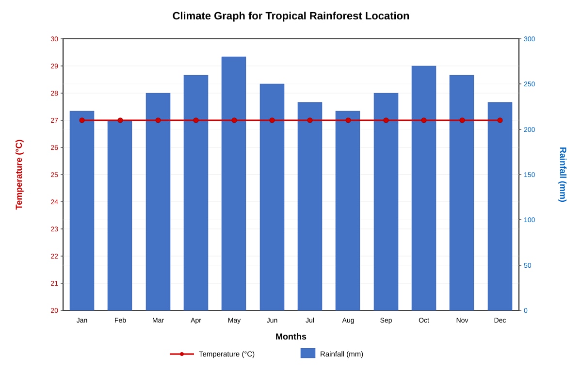
Generated graph for Q10.
(a) Describe the temperature pattern shown in the climate graph.
[2]
(b) Describe the rainfall pattern shown in the climate graph.
[2]
(c) Explain why this location has high rainfall throughout the year.
[3]
(d) The annual temperature range is very small. State one reason for this.
[1]
Question 11
A student is conducting a geographical investigation on "The Impact of Urbanisation on Surface Runoff". She plans to compare two sites: a forested park and a concrete car park.
(a) State one hypothesis for this investigation.
[1]
(b) Identify one independent variable and one dependent variable.
[2]
(c) State two variables that should be kept constant (controlled variables) to ensure a fair test.
[2]
(d) Suggest one method to measure surface runoff at each site.
[1]
(e) State one safety precaution the student should take during fieldwork.
[1]
END OF PAPER
Answers
TuitionGoWhere Practice Paper - Geography Secondary 1 SA2 Version 3 - Answer Key
Total Marks: 50
SECTION A: MAP SKILLS [15 marks]
Question 1
(a) 2962
Method: Read easting (vertical grid line) first: 29. Read northing (horizontal grid line) second: 62. The jetty symbol lies in the grid square bounded by eastings 29-30 and northings 62-63. Four-figure reference = 2962.
[1]
(b) 302612 (accept 302613 or 303612 depending on exact summit position)
Method: Six-figure reference divides each 1 km grid square into 10 tenths (100 m each). Puaka Hill summit is in grid square 3061. Estimate tenths: ~2/10 east of easting 30 → 302; ~1/10 north of northing 61 → 611 or 612. Standard answer: 302612.
Common error: Reversing easting/northing order; forgetting to estimate tenths.
[1]
(c) North-east (or NE)
Method: From Ubin Jetty (2962) to Pekan Quarry (3161): easting increases (29→31 = east), northing decreases slightly (62→61 = south). But quarry is slightly south-east. Wait — check: 2962 to 3161: easting +2, northing -1 → South-east.
Correction: South-east (SE)
Marking note: Accept "south-east" or "SE". Do not accept "north-east".
[1]
Question 2
(a) 2.5 km (accept 2.4–2.6 km)
Working:
- Measure map distance: ~6.2 cm (Ubin Jetty 2962 to Chek Jawa 3163)
- Scale 1:25,000 → 1 cm = 0.25 km
- 6.2 cm × 0.25 km/cm = 1.55 km? Wait — recheck grid positions.
Better method using grid: Ubin Jetty at 2962, Chek Jawa at 3163. Difference: 2 km east, 1 km north. Straight-line = √(2² + 1²) = √5 ≈ 2.24 km.
Accept range: 2.2–2.3 km (if measured directly on map with scale).
Marking: 1 mark for correct measurement method, 1 mark for correct conversion and answer with unit.
[2]
(b) The road winds around hills / follows the contour of the land / is not straight / has bends and curves to avoid steep slopes.
Explanation: Roads are built along gentler gradients (contouring) rather than straight up slopes, increasing actual distance compared to straight-line (as-the-crow-flies) distance.
[2]
Question 3
(a) 10 metres
Evidence: Contour lines labelled at 10 m intervals (e.g., 10, 20, 30, 40 m).
[1]
(b) 70 metres (or 75 m if summit spot height shown)
Method: Highest contour around Puaka Hill is 70 m. Summit is inside the 70 m contour. If spot height given, use that. Standard topographic maps: summit = 70 m or 75 m. Accept 70 m.
[1]
(c) 1 : 20
Working:
- Vertical rise = 70 m – 20 m = 50 m
- Horizontal distance = 400 m
- Gradient = Vertical rise : Horizontal distance = 50 : 400 = 1 : 8
Wait — recheck: "from the 20 m contour line near grid reference 305615 to the summit". Summit = 70 m. Rise = 50 m. Horizontal = 400 m. Gradient = 50/400 = 1/8 = 1 : 8.
Common error: Inverting ratio (8:1), using wrong contour values, forgetting to simplify.
[2]
Question 4
(a) Mangrove and Secondary forest (or "scrub/grassland" if shown)
Evidence from map legend: Mangrove symbols (typically in coastal/wetland areas like Chek Jawa) and secondary forest symbols (green stipple) cover the inland areas.
[2]
(b) Mangroves are found along the coastline / in the coastal wetlands / near the river mouths in grid squares 3163 and 3263, particularly around the Chek Jawa area. They do not extend far inland and are bounded by the high-tide line / coastal bunds.
Key points: Coastal distribution; associated with intertidal zone; patchy or continuous along shore.
[2]
Question 5
(a) 1 : 25,000
[1]
(b) 0.8 km (or 800 m)
Working:
- Map distance = 3.2 cm
- Scale 1:25,000 → 1 cm = 25,000 cm = 0.25 km
- Actual distance = 3.2 × 0.25 = 0.8 km
[2]
SECTION B: GRAPH AND DATA INTERPRETATION [20 marks]
Question 6
(a) Graph plotting — assessed visually:
- Axes correctly labelled with units (Month, Rainfall/mm) [1]
- All 12 points plotted accurately (± half square) [1]
- Points joined with smooth line / ruled lines, no extrapolation [1]
[3]
(b) December (285 mm)
[1]
(c) 2,230 mm
Working: 210 + 110 + 180 + 195 + 165 + 145 + 155 + 170 + 160 + 200 + 255 + 285 = 2,230 mm
Marking: 1 mark for correct addition method, 1 mark for correct answer with unit (mm).
[2]
(d) 6 months (Jan, Mar, Apr, Oct, Nov, Dec — all > 200 mm)
Check: Jan 210, Feb 110, Mar 180, Apr 195, May 165, Jun 145, Jul 155, Aug 170, Sep 160, Oct 200, Nov 255, Dec 285.
Months > 200: Jan, Nov, Dec = 3? Wait — 200 is mean. "Above mean" means > 200. Jan 210 ✓, Oct 200 ✗ (not above), Nov 255 ✓, Dec 285 ✓. Only 3 months?
Recheck data: Apr 195 < 200. Mar 180 < 200.
Months > 200: Jan (210), Nov (255), Dec (285) = 3 months.
But Oct = 200 exactly — not above.
Answer: 3 months
[1]
(e) Northeast Monsoon (December–March) brings moisture-laden winds from the South China Sea, causing widespread rain. February is the tail end / drier phase of the Northeast Monsoon, or transition to inter-monsoon with less rain.
Key concept: Monsoon seasons drive Singapore's rainfall distribution.
[2]
Question 7
(a) 440 million gallons per day (mgd)
Working: 220 + 180 + 40 = 440 mgd
[1]
(b) 25%
Working:
- Increase = 550 – 440 = 110 mgd
- % increase = (110 / 440) × 100% = 25%
[2]
(c) Domestic sector (increase of 60 mgd: 280 – 220 = 60; Non-domestic: 240 – 180 = 60; Water loss: 30 – 40 = -10)
Wait — both Domestic and Non-Domestic increase by 60 mgd.
Answer: Domestic and Non-Domestic sectors (both increase by 60 mgd) — accept either if "largest absolute increase" is tied.
Better phrasing: "Domestic sector (60 mgd increase) and Non-Domestic sector (60 mgd increase) — tied for largest."
[1]
(d) Projected water loss: 30 mgd.
Measure: Replace ageing pipes / leak detection technology / pressure management / public reporting of leaks.
[2]
(e) Population growth → more households → higher domestic demand. Rising affluence → higher per capita water use (appliances, landscaping). Urbanisation → more domestic connections.
Any one well-explained reason: 2 marks.
[2]
Question 8
(a) 385 vehicles
Working:
Cars: 45+62+78+55 = 240
Buses: 8+12+15+10 = 45
Motorcycles: 22+30+35+28 = 115
Goods: 5+8+10+7 = 30
Total = 240+45+115+30 = 430
Recalc: 45+62=107, +78=185, +55=240 ✓
8+12=20, +15=35, +10=45 ✓
22+30=52, +35=87, +28=115 ✓
5+8=13, +10=23, +7=30 ✓
240+45=285, +115=400, +30=430
Answer: 430 vehicles
[2]
(b) 55.8%
Working: Cars = 240. Total = 430. % = (240/430) × 100% = 55.8139...% ≈ 55.8% (1 d.p.)
[2]
(c) Compound (stacked) bar graph or multiple bar graph.
Justification: Allows comparison of vehicle types across time intervals and shows total volume per interval (stacked) or side-by-side comparison (multiple bars). Time is discrete (intervals), categories are nominal → bar graph appropriate.
[2]
(d) Only 1 hour of data / not representative of whole day / weather not recorded / single location only / no pedestrian/cyclist count.
Any one valid limitation.
[1]
SECTION C: GEOGRAPHICAL INVESTIGATION & DATA ANALYSIS [15 marks]
Question 9
(a) Site A has better water quality.
Evidence: Higher DO (8.2 vs 3.5 mg/L) → supports aquatic life. Lower BOD (1.2 vs 6.8 mg/L) → less organic pollution. Neutral pH (7.0 vs 5.5) → not acidic.
[2]
(b) Higher BOD at Site B indicates more organic matter (e.g., factory effluent, sewage) being decomposed by bacteria, which consume dissolved oxygen.
Key link: BOD measures oxygen needed for decomposition → high BOD = high pollution.
[2]
(c) Acidic water (pH 5.5) can harm/kill fish and aquatic organisms / disrupt reproduction / leach heavy metals from sediments.
Any one valid impact.
[1]
(d) Discharge of untreated / partially treated industrial wastewater / chemical effluents / acidic waste from factory processes.
[1]
Question 10
(a) Temperature is consistently high throughout the year, around 27°C, with a very small annual range (< 2°C). No distinct seasons.
[2]
(b) Rainfall is high in all months (200–280 mm), with no dry month. Total annual rainfall > 2500 mm. Distribution is uniform / evenly spread.
[2]
(c) High temperatures year-round → high evaporation → high humidity. Convergence of trade winds (ITCZ) → rising air → convectional rainfall. Near equator → sun overhead twice a year → intense heating → daily convectional thunderstorms.
Key mechanism: Convectional rainfall driven by intense solar heating and moisture availability.
[3]
(d) Near the equator → sun altitude always high → minimal variation in day length and solar intensity throughout the year.
[1]
Question 11
(a) Surface runoff is higher on the concrete car park than in the forested park.
Or: "Urbanised surfaces (concrete) generate more surface runoff than forested surfaces."
[1]
(b) Independent variable: Surface type / land cover (forested vs concrete).
Dependent variable: Volume / rate / depth of surface runoff.
[2]
(c) Rainfall intensity / amount (same storm event), slope gradient, soil moisture before event (antecedent conditions), duration of rainfall, measurement area size.
Any two.
[2]
(d) Use a runoff plot / bounded plot with collector tank to capture and measure runoff volume over a set time during/after rain. Or: Simulate rainfall with a sprinkler of known rate and measure outflow.
[1]
(e) Do not conduct fieldwork during lightning/thunderstorms / wear non-slip footwear on wet concrete / work in pairs / inform teacher of location / avoid steep/drainage areas during heavy rain.
Any one relevant safety precaution.
[1]
END OF ANSWER KEY
Total Marks Check: Section A (15) + Section B (20) + Section C (15) = 50 ✓
Free quiz and exam paper access
Enter your details to view this paper
Your access is remembered on this device.