AI Generated Quiz
Primary 3 Mathematics Data Analysis Quiz
Free P3 Maths Data Analysis quiz, Kimi2.6 AI version, with questions, answers, and syllabus-aligned practice for Singapore students.
These static practice materials are generated from the site's syllabus and paper-generation workflow, with source and model context shown so students and parents can evaluate the material before use.
Questions
Primary 3 Mathematics Quiz - Data Analysis
Name:_________________________ Class:______ Date:___________
Score:_________/40
Duration: 40 minutes
Total Marks: 40
Instructions:
- Read each question carefully.
- Write your answers in the spaces provided.
- Show your working where asked.
- Use a ruler when drawing or reading graphs.
Section A: Reading Bar Graphs (Questions 1–8, 16 marks)
Instructions: Each bar graph shows information about a group of Primary 3 students. Answer the questions based on the graphs.
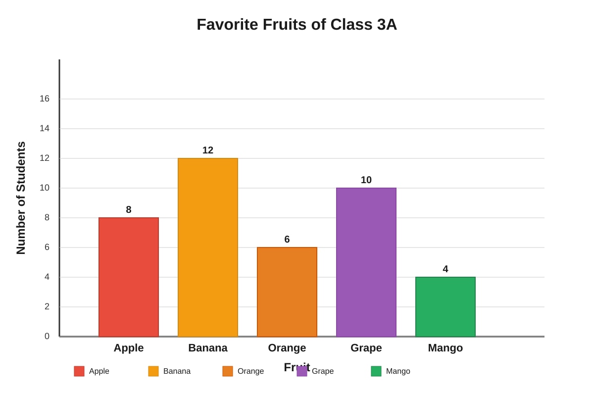
Generated bar_graph for Q1-Q4.
1. Look at the bar graph above.
(a) How many students chose banana as their favorite fruit?
Ans: _________________ students [1]
(b) Which fruit was chosen by exactly 6 students?
Ans: _________________ [1]
2. Using the same bar graph:
(a) What is the total number of students in Class 3A?
Working:
Ans: ________________ students [2]
(b) How many more students chose banana than chose mango?
Working:
Ans: ________________ students [2]
3. Ms. Tan wants to buy enough fruits for a class party. She needs to buy the two most popular fruits.
(a) Which two fruits should Ms. Tan buy?
Ans: _________________ and _________________ [1]
(b) How many students chose these two fruits altogether?
Working:
Ans: ________________ students [2]
4. The class needs to vote for one more fruit to add to the menu. They will choose the fruit with fewer than 7 votes but more than 5 votes.
Which fruit will be chosen?
Ans: _________________ [1]
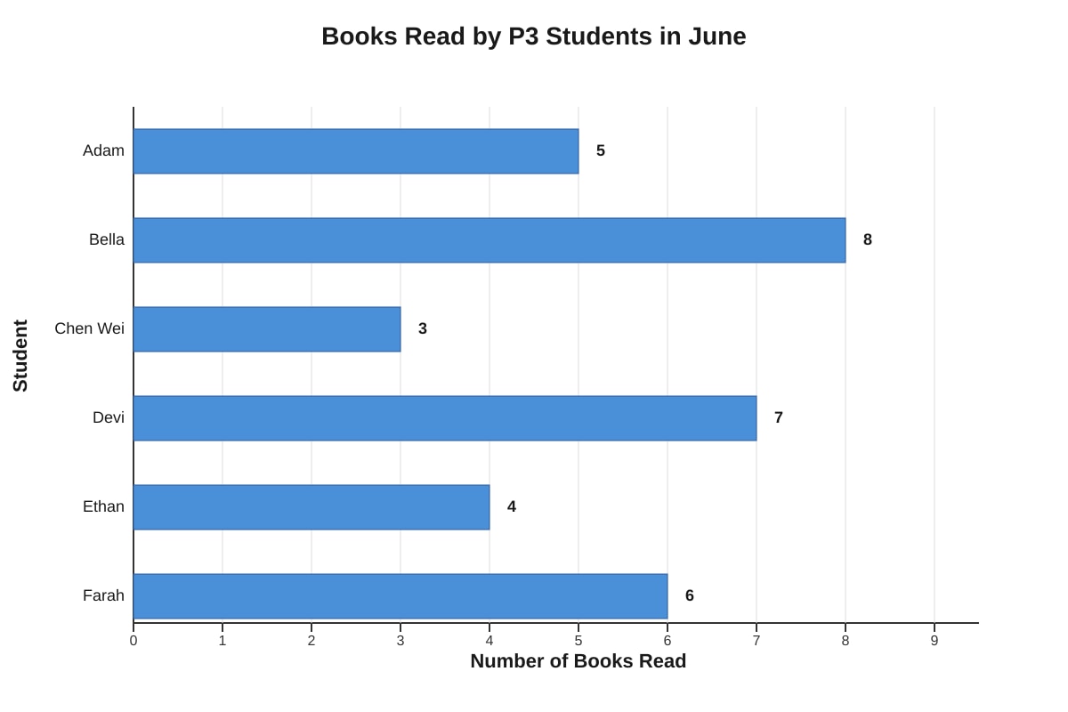
Generated bar_graph for Q5-Q8.
5. Look at the horizontal bar graph above.
(a) How many books did Devi read?
Ans: _________________ books [1]
(b) Which student read the fewest books?
Ans: _________________ [1]
6. The school's reading challenge gives a certificate to students who read at least 6 books.
(a) Which students will receive a certificate? List all of them.
Ans: _________________________________________________ [2]
(b) How many students will not receive a certificate?
Working:
Ans: ________________ students [2]
7. The class target is to read 40 books altogether. Did the class reach the target? Show your working.
Working:
Ans: _________________ (Yes/No) [2]
8. Adam says, "If I read 2 more books, I would have read as many books as the student who read the most." Is Adam correct? Explain your answer.
Working and explanation:
Ans: Adam is _________________ (correct/incorrect) because _________________ [2]
Section B: Creating and Completing Bar Graphs (Questions 9–14, 14 marks)
9. Complete the bar graph below using the information in the table.
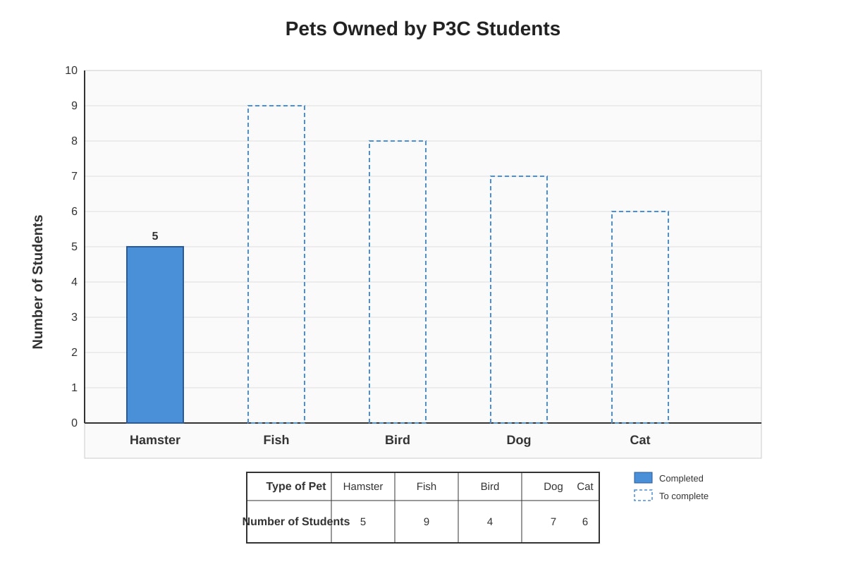
Generated bar_graph for Q9.
| Type of Pet | Hamster | Fish | Bird | Dog | Cat |
|---|---|---|---|---|---|
| Number of Students | 5 | 9 | 4 | 7 | 6 |
(a) Complete the bar for Fish. [1]
(b) Complete the remaining three bars: Bird, Dog, and Cat. [2]
(c) Label your y-axis correctly with the scale. [1]
10. A survey was conducted to find out how P3 students travel to school. The results are shown below.
| Mode of Transport | Walk | Bus | MRT | Car | Bicycle |
|---|---|---|---|---|---|
| Number of Students | 8 | 15 | 10 | 12 | 5 |
Draw a bar graph to show this information in the space below.
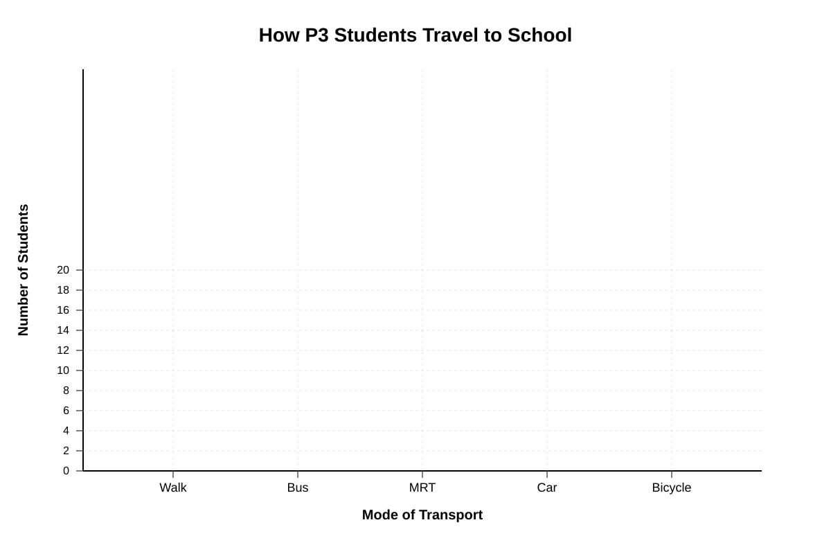
Generated blank_graph for Q10.
(a) Draw all five bars using the correct heights. [3]
(b) Label both axes correctly. [1]
(c) Give your graph a suitable title. [1]
11. The table shows the number of stamps collected by four friends.
| Friend | Ali | Ben | Cindy | David |
|---|---|---|---|---|
| Number of Stamps | 24 | 36 | 18 | 30 |
(a) On the grid below, draw a bar graph to represent this information. Use a scale where 1 unit = 6 stamps.
Generated blank_graph for Q11.
[3]
(b) How many units tall should Cindy's bar be?
Working:
Ans: ________________ units [2]
12. The pictograph below shows the number of points scored by four houses in a competition.
🏅 = 5 points
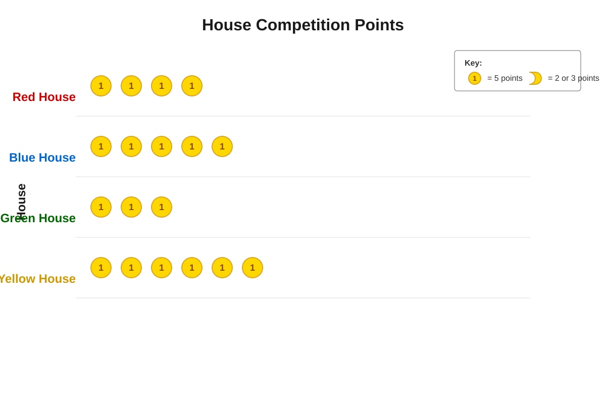
Generated pictograph for Q12-Q13.
(a) How many points did Blue House score?
Working:
Ans: ________________ points [2]
(b) Which house scored exactly 15 points?
Working:
Ans: _________________ [2]
13. Green House wants to catch up to Yellow House. How many more points does Green House need?
Working:
Ans: ________________ points [2]
14. The table shows the temperature recorded at different times of a day.
| Time | 6 a.m. | 10 a.m. | 2 p.m. | 6 p.m. |
|---|---|---|---|---|
| Temperature (°C) | 24 | 32 | 35 | 28 |
(a) Draw a bar graph to show this information. Remember to label your axes.
Generated blank_graph for Q14.
[3]
(b) Why does your y-axis not need to start from 0?
_________________________________________________ [1]
Section C: Interpreting Data and Problem Solving (Questions 15–20, 10 marks)
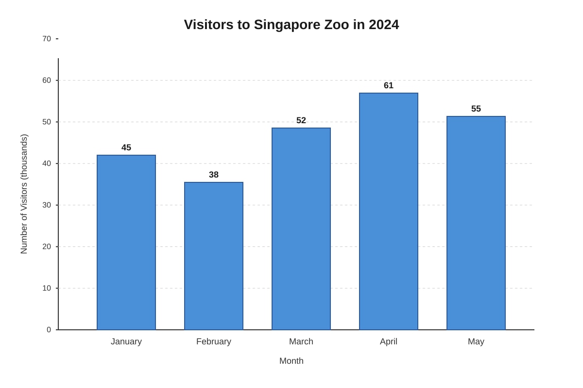
Generated bar_graph for Q15-Q17.
15. Look at the bar graph above showing visitors to Singapore Zoo.
(a) In which month were there the most visitors?
Ans: _________________ [1]
(b) How many visitors were there in March? Write your answer in numerals.
Ans: _________________ visitors [2]
16. How many more visitors were there in April than in February?
Working:
Ans: ________________ visitors [2]
17. A "busy month" is defined as a month with more than 50,000 visitors. How many busy months are shown in the graph?
Working:
Ans: ________________ busy months [2]
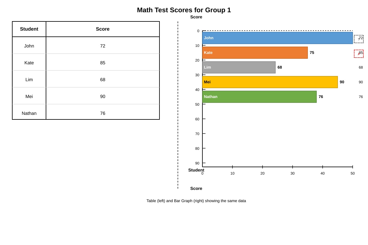
Generated table_and_bar_graph_combined for Q18-Q20.
18. Look at the table and bar graph above. They are supposed to show the same information.
(a) What score should be labeled on John's bar?
Ans: _________________ [1]
(b) Kate's bar is drawn incorrectly. What should the correct length of Kate's bar be?
Ans: _________________ [1]
19. What is the difference between the highest score and the lowest score?
Working:
Ans: ________________ marks [2]
20. The passing mark for the test is 70. How many students passed the test?
Working:
Ans: ________________ students [2]
END OF QUIZ
Please check your answers before handing in.
Answers
Primary 3 Mathematics Quiz - Data Analysis: Answer Key
Total Marks: 40
Section A: Reading Bar Graphs
1(a) 12 students ✓ [1]
Teaching note: Read the height of the banana bar directly from the graph. The value should be clearly labeled on or above the bar.
1(b) Orange ✓ [1]
Teaching note: Find the bar with height 6 and read the corresponding fruit label on the x-axis.
2(a) 8 + 12 + 6 + 10 + 4 = 40 students ✓ [2]
Mark breakdown: Correct addition of all five values (1 mark), correct final answer with unit (1 mark)
Teaching note: To find total, add all values shown on the graph. Students often forget to include all categories—double-check that five numbers are added.
Common mistake: Adding only two or three bars, or misreading one bar height.
2(b) 12 − 4 = 8 students ✓ [2]
Mark breakdown: Correct identification of 12 and 4 (1 mark), correct subtraction with answer (1 mark)
Teaching note: "How many more" means subtraction. Identify the larger value (banana = 12) and subtract the smaller value (mango = 4). The phrase "more than" signals a difference problem.
3(a) Banana and Grape ✓ [1]
Teaching note: The two most popular fruits have the two tallest bars: banana (12) and grape (10). Compare all five values or visually identify the two tallest bars.
3(b) 12 + 10 = 22 students ✓ [2]
Mark breakdown: Correctly identified 12 and 10 (1 mark), correct addition (1 mark)
Teaching note: After identifying the two fruits, add their values together. This combines reading comprehension with addition.
4. Orange ✓ [1]
Teaching note: Check each fruit against two conditions: fewer than 7 votes AND more than 5 votes.
- Apple: 8 (too high)
- Banana: 12 (too high)
- Orange: 6 ✓ (5 < 6 < 7)
- Grape: 10 (too high)
- Mango: 4 (too low)
Only orange satisfies both conditions. Students must apply both criteria—common mistake is checking only one condition.
5(a) 7 books ✓ [1]
Teaching note: On a horizontal bar graph, read the value where the bar ends. Devi's bar extends to 7 on the x-axis.
5(b) Chen Wei ✓ [1]
Teaching note: Find the shortest bar (fewest books read). On a horizontal bar graph, the shortest bar represents the smallest value. Chen Wei's bar is shortest at 3 books.
6(a) Bella (8), Devi (7), Farah (6) ✓ [2]
Mark breakdown: All three correct names (2 marks), two correct names (1 mark), one or fewer (0 marks)
Teaching note: "At least 6" means 6 or more (≥ 6). Check each student:
- Adam: 5 ✗
- Bella: 8 ✓
- Chen Wei: 3 ✗
- Devi: 7 ✓
- Ethan: 4 ✗
- Farah: 6 ✓
Common mistake: Forgetting that "at least 6" includes 6 itself, not just numbers above 6.
6(b) Adam (5), Chen Wei (3), Ethan (4) = 3 students ✓ [2]
Mark breakdown: Correct identification of non-certificate students (1 mark), correct count (1 mark)
Alternative method: Total students (6) − certificate students (3) = 3 students
7. Total books: 5 + 8 + 3 + 7 + 4 + 6 = 33 books [2]
33 < 40, so No ✓
Mark breakdown: Correct total (1 mark), correct comparison and answer (1 mark)
Teaching note: Add all six values, then compare to target of 40. The class did not reach the target because 33 < 40 (33 is less than 40). Students must both calculate and make a comparison conclusion.
8. Adam read 5 books. The student who read the most is Bella with 8 books. [1]
If Adam read 2 more: 5 + 2 = 7 books [1]
7 ≠ 8, so Adam is incorrect because 7 is not equal to 8 (he would need 3 more books). ✓ [2 total]
Mark breakdown: Correct calculation (1 mark), correct conclusion with explanation (1 mark)
Teaching note: Break the statement into parts. First identify max value (Bella, 8), then calculate Adam's hypothetical total (5 + 2 = 7), then compare. The explanation must show the numerical comparison clearly.
Common mistake: Saying "incorrect" without numerical justification, or calculating correctly but drawing wrong conclusion.
Section B: Creating and Completing Bar Graphs
9. Graph completion: ✓ [4 total]
(a) Fish bar drawn to height 9 ✓ [1]
(b) Bird bar: 4, Dog bar: 7, Cat bar: 6 ✓ [2]
(c) y-axis labeled "Number of Students" with scale 0, 1, 2, 3, 4, 5, 6, 7, 8, 9, 10 ✓ [1]
Teaching note: Transfer values from table to bars accurately. Scale is 1 unit = 1 student. Lines should be straight and bars equal width with gaps between them. Labeling both axes is essential for a complete graph.
Marking note: Deduct ½ mark per incorrect bar height if bars are close but not exact. No marks for axes labels if completely missing.
10. Graph drawing: ✓ [5 total]
(a) Five bars: Walk (8), Bus (15), MRT (10), Car (12), Bicycle (5) ✓ [3]
Mark breakdown: 3-4 correct bars (2 marks), 5 correct bars (3 marks), 1-2 correct (1 mark), all wrong (0)
(b) x-axis: "Mode of Transport", y-axis: "Number of Students" ✓ [1]
(c) Title: "How P3 Students Travel to School" or equivalent ✓ [1]
Teaching note: When drawing from scratch, choose an appropriate scale. With maximum 15, scale of 1 or 2 per unit works. Bars must be same width, equally spaced, with clear height alignment to scale. The title should describe what the graph shows.
Common mistakes: Bars different widths, no gaps between bars, scale not starting at 0, or bars not aligned to scale marks.
11(a) Graph drawing: ✓ [3]
Bars: Ali (4 units), Ben (6 units), Cindy (3 units), David (5 units)
Mark breakdown: 2-3 correct bar heights (2 marks), all 4 correct (3 marks), 1 correct (1 mark)
11(b) 18 ÷ 6 = 3 units ✓ [2]
Mark breakdown: Correct division setup (1 mark), correct answer with unit (1 mark)
Teaching note: Scale means 1 unit represents 6 stamps. To find bar height, divide actual value by scale factor: 18 ÷ 6 = 3. This tests understanding of scaled graphs, a key P3 skill. Always show the division—do not just write the answer.
Common mistake: Drawing bar to 18 instead of 3, ignoring the scale completely.
12(a) Blue House: 4 × 5 = 20 points? Wait—recheck: 5 medals × 5 = 25 points ✓ [2]
Mark breakdown: Correct interpretation of 5 medals (1 mark), correct multiplication 5 × 5 = 25 (1 mark)
Teaching note: In pictographs, the key (🏅 = 5 points) is critical. Multiply number of symbols by value per symbol. Blue House has 5 medals, not 4—count carefully.
Common mistake: Miscounting symbols or using wrong symbol value.
12(b) 15 points ÷ 5 points per medal = 3 medals = Green House ✓ [2]
Mark breakdown: Correct division to find 3 medals (1 mark), correct house identification (1 mark)
Teaching note: Work backwards from points to symbols. 15 ÷ 5 = 3 medals. Find the house with exactly 3 medals. This reverses the usual pictograph reading direction.
13. Yellow House: 6 × 5 = 30 points Green House: 3 × 5 = 15 points [1]
30 − 15 = 15 points ✓ [2]
Mark breakdown: Both house values correct (1 mark), correct subtraction (1 mark)
Teaching note: Two-step problem: find both values first, then subtract. Students may try to subtract symbols directly (6 − 3 = 3 medals, then 3 × 5 = 15)—this method also works and should be accepted if shown clearly.
14(a) Four bars: 6 a.m. (24), 10 a.m. (32), 2 p.m. (35), 6 p.m. (28) ✓ [3]
Mark breakdown: All four bars correct heights (2 marks), all labels correct including axes (1 mark)
Teaching note: With temperatures from 24–35°C, starting y-axis at 20°C saves space and is appropriate for temperature data (we don't need to show 0–20 which contains no data). Bars should still be drawn accurately relative to the scale starting at 20.
14(b) The temperatures are all above 20°C, so starting from 0 would waste space and make the differences between bars harder to see. / All values are between 24°C and 35°C, so starting from 20°C makes the differences clearer. ✓ [1]
Teaching note: This introduces the concept of broken scale or non-zero start, appropriate for P3 when data values are clustered away from zero. The key reason is visual clarity—small differences become visible.
Section C: Interpreting Data and Problem Solving
15(a) April ✓ [1]
Teaching note: Identify the tallest bar. April has the highest bar at 61 (thousand).
15(b) 52,000 visitors ✓ [2]
Mark breakdown: Reading 52 from graph (1 mark), understanding "in thousands" and writing 52,000 (1 mark)
Teaching note: The y-axis label says "Number of Visitors (in thousands)" so 52 on the scale means 52,000 actual visitors. This tests careful reading of axis labels—many students write "52" without converting.
Common mistake: Writing 52 instead of 52,000; forgetting unit conversion.
16. April: 61,000; February: 38,000 [1]
61,000 − 38,000 = 23,000 visitors ✓ [2]
Mark breakdown: Correct values with units (1 mark), correct subtraction (1 mark)
Teaching note: Subtract after converting from "thousands" to actual numbers. Can also calculate: 61 − 38 = 23, then add "thousand." Both methods acceptable if working shown.
17. March: 52,000 ✓, April: 61,000 ✓, May: 55,000 ✓ [1]
3 busy months ✓ [2]
Mark breakdown: Correct identification of all three (1 mark), correct count (1 mark)
Teaching note: "More than 50,000" means strictly greater than 50,000 (> 50,000, not ≥). Check each: January 45,000 ✗; February 38,000 ✗; March 52,000 ✓; April 61,000 ✓; May 55,000 ✓.
Common mistake: Including January (not more than 50,000) or excluding March (not understanding "> 50,000" includes 52,000).
18(a) 72 ✓ [1]
Teaching note: Cross-reference table and graph. The table shows John scored 72; his bar should be labeled 72. The missing label is a data representation error.
18(b) 85 or "85 marks" ✓ [1]
Teaching note: Kate's bar should match her table score of 85, but is drawn only to 75. This tests ability to detect inconsistency between data representations—an important data analysis skill.
19. Highest: Mei 90; Lowest: Lim 68 [1]
90 − 68 = 22 marks ✓ [2]
Mark breakdown: Correct identification of extremes (1 mark), correct subtraction (1 mark)
Teaching note: "Difference" means subtraction. Must identify both highest and lowest values from either table or graph, then find their difference. Ensure using correct values (90 and 68, not 85 and 68—Kate's bar is wrong, table is correct).
20. Passing = 70 or more (≥ 70)
John: 72 ✓, Kate: 85 ✓, Lim: 68 ✗, Mei: 90 ✓, Nathan: 76 ✓ [1]
4 students passed ✓ [2]
Mark breakdown: Correct checking of each student (1 mark), correct count (1 mark)
Teaching note: Systematic check of all five students against passing mark. Mark each as pass or fail, then count passes. Methodical approach prevents missing students.
Common mistake: Counting Lim (68) as pass, or forgetting to check all five students.
Free quiz and exam paper access
Enter your details to view this paper
Your access is remembered on this device.