AI Generated Quiz
O Level Geography Map Graph Data Skills Quiz
Free O Level Geography Map Graph Data Skills quiz, HY3 AI version, with questions, answers, and O Level-style practice for Singapore students.
These static practice materials are generated from the site's syllabus and paper-generation workflow, with source and model context shown so students and parents can evaluate the material before use.
Questions
O-Level Geography Quiz - Map Graph Data Skills
Name: ___________________________
Class: ___________________________
Date: ___________________________
Score: ______ / 40
Duration: 50 minutes
Total Marks: 40
Instructions: Answer all 20 questions. Use the data, tables, maps, and graphs provided. Show your working where calculations are required. Use a calculator if needed.
Section A: Data Representation and Graph Skills (Questions 1–7)
1. (2 marks) The students collected the average monthly temperature at four weather stations in Singapore (Ang Mo Kio, Bedok, Jurong, Woodlands). Suggest how the average monthly temperature at the four stations could be shown on one graph.
2. (2 marks) A fieldwork group recorded the number of visitors to a park at 08:00, 12:00, 16:00, and 20:00 on a Saturday. State the most appropriate graph type to show how visitor numbers change over the day and give one reason.
3. (3 marks) Study the table below showing rainfall (mm) recorded at three locations in a catchment area.
| Location | Jan | Feb | Mar | Apr |
|---|---|---|---|---|
| A | 210 | 190 | 200 | 180 |
| B | 250 | 230 | 240 | 220 |
| C | 180 | 170 | 160 | 175 |
Suggest how the rainfall data for the three locations could be presented on a single graph to allow comparison. Include the graph type and labelling requirements.
4. (2 marks) Describe one advantage of using a bar chart instead of a pie chart when comparing the land use types (residential, industrial, commercial, green) in a town.
5. (3 marks) The students measured wind speed (km/h) at five points along a coastal transect: P1 = 12, P2 = 15, P3 = 14, P4 = 18, P5 = 20. Calculate the mean wind speed. Show your working.
Working: ___________________________________________________
Mean = ______ km/h
6. (2 marks) A map shows the location of hawker centres using dots of different sizes. State what the different dot sizes most likely represent and why this is useful.
7. (2 marks) Explain why a line graph is more suitable than a bar chart for showing the change in temperature from 2015 to 2024.
Section B: Map and Spatial Data Skills (Questions 8–13)
8. (2 marks) On a topographic map, a contour line marked 50 m is drawn close to another contour line marked 60 m. What does the close spacing of these contours indicate about the slope?
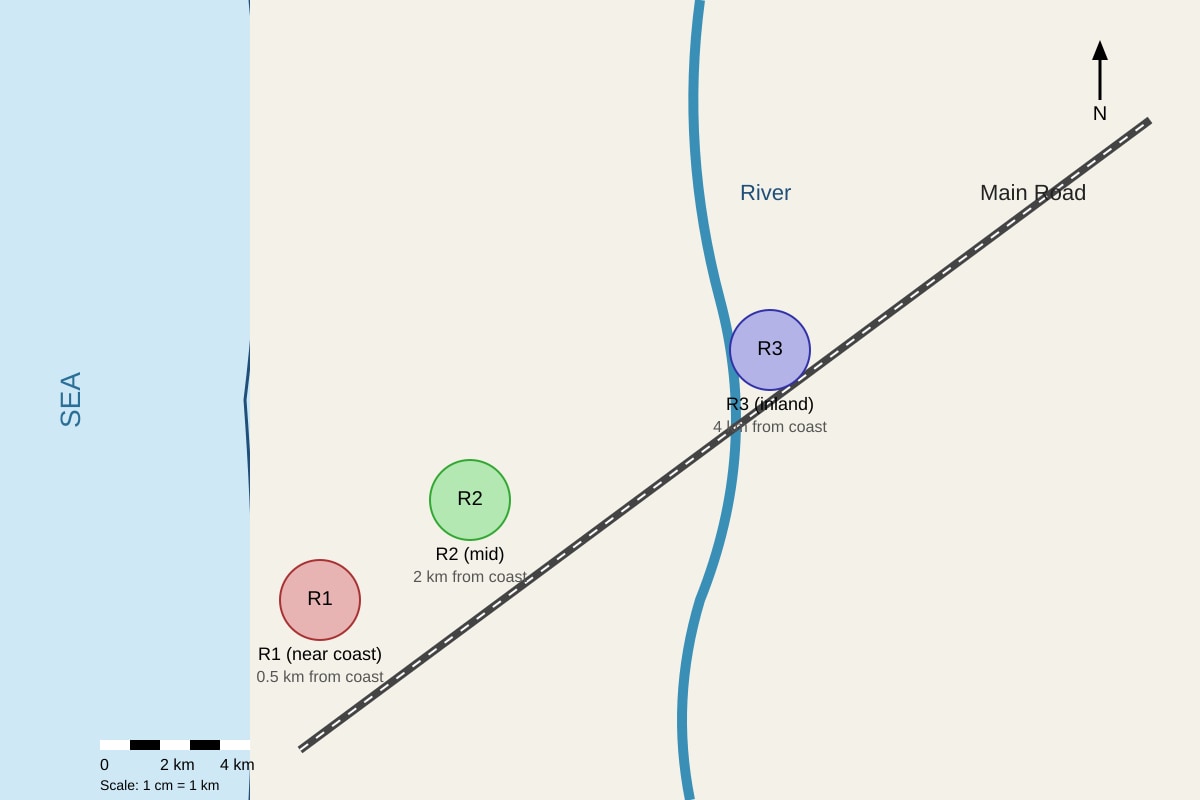
9. (3 marks) Study the map extract below.
Image pending generation: map for Q9.
Using the map, describe the spatial pattern of residential zones in relation to the coastline.
10. (2 marks) A GIS layer shows flood-prone areas in blue and elevation in shades of brown. Explain how overlapping these two layers helps planners.
11. (3 marks) The table below shows the distance of four villages from a new MRT station and their population.
| Village | Distance from MRT (km) | Population |
|---|---|---|
| V1 | 1 | 3200 |
| V2 | 3 | 1800 |
| V3 | 5 | 900 |
| V4 | 7 | 600 |
Describe the relationship between distance from MRT station and population size.
12. (2 marks) State one limitation of using dot density maps to show population distribution in a small country like Singapore.
13. (2 marks) A student uses a compass bearing of 045° to walk from a school to a park. In which general direction did the student walk?
Section C: Data Interpretation and Analysis (Questions 14–20)
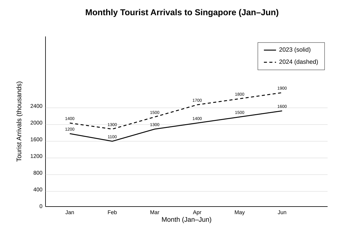
14. (3 marks) Study the graph below.
Image pending generation: graph for Q14.
Describe the trend in tourist arrivals for 2024 compared with 2023.
15. (2 marks) Calculate the range of the following temperature readings (°C): 28, 31, 29, 33, 30. Show your working.
Working: ___________________________________________________
Range = ______ °C
16. (3 marks) A class surveyed 50 residents on their satisfaction with local amenities using a Likert scale: Strongly Agree (+2), Agree (+1), Disagree (−1), Strongly Disagree (−2). For a park: 20 Strongly Agree, 15 Agree, 10 Disagree, 5 Strongly Disagree. Describe how to calculate the net satisfaction score and compute it.
Working: ___________________________________________________
Net score = ______
17. (2 marks) Explain why a sample size of 10 households is less reliable than a sample size of 100 households for estimating average household income in a town.
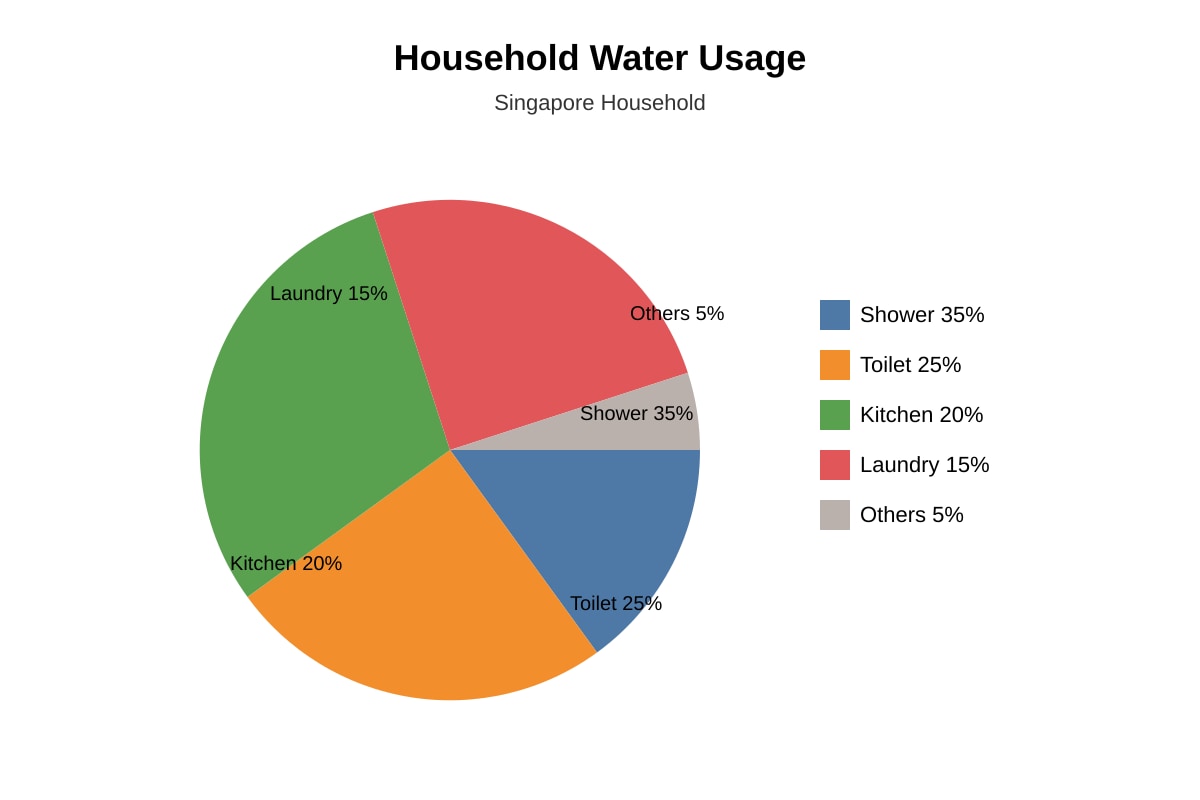
18. (3 marks) Study the pie chart description below.
Image pending generation: chart for Q18.
Identify the two largest water-use activities and suggest one reason why showers use the most water.
19. (2 marks) A scatter graph shows a positive correlation between distance from city centre and air temperature. State what this suggests about the urban heat island effect.
20. (4 marks) The students collected the average wind speed at three locations (L1 = 10 km/h, L2 = 14 km/h, L3 = 18 km/h) and want to test the hypothesis: "Wind speed increases with distance from the shelter of buildings." Evaluate whether their data collection method (measuring once at each location for 1 minute) is reliable for testing this hypothesis.
Answers
O-Level Geography Quiz - Answer Key (Map Graph Data Skills)
Total Marks: 40
Topic: Map, Graph & Data Skills
Level: O-Level
Section A: Answers 1–7
Q1 (2 marks)
Answer: Use a single line graph (or grouped bar chart) with months on the x-axis and temperature on the y-axis, plotting one line (or bar group) per station with a clear legend.
Teaching note: A combined graph lets us compare stations directly. Mark breakdown: 1 mark for graph type (line/grouped bar), 1 mark for labelling/legend. Common mistake: suggesting four separate graphs.
Q2 (2 marks)
Answer: Line graph; because it shows continuous change over time (hours of the day).
Teaching note: Time-series data is best shown with line graphs. 1 mark type, 1 mark reason.
Q3 (3 marks)
Answer: Use a grouped bar chart or line graph with months on x-axis, rainfall (mm) on y-axis, and one bar/line per location (A, B, C) with legend. Label axes and units.
Marking: 1 mark graph type, 1 mark axes/units, 1 mark legend/comparison intent.
Q4 (2 marks)
Answer: Bar chart allows easy visual comparison of actual values; pie chart shows proportion of a whole but makes small differences harder to read.
1 mark comparison advantage, 1 mark pie limitation.
Q5 (3 marks)
Working: (12 + 15 + 14 + 18 + 20) ÷ 5 = 79 ÷ 5 = 15.8
Mean = 15.8 km/h
Marking: 1 mark correct sum, 1 mark division by 5, 1 mark correct value with unit.
Q6 (2 marks)
Answer: Dot size represents the number of patrons or capacity; useful to show magnitude at a glance without reading labels.
1 mark size meaning, 1 mark usefulness.
Q7 (2 marks)
Answer: Line graph connects data over continuous years showing trend; bar chart separates each year and hides continuity.
1 mark line reason, 1 mark bar limitation.
Section B: Answers 8–13
Q8 (2 marks)
Answer: Steep slope; close contours mean large elevation change over short distance.
1 mark steep, 1 mark explanation.
Q9 (3 marks)
Answer: Residential zones are arranged with R1 nearest coast (0.5 km), R2 mid (2 km), R3 inland (4 km); linear pattern parallel to coast along river/main road.
Marking: 1 mark distance order, 1 mark pattern description, 1 mark reference to map features.
Q10 (2 marks)
Answer: Overlay shows which low-elevation areas are flood-prone, helping avoid building there.
1 mark identification, 1 mark planning use.
Q11 (3 marks)
Answer: Negative relationship – as distance from MRT increases, population decreases (V1 3200 → V4 600).
1 mark trend stated, 2 marks data evidence.
Q12 (2 marks)
Answer: Dots may overlap in dense areas, hiding true distribution; or small area limits spatial detail.
1 mark overlap, 1 mark consequence.
Q13 (2 marks)
Answer: North-east direction.
1 mark direction, 1 mark compass explanation.
Section C: Answers 14–20
Q14 (3 marks)
Answer: 2024 arrivals are higher than 2023 every month and both show an upward trend from Jan to Jun.
1 mark higher, 1 mark trend, 1 mark comparison.
Q15 (2 marks)
Working: Range = max − min = 33 − 28 = 5
Range = 5 °C
1 mark subtraction, 1 mark value+unit.
Q16 (3 marks)
Working: Positive = (20×2)+(15×1) = 40+15 = 55; Negative = (10×1)+(5×2) = 10+10 = 20; Net = 55 − 20 = 35
Net score = 35
1 mark method, 1 mark positive/negative, 1 mark net.
Q17 (2 marks)
Answer: Larger sample reduces effect of outliers and better represents population; 10 may be biased.
1 mark representativeness, 1 mark bias.
Q18 (3 marks)
Answer: Shower (35%) and Toilet (25%); showers use most due to long daily use and flow rate.
1 mark two activities, 1 mark reason, 1 mark link.
Q19 (2 marks)
Answer: City centre is warmer (urban heat island); temperature falls with distance from centre.
1 mark UHI, 1 mark interpretation.
Q20 (4 marks)
Answer: Partially reliable. Strengths: three locations show gradient. Weaknesses: one-minute measurement may miss gust variation; no repeat; no wind direction control.
Marking: 1 mark position, 2 marks evidence, 1 mark qualification.
Free quiz and exam paper access
Enter your details to view this paper
Your access is remembered on this device.