From Real Exams Quiz
O Level Geography Map Graph Data Skills Quiz
Free O Level Geography Map Graph Data Skills quiz, HY3 Exam version, with questions, answers, and O Level-style practice for Singapore students.
These static practice materials are generated from the site's syllabus and paper-generation workflow, with source and model context shown so students and parents can evaluate the material before use.
Questions
Free quiz and exam paper access
Enter your details to view this paper
Your access is remembered on this device.
Answers
O-Level Geography Quiz - Answer Key (Map Graph Data Skills)
Total Marks: 40
Topic: Map, Graph & Data Skills
Section A: Graph and Data Representation
Q1 [2 marks]
- Answer: Use a grouped bar chart or two line graphs overlaid on the same axes (one line for Station A, one for Station B) with months on x-axis and rainfall (mm) on y-axis. (2 marks: 1 for graph type, 1 for correct axes/labeling)
- Teaching note: Rainfall over months is continuous data across same period; overlay line graph or grouped bars allows direct comparison. Avoid two separate graphs.
- Common mistake: Suggesting two pie charts.
Q2 [3 marks]
- Answer: Use a bar chart with four bars (P, Q, R, S) on x-axis and visitor numbers on y-axis; OR a pie chart if proportion is intended. Best: bar chart for comparison. (3 marks: 1 graph type, 1 labeling of parks, 1 axis/units)
- Teaching note: Categorical comparison of counts → bar chart. Include title, labelled axes, units.
- Common mistake: Line graph (implies continuity between parks).
Q3 [2 marks]
- Answer: Pie chart (or divided bar chart). (2 marks)
- Teaching note: Proportion of parts of a whole → pie chart.
Q4 [2 marks]
- Answer: Line graph shows trend/continuity over time; bar chart treats each month as separate. (2 marks: 1 point each)
- Teaching note: Time-series needs line to show change.
Q5 [3 marks]
- Answer: Use a line graph with time (9am, 12pm, 3pm) on x-axis, wind speed (km/h) on y-axis, and three lines (X, Y, Z) with legend. (3 marks: 1 type, 1 axes, 1 legend/multiple lines)
- Teaching note: Same as template 1; overlay method for comparison.
Q6 [2 marks]
- Answer: Paired bar chart (two bars per town: 2010, 2020) or line graph with towns as series. (2 marks)
- Teaching note: Comparison over time for categories.
Q7 [2 marks]
- Answer: Pie chart shows proportion of whole, not change over time; temperature across days is a sequence, not parts of one total. (2 marks)
- Teaching note: Misuse of chart type.
Section B: Data Calculation and Interpretation
Q8 [2 marks]
- Answer: Assign weights: SA=+2, A=+1, D=−1, SD=−2. Positive score = (SA×2)+(A×1). Negative score = (D×1)+(SD×2). Net = Positive + Negative. (2 marks: 1 for weighting, 1 for method)
- Teaching note: From template 3; weighted Likert.
Q9 [2 marks]
- Working: Positive = (10×2)+(15×1)=20+15=35. Negative = (5×1)+(2×2)=5+4=9. Net = 35−9 = 26.
- Answer: 26 (2 marks: 1 working, 1 answer)
Q10 [2 marks]
- Working: Positive = (8×2)+(12×1)=16+12=28. Negative = (6×1)+(4×2)=6+8=14. Net = 28−14 = 14.
- Answer: 14 (2 marks)
Q11 [3 marks]
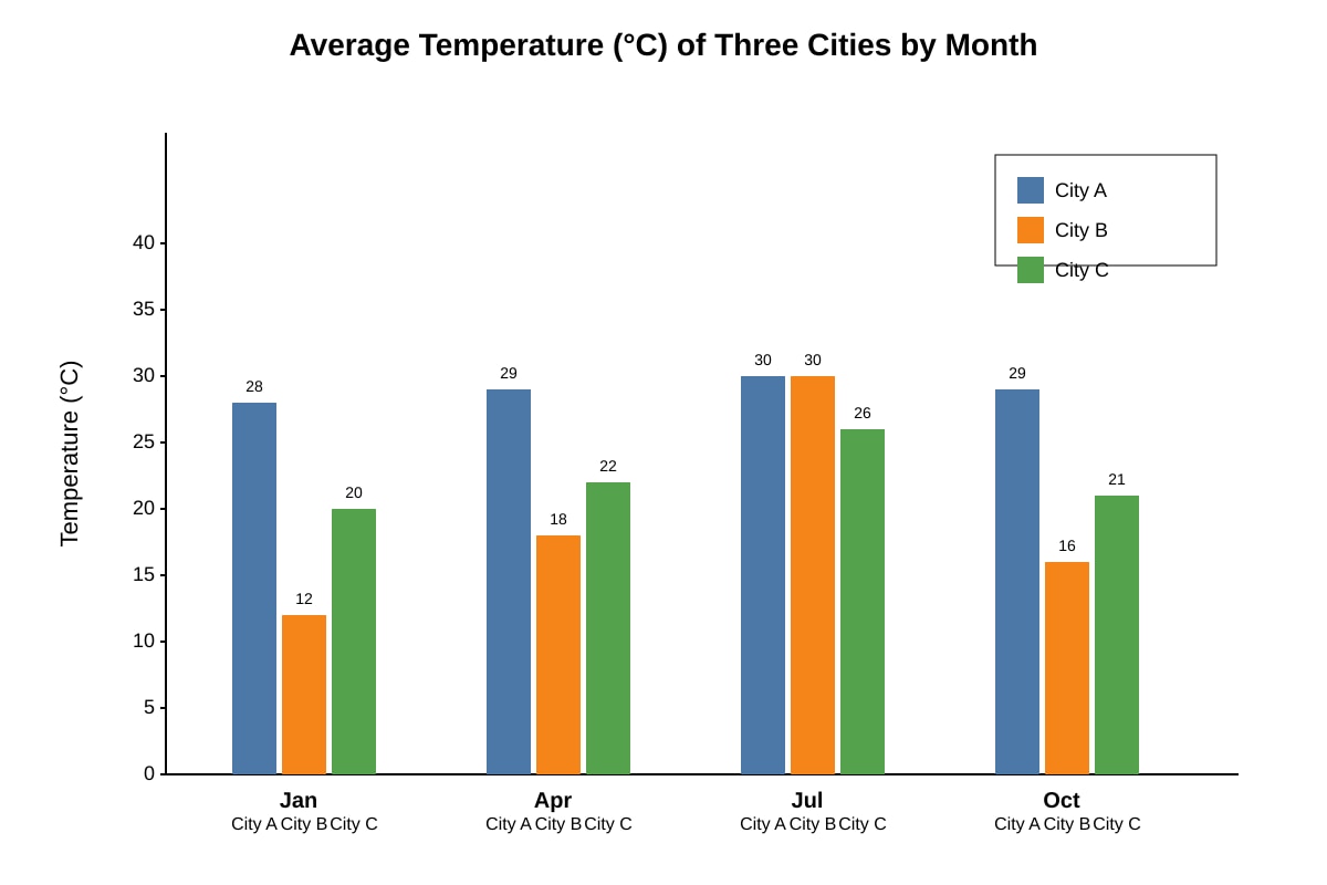
- City: City B (Jan 12, Apr 18, Jul 30, Oct 16 → range 30−12=18). City A range = 30−28=2; City C = 26−20=6. Smallest = City A actually (2°C). Correction: City A range = 30−28 = 2°C.
- Answer: City A, Range 2°C (3 marks: 1 city, 2 working/calc)
- Teaching note: Range = max − min.
Q12 [2 marks]
- Working: 50 m − 20 m = 30 m.
- Answer: 30 m (2 marks)
Q13 [3 marks]
- Answer: Display as pie chart (percentages). Limitation: hides actual student numbers; hard to compare small differences. (3 marks: 1 display, 2 limitation)
- Teaching note: % data → pie; limitation on absolute counts.
Q14 [2 marks]
- Answer: Rent increases as distance from centre increases (unusual; normally decreases) showing positive spatial association. (2 marks)
- Teaching note: Positive correlation = both rise.
Section C: Data Reliability and Evaluation
Q15 [2 marks]
- Answer: Only 10 min, one day → not representative of daily/weekly traffic. (2 marks)
- Teaching note: Small sample/time.
Q16 [4 marks]
- Mark breakdown: Position (1): Partially unreliable. Evidence (2): single location, short duration, weekday only. Qualification (1): if only snapshot needed, acceptable.
- Teaching note: Template 2 structure.
Q17 [3 marks]
- Answer: (1) Increase sample to 100+; (2) Use stratified sampling by age; (3) Repeat survey. Any two = 3 marks (1.5 each)
- Teaching note: Reliability via sample size.
Q18 [2 marks]
- Answer: Data collected first-hand by students (e.g., survey, measurement). (2 marks)
Q19 [3 marks]
- Answer: Observe concentration along boundary; note clustering; measure spacing with ruler/scale. (3 marks: 1 observation, 1 pattern, 1 method)
- Teaching note: Map pattern identification.
Q20 [4 marks]
- Mark: Bar chart appropriate for comparison (2); alternatives: pie for proportion (1); evaluate fitness (1).
- Teaching note: Template 1 variation.