AI Generated Exam Paper
O Level Geography Practice Paper 5
Free O Level Geography Practice Paper 5, HY3 AI version, with questions, answers, and O Level-style practice for Singapore students.
These static practice materials are generated from the site's syllabus and paper-generation workflow, with source and model context shown so students and parents can evaluate the material before use.
Questions
TuitionGoWhere Practice Paper - Geography O-Level
TuitionGoWhere Practice Paper (AI) — Version 5
Subject: Geography
Level: O-Level
Paper: Practice Paper (AI-Synthesised, not official format)
Duration: 45 minutes
Total Marks: 40
Name: ________________________
Class: ____________
Date: ____________
Instructions:
- This practice paper tests Map, Graph & Data Skills only.
- Answer all questions in the spaces provided.
- Calculators are allowed.
- Section A: 10 short data-skill questions (1 mark each). Section B: 6 structured data questions (2–4 marks). Section C: 4 applied data-evaluation questions (3–5 marks).
- Section marks sum to Total Marks exactly.
Section A: Basic Data and Map Skills (10 marks)
Q1. A student records the temperature at 08:00, 12:00 and 16:00 as 26°C, 31°C and 29°C. What is the mean temperature? [1]
Q2. On a bar graph of rainfall, the x-axis should show __________ and the y-axis should show __________. [1]
Q3. A map has a scale of 1:25 000. Which real-world distance does 4 cm on the map represent? [1]
Q4. State one advantage of using a line graph instead of a pie chart for showing monthly rainfall. [1]
Q5. In a field survey, 40 people answered a Likert scale (Strongly Agree = +2, Agree = +1, Disagree = −1, Strongly Disagree = −2). If 10 chose Agree, what is their contribution to the positive score? [1]
Q6. A scatter plot shows a pattern where higher temperature relates to higher electricity use. This is described as a __________ correlation. [1]
Q7. Study the table below. The modal class for wind speed is the class with the highest __________.
| Wind speed (km/h) | Frequency |
|---|---|
| 0–10 | 3 |
| 10–20 | 8 |
| 20–30 | 5 |
[1]
Q8. A GIS user overlays a drainage map and an elevation map. This process is called __________ analysis. [1]
Q9. To test reliability of data collected at 3 sites, a student should check if repeated measurements give __________ results. [1]
Q10. On a climate graph, the bars usually show __________ and the line shows __________. [1]
Section B: Structured Data Interpretation (16 marks)
Q11. The students collected average visitor numbers at four parks: A (120), B (200), C (90), D (150). Suggest how these could be shown on one graph. [3]
Q12. Table 1 shows amenity ratings by 20 residents using a scale: Agree = +1, Disagree = −1.
| Amenity | Agree | Disagree |
|---|---|---|
| Bench | 12 | 8 |
| Shelter | 5 | 15 |
Describe how to calculate the net score for each amenity. [2]
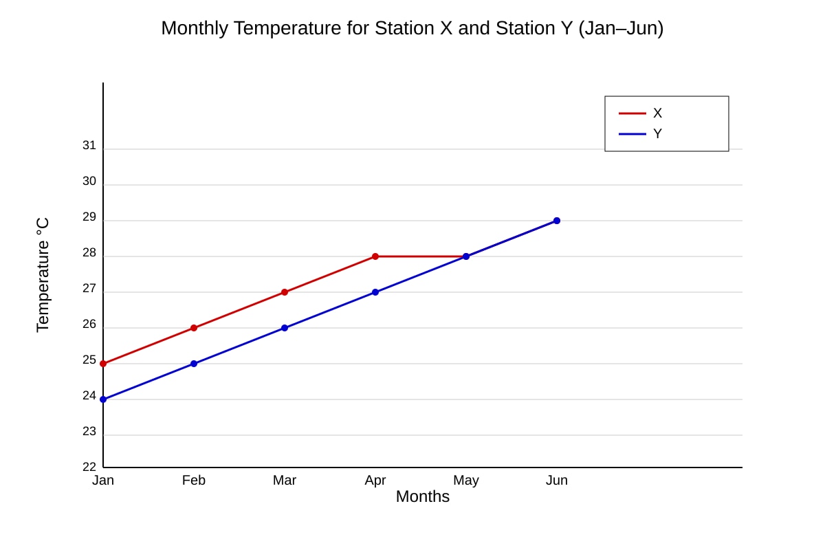
Q13. Study the graph described below.
Image pending generation: graph for Q13.
Calculate the mean temperature for Station X over the 6 months and explain one difference between X and Y. [4]
Q14. A class measured beach sediment size every 10 m along a 50 m transect. Explain how they could use GIS to present this. [3]
Q15. Table 2 shows rainfall (mm) at 3 stations.
| Station | Jan | Feb | Mar |
|---|---|---|---|
| P | 200 | 180 | 210 |
| Q | 150 | 160 | 140 |
| R | 300 | 290 | 310 |
Calculate the range of rainfall for Station R and state what this indicates. [3]
Q16. Students tested: "Noise level decreases with distance from road." They used a sound meter every 5 m up to 25 m, 3 repeats each. Evaluate whether their method is reliable. [5]
Section C: Applied Data Evaluation (14 marks)
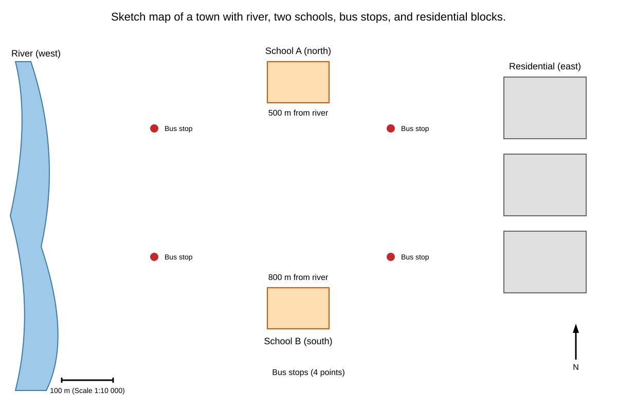
Q17. Study the map extract described.
Image pending generation: map for Q17.
Using the map, suggest how to calculate accessibility score for each school based on bus stop distance. [3]
Q18. A survey used a 5-point Likert scale (Strongly Agree +2 to Strongly Disagree −2) for "Park is clean". Results: SA 5, A 10, D 8, SD 2 (neutral 0, n=25). Calculate net score and evaluate if the park is perceived positively. [4]
Q19. Explain how remote sensing could monitor urban heat islands and discuss one limitation. [3]
Q20. Students collected wind speed at 5 locations but only on one calm day. Evaluate the reliability and representativeness of their data for describing annual wind patterns. [4]
End of Practice Paper
Answers
TuitionGoWhere Practice Paper — Answer Key (Version 5)
Subject: Geography (O-Level)
Topic: Map, Graph & Data Skills
Total Marks: 40
Section A Answers (10 marks)
Q1. [1] Mean = (26 + 31 + 29) ÷ 3 = 86 ÷ 3 = 28.7°C (accept 28.7 or 29°C rounded).
Teaching note: Mean is sum ÷ count. Common mistake: omitting one reading.
Q2. [1] x-axis: months (or time); y-axis: rainfall amount (mm).
Teaching note: Bar graphs use categorical x and continuous y.
Q3. [1] 4 cm × 25 000 = 100 000 cm = 1 km.
Method: Scale 1:25 000 means 1 cm = 250 m; 4 × 250 = 1000 m.
Q4. [1] Line graph shows trend over time; pie chart shows proportion only.
Accept any valid advantage.
Q5. [1] 10 × (+1) = +10.
Teaching note: Likert weight × frequency.
Q6. [1] positive.
Teaching note: Both variables rise together = positive correlation.
Q7. [1] frequency.
Modal class = class with highest frequency (10–20).
Q8. [1] overlay (or spatial).
GIS overlay combines layers.
Q9. [1] similar / consistent.
Reliability = repeatability.
Q10. [1] bars: rainfall; line: temperature.
Standard climate graph.
Section B Answers (16 marks)
Q11. [3] Use a bar chart with parks A–D on x-axis and visitor numbers on y-axis. [1] One combined graph (not separate). [1] Label axis "Average visitors" and give legend/title. [1]
Marking: 3 marks for correct graph type, combined, labelled.
Q12. [2] Net score = (Agree × +1) + (Disagree × −1). [1] Bench: 12−8=+4; Shelter: 5−15=−10. [1]
Teaching note: Show substitution per amenity.*
Q13. [4] Mean X = (26+27+28+29+29+30)÷6 = 169÷6 = 28.2°C. [2] Difference: X consistently higher than Y by about 2°C each month. [2]
From image_placeholder: lines show X above Y. Mark: 2 for calc, 2 for valid contrast.
Q14. [3] Enter coordinates and sediment size into GIS. [1] Create point layer along transect. [1] Use colour ramp to show size change with distance. [1]
Teaching note: GIS visualises spatial gradient.
Q15. [3] Range R = 310 − 290 = 20 mm. [2] Indicates low variation month to month. [1]
Method: max − min.
Q16. [5] Position: Partially reliable. [1] Strengths: systematic 5 m interval reduces bias; 3 repeats improve consistency. [2] Weakness: only 25 m may miss further change; road type not stated. [1] Conclusion: usable for near-road but not full area. [1]
Marking descriptors: clear eval with evidence.
Section C Answers (14 marks)
Q17. [3] Count bus stops within 300 m of each school. [1] Score = number of stops / total distance to river. [1] School A closer to river and may have more stops → higher score. [1]
From map: distances given; use scale.
Q18. [4] Net = (5×2)+(10×1)+(8×−1)+(2×−2) = 10+10−8−4 = +8. [2] Positive net shows more agreement than disagreement → perceived positively. [2]
Teaching note: weight × freq, sum.
Q19. [3] Remote sensing via satellite thermal bands shows temperature zones. [2] Limitation: cloud cover may block images. [1]
Accept other valid limitation.
Q20. [4] Not reliable for annual: one day not representative. [2] Calm day underestimates typical wind. [1] Need multiple days/seasons. [1]
Marking: clear eval of representativeness.
Total: 40 marks verified.
Free quiz and exam paper access
Enter your details to view this paper
Your access is remembered on this device.