AI Generated Exam Paper
O Level Geography Practice Paper 4
Free O Level Geography Practice Paper 4, HY3 AI version, with questions, answers, and O Level-style practice for Singapore students.
These static practice materials are generated from the site's syllabus and paper-generation workflow, with source and model context shown so students and parents can evaluate the material before use.
Questions
TuitionGoWhere Practice Paper - Geography O-Level
TuitionGoWhere Practice Paper (AI) — Version 4
Subject: Geography
Level: O-Level
Paper: Practice Paper (Map Graph Data Skills Focus)
Duration: 1 hour 15 minutes
Total Marks: 50
Name: ________________________
Class: ____________
Date: ____________
Instructions:
- This practice paper contains 20 questions focused on Map, Graph & Data Skills.
- Answer all questions in the spaces provided.
- Calculators are allowed.
- Marks for each question are shown in brackets [ ].
- Section marks and total marks are shown at the end of each section.
Section A: Data Representation and Graph Skills (Questions 1–7) [17 marks]
1. The students collected the average monthly temperature at four weather stations in Singapore. Suggest how the average monthly temperature at the four stations could be shown on one graph. [3]
2. A class recorded the number of visitors to a park at 5 different time slots. State the most appropriate graph type to compare visitor numbers and give one reason. [2]
3. Study the table below showing rainfall (mm) at three locations for Week 1.
| Location | A | B | C |
|---|---|---|---|
| Rainfall | 12 | 18 | 9 |
Suggest one suitable graph to show all three locations on a single diagram and label what the x-axis should represent. [2]
4. The students measured wind speed (km/h) at 3 sites every hour from 8am to 12pm. Describe how you would plot this as one line graph. [3]
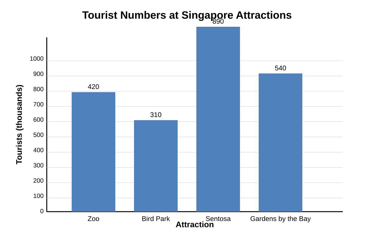
5.
Image pending generation: graph for Q5.
Using the bar chart above, calculate the total number of tourists (in thousands) across the four attractions. [2]
6. Explain why a pie chart would be unsuitable for showing temperature change over 12 months. [2]
7. A fieldwork group collected noise level data (dB) at 10 points along a road. They want to show the spread of values. State one graph type suitable for this and one limitation. [3]
Section B: Statistical Calculation and Interpretation (Questions 8–14) [18 marks]
8. Table below shows daily rainfall (mm) recorded over 5 days: 0, 4, 6, 2, 8. Calculate the mean daily rainfall. [2]
9. Using the data in Q8, calculate the range of the rainfall values. [1]
10. Describe how the students could calculate positive and negative scores for each amenity in Table 1 where responses use a scale: Strongly Agree = +2, Agree = +1, Disagree = −1, Strongly Disagree = −2. [2]
| Amenity | Strongly Agree | Agree | Disagree | Strongly Disagree |
|---|---|---|---|---|
| Park | 5 | 3 | 2 | 1 |
11. Study the table of temperature (°C) at 6 stations: 29, 31, 30, 28, 32, 30. Calculate the median temperature. Show your working. [2]
12. The students collected the following wind speeds (km/h): 10, 14, 12, 18, 16. Calculate the mean wind speed. [2]
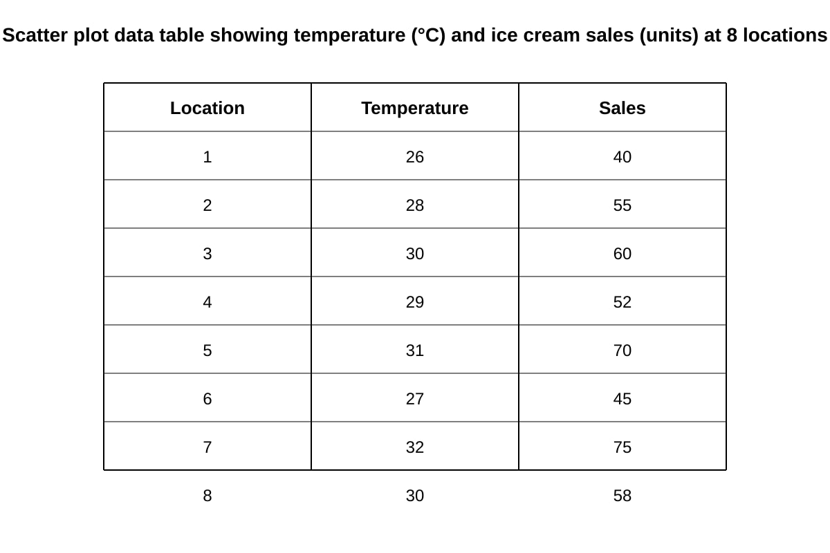
13.
Image pending generation: table for Q13.
Using the data table above, describe the relationship between temperature and ice cream sales. [3]
14. A map shows 5 earthquake epicentres along a line. Explain what this pattern suggests about plate boundary type. [3]
Section C: Map Reading and Data Evaluation (Questions 15–20) [15 marks]
15. On a topographic map, a contour line forms a closed loop with values increasing inward. State the landform shown. [1]
16. Study the extract below from a fieldwork report: "We counted 20 cars at 3pm at one junction on Monday." Evaluate whether this data collection is reliable for understanding traffic volume. [4]
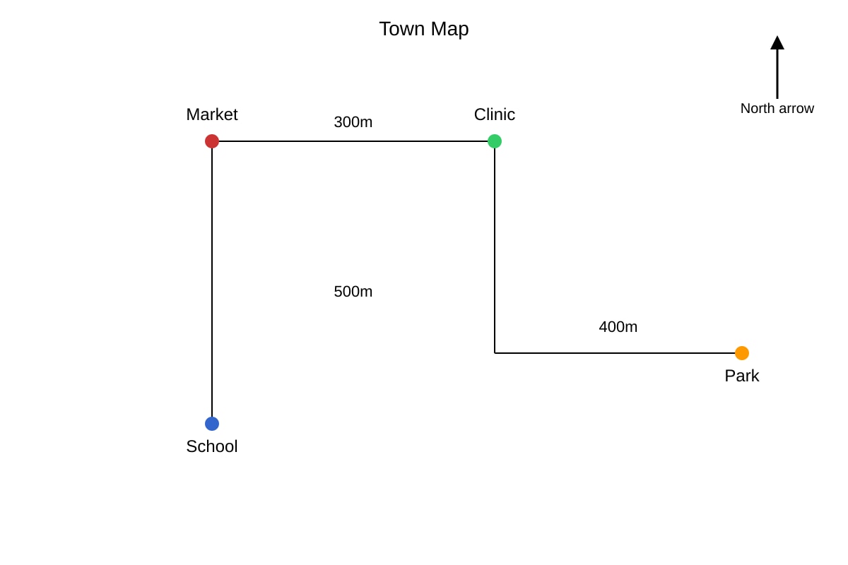
17.
Image pending generation: map for Q17.
Using the map, give the compass direction from the School to the Clinic (via Market). [2]
18. A bar graph shows rainfall for Jan–Jun: 240, 190, 210, 170, 150, 130 mm. Calculate the total rainfall for the first half of the year. [2]
19. Explain how GIS could be used to map flood risk and state one limitation. [3]
20. The students tested the hypothesis: "Tree height decreases with distance from the river." They measured 10 trees at 5m, 10m, 15m from river using a clinometer. Evaluate the effectiveness of this methodology. [3]
End of Paper
Total Marks: 50
Answers
TuitionGoWhere Practice Paper — Answer Key (Version 4)
Subject: Geography O-Level
Topic: Map Graph Data Skills
Total Marks: 50
Section A: Data Representation and Graph Skills (17 marks)
Q1 [3 marks]
- Use a line graph with months on x-axis and temperature on y-axis. [1]
- Plot four lines, one for each station, using different colours or styles. [1]
- Include a legend identifying each station and label axes with units (°C). [1]
- Teaching note: A line graph compares trends over time across locations on one diagram. Avoid separate graphs.
Q2 [2 marks]
- Bar chart. [1]
- Reason: allows easy visual comparison of discrete categories (time slots). [1]
- Common mistake: choosing line graph for non-continuous categories.
Q3 [2 marks]
- Bar chart (or grouped bar). [1]
- X-axis: Location (A, B, C). [1]
Q4 [3 marks]
- X-axis: Time (8am–12pm, hourly). [1]
- Y-axis: Wind speed (km/h). [1]
- Plot 3 lines (one per site) with legend. [1]
Q5 [2 marks]
- Total = 420 + 310 + 890 + 540 = 2160 thousand. [2]
- Based on image_placeholder Q5-fig1 values.
Q6 [2 marks]
- Pie chart shows proportion of a whole at one point in time. [1]
- Temperature change over 12 months is a continuous series; line graph is appropriate instead. [1]
Q7 [3 marks]
- Box plot (or histogram). [1]
- Suitable to show spread/median. [1]
- Limitation: loses individual point detail or needs grouped data. [1]
Section B: Statistical Calculation and Interpretation (18 marks)
Q8 [2 marks]
- Mean = (0+4+6+2+8) ÷ 5 = 20 ÷ 5 = 4 mm. [2]
Q9 [1 mark]
- Range = 8 − 0 = 8 mm. [1]
Q10 [2 marks]
- Positive score = (5×2)+(3×1) = 10+3 = 13. [1]
- Negative score = (2×1)+(1×2) = 2+2 = 4. [1]
- Method: multiply frequency by weight then sum.
Q11 [2 marks]
- Ordered: 28, 29, 30, 30, 31, 32. [1]
- Median = (30+30)÷2 = 30°C. [1]
Q12 [2 marks]
- Mean = (10+14+12+18+16)÷5 = 70÷5 = 14 km/h. [2]
Q13 [3 marks]
- As temperature increases, ice cream sales increase. [1]
- Positive correlation. [1]
- E.g., at 32°C sales 75 vs 26°C sales 40. [1]
Q14 [3 marks]
- Line of epicentres suggests a conservative (transform) or convergent boundary. [1]
- Earthquakes align along plate margin. [1]
- In Singapore context, usually distant but shows plate edge. [1]
Section C: Map Reading and Data Evaluation (15 marks)
Q15 [1 mark]
- Hill (or mountain). [1]
Q16 [4 marks]
- Position: Not reliable. [1]
- Evidence: single time, single day, one junction. [1]
- Explanation: does not capture daily/ weekly variation. [1]
- Qualification: quick snapshot but biased. [1]
Q17 [2 marks]
- School → Market (e.g., East), Market → Clinic (e.g., North) → overall NE. [2]
- Based on map distances and north arrow.
Q18 [2 marks]
- Total = 240+190+210+170+150+130 = 1090 mm. [2]
Q19 [3 marks]
- GIS overlays elevation, drainage, land use to show risk zones. [1]
- Advantage: visual, fast. [1]
- Limitation: needs accurate data input. [1]
Q20 [3 marks]
- Strengths: systematic distances, clinometer precise. [1]
- Weakness: only 3 distances, small sample. [1]
- Partial effectiveness; more points needed. [1]
Total Marks: 50 — Section totals: A=17, B=18, C=15.
Free quiz and exam paper access
Enter your details to view this paper
Your access is remembered on this device.