AI Generated Exam Paper
O Level Geography Practice Paper 3
Free O Level Geography Practice Paper 3, HY3 AI version, with questions, answers, and O Level-style practice for Singapore students.
These static practice materials are generated from the site's syllabus and paper-generation workflow, with source and model context shown so students and parents can evaluate the material before use.
Questions
TuitionGoWhere Practice Paper - Geography O-Level
TuitionGoWhere Practice Paper (AI) — Version 3
Subject: Geography
Level: O-Level
Paper: Practice Paper (Topic: Map, Graph & Data Skills)
Duration: 45 minutes
Total Marks: 40
Name: ________________________
Class: ________
Date: ________
Instructions:
- This practice paper tests Map, Graph & Data Skills based on the O-Level Geography syllabus (2279).
- Answer all 20 questions.
- Calculators are allowed.
- Use the data, tables, maps, and figures provided.
- Section marks are shown. Question marks add up to Total Marks exactly.
Section A: Data Representation and Reading Graphs (Questions 1–6) [12 marks]
1. The students collected the average temperature at four weather stations in Singapore. Suggest how the average temperature at the four stations could be shown on one graph. [2]
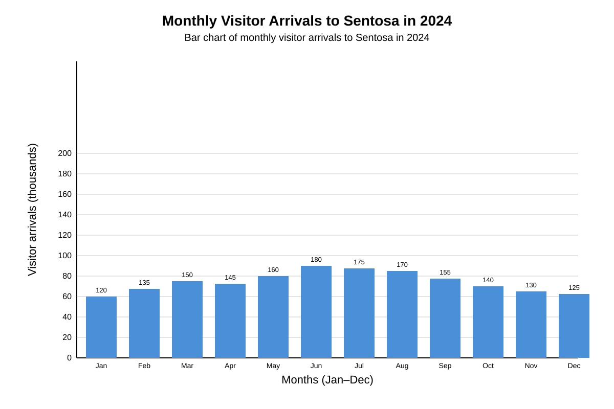
2. Study the bar chart below showing monthly visitor arrivals to Sentosa in 2024.
Image pending generation: graph for Q2.
State the month with the highest visitor arrivals. [1]
3. Using the bar chart in Q2, calculate the total visitor arrivals for the first quarter (Jan–Mar). [2]
4. A fieldwork group measured noise levels (in dB) at 5 locations along Orchard Road. They want to show if noise changes with distance from a junction. Suggest a suitable graph type and explain why. [2]
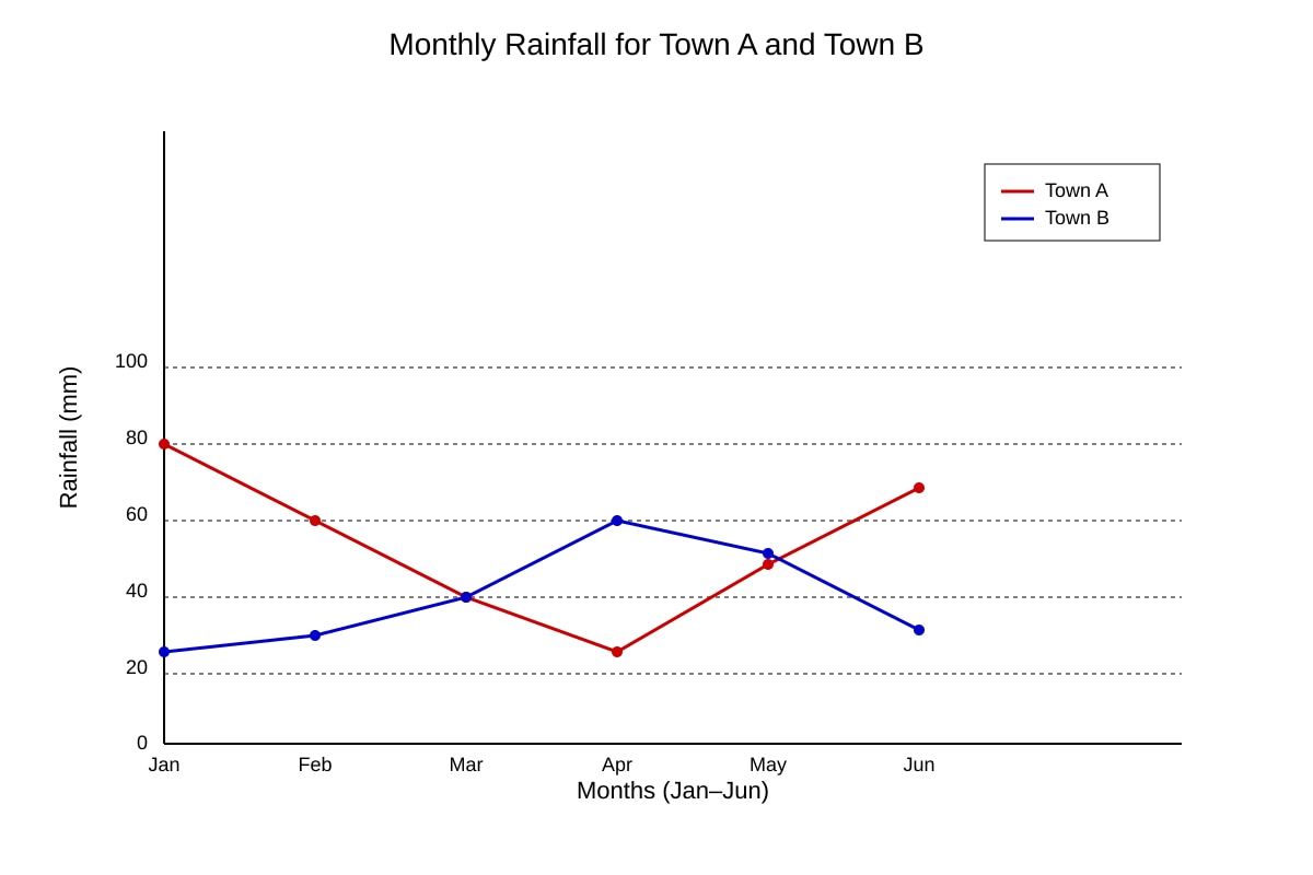
5. Study the line graph of rainfall in Town A and Town B.
Image pending generation: graph for Q5.
Describe one difference in rainfall pattern between Town A and Town B. [1]
6. The students collected the number of cars parked at a mall at 3-hour intervals. Suggest how this could be shown on one graph. [2]
Section B: Calculations and Data Interpretation (Questions 7–13) [14 marks]
7. Table 1 shows wind speed (km/h) recorded at 6 stations.
| Station | Wind speed (km/h) |
|---|---|
| 1 | 12 |
| 2 | 18 |
| 3 | 15 |
| 4 | 21 |
| 5 | 14 |
| 6 | 16 |
Calculate the mean wind speed. [2]
8. Using the table in Q7, find the range of wind speed. [1]
9. A survey used a Likert scale: Strongly Agree = +2, Agree = +1, Disagree = −1, Strongly Disagree = −2. For amenity X: 10 Strongly Agree, 5 Agree, 3 Disagree, 2 Strongly Disagree. Calculate the net score. [2]
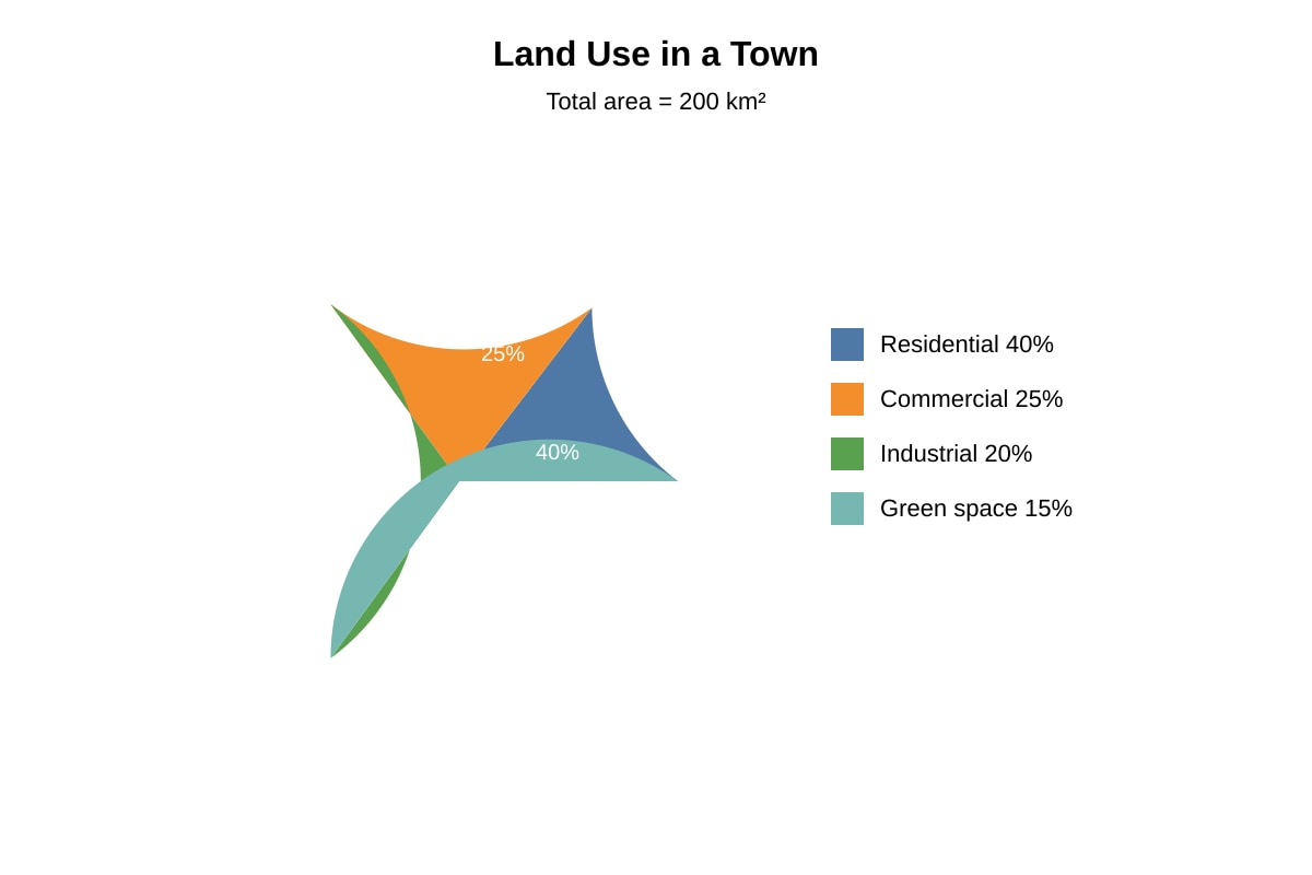
10. Study the pie chart of land use in a town.
Image pending generation: chart for Q10.
Calculate the area used for green space. [1]
11. Using the pie chart in Q10, calculate the area used for commercial purposes. [1]
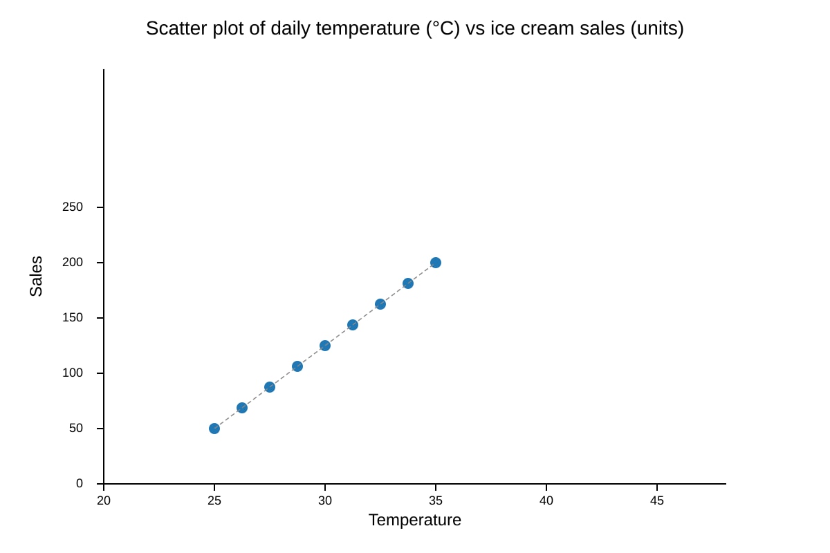
12. Study the scatter plot of temperature vs ice cream sales.
Image pending generation: graph for Q12.
Describe the relationship shown. [1]
13. A map shows 4 earthquake epicentres along a line. Explain what this suggests about plate boundary location. [2]
Section C: Evaluation and Higher-Order Skills (Questions 14–20) [14 marks]
14. For a study, students measured river depth at 3 sites using a ruler once per site. Evaluate whether the data collection is reliable. [4]
15. Explain how GIS could be used to investigate urban heat islands in Singapore. Discuss one advantage and one limitation. [3]
16. A class tested: "Beach sediment size decreases with distance from cliff." They used systematic sampling every 5 m for 50 m, measuring 10 pebbles per site. Evaluate the methodology. [3]
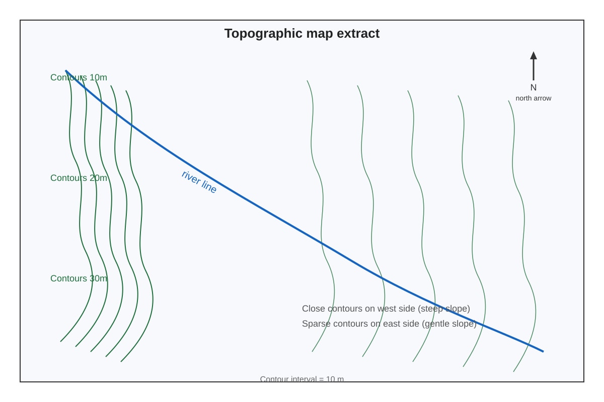
17. Study the topographic map extract.
Image pending generation: map for Q17.
Describe the slope steepness on the west side and explain how you know. [2]
18. Students collected rainfall data using one rain gauge for 1 week. Suggest two improvements to increase reliability. [2]
19. A bar chart compares recycling rates in 3 housing estates. Explain how you would check if the graph is misleading. [2]
20. To what extent can graphs alone prove cause-and-effect in geography? Evaluate using an example. [3]
Total Marks: 40
Answers
TuitionGoWhere Practice Paper Answer Key — Geography O-Level (Version 3)
Topic: Map, Graph & Data Skills
Total Marks: 40
Section A Answers
Q1 [2 marks]
Answer: Use a bar chart with stations on x-axis and temperature on y-axis, OR a line graph if comparing across a variable.
Teaching note: For categorical comparison (stations), bar chart is suitable. Mark breakdown: 1 mark for graph type, 1 mark for labelling axes/legend.
Common mistake: Suggesting 4 separate graphs instead of one combined.
Q2 [1 mark]
Answer: June (180 thousand).
Teaching note: Read highest bar from provided chart values.
Q3 [2 marks]
Answer: 120 + 135 + 150 = 405 thousand.
Working: Jan 120 + Feb 135 + Mar 150 = 405.
Mark: 1 for correct addition, 1 for unit (thousands).
Q4 [2 marks]
Answer: Line graph; because distance is continuous and shows change/trend.
Mark: 1 type, 1 reason.
Q5 [1 mark]
Answer: Town A has highest rainfall in Jan (80mm) and lowest in Apr (30mm); Town B peaks later (Apr 60mm). Any valid difference.
Teaching: Read both lines.
Q6 [2 marks]
Answer: Line graph with time on x-axis and cars on y-axis (shows change over time).
Mark: 1 graph, 1 justification.
Section B Answers
Q7 [2 marks]
Mean = (12+18+15+21+14+16) ÷ 6 = 96 ÷ 6 = 16 km/h.
Working shown; 1 mark formula, 1 mark answer+unit.
Q8 [1 mark]
Range = 21 − 12 = 9 km/h.
Q9 [2 marks]
Net = (10×2)+(5×1)+(3×−1)+(2×−2) = 20+5−3−4 = 18.
Step-by-step: SA 20, A 5, D −3, SD −4; total 18.
Mark: 1 calculation, 1 answer.
Q10 [1 mark]
Green space = 15% of 200 = 30 km².
Q11 [1 mark]
Commercial = 25% of 200 = 50 km².
Q12 [1 mark]
Positive correlation: as temperature rises, sales increase.
Q13 [2 marks]
Answer: Epicentres along a line suggest a linear plate boundary (e.g., transform or convergent).
Mark: 1 line suggests boundary, 1 explanation.
Section C Answers
Q14 [4 marks]
Position: Partially reliable (1). Evidence: only one measurement per site, no repeat → low reliability (1). Small sample 3 sites (1). Counter: quick method but bias possible (1).
Descriptors: clear position, specific method reference, balanced.
Q15 [3 marks]
GIS overlays temperature, land cover, buildings (1). Advantage: visualises hotspots (1). Limitation: needs accurate input data (1).
Q16 [3 marks]
Strengths: systematic sampling reduces bias (1). Limitations: 50m short, 10 pebbles small sample (1). Overall partial (1).
Q17 [2 marks]
West side steep (1) because contours close together (1).
Q18 [2 marks]
Two improvements: more gauges, longer period. (1 each)
Q19 [2 marks]
Check y-axis starts at 0, scale consistent, labels clear. (1+1)
Q20 [3 marks]
Graphs show correlation not causation (1). Example: ice cream sales and drowning (1). Need other evidence (1).
End of Answer Key
Free quiz and exam paper access
Enter your details to view this paper
Your access is remembered on this device.