AI Generated Exam Paper
O Level Geography Practice Paper 1
Free O Level Geography Practice Paper 1, HY3 AI version, with questions, answers, and O Level-style practice for Singapore students.
These static practice materials are generated from the site's syllabus and paper-generation workflow, with source and model context shown so students and parents can evaluate the material before use.
Questions
TuitionGoWhere Practice Paper - Geography O-Level
TuitionGoWhere Practice Paper (AI) — Version 1
Subject: Geography
Level: O-Level
Paper: Practice Paper (Map, Graph & Data Skills Focus)
Duration: 1 hour 15 minutes
Total Marks: 50
Name: ________________________
Class: ____________
Date: ____________
Instructions:
- This practice paper tests Map, Graph & Data Skills based on the O-Level Geography (2279) syllabus.
- Answer all questions.
- Calculators are allowed.
- Use the data, tables, maps, and figures provided.
- Write your answers clearly in the spaces provided.
Section A: Data Representation and Basic Interpretation (Questions 1–8) [16 marks]
1. The students collected the average monthly temperature at four weather stations (A, B, C, D). Suggest how the average monthly temperature at the four stations could be shown on one graph. [3]
2. Study the table below showing visitor numbers to a park.
| Month | Visitors |
|---|---|
| Jan | 1200 |
| Feb | 1500 |
| Mar | 1800 |
| Apr | 1400 |
State the month with the highest visitor number. [1]
3. A bar chart shows the population of five towns: P (20 000), Q (35 000), R (15 000), S (40 000), T (25 000). Which town has the smallest population? [1]
4. The students measured noise level (dB) at three sites: Road (85), Park (55), Market (75). Suggest one suitable graph to compare these values and give a reason. [2]
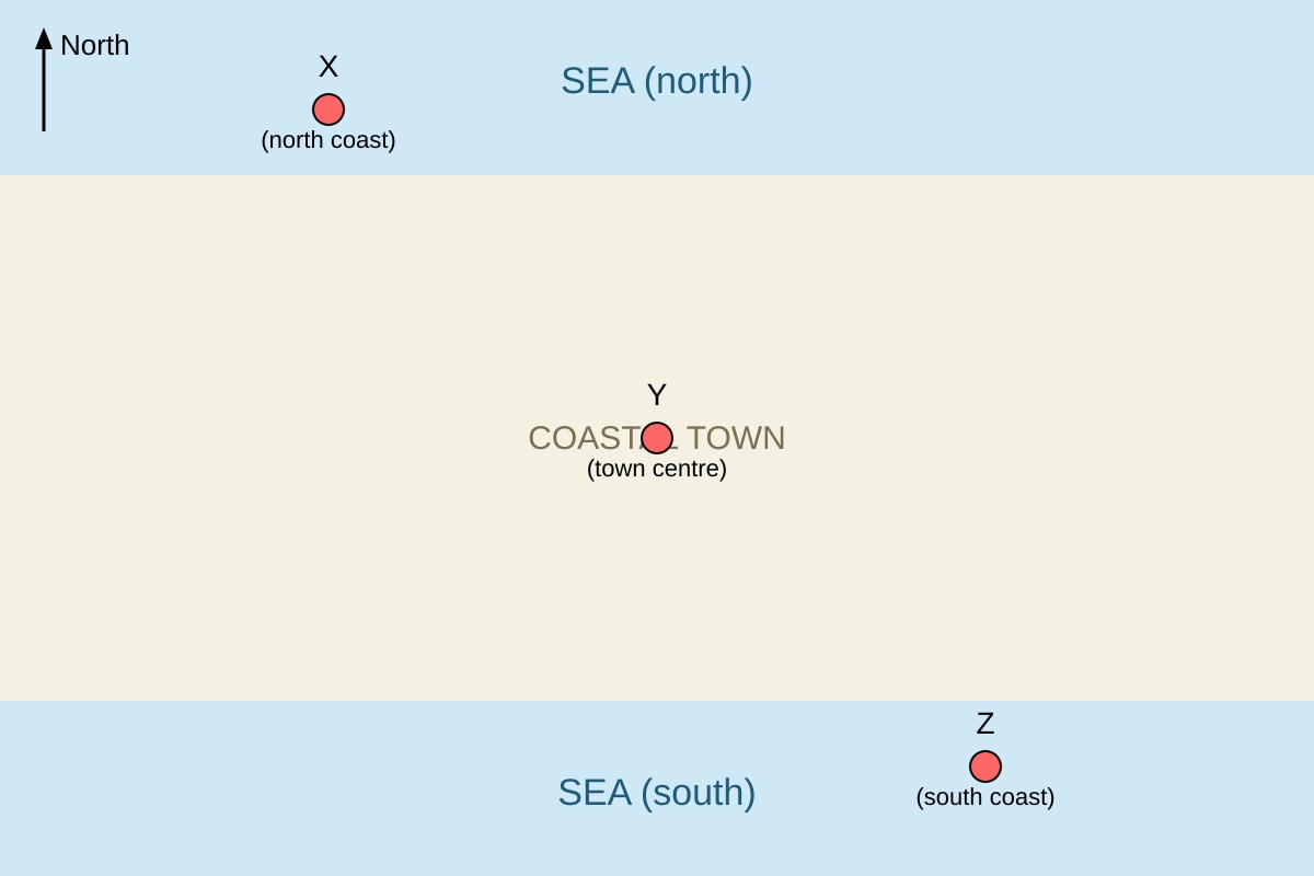
5. Study the map below.
Image pending generation: map for Q5.
State the direction of Y from X. [1]
6. The students collected the number of cars counted per hour at two locations (Bridge: 45, Tunnel: 60). Describe how this could be shown on one graph. [2]
7. A line graph shows rainfall (mm) over 6 months: 100, 120, 90, 110, 130, 95. Calculate the mean rainfall. [2]
8. Study the photograph description: "A wide sandy beach with a gentle slope, backed by a low cliff." Name one map symbol that could show the cliff on a topo map. [1]
Section B: Statistical Analysis and Graph Reading (Questions 9–14) [18 marks]
9. Study Table 1 showing wind speed (km/h) at 5 stations.
| Station | Wind speed |
|---|---|
| A | 10 |
| B | 15 |
| C | 12 |
| D | 18 |
| E | 20 |
Calculate the range of wind speed. [2]
10. Using the data in Q9, calculate the mean wind speed. [2]
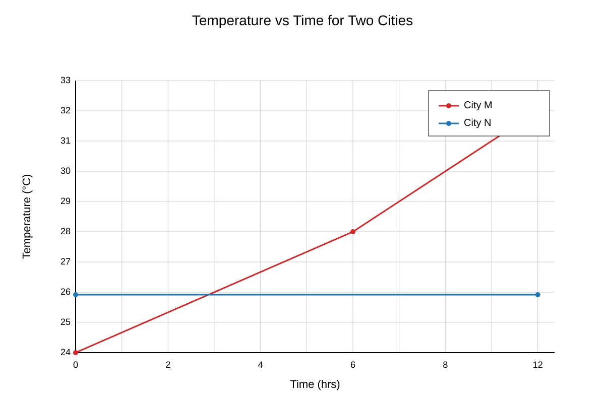
11. Study the graph below.
Image pending generation: graph for Q11.
State which city has the greater temperature range. [1]
12. For the graph in Q11, describe the trend of City M from 0 to 12 hours. [2]
13. A fieldwork table shows amenity ratings by 30 students using scale: Strongly Agree (+2), Agree (+1), Disagree (−1), Strongly Disagree (−2). For "Park": 10 SA, 5 A, 10 D, 5 SD. Describe how to calculate the net score. [3]
14. Using the data in Q13, calculate the net score for Park. [2]
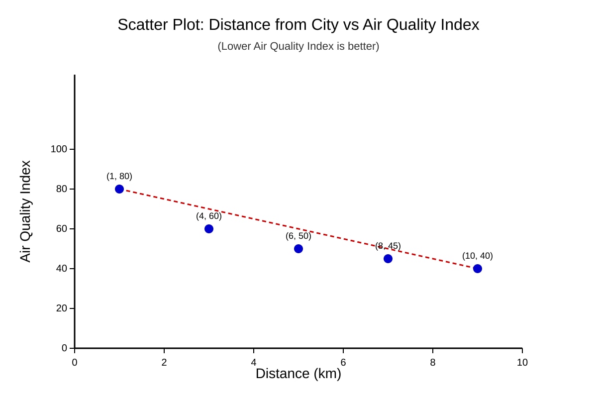
15. Study the scatter plot below.
Image pending generation: graph for Q15.
Describe the relationship between distance and air quality. [2]
Section C: Evaluation and Application (Questions 16–20) [16 marks]
16. A class tested hypothesis: "Traffic volume decreases with distance from school." They counted cars at 5 sites (50m, 100m, 200m, 400m, 800m) once at 8am on a weekday. Evaluate the reliability of this data collection. [4]
17. Explain how GIS could be used to map flood risk in a town. Give one advantage and one limitation. [5]
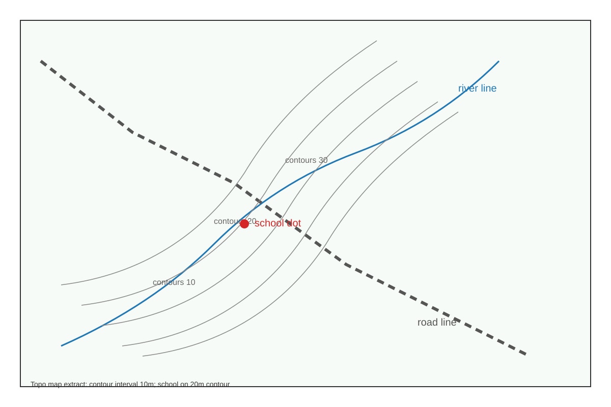
18. Study the map extract.
Image pending generation: map for Q18.
Describe the relief around the school. [2]
19. The students used a pie chart to show land use: Residential 40%, Commercial 25%, Green 20%, Other 15%. State one problem with using this to show change over time. [2]
20. A table shows temperature and rainfall for 4 months. Suggest how to present both variables together on one graph and justify. [3]
Total Marks: 50
Answers
TuitionGoWhere Practice Paper Answer Key — Version 1
Subject: Geography O-Level
Topic: Map, Graph & Data Skills
Total Marks: 50
Section A Answers (16 marks)
Q1 [3]
Answer: Use a line graph or grouped bar chart with x-axis as months and y-axis as temperature (°C); plot four lines (one per station) or grouped bars; include legend A–D.
Teaching: One combined graph compares stations. Line graph shows trend; bar compares values. Must label axes, units, legend.
Mark breakdown: 1 for graph type, 1 for axes/labeling, 1 for legend/multiple stations.
Q2 [1]
Answer: March (1800).
Teaching: Highest value in table is March.
Q3 [1]
Answer: R (15 000).
Teaching: Smallest bar/value is R.
Q4 [2]
Answer: Bar chart; reason: compares discrete site values clearly.
Mark: 1 graph, 1 reason.
Q5 [1]
Answer: South (Y is below X on map; X north coast, Y centre).
Teaching: Map shows X at north, Y centre → Y is south of X.
Q6 [2]
Answer: Bar chart with two bars (Bridge, Tunnel) on x-axis, cars/hour on y-axis.
Mark: 1 type, 1 labeling.
Q7 [2]
Mean = (100+120+90+110+130+95)/6 = 645/6 = 107.5 mm.
Teaching: Sum ÷ count.
Q8 [1]
Answer: Cliff symbol (short ticks on contour or specific topo cliff symbol).
Teaching: Topo maps use symbol for cliffs.
Section B Answers (18 marks)
Q9 [2]
Range = max − min = 20 − 10 = 10 km/h.
Teaching: Range shows spread.
Q10 [2]
Mean = (10+15+12+18+20)/5 = 75/5 = 15 km/h.
Q11 [1]
Answer: City M (range 24–32 = 8 vs N = 0).
Q12 [2]
Answer: Temperature increases steadily from 24°C to 32°C over 12 hours.
Mark: 1 increase, 1 from-to values.
Q13 [3]
Method: Net = (10×2)+(5×1)+(10×−1)+(5×−2). Assign weights, multiply by freq, sum.
Mark: 1 weights, 1 multiply, 1 sum.
Q14 [2]
Net = 20+5−10−10 = 5.
Teaching: Positive score 25, negative 20, net 5.
Q15 [2]
Answer: Negative correlation – air quality improves (index lower) as distance increases.
Mark: 1 direction, 1 interpretation.
Section C Answers (16 marks)
Q16 [4]
Answer: Partially reliable. Strengths: systematic distances, clear variable. Weakness: only one day/time, weather/traffic variation ignored, no repeat. Counter: weekday 8am typical but not comprehensive.
Mark: 1 position, 2 evidence, 1 qualifier.
Q17 [5]
Answer: GIS overlays elevation, drainage, land use to show risk zones. Adv: visual, fast. Lim: needs data, cost.
Mark: 2 use, 1 adv, 1 lim, 1 clarity.
Q18 [2]
Answer: Gentle slopes (10–30m contours close), school on 20m mid-slope.
Mark: 1 relief, 1 site.
Q19 [2]
Answer: Pie chart can't show time change; only proportions at one time.
Mark: 1 problem, 1 explain.
Q20 [3]
Answer: Dual-axis graph: bars rainfall, line temp; justify comparison.
Mark: 1 type, 1 axes, 1 justify.
Total: 50 marks
Free quiz and exam paper access
Enter your details to view this paper
Your access is remembered on this device.