From Real Exams Exam Paper
O Level Geography Practice Paper 5
Free O Level Geography Practice Paper 5, HY3 Exam version, with questions, answers, and O Level-style practice for Singapore students.
These static practice materials are generated from the site's syllabus and paper-generation workflow, with source and model context shown so students and parents can evaluate the material before use.
Questions
Free quiz and exam paper access
Enter your details to view this paper
Your access is remembered on this device.
Answers
TuitionGoWhere Exam Practice (AI) - Geography O-Level Practice Paper Answer Key (Version 5)
Subject: Geography
Level: O-Level
Topic: Map, Graph & Data Skills
Total Marks: 60
Section A: Graph and Data Representation
Q1 [3 marks]
- Suggested answer: Use a line graph with months (Jan–Jun) on the x-axis and rainfall (mm) on the y-axis; plot 4 lines (one per station) with a legend identifying Woodlands, Tampines, Jurong, Bedok. (1 mark for graph type, 1 mark for axes/units, 1 mark for overlay/legend)
- Teaching note: Continuous data over time for multiple sites is best as overlaid line graphs to compare trends. Avoid separate graphs (common trap).
Q2 [2 marks]
- Graph: Bar chart. Reason: Data are categorical (days) and show counts; bar chart compares discrete values clearly. (1+1)
- Teaching note: Days are categories, not continuous time series needing line.
Q3 [2 marks]
- X-axis: Time (hours from 6am to 6pm); Y-axis: Temperature (°C). (1 each)
- Teaching note: Line graph needs independent variable (time) on x, dependent (temp) on y.
Q4 [2 marks]
- Assign weights (e.g., SA=+2, A=+1, D=−1, SD=−2), multiply count by weight per category, sum for net score per amenity. (1 method, 1 weighting)
- Teaching note: Net score = Σ(weight×frequency). Template 3.
Q5 [3 marks]
- Overlaid line graph or grouped bar chart; line graph allows trend comparison across sites over time if time-based, or bar for discrete. (1 type, 2 justification/labelling)
- Answer: Use a line graph with wind speed on y, time/site on x, legend for 3 sites.
Q6 [2 marks]
- Bar chart to compare magnitudes; label y-axis "Magnitude", x-axis "Town". (1+1)
Section B: Map and Photograph Interpretation
Q7 [1 mark]
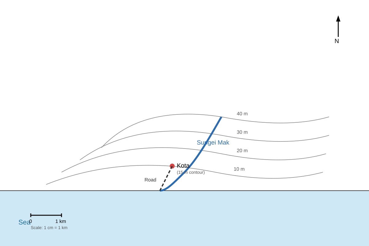
- From contour pattern and sea position, river flows from inland (higher contour) east to coast (lower). Answer: Eastward / to the east.
- Based on Q7-fig1: river from 40 m contour to sea, town west.
Q8 [2 marks]
- East of town: contours 10–40 m show rising relief inland; steep/moderate slope; hill up to 40 m. (1 description, 1 inference)
- From map: contours close = steeper.
Q9 [1 mark]
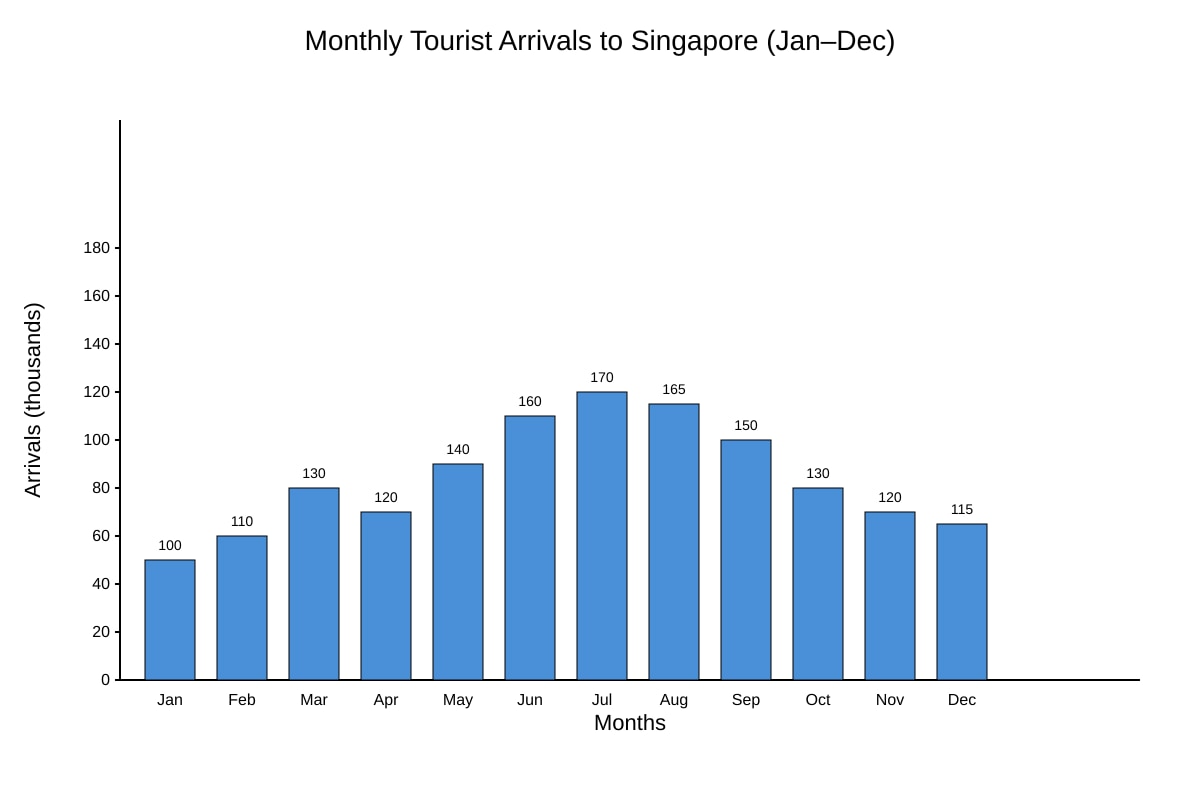
- July (170 thousand). From Q9-fig1 highest bar.
Q10 [2 marks]
- Jan=100, Jul=170. % increase = (170−100)/100 ×100 = 70%. (1 formula, 1 answer)
- Working: (70/100)*100 = 70%.
Q11 [2 marks]
- Scale 1:25 000 → 8 cm map = 8×25 000 = 200 000 cm = 2 km. (1 calc, 1 unit)
- 200 000 cm / 100 000 = 2 km.
Q12 [2 marks]
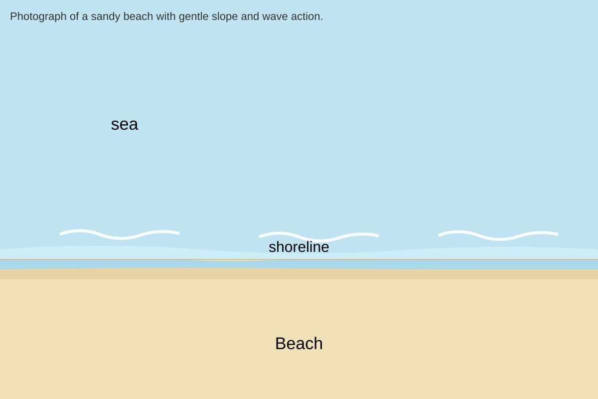
- Flat sandy beach; gentle slope to sea; waves at shoreline. (1 each)
- From Q12-fig1.
Section C: Data Analysis and Evaluation
Q13 [2 marks]
- Net = (20×2)+(15×1)+(10×−1)+(5×−2) = 40+15−10−10 = 35. (1 working, 1 answer)
Q14 [4 marks]
- Position: Partially reliable (1).
- Evidence: n=50 is moderate; used clear Likert scale (1).
- Explanation: Weighted scoring reduces bias; but self-report may have subjectivity (1).
- Qualification: While sample adequate, single site limits representativeness (1).
- Template 2 structure.
Q15 [2 marks]
- Axis labels and units; trend line / overall direction; scale. (1+1)
Q16 [3 marks]
- Grouped bar chart: x-axis sites, bars for time 1 and time 2, legend. Or clustered line. (1 type, 2 labelling)
- Allows comparison of noise across sites and times.
Q17 [1 mark]
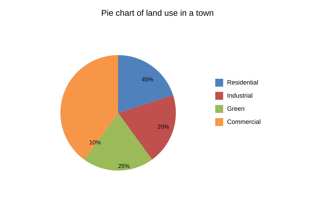
- Residential (45%). From Q17-fig1.
Q18 [2 marks]
- Green 25% → angle = 25% × 360° = 90°. (1 calc, 1 answer)
- 0.25×360 = 90°.
Q19 [3 marks]
- Line graph: x=distance along channel, y=depth; plot 10 points. (1 type, 2 labels/points)
- Shows variation pattern.
Q20 [4 marks]
- Useful: compares 5 cities' monthly trends; identifies wet/dry months (2).
- Limit: clutter if too many lines; need legend/clear colour (1).
- Conclusion: effective with proper labelling (1).
- Marking: 2 for strengths, 1 weakness, 1 judgement.
End of Answer Key