From Real Exams Exam Paper
O Level Geography Practice Paper 4
Free O Level Geography Practice Paper 4, HY3 Exam version, with questions, answers, and O Level-style practice for Singapore students.
These static practice materials are generated from the site's syllabus and paper-generation workflow, with source and model context shown so students and parents can evaluate the material before use.
Questions


Free quiz and exam paper access
Enter your details to view this paper
Your access is remembered on this device.
Answers
Answer Key — TuitionGoWhere Exam Practice (AI) Geography O-Level Practice Paper (Version 4)
Topic: Map, Graph & Data Skills
Total Marks: 60
Section A
1. [3 marks]
Answer: Use a line graph or grouped bar chart with months on x-axis and rainfall on y-axis; plot 4 lines/bars for stations A–D with legend.
Teaching: Continuous monthly data compared across 4 sites → line graph shows trends; bar chart compares discrete values. Must label axes (months, rainfall mm), include units, legend.
Marking: 1 mark graph type, 1 mark single graph with all stations, 1 mark labelling/legend.
2. [2 marks]
Answer: Line graph; reason: shows trend over time (months).
Teaching: Time-series data → line graph best. 1 mark type, 1 mark reason.
3. [3 marks]
Answer: Single line graph, x-axis height (2,10,20 m), y-axis temp °C, 3 lines for each height with legend.
Teaching: Comparing same variable at different heights → overlay lines. Marks: 1 graph type, 1 all on one, 1 labels.
4. [2 marks]
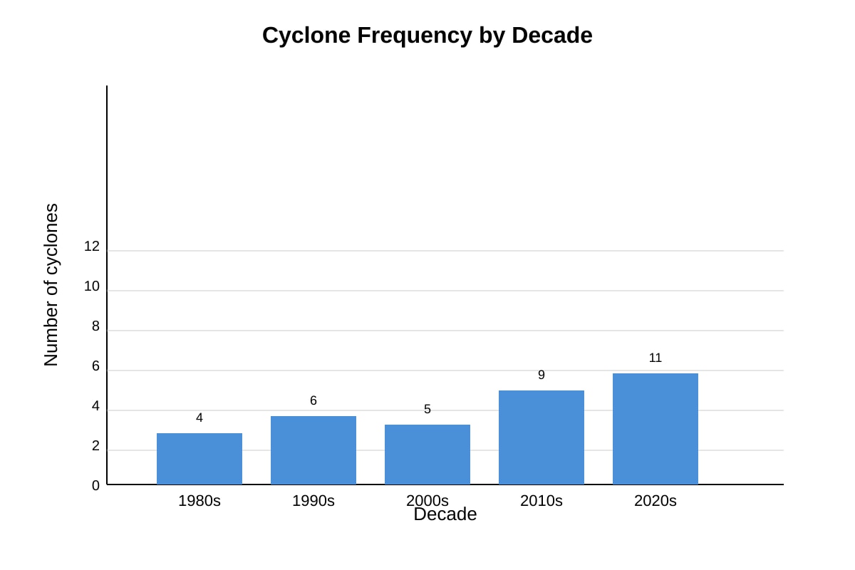
Answer: 2020s, 11 cyclones.
Teaching: Read tallest bar from placeholder. 1 mark decade, 1 mark value.
5. [2 marks]
Answer: Pie chart shows proportion at one time, not change over time; wind speed over day is time-series.
Teaching: 1 mark pie unsuitable for trend, 1 mark reason time-series.
6. [1 mark]
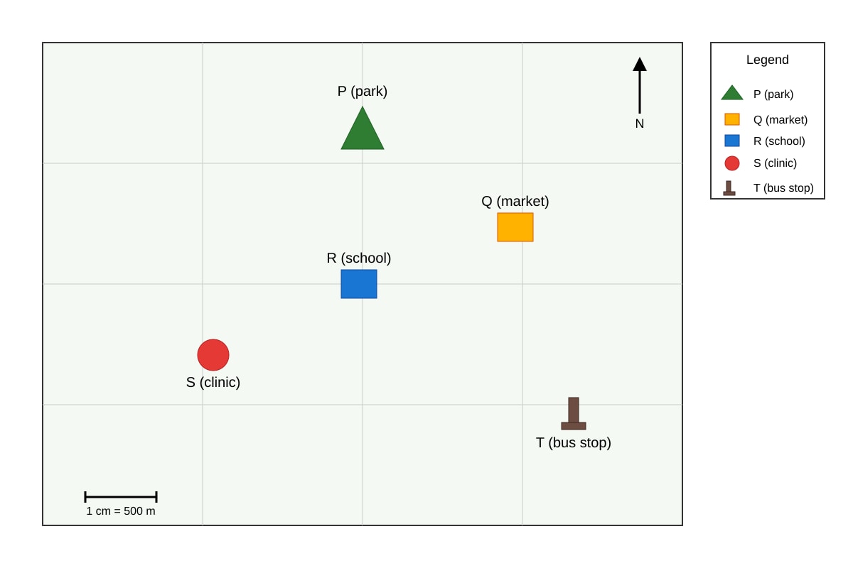
Answer: (Based on placeholder: if T is north of R) T (bus stop).
Teaching: Read map relative position.
7. [2 marks]
Working: Agree 10×1=10; Disagree 5×−1=−5; Net=10−5=+5.
Answer: +5.
Teaching: Apply weights, sum. 1 mark calc, 1 mark final.
Section B
8. [2 marks]
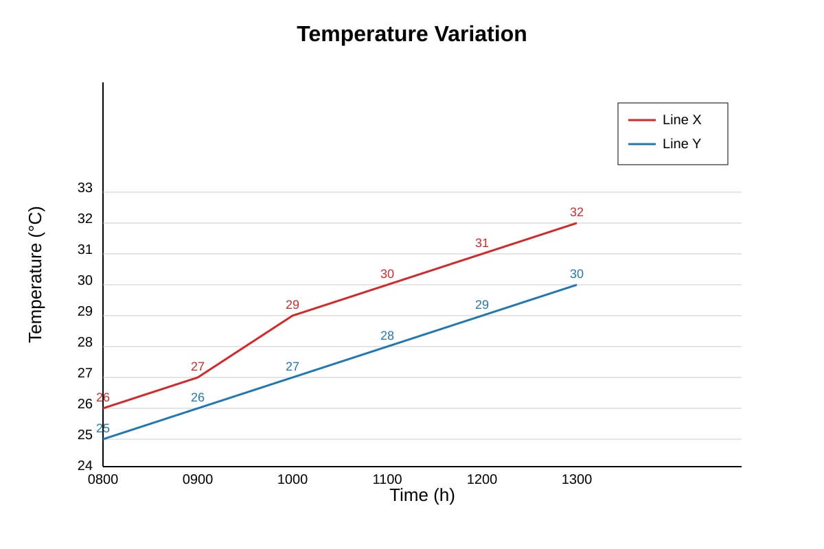
Answer: Line X increases steadily from 26°C (0800) to 32°C (1300).
Teaching: Read values, state rise. 1 mark trend, 1 mark values.
9. [4 marks]
Answer: Partially reliable. Evidence: 10-min surveys short, 5 locations small sample. But standardised time reduces bias. Counter: more sites needed.
Teaching: Position (1), evidence method (2), qualification (1).
10. [2 marks]
Working: (300−120)/120×100 = 150%.
Answer: 150%.
Teaching: % increase formula. 1 mark calc, 1 mark answer.
11. [3 marks]
Answer: Earthquakes clustered along plate boundary line; linear pattern; most within close distance.
Teaching: Describe spatial. 1 mark cluster, 1 mark along boundary, 1 mark pattern.
12. [3 marks]
Answer: Grouped bar chart: x-axis sites, 3 bars per site for times, legend for times.
Teaching: Compare categories. 1 type, 1 all shown, 1 labels.
13. [2 marks]
Working: (12+15+18+22+25)/5 = 92/5 = 18.4.
Answer: 18.4 (000s).
Teaching: Mean = sum/n.
14. [4 marks]
Answer: Photo shows real detail (buildings use) but limited extent; map shows distribution clearly but not detail. Both useful, photo less reliable for area.
Teaching: Position (1), photo strength (1), map strength (1), trade-off (1).
Section C
15. [2 marks]
Working: Pos = 8×2 + 10×1 = 26; Neg = 4×1 + 2×2 = 8.
Answer: Positive 26, Negative 8.
16. [3 marks]
Answer: Apr (200mm), Nov (220mm); temp steady ~27–28°C.
Teaching: Read dual axis. 1 mark months, 2 marks temp desc.
17. [4 marks]
Answer: Low reliability: 20 questionnaires small, one mall not representative. But focused. Need larger sample.
Teaching: As template 2.
18. [3 marks]
Answer: Scatter graph, x distance, y rent, plot points, look for correlation.
Teaching: 1 type, 1 axes, 1 use.
19. [2 marks]
Working: 12/15×100 = 80%.
Answer: 80%.
20. [4 marks]
Answer: Use small multiples or grouped bar with river on x, 3 bars (width, depth, velocity) but diff units need normalisation; or 3 separate panels. Best: 3 line graphs with normalised index.
Teaching: 1 mark identify issue units, 2 marks method, 1 mark labelling.