From Real Exams Exam Paper
O Level Geography Practice Paper 2
Free O Level Geography Practice Paper 2, HY3 Exam version, with questions, answers, and O Level-style practice for Singapore students.
These static practice materials are generated from the site's syllabus and paper-generation workflow, with source and model context shown so students and parents can evaluate the material before use.
Questions
TuitionGoWhere Exam Practice (AI) — Geography O-Level
Practice Paper: Map, Graph & Data Skills (Version 2 of 5)
School: TuitionGoWhere Secondary School (AI)
Subject: Geography
Level: O-Level
Paper: Practice Paper (Map Graph Data Skills)
Duration: 60 minutes
Total Marks: 50
Name: __________________________
Class: ____________
Date: ____________
Instructions:
- Answer all questions in the spaces provided.
- Use a calculator if needed.
- Show your working where calculation is required.
- For data interpretation, label graphs and state units clearly.
Section A: Data Representation and Basic Interpretation (Questions 1–8) [16 marks]
1. A geography class recorded the number of visitors at four parks in Singapore (East Coast, Bishan, Botanic Gardens, Pasir Ris) on a Sunday afternoon. Suggest how the visitor numbers at the four parks could be shown on one graph. [3]
2. State one advantage of using a bar chart instead of a pie chart to compare rainfall in five towns. [1]
3. The table below shows mean monthly temperature (°C) for Station X and Station Y.
| Month | X | Y |
|---|---|---|
| Jan | 27 | 22 |
| Apr | 28 | 24 |
| Jul | 29 | 26 |
| Oct | 28 | 23 |
Suggest a suitable graph to show both stations on one diagram and give one reason. [2]
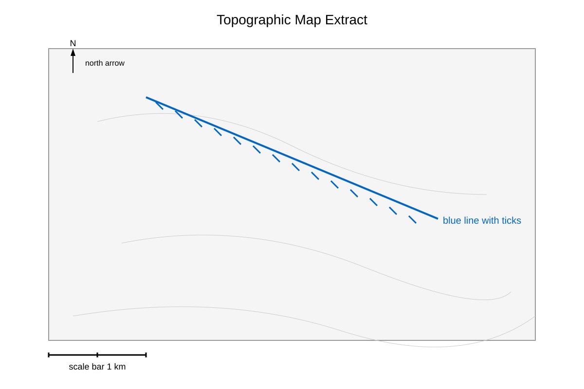
4. Identify the map symbol shown below.
Image pending generation: map for Q4.
What does the blue line with ticks represent? [1]
5. A student collected wind direction at 3 locations using a compass rose. Describe how this could be presented on a single map. [2]
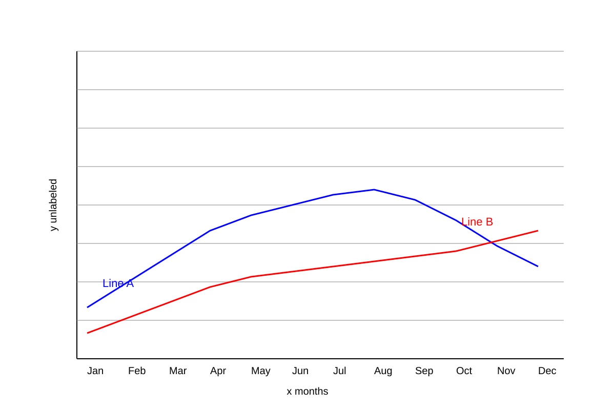
6. The figure shows a graph with no title and unlabelled axes.
Image pending generation: graph for Q6.
State two missing features that must be added for the graph to be acceptable. [2]
7. Give one reason why a line graph is more suitable than a bar chart for showing temperature change over a year. [1]
8. The students measured noise level (dB) at 5 points along a road. They want to show the change from point 1 to point 5. Name the graph type most suitable. [1]
Section B: Data Calculation and Reliability (Questions 9–14) [18 marks]
9. Table below shows responses from 20 residents on amenity P (Likert: SA=Strongly Agree, A=Agree, D=Disagree, SD=Strongly Disagree).
| Response | Frequency |
|---|---|
| SA | 8 |
| A | 6 |
| D | 4 |
| SD | 2 |
Describe how to calculate the net score if SA=+2, A=+1, D=−1, SD=−2. [2]
10. Using the weights in Q9, calculate the net score for amenity P. [2]
11. A study used 10 random samples of river depth across a 2 m width. Evaluate whether the data collection is reliable. [4]
12. The table shows population (thousands) of three towns in 2010 and 2020.
| Town | 2010 | 2020 |
|---|---|---|
| A | 120 | 150 |
| B | 90 | 110 |
| C | 200 | 180 |
Calculate the percentage increase for Town A from 2010 to 2020. [2]
13. Using the table in Q12, calculate the total population change for all three towns from 2010 to 2020. [2]
14. A fieldwork group counted vehicles at a junction for 15 minutes during morning peak only. Suggest one way to improve reliability. [1]
15. For the study in Q11, state one factor that reduces accuracy but not reliability. [1]
Section C: Graph and Map Interpretation (Questions 16–20) [16 marks]
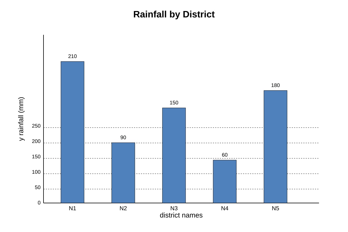
16. Study the bar chart of rainfall (mm) for five districts.
Image pending generation: chart for Q16.
(a) Which district had the lowest rainfall? [1]
(b) Calculate the difference between highest and lowest rainfall. [2]
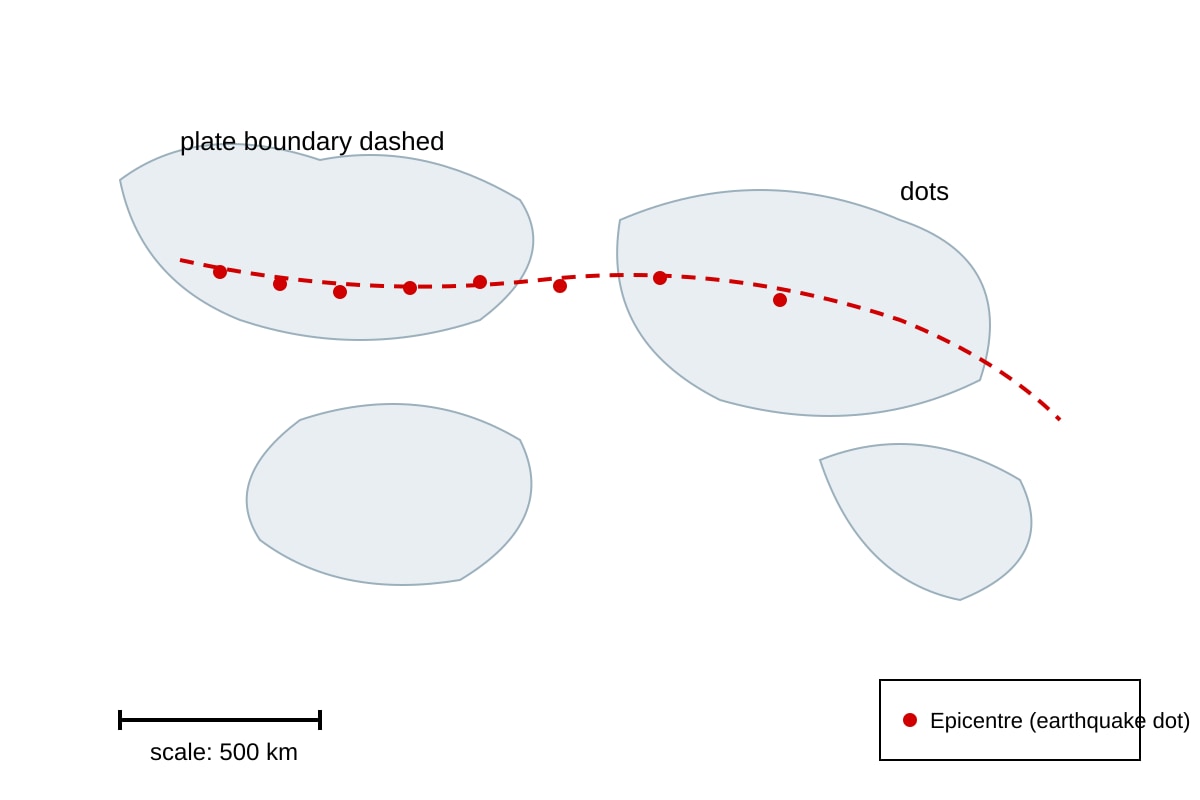
17. The map shows earthquake epicentres as dots along a line.
Image pending generation: map for Q17.
Describe the pattern of earthquake distribution. [2]
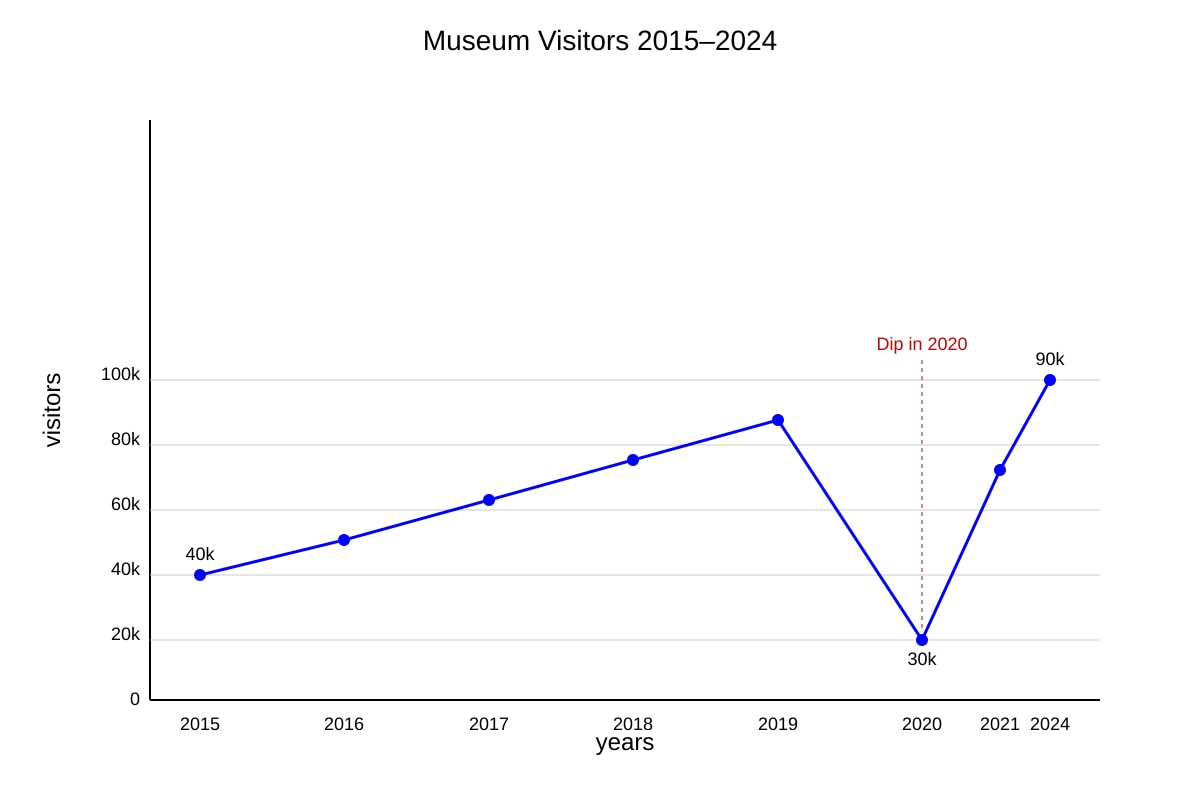
18. A line graph shows visitor numbers to a museum from 2015–2024.
Image pending generation: graph for Q18.
State the trend and identify the unusual year. [2]
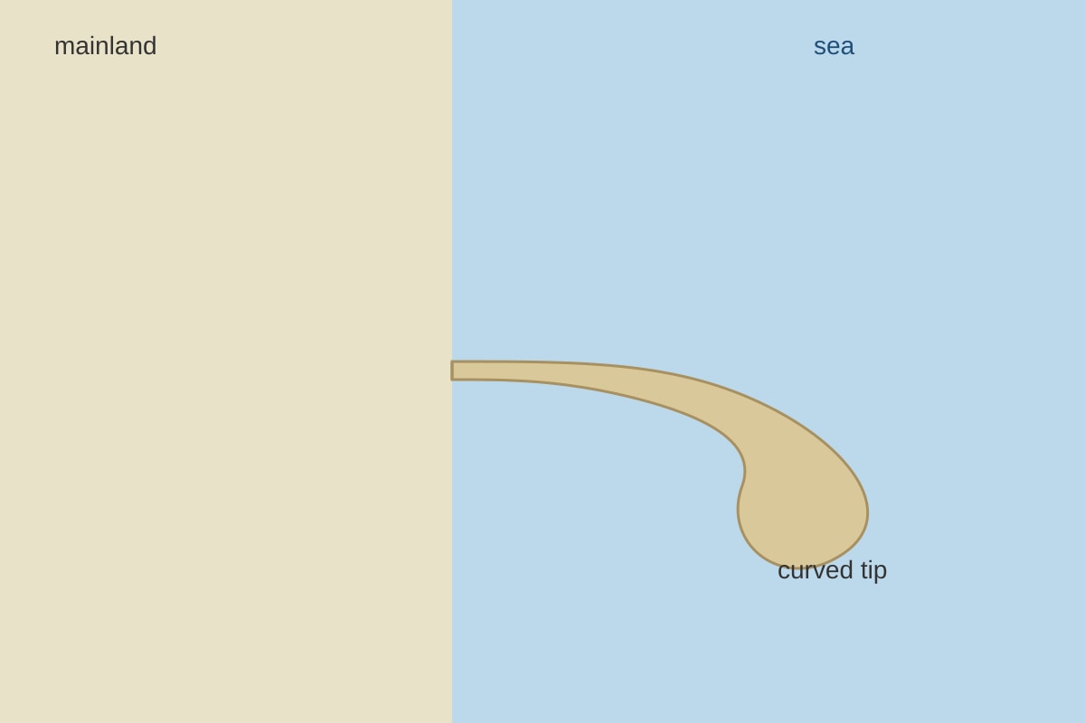
19. The photograph shows a spit.
Image pending generation: figure for Q19.
With reference to the photo, describe one feature of the spit. [1]
20. Table shows CO₂ (ppm) readings at two heights: ground (410) and roof (405) in a city.
| Height | CO₂ |
|---|---|
| Ground | 410 |
| Roof | 405 |
Suggest a reason for the difference. [2]
End of Paper
Answers
TuitionGoWhere Exam Practice (AI) — Geography O-Level
Practice Paper: Map Graph Data Skills (Version 2) — Answer Key
Total Marks: 50
Section A (16 marks)
Q1 [3]
Suggested: Use a bar chart with parks on x-axis and visitor numbers on y-axis; OR grouped bar if time bands needed.
Marks: 1 for graph type, 1 for stating axes, 1 for noting single graph comparison.
Teaching: A single bar chart lets side-by-side comparison. Avoid 4 separate pies.
Q2 [1]
Bar chart allows exact value comparison; pie shows proportion only.
Mark: 1 for valid advantage.
Q3 [2]
Line graph with months on x-axis, temperature on y-axis, two lines for X and Y with legend. Reason: shows trend over time for both.
Marks: 1 type, 1 reason.
Q4 [1]
River or drainage line with bank ticks.
Mark: 1 for correct identification from symbol.
Q5 [2]
Place compass roses on a base map at the 3 locations, or use arrows with direction.
Marks: 1 map, 1 method.
Q6 [2]
Missing: axis titles (months, rainfall mm), graph title.
Marks: 1 each.
Q7 [1]
Line shows continuous change; bar separates discrete categories.
Mark: 1.
Q8 [1]
Line graph.
Mark: 1.
Section B (18 marks)
Q9 [2]
Multiply frequency by weight: SA×2 + A×1 + D×(−1) + SD×(−2); sum = net.
Marks: 1 method, 1 weighting.
Q10 [2]
Net = (8×2)+(6×1)+(4×−1)+(2×−2) = 16+6−4−4 = 14.
Marks: 1 working, 1 answer.
Q11 [4]
Position: Partially reliable. Evidence: random sampling reduces bias (1); small sample 10 limits representation (1); width 2 m may miss variability (1); counter: random method gives consistency if repeated (1).
Teaching: Reliability = consistency, not accuracy.
Q12 [2]
% increase = (150−120)/120 ×100 = 25%.
Marks: 1 formula, 1 answer.
Q13 [2]
Total 2010 = 410; 2020 = 440; change = +30 thousand.
Marks: 1 totals, 1 change.
Q14 [1]
Sample across different times/days.
Mark: 1.
Q15 [1]
Instrument error (e.g., ruler calibration).
Mark: 1.
Section C (16 marks)
Q16 [3]
(a) N4 [1]
(b) 210−60 = 150 mm [2]
Q17 [2]
Earthquakes occur along plate boundary line; clustered not random.
Marks: 1 pattern, 1 location.
Q18 [2]
Trend: general increase 40k→90k; unusual year 2020 dip to 30k.
Marks: 1 each.
Q19 [1]
Narrow landform attached to coast, curved seaward end.
Mark: 1.
Q20 [2]
Ground higher due to traffic/exhaust; roof less polluted.
Marks: 1 reason, 1 link.
End of Answer Key
Free quiz and exam paper access
Enter your details to view this paper
Your access is remembered on this device.