From Real Exams Exam Paper
O Level Geography Practice Paper 1
Free O Level Geography Practice Paper 1, HY3 Exam version, with questions, answers, and O Level-style practice for Singapore students.
These static practice materials are generated from the site's syllabus and paper-generation workflow, with source and model context shown so students and parents can evaluate the material before use.
Questions
TuitionGoWhere Exam Practice (AI) — Geography O-Level Practice Paper
School: TuitionGoWhere Exam Practice (AI)
Subject: Geography
Level: O-Level
Paper: Practice Paper (Map, Graph & Data Skills) — Version 1 of 5
Duration: 60 minutes
Total Marks: 40
Name: ___________________________
Class: ______________
Date: ______________
Instructions
- This practice paper tests Map, Graph & Data Skills only.
- Answer all questions in the spaces provided.
- Calculators are allowed.
- Use the data, maps, and figures provided to support your answers.
Section A: Graph and Data Interpretation (Questions 1–8) [16 marks]
1. A student recorded the monthly rainfall (mm) at Changi, Singapore for Jan–Jun as: 220, 150, 170, 180, 200, 160. State one suitable type of graph to show this data and give one reason. [2]
2. The table below shows average temperature (°C) at two stations.
| Station | Jan | Feb | Mar |
|---|---|---|---|
| A | 27 | 28 | 29 |
| B | 25 | 26 | 27 |
Suggest how the temperature of the two stations could be shown on one graph. [3]
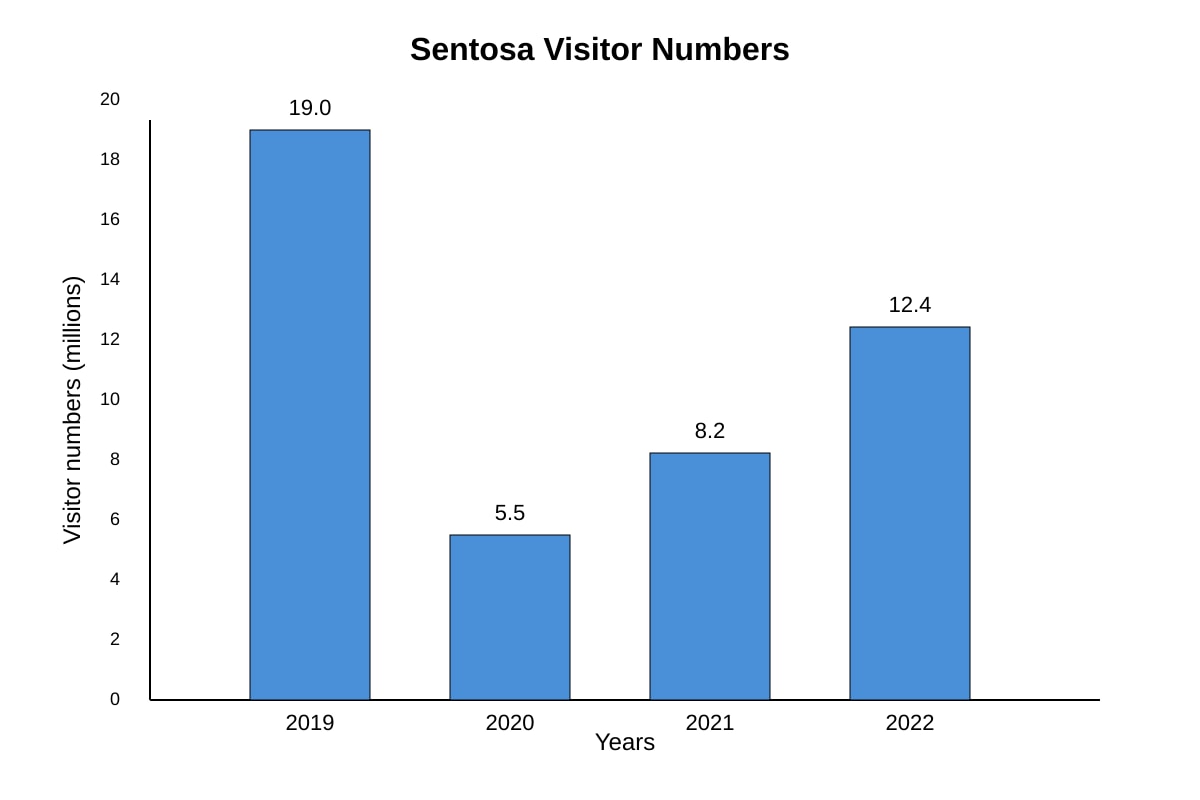
3. Study the bar chart of visitor numbers to Sentosa from 2019–2022.
Image pending generation: graph for Q3.
Describe the trend shown in the graph. [2]
4. Calculate the mean monthly wind speed (km/h) from: 12, 15, 9, 14, 10. Show your working. [2]
5. A map shows housing estates as dots. Describe how you would use the map to find the nearest MRT station from a given school. [2]
6. The students collected the average wind speed at four locations. Suggest how the average wind speed at the four locations could be shown on one graph. [3]
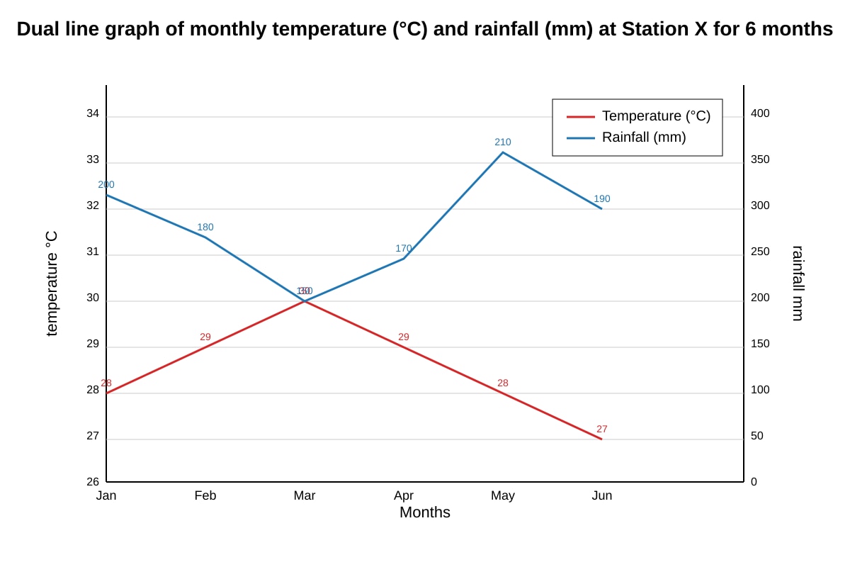
7. Study the line graph of temperature and rainfall at Station X.
Image pending generation: graph for Q7.
State one similarity and one difference between the two lines. [2]
8. A survey used a Likert scale: Strongly Agree (+2), Agree (+1), Disagree (−1), Strongly Disagree (−2). 10 students chose Agree, 5 chose Strongly Disagree for "Park is clean". Calculate the net score. [2]
Section B: Map Skills (Questions 9–14) [12 marks]
9. On a topographic map, contour lines are close together. State what this indicates about the slope. [1]
10. A map has a scale of 1:25 000. Calculate the actual distance (in km) represented by 4 cm on the map. Show working. [2]
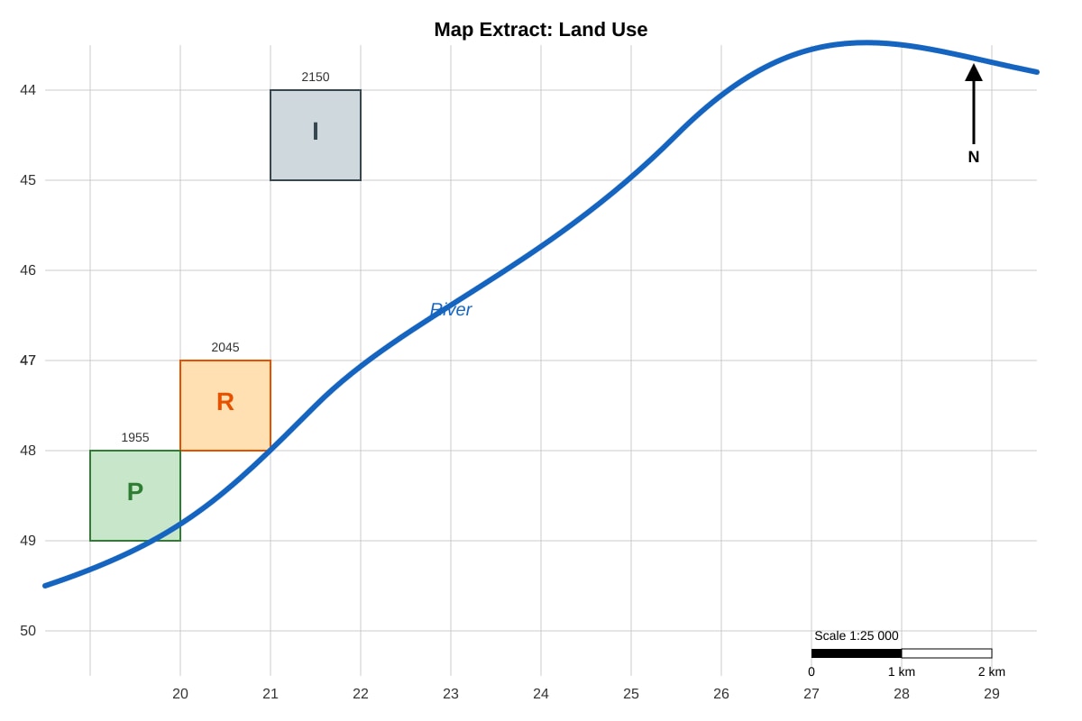
11. Study the map extract showing land use.
Image pending generation: map for Q11.
Give the four-figure grid reference for the industrial zone. [1]
12. Explain why a north arrow is needed on a map. [2]
13. A student uses a map to count the number of bus stops in 5 districts. State one way to present this as a graph. [2]
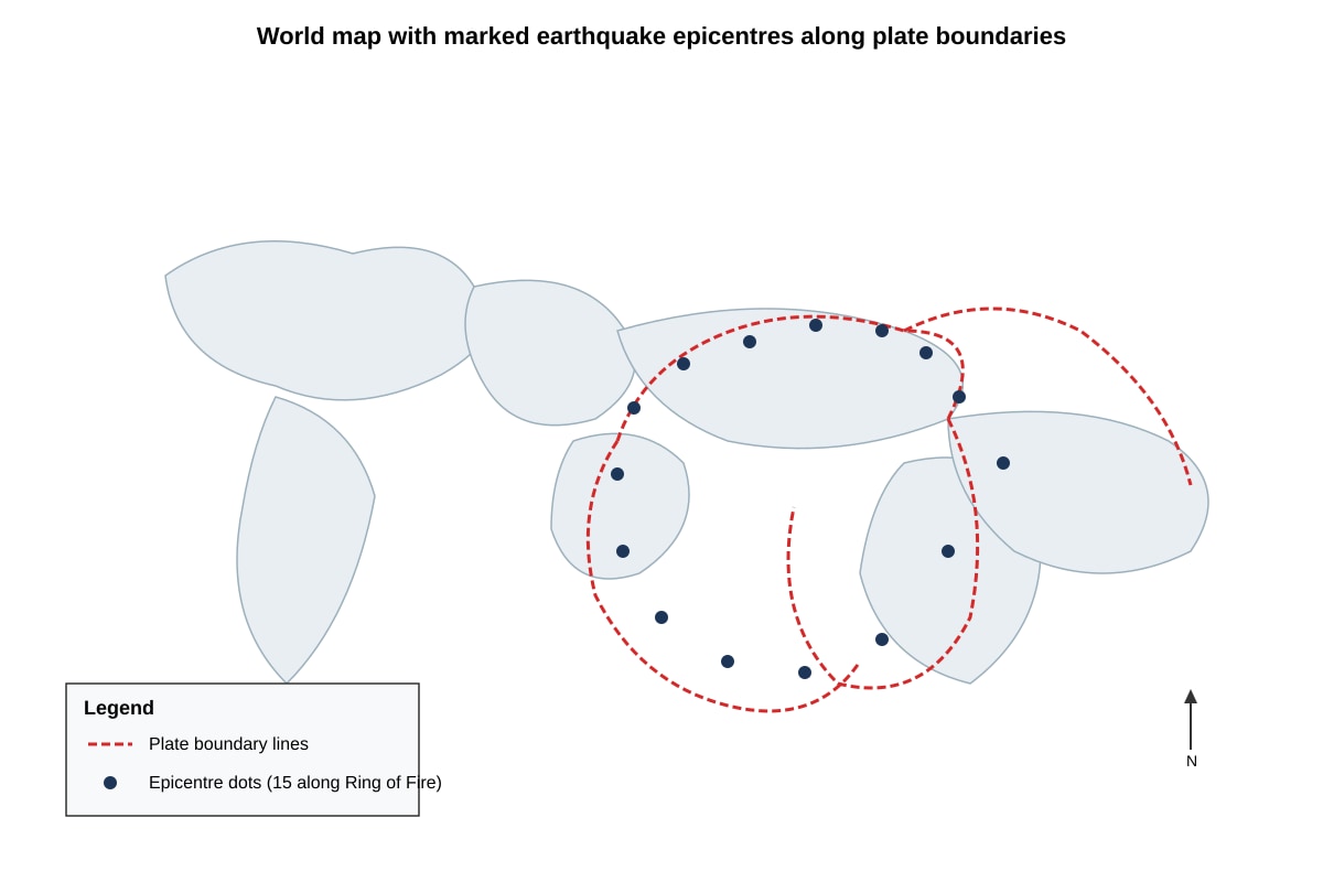
14. Study the map of earthquake epicentres.
Image pending generation: map for Q14.
Describe the spatial pattern of earthquake epicentres. [2]
15. State one advantage of using a GIS layer to show population density instead of a paper map. [2]
Section C: Data Reliability and Evaluation (Questions 16–20) [12 marks]
16. For a study where 20 students counted cars at one road for 10 minutes, evaluate whether the data collection is reliable. [4]
17. Describe how students could calculate positive and negative scores for amenities using a Likert scale (Strongly Agree +2 to Strongly Disagree −2). [2]
18. A bar graph shows energy use by sector. State two rules for drawing a correct bar graph. [2]
19. Study the table of temperature readings.
| Time | 8am | 12pm | 4pm |
|---|---|---|---|
| Temp | 26 | 31 | 29 |
Identify the highest temperature and the time it occurred. [2]
20. A fieldwork study measured noise levels at 3 sites using a phone app on one day. Suggest two improvements to increase reliability. [2]
Answers
TuitionGoWhere Exam Practice (AI) — Geography O-Level Practice Paper Answer Key (Version 1)
Paper: Practice Paper (Map, Graph & Data Skills)
Total Marks: 40
Section A: Graph and Data Interpretation (16 marks)
1. [2 marks]
- Suitable graph: Bar chart (or line graph). [1]
- Reason: Bar chart compares discrete monthly values; line graph shows trend over time. [1]
- Teaching note: Rainfall per month is categorical over time; either is acceptable if justified.
2. [3 marks]
- Use a line graph with months on x-axis. [1]
- Plot two lines, one for Station A, one for Station B. [1]
- Label axes (°C, months), include legend. [1]
- Teaching: Overlay lines on same axes to compare trends directly.
3. [2 marks]
- Visitor numbers fell sharply in 2020, then recovered gradually to 2022. [2] (1 for drop, 1 for recovery)
- From image: 19.0 → 5.5 (drop), then 8.2 → 12.4 (rise).
4. [2 marks]
- Mean = (12+15+9+14+10) ÷ 5 = 60 ÷ 5 = 12 km/h. [2 for working + answer]
- Answer: 12 km/h.
5. [2 marks]
- Locate school symbol on map. [1]
- Use straight-line or route measure to nearest MRT dot. [1]
6. [3 marks]
- Use a bar chart with locations on x-axis, wind speed on y-axis. [2]
- Or overlay line graph if time-series; label legend. [1]
- Teaching: One combined graph, not separate.
7. [2 marks]
- Similarity: Both peak around Mar–Apr (temp 30, rain 150–170). [1]
- Difference: Temp decreases after Mar, rain varies independently. [1]
8. [2 marks]
- Agree: 10 × (+1) = +10
- Strongly Disagree: 5 × (−2) = −10
- Net = +10 + (−10) = 0. [2]
Section B: Map Skills (12 marks)
9. [1 mark] Steep slope.
10. [2 marks]
- Map scale 1:25 000 → 1 cm = 250 m = 0.25 km.
- 4 cm = 4 × 0.25 km = 1.0 km. [2]
11. [1 mark] 2150.
12. [2 marks]
- Shows orientation (which way is north). [1]
- Allows user to align map with ground. [1]
13. [2 marks]
- Bar chart of districts (x) vs bus stop count (y). [2]
14. [2 marks]
- Epicentres concentrated along plate boundaries. [1]
- Especially Pacific Ring of Fire. [1]
15. [2 marks]
- Can layer and query data dynamically (e.g., zoom, filter). [2]
Section C: Data Reliability and Evaluation (12 marks)
16. [4 marks]
- Position: Partially reliable. [1]
- Evidence: Sample short (10 min), single road, 20 observers may differ. [1]
- Explanation: Short window may miss peak; many observers add variance. [1]
- Qualification: 20 students give spread but no repeat days. [1]
17. [2 marks]
- Assign weights: SA +2, A +1, D −1, SD −2. [1]
- Multiply frequency by weight, sum per amenity. [1]
18. [2 marks]
- Equal bar widths. [1]
- Labelled axes and title. [1]
19. [2 marks]
- Highest = 31 °C at 12pm. [2]
20. [2 marks]
- Repeat on multiple days. [1]
- Use calibrated sound meter, not phone. [1]
Free quiz and exam paper access
Enter your details to view this paper
Your access is remembered on this device.