AI Generated Quiz
A Level H2 Geography Map Graph Data Skills Quiz
Free A Level H2 Geography Map Graph Data Skills quiz, HY3 AI version, with questions, answers, and A Level-style practice for Singapore students.
These static practice materials are generated from the site's syllabus and paper-generation workflow, with source and model context shown so students and parents can evaluate the material before use.
Questions
A-Level Geography H2 Quiz - Map Graph Data Skills
Name: ___________________________
Class: ___________________________
Date: ___________________________
Score: _______ / 40
Duration: 50 minutes
Total Marks: 40
Instructions: This quiz tests map, graph, and data interpretation skills aligned to the H2 Geography (9173) syllabus. Answer all 20 questions. Use the resources provided. Write clearly in the spaces given.
Section A: Map Reading and Classification (Questions 1–5)
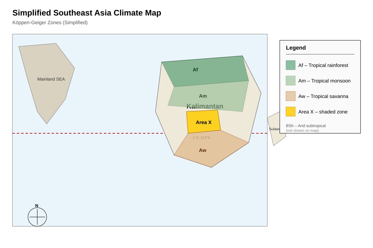
1. Study the climate map below. Identify the Köppen-Geiger climatic zone of the shaded area labelled X in central Kalimantan, Indonesia. [2]
Image pending generation: map for Q1.
2. Using the same map (Q1-fig1), name two physical characteristics that distinguish the humid tropics from the arid tropics on the map. [2]
3. A choropleth map shows population density (persons/km²) across five districts: A (12), B (48), C (205), D (89), E (340). State the class interval width if the map uses equal intervals from 0–400 with 4 classes. [1]
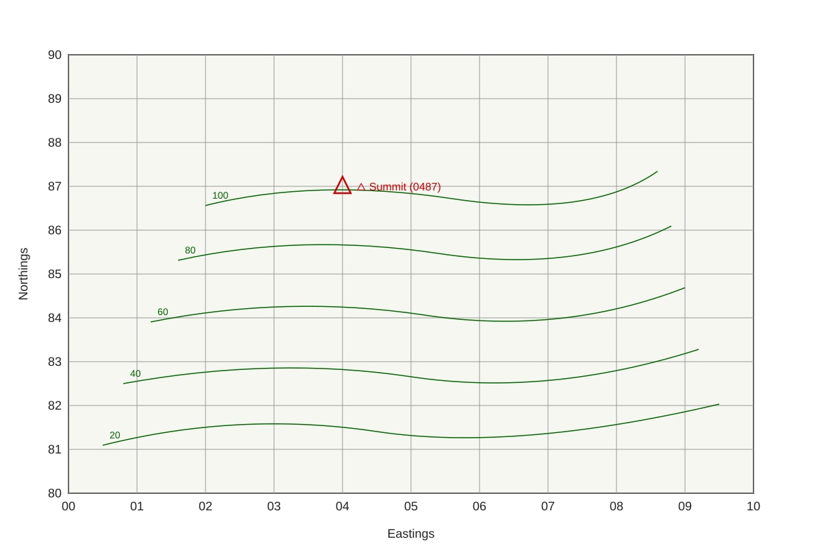
4. Refer to the topographic extract below. Identify the grid reference (to nearest 100 m) of the highest point marked with a triangle. [2]
Image pending generation: map for Q4.
5. Explain one strength and one limitation of using a choropleth map to show regional development indicators. [3]
Section B: Graph and Chart Interpretation (Questions 6–12)
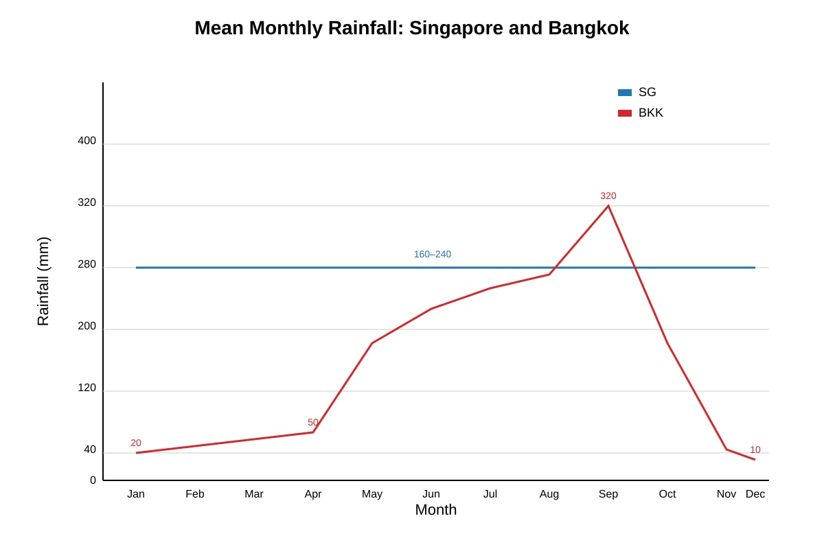
6. The line graph below shows mean monthly rainfall (mm) for Singapore and Bangkok. Describe the rainfall seasonality pattern of Bangkok. [3]
Image pending generation: graph for Q6.
7. Using Q6-fig1, calculate the difference in total annual rainfall between Singapore and Bangkok. Show your working. [3]
8. A bar chart shows CO₂ emissions (Mt) for 2010 and 2020 for four countries:
Indonesia 410→620, Malaysia 180→250, Thailand 250→330, Vietnam 150→340.
Compare the percentage increase in emissions for Vietnam and Indonesia. [3]
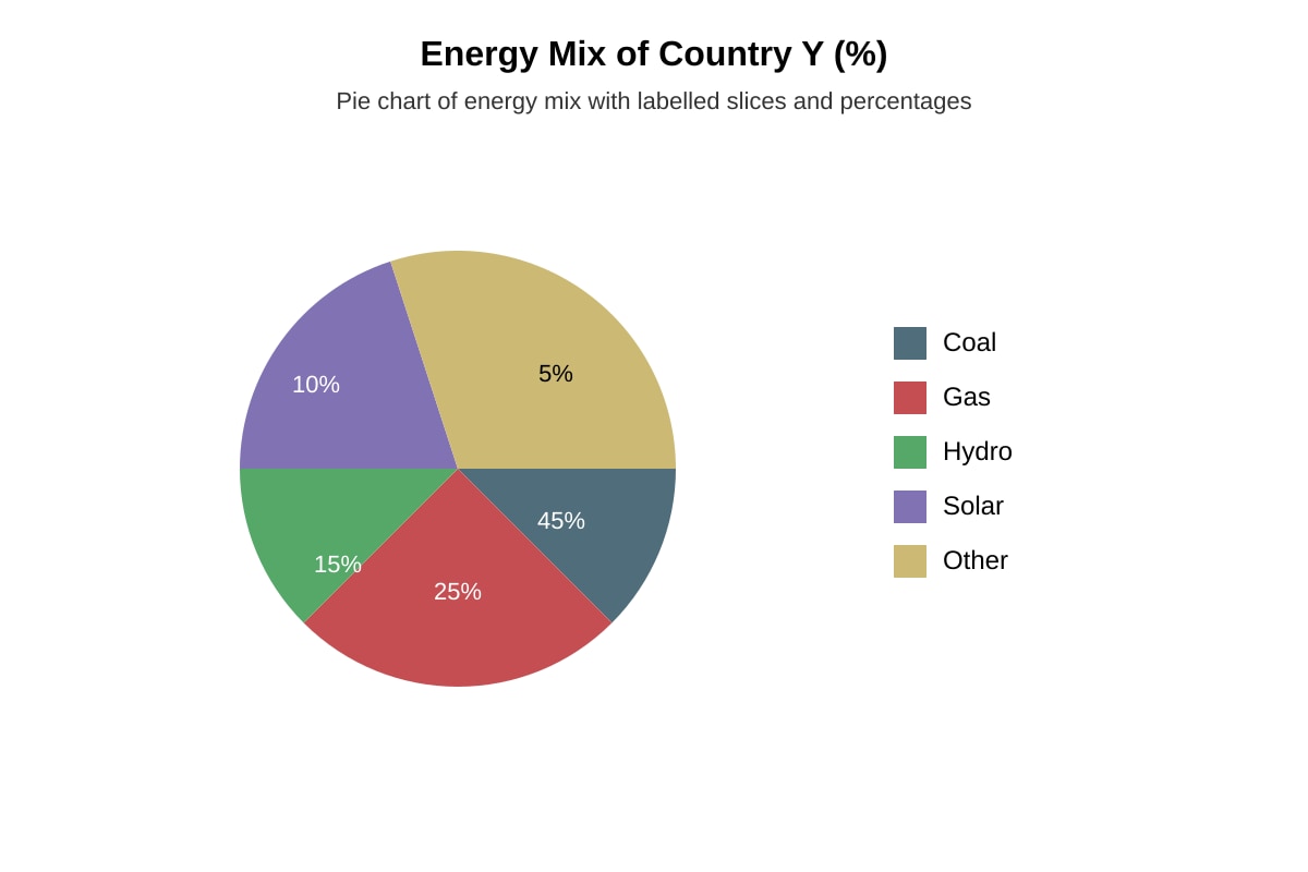
9. The pie chart below shows energy mix (%) of Country Y: Coal 45, Gas 25, Hydro 15, Solar 10, Other 5. State the two largest sources and their combined share. [2]
Image pending generation: chart for Q9.
10. A scatter plot shows GDP per capita (x) vs Ecological Footprint (y) for 10 Asian economies with r = 0.82. State what the correlation suggests. [2]
11. Using the scatter plot in Q10, explain why a high correlation does not prove causation. [2]
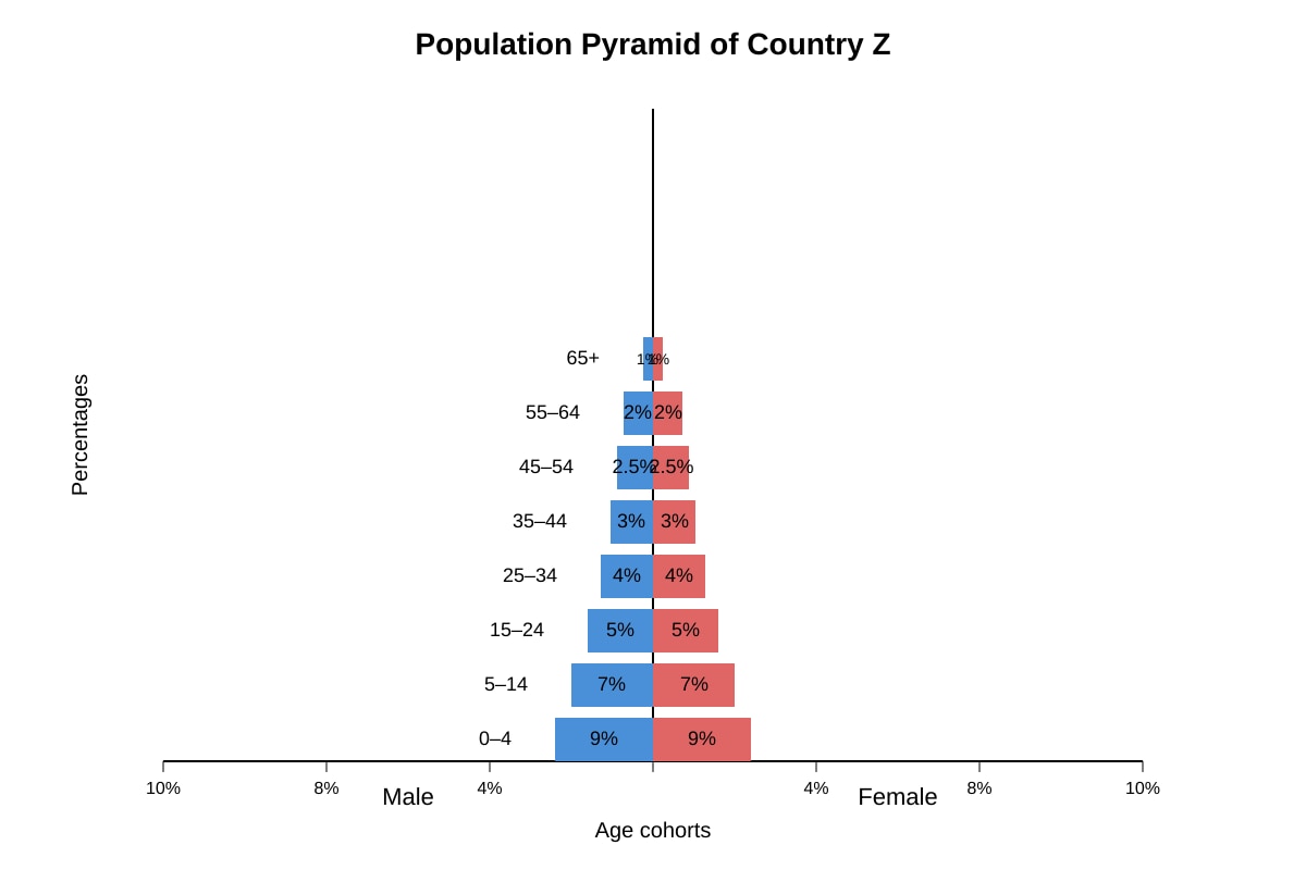
12. The population pyramid below shows Country Z with wide base and narrow top. Identify the demographic stage and one implication. [3]
Image pending generation: graph for Q12.
Section C: Data Table and Composite Skills (Questions 13–20)
13. Table below shows HDI and Forest Area (%) for 4 nations.
| Nation | HDI | Forest % |
|---|---|---|
| A | 0.92 | 38 |
| B | 0.65 | 62 |
| C | 0.78 | 45 |
| D | 0.51 | 71 |
State the relationship between HDI and forest area evident from the table. [2]
14. Using the table in Q13, calculate the mean forest area percentage. [2]
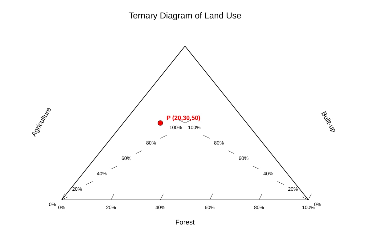
15. A triangular graph (ternary) shows land use: agriculture, built-up, forest for 5 towns. Town P is at 20% agri, 30% built, 50% forest. State Town P's built-up share. [1]
Image pending generation: graph for Q15.
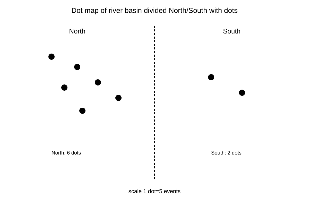
16. Resource below is a dot map of flood occurrences in a river basin (1 dot = 5 events). Region North has 6 dots, South has 2. Calculate total events in North. [2]
Image pending generation: map for Q16.
17. Using Q16-fig1, suggest one reason why North has more flood events than South based on drainage density. [2]
18. The table shows temperature anomaly (°C) by decade: 1980s +0.2, 1990s +0.4, 2000s +0.7, 2010s +1.0. Describe the trend. [2]
19. A cartogram resizes countries by carbon emissions. State one advantage over a standard map for communicating emissions. [2]
20. Evaluate the usefulness of combining a map and a line graph in one figure to show coastal erosion rates. [3]
Answers
A-Level Geography H2 Quiz - Map Graph Data Skills (Answer Key)
Total Marks: 40
Topic: Map Graph Data Skills (syllabus-aligned, AI-generated from Stage 4 patterns; not past-year derived)
Section A Answers (Q1–5)
Q1 [2]
Answer: Area X is classified as Aw (tropical savanna).
Teaching note: Köppen-Geiger zones in the humid tropics include Af (rainforest), Am (monsoon), Aw (savanna). Central Kalimantan at 1°S with Aw to south and Af to north places X in the transitional savanna zone. 1 mark for zone, 1 mark for correct code Aw.
Q2 [2]
Answer: (i) Humid tropics show high and year-round rainfall (Af/Am); arid tropics (BSh) show low rainfall. (ii) Humid tropics have denser vegetation; arid have sparse.
Marking: 1 mark each characteristic. Common mistake: confusing BWh (desert) with BSh (steppe).
Q3 [1]
Answer: Class width = 400 ÷ 4 = 100 persons/km².
Teaching: Equal interval = (max–min)/classes = 400/4.
Q4 [2]
Answer: Grid reference 0487 (easting 04, northing 87).
Note: Four-figure grid reference uses first two digits of easting and northing.
Q5 [3]
Answer: Strength: easy visual comparison of spatial variation (1). Limitation: masks variation within districts (1); arbitrary class boundaries can mislead (1).
Marking: 1+1 for valid pair, 1 for explanation quality.
Section B Answers (Q6–12)
Q6 [3]
Answer: Bangkok has a marked wet season Sep–Oct (peak ~320 mm) and dry season Nov–Mar (<40 mm); strongly seasonal unlike Singapore.
Marking: 1 monsoon peak, 1 dry period, 1 contrast with aperiodic SG.
Q7 [3]
Working: BKK annual = 20+30+50+50+150+200+250+300+320+250+80+10 = 1710 mm. SG ≈ 12×200 = 2400 mm (using mid 200). Diff = 2400–1710 = 690 mm.
Marks: 1 calculation BKK, 1 SG, 1 difference.
Q8 [3]
Vietnam: (340–150)/150×100 = 127%. Indonesia: (620–410)/410×100 = 51%. Vietnam's increase >2× Indonesia's.
Marks: 1 each % , 1 comparison.
Q9 [2]
Answer: Coal (45%) and Gas (25%); combined 70%.
1 mark each part.
Q10 [2]
Answer: Strong positive correlation (r=0.82) suggests higher GDP associates with larger footprint.
1 for positive, 1 for interpretation.
Q11 [2]
Answer: Correlation shows association not cause; other factors (technology, policy) may drive both.
1 mark each.
Q12 [3]
Answer: Early/expanding stage (1); implication: high youth dependency, future labour surge (2).
Marks: 1 stage, 2 implication.
Section C Answers (Q13–20)
Q13 [2]
Answer: Negative relationship – higher HDI links to lower forest % (A high HDI low forest). 1 mark trend, 1 example.
Q14 [2]
Mean = (38+62+45+71)/4 = 216/4 = 54%. 1 working, 1 answer.
Q15 [1]
Answer: 30% built-up.
Q16 [2]
6 dots × 5 = 30 events. 1 calc, 1 answer.
Q17 [2]
Answer: North likely higher drainage density → faster runoff (1); more impervious surface (1).
Q18 [2]
Answer: Steady rise +0.2 to +1.0 °C per decade (1); warming accelerating (1).
Q19 [2]
Answer: Emphasises magnitude not land area (1); avoids bias of large countries (1).
Q20 [3]
Answer: Map shows spatial pattern (1), line graph shows temporal change (1), together reveal location-specific trends for policy (1).
Marking descriptors: 3 = clear synergy, 2 = partial, 1 = single merit.
Free quiz and exam paper access
Enter your details to view this paper
Your access is remembered on this device.