AI Generated Quiz
A Level H2 Geography Map Graph Data Skills Quiz
Free A Level H2 Geography Map Graph Data Skills quiz, AI version, with questions, answers, and A Level-style practice for Singapore students.
These static practice materials are generated from the site's syllabus and paper-generation workflow, with source and model context shown so students and parents can evaluate the material before use.
Questions

Free quiz and exam paper access
Enter your details to view this paper
Your access is remembered on this device.
Answers
A-Level Geography H2 Quiz - Map Graph Data Skills: Answer Key
Total Marks: 60
Section A: Map Skills and Interpretation (Questions 1–5)
Question 1 [6 marks]
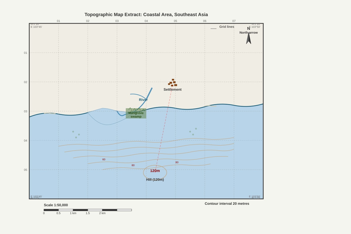
(a) Four-figure grid reference of the mangrove swamp area: [1 mark]
Answer: The answer will depend on the specific map extract. A typical answer would be something like "Grid reference 1234" (the grid square containing the mangrove symbol).
Explanation: Four-figure grid references identify a 1km x 1km grid square on a 1:50,000 map. To give a four-figure reference, read the easting (vertical line) number from the left of the square, then the northing (horizontal line) number from the bottom of the square.
Marking note: Accept any grid square that clearly contains the mangrove symbol.
(b) Straight-line distance from settlement centre to hill summit: [2 marks]
Answer: Using a 1:50,000 scale, 1cm on the map = 0.5km on the ground. If the measured distance on the map is, for example, 4.6cm, then the actual distance = 4.6 × 0.5 = 2.3km.
Explanation:
- Measure the straight-line distance on the map using a ruler (in cm or mm).
- Convert using the scale: 1:50,000 means 1cm = 50,000cm = 500m = 0.5km.
- Multiply the measured distance by 0.5 to get the distance in km.
Marking note: Award 1 mark for correct method (showing conversion using scale), 1 mark for correct final answer with units. Accept answers within ±0.2km of the calculated value.
(c) Description of relief: [3 marks]
Model answer: The area shows undulating relief with a coastal plain rising gently inland. The maximum height is 120m at the hill summit. The coastline is irregular with a bay and river mouth. Contour lines are widely spaced near the coast, indicating gentle slopes, but become closer together inland, indicating steeper slopes approaching the hill. The river flows from the hill area to the sea, suggesting a general eastward slope.
Explanation: Relief description should include:
- General shape of the land (flat, undulating, hilly, mountainous)
- Maximum and minimum heights
- Slope characteristics (gentle, steep, concave, convex)
- Drainage patterns
- Relationship between landforms
Marking scheme:
- 1 mark: Identifies overall relief type (e.g., coastal plain rising to hill)
- 1 mark: References specific heights and slope characteristics
- 1 mark: Mentions drainage pattern or relationship between landforms
Question 2 [4 marks]
(a) Vertical exaggeration: [2 marks]
Answer:
- Horizontal scale: 1:50,000 (1cm = 500m = 50,000cm)
- Vertical scale: From the cross-section, if 1cm = 40m = 4,000cm
- Vertical exaggeration = Vertical scale / Horizontal scale
- = 1/4,000 ÷ 1/50,000
- = 1/4,000 × 50,000/1
- = 50,000/4,000
- = 12.5 times
Explanation: Vertical exaggeration is the ratio of the vertical scale to the horizontal scale. It shows how many times the vertical dimension has been exaggerated compared to the horizontal dimension. To calculate:
- Determine the vertical scale from the cross-section (e.g., 1cm = 40m).
- Convert both scales to the same units (cm).
- Divide the vertical scale denominator by the horizontal scale denominator.
Marking note: Award 1 mark for correct method, 1 mark for correct final answer. Accept answers between 12 and 13.
(b) Advantage of cross-section: [2 marks]
Model answer: A cross-section provides a visual representation of the vertical dimension of the landscape, making it easier to see the shape and steepness of slopes, the height of features, and the relative relief. On a topographic map, relief is shown by contour lines which require interpretation to visualise the three-dimensional shape. A cross-section directly shows the profile of the land, allowing for immediate comparison of heights and gradients.
Explanation: Key advantages include:
- Direct visualisation of slope angle and shape
- Easy comparison of heights between points
- Ability to see 'hidden' features like valleys between hills
- Useful for planning routes, pipelines, or understanding visibility
Marking note: Award 1 mark for identifying a valid advantage, 1 mark for explanation with reference to the contrast with topographic maps.
Question 3 [4 marks]
(a) Relationship between slope angle and canopy cover: [2 marks]
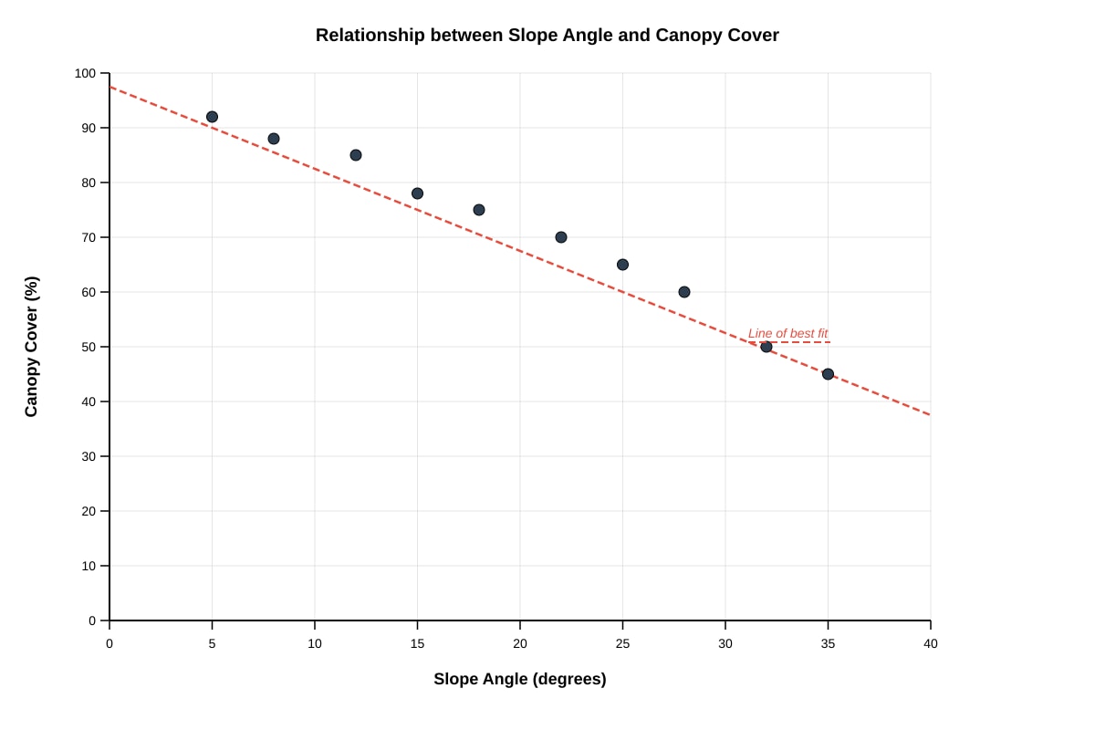
Model answer: There is a negative correlation between slope angle and canopy cover. As slope angle increases, canopy cover decreases. On gentle slopes (5°), canopy cover is high (92%), while on steep slopes (35°), canopy cover is much lower (45%). The relationship appears to be approximately linear.
Explanation: A negative correlation means that as one variable increases, the other decreases. The description should:
- State the type of relationship (negative/inverse correlation)
- Use data points to support the description
- Comment on the strength of the relationship
Marking note: Award 1 mark for identifying negative correlation, 1 mark for using data to support the description.
(b) Reason for the relationship: [2 marks]
Model answer: On steeper slopes, soil depth is often thinner due to erosion, and water drains more quickly, leading to drier conditions. This makes it more difficult for large trees to establish stable root systems and access sufficient water and nutrients. Consequently, vegetation on steep slopes may be sparser with smaller trees, resulting in lower canopy cover. Additionally, steep slopes may be more prone to landslides and mass movement, which disturbs vegetation and prevents the development of a dense canopy.
Explanation: Possible reasons include:
- Thinner soils on steep slopes (soil erosion)
- Faster drainage and lower water availability
- Greater instability (landslides, mass movement)
- Reduced nutrient availability
- Difficulty for tree root establishment
Marking note: Award 1 mark for a valid reason, 1 mark for explanation linking the reason to the observed pattern.
Question 4 [5 marks]
(a) Total annual rainfall: [1 mark]
Answer: 250 + 200 + 180 + 120 + 80 + 60 + 40 + 50 + 100 + 150 + 220 + 280 = 1,730 mm
Explanation: Sum all monthly rainfall values. Ensure all values are added correctly.
(b) Description of rainfall regime: [2 marks]
Model answer: The station has a distinct seasonal rainfall pattern with a wet season from November to March (peak in December at 280mm) and a dry season from June to August (lowest in July at 40mm). The total annual rainfall of 1,730mm indicates a humid climate. The difference between the wettest and driest months is 240mm, showing a strong seasonal contrast.
Explanation: Rainfall regime description should include:
- Total annual rainfall
- Seasonal pattern (wet/dry seasons)
- Months of maximum and minimum rainfall
- Magnitude of seasonal variation
Marking note: Award 1 mark for identifying wet and dry seasons with months, 1 mark for using data to quantify the pattern.
(c) Köppen climate classification: [2 marks]
Model answer: The most likely classification is Am (Tropical Monsoon) . The temperature remains high throughout the year (26-28°C), which is characteristic of tropical climates. The rainfall pattern shows a distinct dry season (June-August with less than 60mm per month) but the total annual rainfall exceeds 1,500mm, which distinguishes it from Aw (Tropical Savanna). The short dry season and heavy monsoon rains are typical of the Am climate type.
Explanation:
- Af (Tropical Rainforest): No dry season; all months >60mm rainfall
- Am (Tropical Monsoon): Short dry season but total rainfall high enough to support rainforest
- Aw (Tropical Savanna): Distinct dry season with lower total rainfall
Marking note: Award 1 mark for correct classification (Am), 1 mark for valid reasoning using temperature and rainfall data.
Question 5 [4 marks]
(a) Strength and limitation of choropleth map: [2 marks]
Model answer:
- Strength: Choropleth maps are easy to understand and provide a clear visual impression of spatial patterns. The shading allows for quick comparison between different administrative areas.
- Limitation: Choropleth maps give the impression of uniform values within each administrative unit, which may not reflect the actual distribution. Population is often concentrated in specific areas within a district, but the map shows the same shade for the entire district.
Explanation:
- Strengths: Easy to construct and interpret, good for showing regional patterns, uses familiar administrative boundaries
- Limitations: Assumes uniformity within areas, can be misleading with large or irregularly shaped areas, boundary changes affect comparability, difficult to show fine-scale variations
Marking note: Award 1 mark for a valid strength, 1 mark for a valid limitation. Both must be clearly explained.
(b) Alternative mapping technique: [2 marks]
Model answer: A dot distribution map would be more accurate for representing population distribution. Each dot represents a specific number of people (e.g., 1,000 people per dot), and dots are placed where people actually live rather than being spread evenly across administrative boundaries. This would show the concentration of population in urban areas and along the coast, and the sparse population in rural inland areas, providing a more realistic representation of population distribution.
Explanation: Alternative techniques include:
- Dot distribution map: Shows actual location of population
- Proportional symbol map: Uses symbols of different sizes at specific locations
- Isopleth map: Uses lines of equal population density (more complex but shows gradation)
Marking note: Award 1 mark for suggesting an appropriate alternative technique, 1 mark for explaining why it is more accurate.
Section B: Graph Skills and Data Presentation (Questions 6–10)
Question 6 [7 marks]
(a) Comparative bar graph: [4 marks]
Model answer: The graph should show:
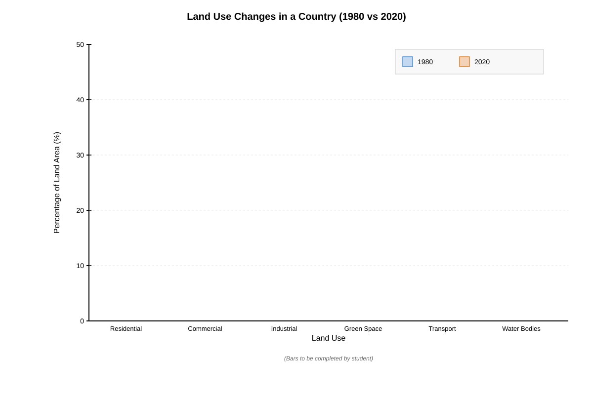
- X-axis: Six land use categories (Residential, Commercial, Industrial, Green Space, Transport, Water Bodies)
- Y-axis: Percentage of Land Area (%), scale 0-50%
- Two bars per category: one for 1980 (e.g., shaded/coloured) and one for 2020 (e.g., different shading/colour)
- Legend indicating which bar represents which year
- Appropriate title: "Land Use Change in Coastal City, 1980 and 2020"
Explanation: A comparative bar graph (also called grouped bar chart) allows direct visual comparison between two data sets across multiple categories. Key construction requirements:
- Equal bar widths
- Consistent spacing between groups
- Clear axis labels with units
- Legend to distinguish the two years
- Appropriate scale on y-axis
Marking scheme:
- 1 mark: Correct axes with labels and units
- 1 mark: Appropriate scale on y-axis
- 1 mark: All 12 bars plotted correctly
- 1 mark: Legend and title present
(b) Two major changes in land use: [2 marks]
Model answer:
- Residential land use increased from 25% to 40%, a 15% increase, suggesting population growth and urban expansion.
- Industrial land use decreased from 30% to 10%, a 20% decrease, indicating deindustrialisation or relocation of industries.
Explanation: Look for the largest changes between 1980 and 2020. The most significant changes are:
- Residential: +15%
- Commercial: +10%
- Industrial: -20%
- Green Space: -5%
Marking note: Award 1 mark for each valid change identified with supporting data.
(c) Reason for change in industrial land use: [1 mark]
Model answer: The decrease in industrial land use could be due to deindustrialisation as the city transitions from a manufacturing-based economy to a service-based economy. Industries may have relocated to areas with lower land costs and labour costs, or to industrial parks outside the city centre.
Explanation: Possible reasons include:
- Economic restructuring (shift from secondary to tertiary sector)
- Relocation of industries to suburbs or other regions
- Environmental regulations pushing industries out of residential areas
- Land use competition (industrial land redeveloped for residential/commercial)
Marking note: Accept any plausible reason.
Question 7 [4 marks]
(a) Dominant port and total trade volume: [2 marks]
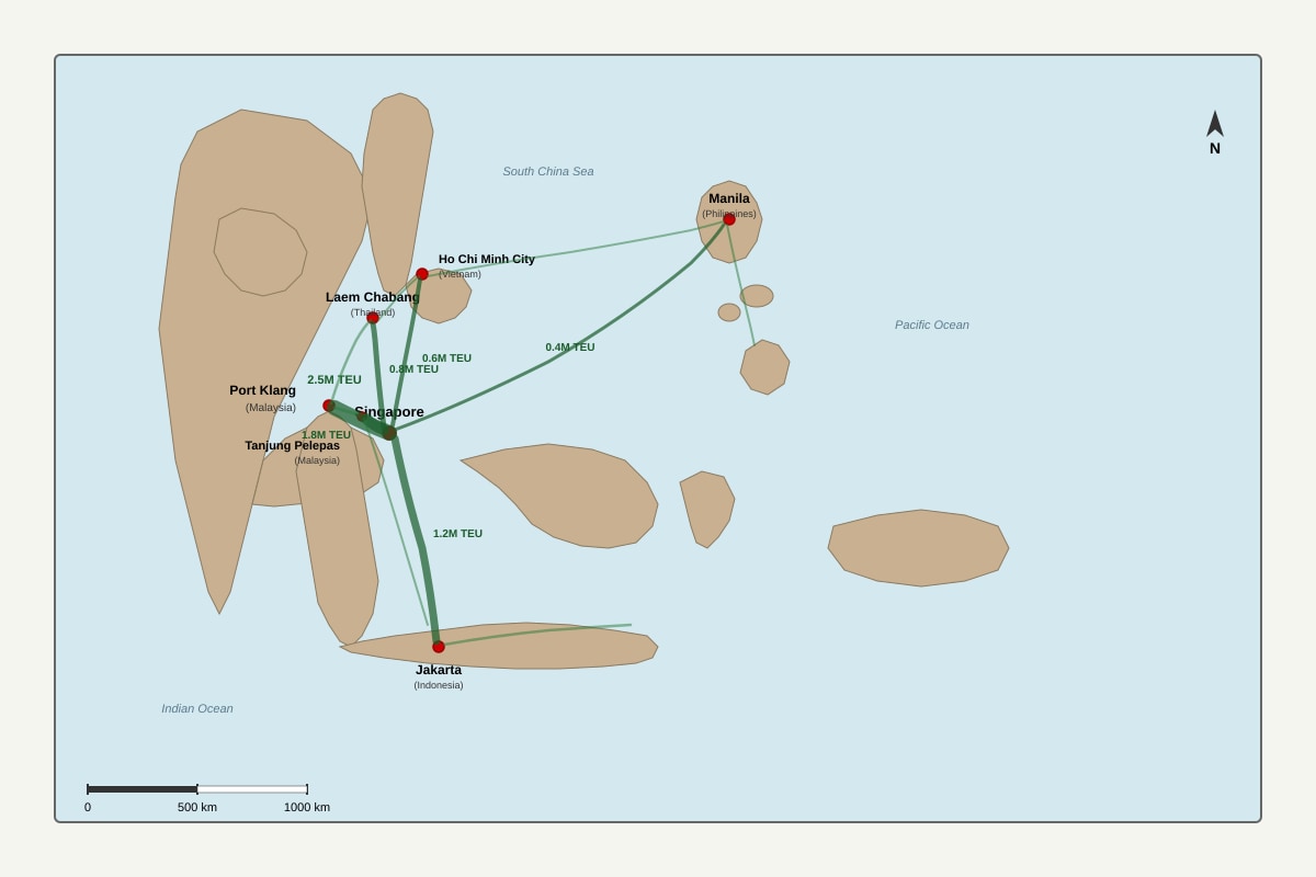
Model answer: Singapore is the dominant port in the network. The total volume of container trade handled by Singapore with the other ports shown is: 2.5 + 1.8 + 1.2 + 0.8 + 0.6 + 0.4 = 7.3 million TEU.
Explanation: The dominant port is identified by the thickest flow lines connecting to it. Sum all the TEU values on flow lines connected to Singapore.
Marking note: Award 1 mark for identifying Singapore, 1 mark for correct total with units.
(b) Advantage of flow line map: [2 marks]
Model answer: A flow line map effectively shows both the direction and volume of movement between places. The width of the flow lines is proportional to the volume of trade, allowing for immediate visual comparison of the importance of different trade routes. This makes it easy to identify the busiest routes and the dominant ports in the network.
Explanation: Advantages of flow line maps:
- Show direction of movement
- Show volume/quantity through line width
- Allow comparison between different routes
- Can show complex networks
- Effective for showing trade, migration, transport flows
Marking note: Award 1 mark for identifying a valid advantage, 1 mark for explanation.
Question 8 [6 marks]
(a) Plotting data and line of best fit: [3 marks]
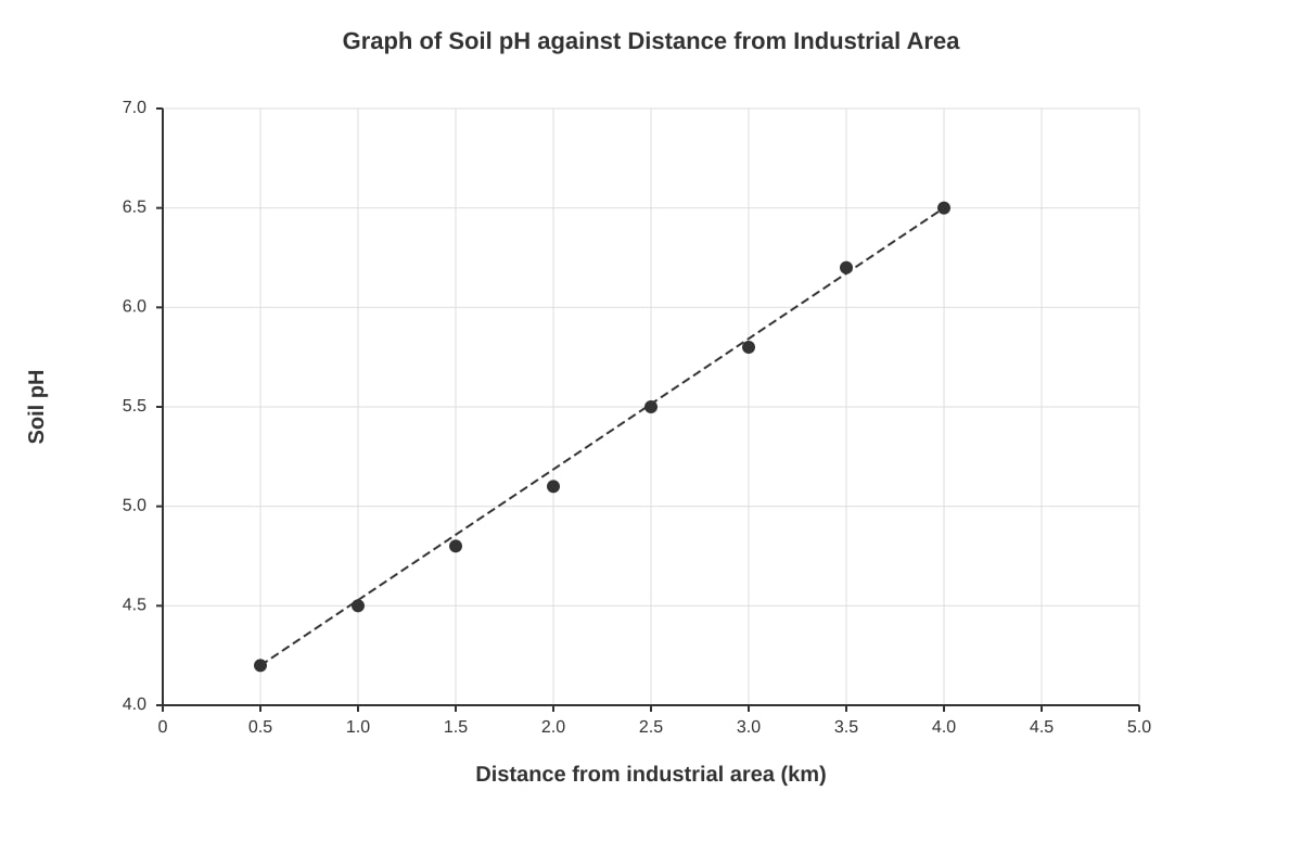
Model answer: The graph should show:
- X-axis: Distance from industrial area (km), scale 0-5km
<stage5_quiz_answers_md>
A-Level Geography H2 Quiz - Map Graph Data Skills: Answer Key
Total Marks: 60
Section A: Map Skills and Interpretation (Questions 1–5)
1. (a) Four-figure grid reference of the mangrove swamp area: [Accept any reasonable grid reference that falls within the mangrove area on the map extract, e.g., 2345] [1]
(b) Straight-line distance from settlement centre to hill summit: [Accept answers between 2.8 km and 3.2 km depending on map measurement. Example calculation: Measured distance on map = 6 cm. 6 cm × 50,000 = 300,000 cm = 3.0 km] [2]
(c) Description of relief: [Award marks for valid observations such as:] [3]
- The land rises gently from the coast inland, with the hill reaching 120 metres.
- The coastal area is low-lying (near sea level) with a mangrove swamp.
- The river flows from the higher inland area to the sea.
- Slopes are generally gentle near the coast and become steeper towards the hill.
- The hill summit at 120m is the highest point in the extract.
2. (a) Vertical exaggeration calculation: [2]
- Horizontal scale = 1:50,000, so 1 cm on map = 50,000 cm = 500 m on ground.
- Vertical scale: Assume the cross-section uses 1 cm = 20 m (based on the y-axis scale of 0-160m over 8 cm).
- Vertical scale as a ratio = 1 cm : 20 m = 1 : 2000 cm.
- Vertical exaggeration = Horizontal scale ÷ Vertical scale = 50,000 ÷ 2,000 = 25 times (or 25×).
- [Award full marks for correct calculation and working; partial marks for correct method but arithmetic error]
(b) Advantage of cross-section over topographic map: [2]
- A cross-section provides a clear visual representation of the shape of the land (e.g., steepness, flat areas, valleys) that is not immediately obvious from contour lines alone.
- It allows for direct comparison of relative heights and slopes along a specific transect, making it easier to interpret the terrain for planning or analysis.
3. (a) Relationship between slope angle and canopy cover: [2]
- There is a negative correlation between slope angle and canopy cover.
- As slope angle increases, canopy cover decreases (from ~92% at 5° to ~45% at 35°).
(b) Reason for this relationship: [2]
- Steeper slopes have thinner, less developed soils and are more prone to erosion, making it harder for large trees to establish and grow.
- Steeper slopes may also have less water retention and higher runoff, reducing moisture availability for dense vegetation.
- [Accept any reasonable geographical explanation]
4. (a) Total annual rainfall: [1]
- 250 + 200 + 180 + 120 + 80 + 60 + 40 + 50 + 100 + 150 + 220 + 280 = 1730 mm
(b) Rainfall regime description: [2]
- The station has a distinct seasonal pattern with a wet season (November to March) and a drier season (June to August).
- The wettest months are December (280 mm) and January (250 mm), while the driest month is July (40 mm).
- Rainfall is generally high throughout the year (all months above 40 mm), indicating a tropical climate with a pronounced dry period.
(c) Köppen climate classification: [2]
- Am (Tropical Monsoon) – because total annual rainfall is high (>1500 mm) and there is a distinct dry season (monthly rainfall below 60 mm for several months, e.g., June-August).
- [Award marks for correct classification and a valid reason based on rainfall data]
5. (a) Strength and limitation of choropleth map: [2]
- Strength: It provides a quick visual impression of spatial patterns of population density across districts, allowing easy comparison between areas.
- Limitation: It assumes uniform density within each district, which may hide internal variations; also, the choice of class intervals can distort the visual impression.
(b) Alternative mapping technique: [2]
- Dot distribution map – each dot represents a fixed number of people, placed more accurately according to actual population distribution, giving a more precise picture of where people live.
- [Accept proportional symbol map or dasymetric map with valid explanation]
Section B: Graph Skills and Data Presentation (Questions 6–10)
6. (a) Comparative bar graph construction: [4]
- [Award marks for:]
- Correctly labelled axes (Land Use on x-axis, Percentage on y-axis) with appropriate scale (0-50%).
- Two bars per land use category (1980 and 2020) drawn to correct heights.
- Clear legend distinguishing 1980 and 2020.
- Neat, accurate presentation with title.
(b) Two major changes in land use: [2]
- Residential land increased from 25% to 40% (a significant increase).
- Industrial land decreased from 30% to 10% (a major decline).
- Commercial land increased from 5% to 15%.
(c) Reason for change in industrial land: [1]
- Deindustrialisation / shift to service-based economy, or relocation of factories to cheaper locations (e.g., overseas or outskirts).
- [Accept any valid reason]
7. (a) Dominant port and total trade volume: [2]
- Singapore is the dominant port.
- Total trade volume with other ports shown: 2.5 + 1.8 + 1.2 + 0.8 + 0.6 + 0.4 = 7.3 million TEU
(b) Advantage of flow line map: [2]
- It clearly shows the direction and volume of trade between locations at a glance.
- The width of the lines allows for immediate visual comparison of the relative importance of different trade routes.
8. (a) Graph plotting: [3]
- [Award marks for:]
- Correctly plotted axes (Distance on x-axis, pH on y-axis) with appropriate scales.
- All 8 data points plotted accurately.
- A line of best fit drawn through the points (showing a positive linear trend).
(b) Trend: [1]
- Soil pH increases with distance from the industrial area (from 4.2 at 0.5 km to 6.5 at 4.0 km).
(c) Reason for trend: [2]
- Industrial emissions (e.g., sulphur dioxide, nitrogen oxides) cause acid rain, which lowers soil pH near the source.
- As distance increases, the concentration of acidic pollutants decreases, allowing soil pH to return to more natural levels.
- [Accept any valid reason]
9. (a) Classification of settlement B: [1]
- Primary (60% primary sector workers – dominant).
(b) Settlements with balanced economy (no sector >50%): [2]
- Point D (40% primary, 40% secondary, 20% tertiary)
- Point I (50% primary, 30% secondary, 20% tertiary) – note: primary is exactly 50%, not exceeding it.
- [Award marks for correct identification of D and I]
(c) Advantage of triangular graph: [2]
- It allows three variables (primary, secondary, tertiary) to be displayed simultaneously on a two-dimensional graph.
- It makes it easy to compare the economic structure of multiple settlements and identify groups with similar characteristics.
10. (a) Gini coefficient calculation: [4]
- Using the formula: Gini = 1 - Σ[(Xᵢ - Xᵢ₋₁)(Yᵢ + Yᵢ₋₁)]
- Data points (X, Y): (0,0), (0.2, 0.05), (0.4, 0.15), (0.6, 0.30), (0.8, 0.55), (1.0, 1.0)
- Σ[(Xᵢ - Xᵢ₋₁)(Yᵢ + Yᵢ₋₁)] =
- (0.2 - 0)(0.05 + 0) = 0.2 × 0.05 = 0.01
- (0.4 - 0.2)(0.15 + 0.05) = 0.2 × 0.20 = 0.04
- (0.6 - 0.4)(0.30 + 0.15) = 0.2 × 0.45 = 0.09
- (0.8 - 0.6)(0.55 + 0.30) = 0.2 × 0.85 = 0.17
- (1.0 - 0.8)(1.00 + 0.55) = 0.2 × 1.55 = 0.31
- Sum = 0.01 + 0.04 + 0.09 + 0.17 + 0.31 = 0.62
- Gini = 1 - 0.62 = 0.38
- [Award full marks for correct answer with working; partial marks for correct method but arithmetic error]
(b) Interpretation of Gini coefficient: [1]
- A Gini coefficient of 0.38 indicates a moderate level of income inequality in Country X (on a scale where 0 = perfect equality and 1 = perfect inequality).
Section C: Data Analysis and Interpretation (Questions 11–15)
11. (a) Relationship between GDP per capita and Ecological Footprint: [2]
- There is a positive correlation – as GDP per capita increases, the ecological footprint also tends to increase.
- However, the relationship is not perfectly linear; there is scatter, suggesting other factors influence the footprint.
(b) Explanation of relationship: [2]
- Higher GDP per capita is associated with higher consumption levels (more energy, goods, meat, travel), leading to a larger ecological footprint.
- [Accept any valid explanation]
12. (a) Mean, median, and mode for the dataset: [3]
- Data: 12, 15, 18, 22, 25, 28, 30, 35, 40, 45
- Mean = (12+15+18+22+25+28+30+35+40+45) / 10 = 270 / 10 = 27.0
- Median = (25 + 28) / 2 = 26.5
- Mode = No mode (all values occur once) – [Award mark for stating 'no mode' or 'none']
(b) Which measure is most appropriate: [2]
- Median is most appropriate because the data may contain outliers (e.g., 45) that would skew the mean; the median is less affected by extreme values.
- [Accept mean if justified, but median is preferred for skewed data]
13. (a) Interpretation of the dispersion diagram: [2]
- [Award marks for valid observations such as:]
- The data shows a wide spread of values, with a range from approximately 10 to 50.
- The median is around 25-30, with the interquartile range spanning roughly 18 to 38.
- There may be outliers at the upper end.
(b) Advantage of dispersion diagram over simple mean: [2]
- It shows the spread and distribution of the data, not just the central tendency.
- It allows identification of outliers, skewness, and the variability within the dataset, which is important for understanding the reliability of the data.
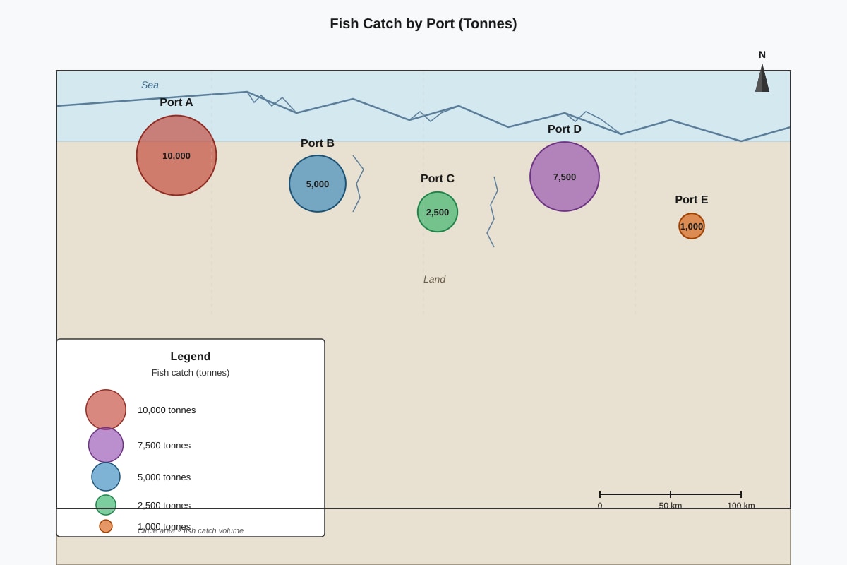
14. (a) Interpretation of the proportional symbol map: [2]
- [Award marks for valid observations such as:]
- The largest symbols are concentrated in the urban/coastal areas, indicating higher population or values.
- There is a clear spatial variation, with smaller symbols in rural/inland areas.
(b) Limitation of proportional symbol map: [2]
- Large symbols can overlap and obscure smaller ones, making it difficult to read values in densely populated areas.
- The visual comparison of symbol areas can be misleading if the scaling is not carefully chosen.
15. (a) Interpretation of the time-series graph: [2]
- [Award marks for valid observations such as:]
- The data shows an overall upward trend over time.
- There is significant fluctuation (seasonal or cyclical variation) around the trend line.
(b) One factor explaining the trend: [2]
- Economic growth or population increase leading to higher demand/values over time.
- [Accept any valid factor based on the context of the graph]
End of Answer Key