From Real Exams Quiz
A Level H2 Geography Map Graph Data Skills Quiz
Free A Level H2 Geography Map Graph Data Skills quiz, HY3 Exam version, with questions, answers, and A Level-style practice for Singapore students.
These static practice materials are generated from the site's syllabus and paper-generation workflow, with source and model context shown so students and parents can evaluate the material before use.
Questions
Free quiz and exam paper access
Enter your details to view this paper
Your access is remembered on this device.
Answers
A-Level Geography H2 Quiz - Map Graph Data Skills: Answer Key
Total Marks: 40
Topic: Map Graph Data Skills
Section A: Map Reading and Classification
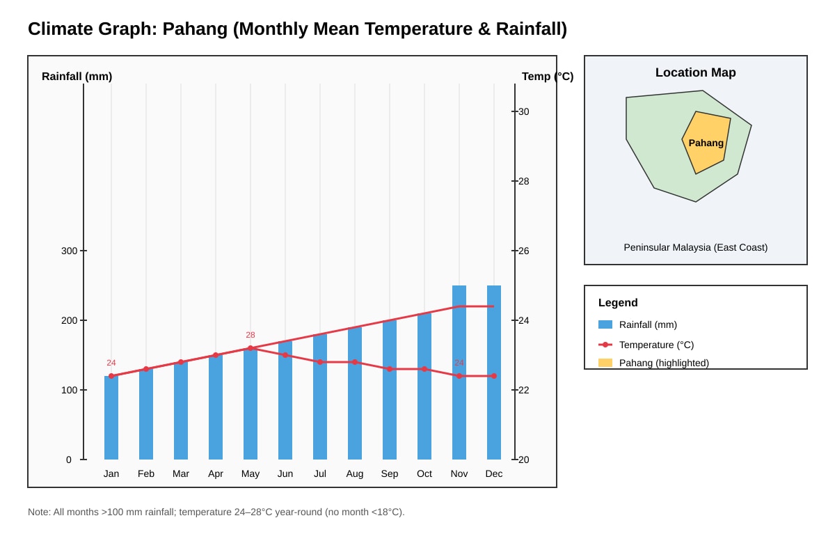
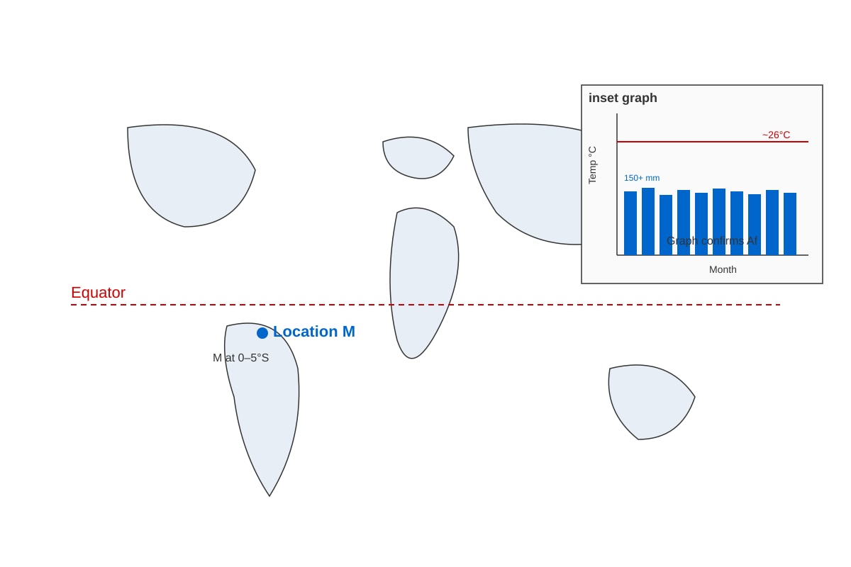
Q1 [2]
Answer: Köppen-Geiger zone Af (tropical rainforest).
Teaching note: Pahang shows temperatures 24–28°C all months (>18°C) and rainfall >100 mm every month (no dry month). Per Köppen rules, Af = tropical with no month below 60 mm rainfall.
Marking: 1 mark for naming Af (or tropical rainforest climate); 1 mark for correct justification using temp + rainfall data from figure.
Q2 [3]
Answer: Technique = Choropleth mapping (shading by value).
Strength: Easy to compare spatial patterns at a glance across regions.
Limitation: Hides variation within each administrative unit (assumes uniform value inside area).
Teaching note: Choropleth uses predefined areas shaded by data class. Common mistake: calling it dot map.
Marking: 1 for name, 1 for strength, 1 for limitation.
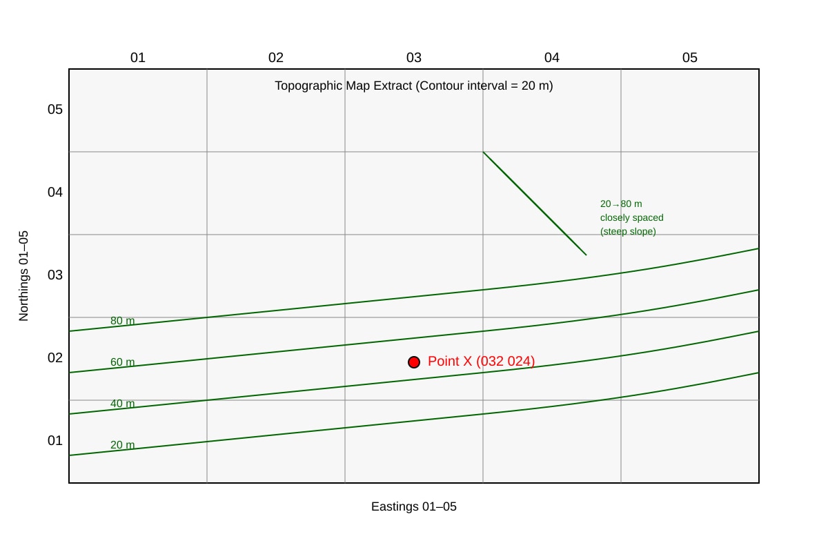
Q3 [3]
Answer: Grid ref = 032 024. Relief NE = steep slope (contours 20→80 m close together).
Teaching note: Six-figure grid: estimate easting 03.2, northing 02.4 → 032 024. Closely spaced contours = steep.
Marking: 1 for GR, 2 for describing steep relief with contour evidence.
Q4 [2]
Answer: Advantage – shows spatial contrast clearly between countries. Disadvantage – misleading if countries differ greatly in area (large country looks more important).
Marking: 1 each.
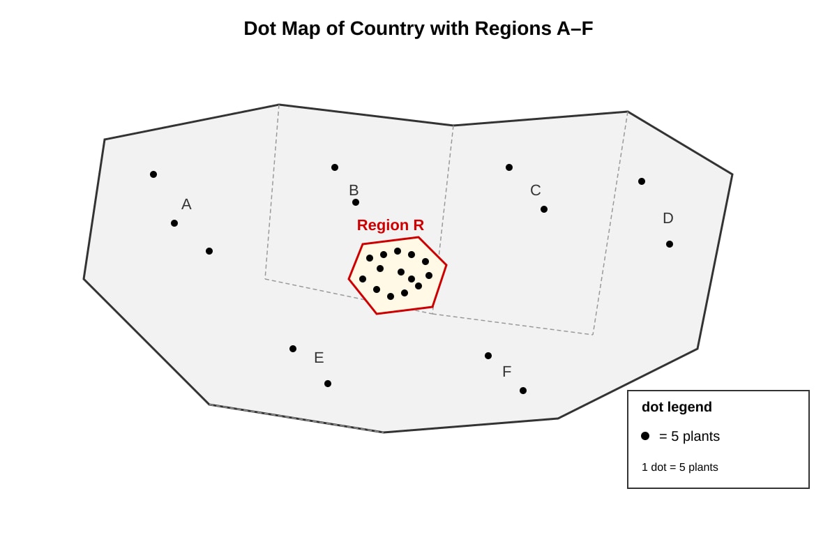
Q5 [2]
Answer: 14 dots × 5 = 70 plants.
Teaching note: Dot maps use legend scale. Multiply count by scale.
Marking: 1 for 14×5, 1 for 70.
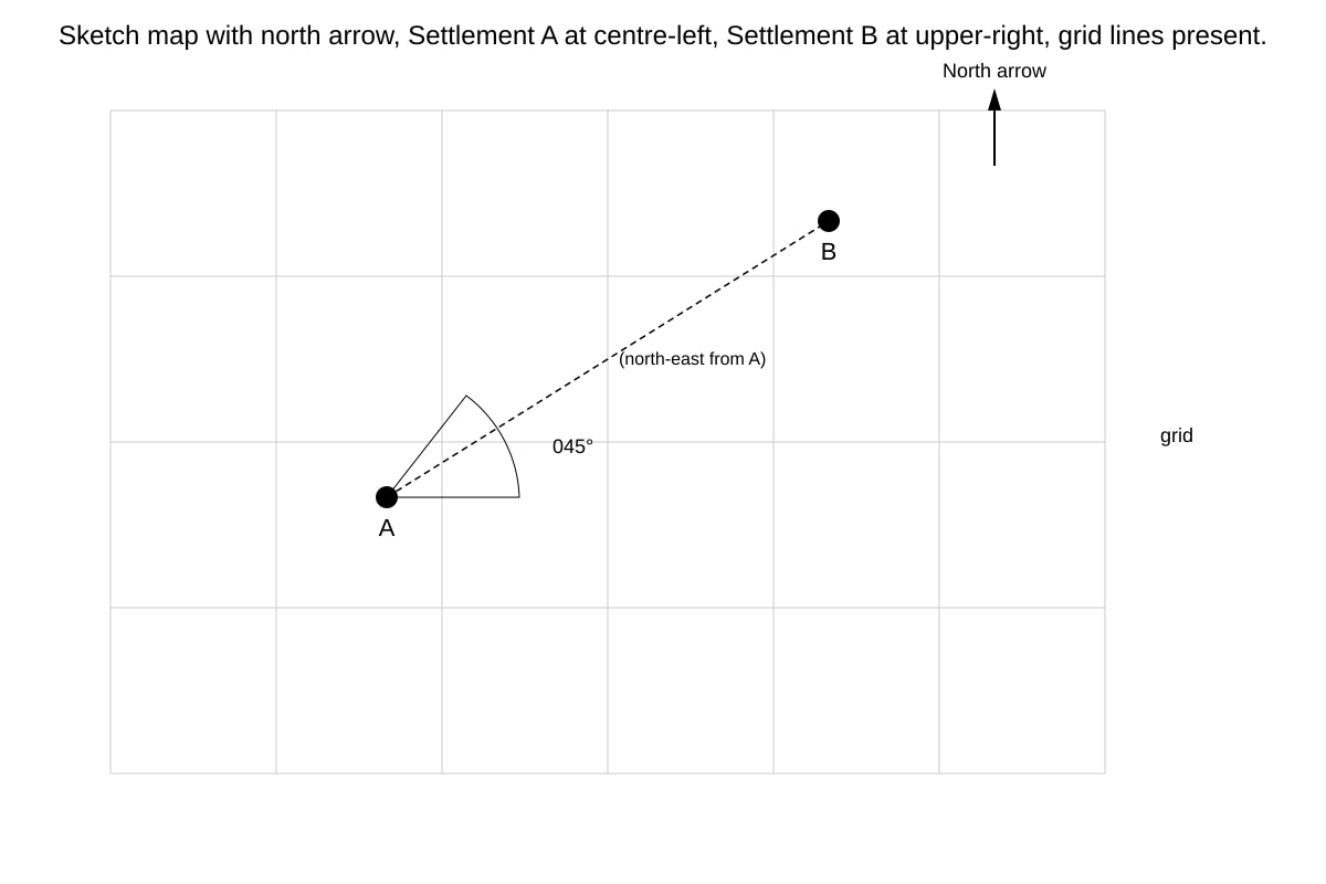
Q6 [2]
Answer: Bearing ≈ 045° (north-east).
Teaching note: Measure angle clockwise from north grid line to line A–B.
Marking: 2 for correct bearing ±5°.
Q7 [2]
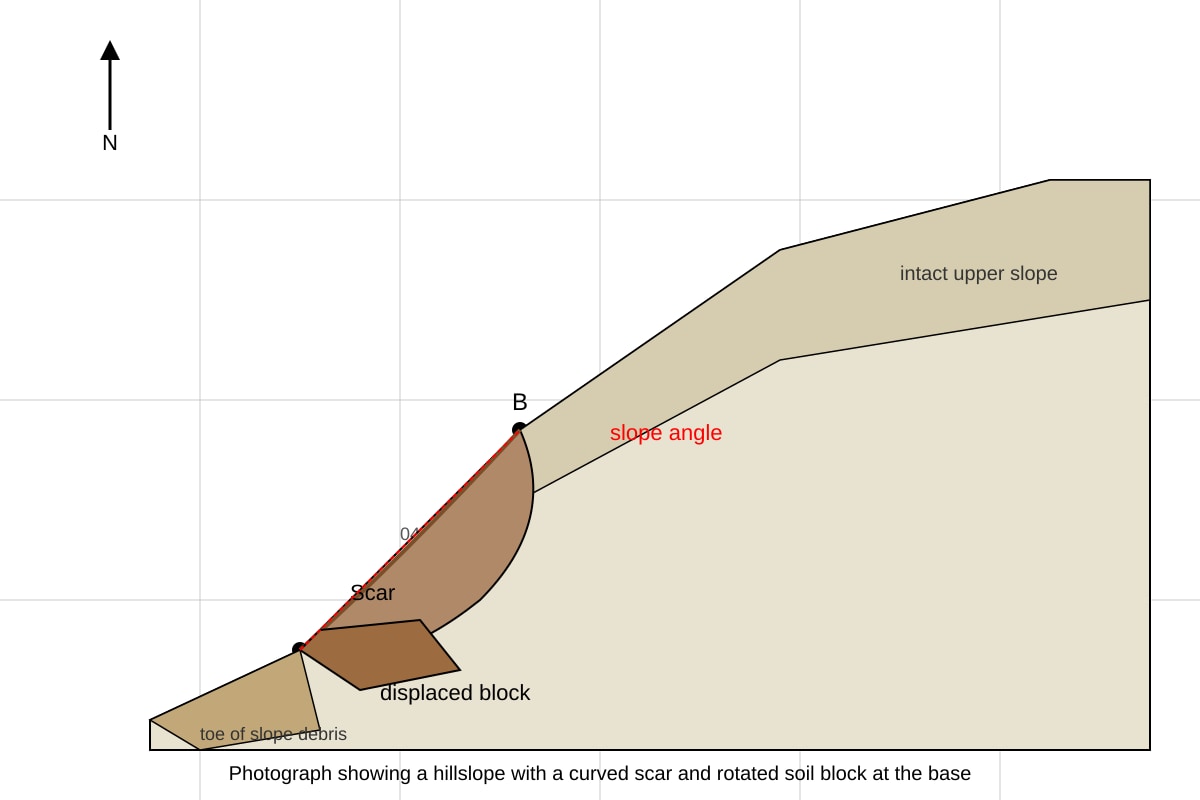
Answer: Slump (rotational slide).
Teaching note: Curved failure surface and rotated block = slump, not fall or flow.
Marking: 2 for correct type.
Section B: Graph and Data Interpretation
Q8 [3]
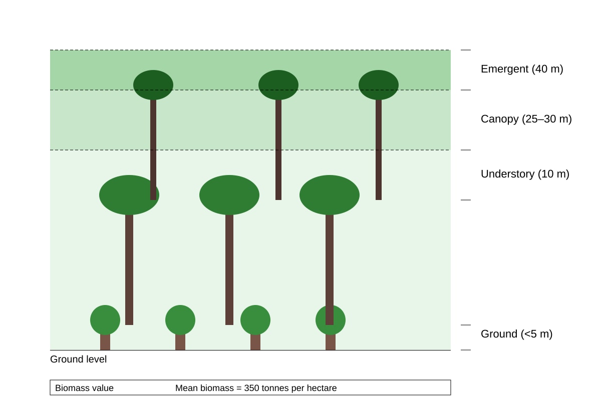
Answer: Structure: emergent (~40 m), continuous canopy (25–30 m), understory (10 m), ground (<5 m). Mean biomass = 350 t/ha.
Teaching note: Describe all vertical layers, not just canopy. Biomass from table.
Marking: 2 for layers, 1 for biomass value.
Q9 [5]
Answer: City C highest total (175); City D lowest (115). City A leads economic (62) but weak environmental (48); City B strong environmental (70) but low economic (40); City C balanced high social (68).
Teaching note: Compare across cities and dimensions with comparative language.
Marking: 1 for highest/lowest, 4 for valid comparisons across dimensions (1 each dimension or paired contrast).
Q10 [3]
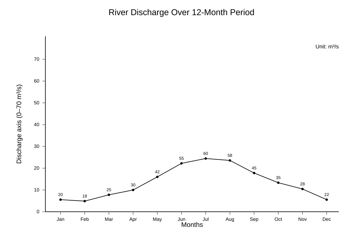
Sum = 20+18+25+30+42+55+60+58+45+35+28+22 = 438 m³/s.
Mean = 438 ÷ 12 = 36.5 m³/s.
Teaching note: Add all months, divide by 12. Units essential.
Marking: 1 sum, 1 division, 1 answer+unit.
Q11 [4]
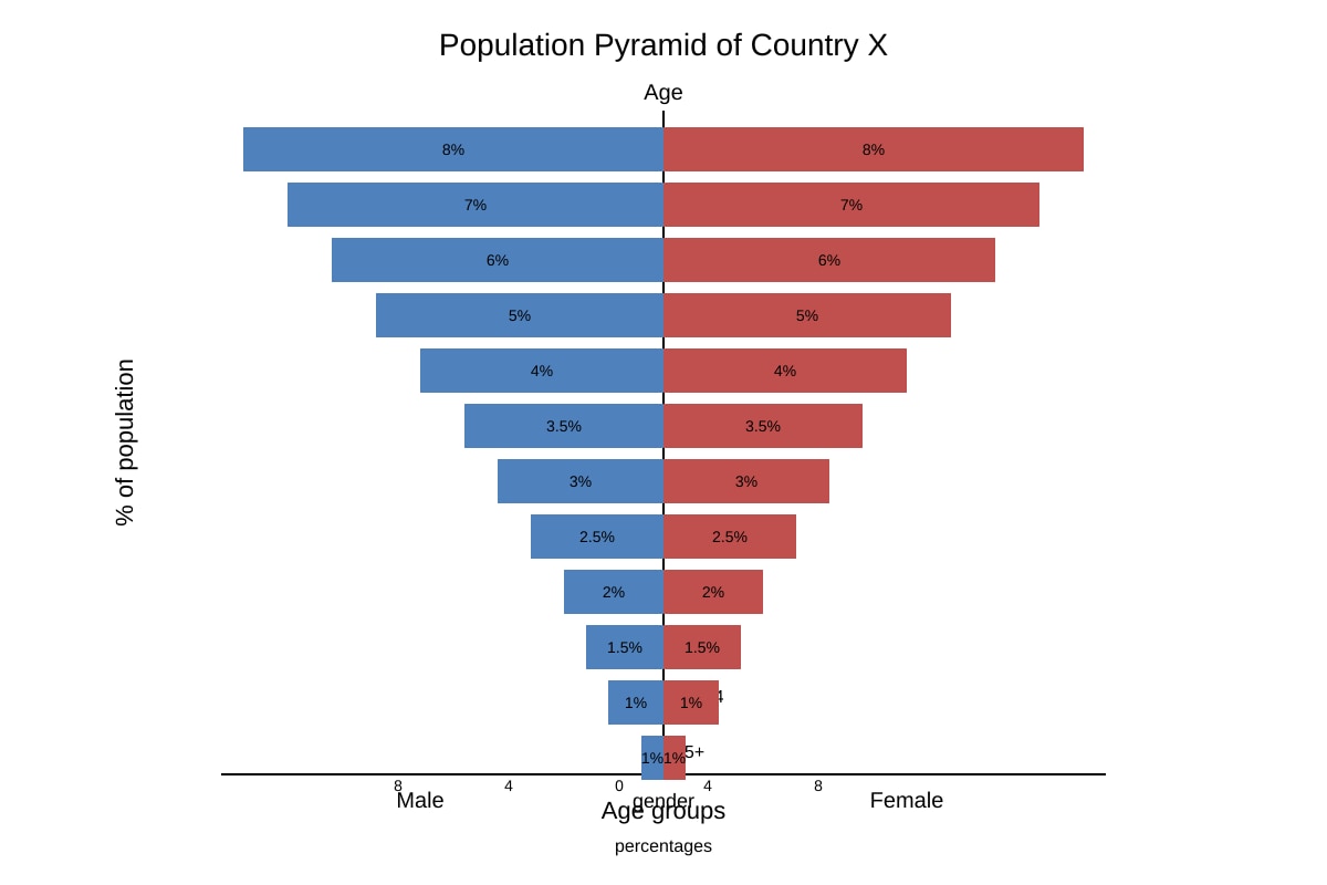
Answer: (1) High birth rate / youthful population (wide base). (2) Low life expectancy / small elderly cohort (rapid narrowing).
Teaching note: Pyramid shape indicates stage 2 demographic transition.
Marking: 2 per characteristic with evidence from graph.
Q12 [3]
Answer: Proportional symbol = size of symbol shows magnitude at point/location; choropleth = shading of areas by average value. For oil: symbol size per country vs shaded area. Strength of proportional: shows actual volume; limitation: overlap in dense areas.
Marking: 1 diff, 1 strength, 1 limitation.
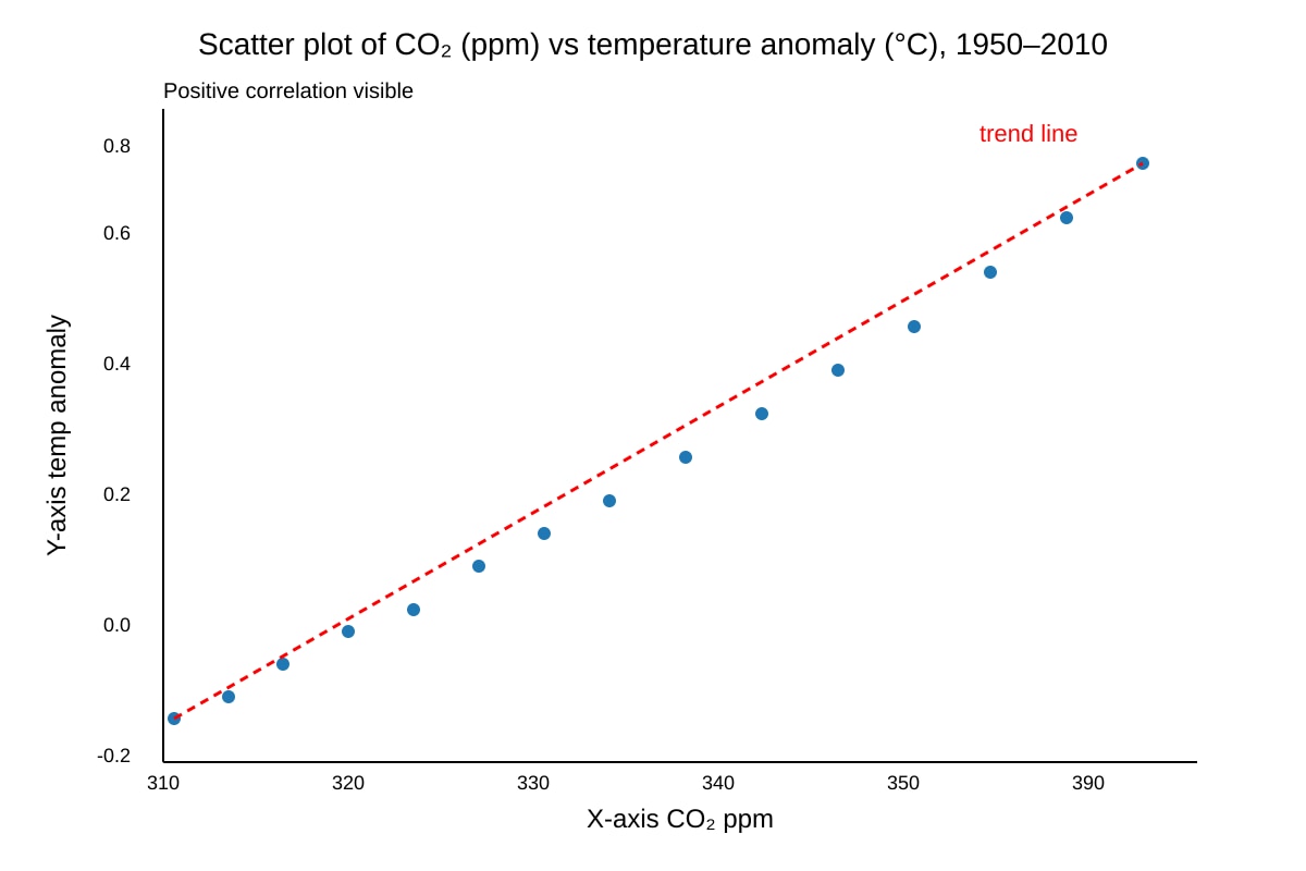
Q13 [3]
Answer: Positive correlation. Reason: CO₂ traps heat → rising concentrations increase anomaly.
Marking: 1 correlation, 2 for reasoned explanation.
Q14 [2]
Runoff coefficient = (360 ÷ 1200) × 100 = 30%.
Teaching note: Ratio of runoff to rainfall ×100.
Marking: 1 calc, 1 answer.
Section C: Integrated Data Skills
Q15 [4]
Answer: Zone = Af. Limitation: Map alone shows only latitude, not rainfall seasonality/temp range needed for full classification.
Marking: 2 for zone, 2 for limitation with reasoning.
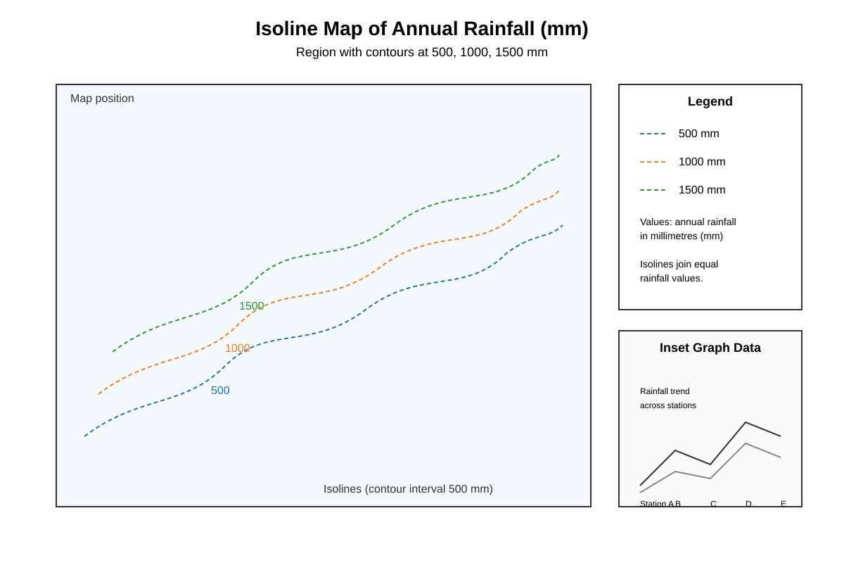
Q16 [3]
Answer: Technique = Isoline (isohyet) map. Strength: shows gradual spatial change. Limitation: interpolation between points may be inaccurate.
Marking: 1 name, 1 strength, 1 limitation.
Q17 [5]
Answer: Japan highest internet (91) and mobile (98); India lowest internet (47) but mobile 79; Vietnam mid (68, 85). Gap internet Japan–India = 44 pts; mobile gap = 19 pts.
Marking: 1 highest/lowest, 4 for cross-country comparison.
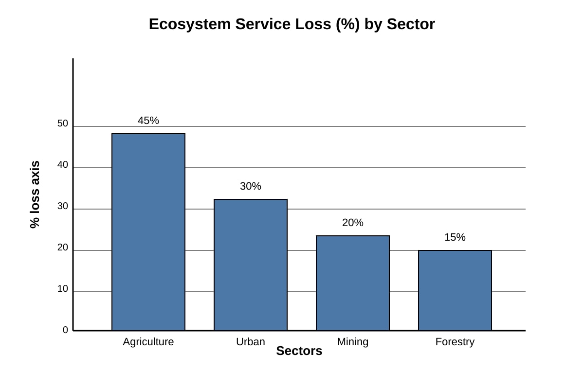
Q18 [4]
Answer: Highest = Agriculture (45%). Lowest = Forestry (15%). Difference = 30 percentage points.
Teaching note: % difference = 45–15 = 30. Not relative %.
Marking: 1 highest, 1 lowest, 2 for calc.
Q19 [3]
Answer: Place line across coast; sample landforms at intervals; compare elevation/type along transect to show change.
Marking: 1 line, 1 sampling, 1 analysis.
Q20 [3]
Answer: Output = map of population in high flood risk zones. Limitation = data resolution may miss local variation; correlation ≠ causation.
Marking: 1 output, 2 for limitation reasoned.