From Real Exams Quiz
A Level H2 Geography Map Graph Data Skills Quiz
Free A Level H2 Geography Map Graph Data Skills quiz, Exam version, with questions, answers, and A Level-style practice for Singapore students.
These static practice materials are generated from the site's syllabus and paper-generation workflow, with source and model context shown so students and parents can evaluate the material before use.
Questions
Free quiz and exam paper access
Enter your details to view this paper
Your access is remembered on this device.
Answers
Answer Key and Marking Scheme
A-Level Geography H2 Quiz - Map Graph Data Skills
Total Marks: 50
Section A: Map Skills (Questions 1-5)
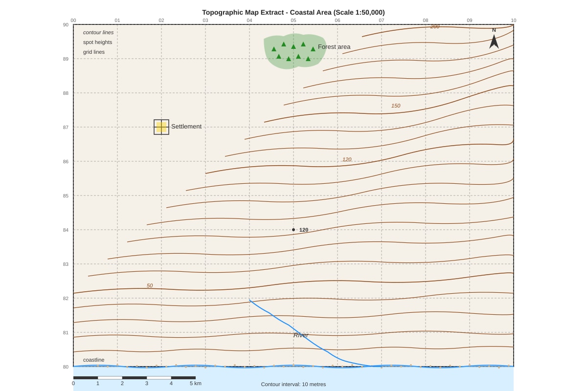
Q1. Give the four-figure grid reference for the settlement shown on the map extract. [1 mark]
Answer: 0287
Marking Notes:
- 1 mark for correct grid reference.
- The easting (first two digits) must be 02 and the northing (second two digits) must be 87.
- Common mistake: Students often reverse the order and write 8702. Remind them: "along the corridor, up the stairs" – read eastings first, then northings.
Q2. State the height of the spot height located at grid reference 0585. [1 mark]
Answer: 120 metres
Marking Notes:
- 1 mark for correct answer with units.
- The answer must include "metres" or "m" for full marks.
Q3. Measure the straight-line distance, in kilometres, between the spot height at 0585 and the settlement. Use the scale bar on the map extract. [2 marks]
Answer: Approximately 2.3 km (allow range: 2.2 km – 2.4 km)
Method:
- Identify the two points: spot height at GR 0585 and settlement at GR 0287.
- Measure the distance between them on the map using a ruler or a piece of string. This should be about 4.6 cm.
- Use the scale bar. A 1:50,000 scale means 1 cm on the map = 0.5 km on the ground.
- Calculate: 4.6 cm × 0.5 km/cm = 2.3 km.
Marking Notes:
- 1 mark for correct method (showing measurement and use of scale).
- 1 mark for correct final answer within the acceptable range.
- Common mistake: Failing to convert cm to km correctly.
- Teaching note: The map scale (1:50,000) means that 1 cm on the map represents 50,000 cm in reality, which is 500 m or 0.5 km.
Q4. Describe the relief of the area within grid square 0588. [3 marks]
Answer: The area within grid square 0588 has a varied relief. The eastern part of the grid square contains a hill, as indicated by the closely spaced contour lines reaching a height of at least 50 metres. This suggests steep slopes. The western part of the grid square has more widely spaced contour lines, indicating gentler slopes (1 mark). A river flows through the northern part of the grid square, forming a valley. The land to the south of the river is lower-lying with spot heights of around 20-30 metres. Overall, the grid square is characterised by undulating terrain with the highest point in the east and the lowest near the river. (1 mark for specific evidence, e.g., mentioning contour spacing, river, or heights). (1 mark for overall description, e.g., "undulating" or "varied relief").
Marking Notes:
- 1 mark for identifying the hill/steep slopes in the east.
- 1 mark for referencing the river valley and/or gentler slopes.
- 1 mark for a coherent overall description that uses evidence from the map (contour lines, spot heights, river).
- Teaching note: "Relief" refers to the shape and height of the land. Describing relief involves talking about altitude (height), slope (steep or gentle), and landforms (hills, valleys).
Q5. Using evidence from the map, suggest one reason why the river flows in a southeasterly direction. [2 marks]
Answer: The river flows in a southeasterly direction because the land slopes from higher ground in the northwest (e.g., spot height at 0585 is 120m) towards the lower ground in the southeast (the coast) (1 mark). The contour lines show that the elevation decreases from the northwest to the southeast of the map extract, and water always flows downhill under gravity (1 mark).
Marking Notes:
- 1 mark for referencing the direction of the gradient or slope (from high to low).
- 1 mark for providing specific map evidence (e.g., spot height at 0585 = 120m, or the presence of the coast as a lower base level).
- Common mistake: Simply stating "because of gravity" without map evidence is insufficient for 2 marks.
- Teaching note: Rivers flow downhill. On a map, flow direction is perpendicular to contour lines, moving from higher to lower values.
Section B: Graph Interpretation (Questions 6-10)
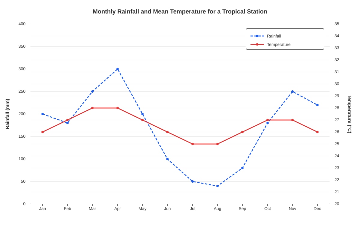
Q6. Identify the month with the lowest rainfall. [1 mark]
Answer: August
Marking Notes:
- 1 mark for the correct answer "August".
- Only accept "August" or "Aug". Do not accept a rainfall value without the month.
Q7. Describe the relationship between temperature and rainfall for the months of June to August. [2 marks]
Answer: During June to August, there is an inverse relationship between temperature and rainfall. As temperature decreases from 26°C in June to 25°C in July and August, rainfall also decreases significantly from 100mm in June to a minimum of 40mm in August (1 mark). Both variables show a downward trend over this period (1 mark).
Marking Notes:
- 1 mark for correctly identifying the nature of the relationship (inverse/negative/downward trend for both).
- 1 mark for using specific data from the graph to support the description (e.g., mentioning the specific temperature and rainfall values).
- Common mistake: Describing the relationship as "positive" or "random."
- Teaching note: A "relationship" describes how one variable changes in response to another. Use terms like "positive," "negative," "inverse," or "no clear relationship."
Q8. Calculate the total annual rainfall for this station. Show your working. [2 marks]
Answer: 200 + 180 + 250 + 300 + 200 + 100 + 50 + 40 + 80 + 180 + 250 + 220 = 2050 mm
Method:
- Add up the rainfall values for every month of the year.
- List the values: 200, 180, 250, 300, 200, 100, 50, 40, 80, 180, 250, 220.
- First, group them: (200+180+250+300) + (200+100+50+40) + (80+180+250+220) = 930 + 390 + 730 = 2050.
- State the answer clearly with the correct unit (mm).
Marking Notes:
- 1 mark for showing the correct working (summation of individual months' values).
- 1 mark for the correct final answer with unit (2050 mm).
- Deduct 1 mark if the unit is missing.
- Common mistake: Forgetting to include the last month (December) or making an arithmetic error.
Q9. State the annual temperature range for this station. Show your working. [2 marks]
Answer: Highest temperature = 28°C (March & April). Lowest temperature = 25°C (July & August). Annual temperature range = 28°C - 25°C = 3°C.
Method:
- Identify the highest monthly mean temperature from the data: 28°C (Mar & Apr).
- Identify the lowest monthly mean temperature from the data: 25°C (Jul, Aug).
- Calculate the difference: Highest - Lowest = 28 - 25 = 3°C.
Marking Notes:
- 1 mark for identifying the correct highest and lowest temperatures.
- 1 mark for the correct calculation and final answer with unit (3°C).
- Accept 3°C or 3. Accept a range of 2°C-4°C if the student's reading is slightly off, provided the working shows the method.
- Teaching note: The annual temperature range is a key indicator of a location's climate. A small range (like 3°C) is characteristic of the humid tropics near the equator.
Q10. Using the data provided, suggest the likely Köppen climate classification for this station. Give a reason for your answer. [2 marks]
Answer: The likely Köppen classification is Tropical Rainforest (Af) (1 mark). The reason is that the station has high temperatures year-round (mean monthly temperature is always above 18°C, ranging from 25°C to 28°C) and high annual rainfall (over 2000mm) (1 mark). However, it is borderline to Tropical Monsoon (Am) as there are a couple of drier months (Jul & Aug with 50mm and 40mm). Af is a stronger answer.
Marking Notes:
- 1 mark for identifying Af (Tropical Rainforest) or Am (Tropical Monsoon) with a strong justification.
- 1 mark for providing a specific reason from the data (e.g., "temperatures are consistently high, above 18°C" and "annual rainfall is high").
- Teaching note: The Köppen system classifies climates based on temperature and precipitation thresholds. For Af:
- Coldest month must be >18°C.
- Driest month must have >60mm of rain. In our data, July has 50mm and August has 40mm, which are <60mm. This makes it a borderline case between Af and Am. A good student would acknowledge this ambiguity. The question says "likely," so Af is still a defensible answer, but some credit may be given for a well-justified Am answer.
Section C: Data Skills (Questions 11-15)
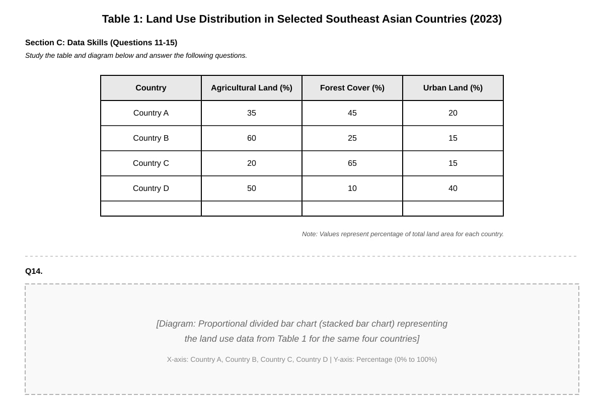
Q11. Identify the country with the highest percentage of urban land. [1 mark]
Answer: Country D
Marking Notes:
- 1 mark for correct answer.
Q12. Calculate the difference in forest cover percentage between Country C and Country B. [1 mark]
Answer: Country C (65%) - Country B (25%) = 40%
Marking Notes:
- 1 mark for correct answer (40%).
- Accept 40 or 40%.
- Common mistake: Subtracting the wrong way around. The difference is always a positive value if you subtract the smaller from the larger.
Q13. Describe the pattern of land use shown in Table 1. [3 marks]
Answer: The table shows a clear variation in land use composition across the four countries (1 mark). Country A has a relatively balanced mix, with forest cover being the largest category (45%). Country B is dominated by agricultural land (60%), with the least urban land (15%). Country C has the highest forest cover (65%) and the lowest agricultural land (20%) (1 mark). Country D stands out for its high proportion of urban land (40%), which is at least double that of any other country, and has the lowest forest cover (10%). This suggests that the four countries are at different stages of development, with Country D likely being the most urbanised (1 mark).
Marking Notes:
- 1 mark for an introductory sentence identifying that there is variation.
- 1 mark for using specific data to describe the composition of at least two countries (e.g., "Country C has the most forest").
- 1 mark for a concluding observation that synthesises the patterns (e.g., identifying extremes or suggesting an underlying reason like development stage).
- Teaching note: A "pattern" in data requires you to look for trends, clusters, and outliers. Don't just list numbers; identify the standout features (e.g., highest, lowest, unusual combinations).
Q14. Using Figure 1, compare the land use composition of Country A and Country D. [4 marks]
Answer: Both Country A and Country D have a similar proportion of agricultural land (35% and 40% respectively) (1 mark). However, there are significant differences in their forest and urban land cover. Country A has much more forest cover (45%) compared to Country D (10%) (1 mark). Conversely, Country D has a much higher percentage of urban land (40%) compared to Country A (20%) (1 mark). Therefore, while agriculture forms a similar base for both, Country A is more forested and less urbanised, whereas Country D is significantly more urbanised and has very little forest cover (1 mark).
Marking Notes:
- 1 mark for identifying a similarity (e.g., similar agricultural land).
- 1 mark for identifying the difference in forest cover.
- 1 mark for identifying the difference in urban land.
- 1 mark for a concluding comparison that synthesises the overall pattern.
- Common mistake: Just describing each country individually without using comparative language. The command word "compare" requires you to explicitly state relationships (e.g., "X is higher/lower/similar to Y").
- Teaching note: When instructed to "compare," you must do both: state similarities AND differences. Use comparative language (more than, less than, similar to, unlike, whereas, in contrast).
Q15. Explain one limitation of using proportional divided bar charts to represent this data. [2 marks]
Answer: One limitation is that it is difficult to compare the absolute total land area represented by each percentage category across different countries (1 mark). Since the total land area of each country is different, a 20% urban area in Country A might represent a much smaller or larger actual area in square kilometres than a 20% urban area in Country D (1 mark). Another valid answer: It is difficult to read precise percentages from the bar chart, especially for smaller segments, so data may be lost compared to a table.
Marking Notes:
- 1 mark for identifying a valid limitation.
- 1 mark for explaining why it is a limitation in the context of this data.
- Accept other valid limitations, such as: "It is difficult to identify small differences between segments" or "It does not show the total area of each country, so relative comparisons of scale are lost." Must be relevant to the specific data given (land use percentages).
Section D: Advanced Data Handling & Synthesis (Questions 16-20)
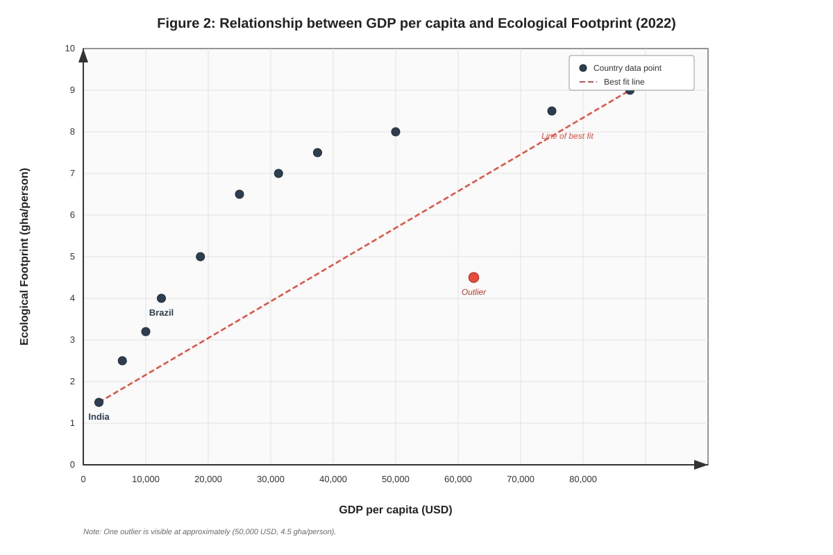
Q16. Identify the relationship between GDP per capita and Ecological Footprint shown in Figure 2. [1 mark]
Answer: Positive relationship / Positive correlation.
Marking Notes:
- 1 mark for "positive" or "positive correlation."
- Do not accept "strong" without "positive."
- Teaching note: A positive relationship means that as one variable increases, the other tends to increase as well.
Q17. Describe the trend for most of the countries shown in Figure 2. [2 marks]
Answer: For most countries, as GDP per capita increases, the Ecological Footprint also increases (1 mark). The relationship is not perfectly linear; the increase in Footprint appears to slow down at higher GDP levels (over 10,000 has a Footprint of about 4 gha/person, while one with $60,000 has a Footprint of about 8.5 gha/person.
Marking Notes:
- 1 mark for describing the general upward trend.
- 1 mark for a more specific observation, such as mentioning the levelling off at the top, the curvilinear nature of the line of best fit, or using data points to support the description.
- Common mistake: Only saying "it increases" without any additional detail or data support.
Q18. The data point for one country is an outlier. Suggest a reason why this country might have a low Ecological Footprint despite a high GDP per capita. [2 marks]
Answer: This outlier could be a country that has successfully "decoupled" its economic growth from environmental impact. A possible reason is that this country has invested heavily in renewable energy sources (e.g., hydropower or nuclear), which have a lower carbon footprint compared to fossil fuels (1 mark). Another reason could be that it has very strict environmental regulations and high taxes on resource consumption, which reduces waste and per-capita consumption despite high wealth (1 mark). It could also be a service-based economy with a small manufacturing sector.
Marking Notes:
- 1 mark for a logical and realistic suggestion (e.g., renewable energy, strict policies, service-based economy).
- 1 mark for explaining the link between the suggestion and the specific outcome (low Footprint despite high GDP).
- Teaching note: An "outlier" is a data point that is far away from the general trend on a graph. It is important to try to explain why that case is different, drawing on geographical knowledge.
Q19. Using the extract and Figure 2, explain why a rising GDP per capita often, but not always, leads to a higher Ecological Footprint. [3 marks]
Answer: The extract states that the Ecological Footprint measures consumption and waste. A rising GDP per capita generally leads to higher consumption (more goods, energy, and food) and more waste, which directly increases the Footprint (1 mark). The positive trend in Figure 2 supports this, showing that wealthier countries have, on average, a higher environmental impact. However, the extract also mentions 'decoupling' (1 mark). The existence of the outlier in Figure 2 proves that it is not always the case. A country with a high GDP per capita might have a low Footprint if it uses efficient technology, a green energy grid, and strong sustainability policies, thereby breaking the link between wealth and environmental pressure (1 mark).
Marking Notes:
- 1 mark for explaining the "often" part: higher GDP = higher consumption = higher Footprint. Reference the extract (consumption & waste).
- 1 mark for referencing the "but not always" part: using the concept of decoupling from the extract or the outlier from the figure.
- 1 mark for a well-developed explanation that integrates evidence from both the extract and the figure.
- Teaching note: This question tests your ability to synthesise information from two different sources and use them to support a balanced explanation. The command word is "explain," so you must give reasons.
Q20. Evaluate the extent to which the data in Figure 2 supports the idea of 'decoupling' economic growth from environmental impact. [4 marks]
Answer: The data in Figure 2 only partially supports the idea of decoupling (1 mark).
On one hand, the data supports the idea that decoupling is possible:
- The presence of a clear outlier shows that it is possible to have a high GDP per capita and a low Ecological Footprint. This single data point is evidence that decoupling can be achieved (1 mark).
- Furthermore, the line of best fit appears to level off at very high GDP levels. This suggests that increasing wealth beyond a certain point does not lead to a proportionate increase in environmental impact, which is a form of relative decoupling (1 mark).
On the other hand, the data strongly challenges the idea of widespread decoupling:
- The overwhelming trend for the vast majority of countries is a strong positive correlation. For every other country, a higher GDP per capita is clearly linked to a higher Ecological Footprint. This suggests that, globally, decoupling is not the norm (1 mark).
- The outlier is just one data point out of twelve. It is an exception, not the rule. The data suggests that for most countries, economic growth comes at an environmental cost (1 mark).
- The data does not show absolute decoupling, where a country's Footprint decreases as its economy grows. At best, it shows a slowing of the increase (relative decoupling) at the highest GDP levels (1 mark).
Conclusion: The data in Figure 2 provides very limited support for the concept of decoupling. While the outlier and the levelling off of the curve provide hints that it is theoretically possible, the dominant trend shows that economic growth and environmental impact remain strongly coupled for most nations (1 mark).
Marking Notes (Levels-based marking):
| Level | Descriptor | Marks |
|---|---|---|
| L3 | A thorough evaluation that addresses both sides of the argument with specific evidence from Figure 2 (the outlier and the overall trend/curve shape). A clear, well-justified conclusion is given. | 4 |
| L2 | Describes both sides of the argument but the evaluation is less balanced or not consistently linked to the specific data in Figure 2. A conclusion is present but may be weak. | 2-3 |
| L1 | Only describes the trend (e.g., "it shows a positive correlation") without evaluation, or only states that there is an outlier without further analysis. No clear conclusion. | 1 |
| L0 | No relevant content. | 0 |
- Teaching note: The command word "evaluate" requires you to make a judgement. Your answer must weigh up both sides of the argument (for and against the statement) and arrive at a final, supported decision. "To what extent" asks for this judgement on a scale (e.g., strongly supports, partially supports, does not support).
Summary of Marks
| Question | Marks |
|---|---|
| 1 | 1 |
| 2 | 1 |
| 3 | 2 |
| 4 | 3 |
| 5 | 2 |
| 6 | 1 |
| 7 | 2 |
| 8 | 2 |
| 9 | 2 |
| 10 | 2 |
| 11 | 1 |
| 12 | 1 |
| 13 | 3 |
| 14 | 4 |
| 15 | 2 |
| 16 | 1 |
| 17 | 2 |
| 18 | 2 |
| 19 | 3 |
| 20 | 4 |
| Total | 50 |