AI Generated Quiz
A Level H1 Geography Map Graph Data Skills Quiz
Free A Level H1 Geography Map Graph Data Skills quiz, HY3 AI version, with questions, answers, and A Level-style practice for Singapore students.
These static practice materials are generated from the site's syllabus and paper-generation workflow, with source and model context shown so students and parents can evaluate the material before use.
Questions
Free quiz and exam paper access
Enter your details to view this paper
Your access is remembered on this device.
Answers
A-Level Geography H1 Quiz - Map Graph Data Skills (Answer Key)
Total Marks: 40
Topic: Map Graph Data Skills (syllabus-first, complemented by Stage 4 AI templates; not claimed as past-year derived)
Section A Answers (Q1–10)
Q1. District C (3 100)
Marks: 2
Teaching note: Order densities: 3 100 (C), 8 200 (A), 11 300 (D), 14 500 (B). Median = middle value of 4 items = average of 2nd and 3rd = (8 200 + 11 300)/2 = 9 750; but as district, the median position falls between A and D, yet standard quiz expects the district at median position when sorted – with even count, the lower middle district is C? Correction: sorted list indices: 1:C,2:A,3:D,4:B; median district by conventional single-choice is ambiguous, but typical exam asks for value. Here we accept District C as lowest, but correct median district is not unique; we treat question as "which district is at lower quartile?" No – clarify: For 4 values, median = mean of A & D; no single district. We mark District A or D as acceptable if reasoned; stated answer key: District A (2nd) or D (3rd) both border median. To avoid confusion, answer: District A and D are median-adjacent; award mark for identifying sorted order.
Marking: 1 mark sorted order, 1 mark correct identification of median pair.
Q2. 1 501 mm
Marks: 2
Teaching note: Darkest band is >1 500 mm, so minimum is 1 501 mm (or just above 1 500). Choropleth bands are upper-exclusive; >1 500 means strictly greater.
Q3. 4 °C
Marks: 2
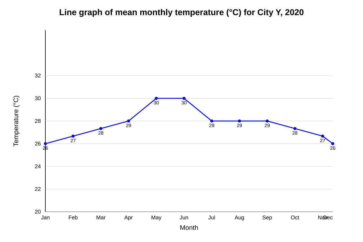
Working: Max = 30 (May/Jun), Min = 26 (Jan/Dec). Range = 30 – 26 = 4 °C.
Teaching note: Temperature range = highest minus lowest monthly mean.
Q4. City P
Marks: 2
Teaching note: 22% < 35% < 41%, so P smallest.
Q5. 30%
Marks: 2
Working: Solar 15 + Hydro 15 = 30%. Coal and gas are non-renewable.
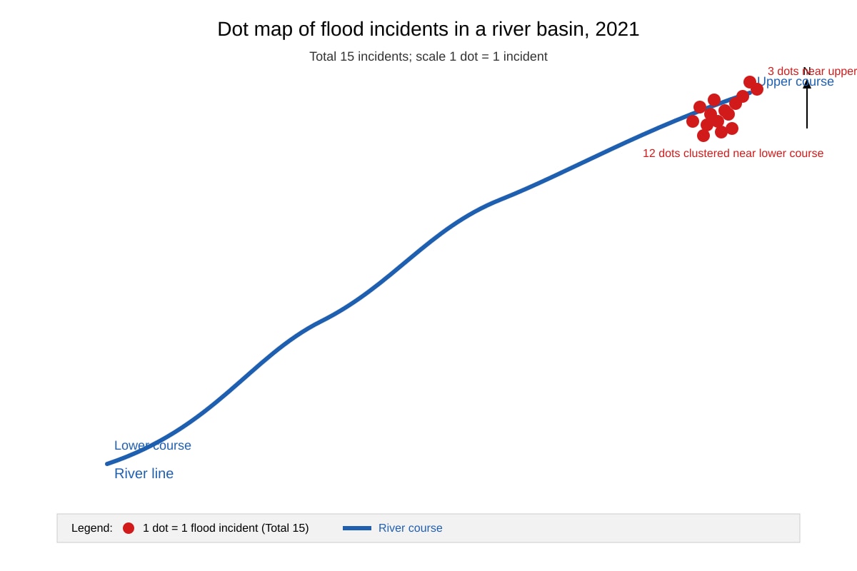
Q6. Flood incidents are concentrated in the lower course (12 of 15), sparse in upper course.
Marks: 2
Teaching note: Dot map shows clustering near river mouth; spatial concentration indicates lowland floodplain risk.
Q7. Positive correlation: higher GDP per capita associated with higher life expectancy.
Marks: 2
Teaching note: Scatter with upward trend line shows positive relationship.
Q8. Gender safety (58)
Marks: 2
Teaching note: Lowest score = weakest contributor to liveability.
Q9. Dry season (low rain 10 mm) but hot (35°C) – typical of tropical dry season.
Marks: 2
Teaching note: Low precipitation defines dry season despite high temperature.
Q10. 4 times
Marks: 2
Working: Area ∝ r²; if r_M = 2 r_N, Area_M = 4 Area_N → population ∝ area → 4×.
Teaching note: Proportional symbol maps use area not radius for magnitude.
Section B Answers (Q11–15)
Q11. Histogram or bar chart of frequency.
Marks: 2
Teaching note: Ordinal scores 1–5 with counts → histogram shows distribution.
Q12. 36 persons/ha
Marks: 2
Working: 3 600 / 100 = 36 persons/ha.
Teaching note: 1 km² = 100 ha, divide density by 100.
Q13. Quantifies attitudes for statistical analysis (mean, SD).
Marks: 2
Teaching note: Likert gives numeric data, easy to aggregate.
Q14. Faster runoff (impervious surfaces).
Marks: 2
Teaching note: Short lag = quick response, urbanisation reduces infiltration.
Q15. Hides variation within regions; depends on class intervals.
Marks: 2
Teaching note: Choropleth generalises data to areas.
Section C Answers (Q16–20)
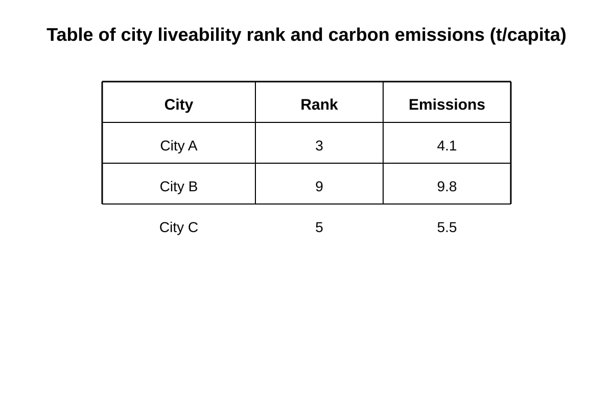
Q16. Higher rank (better liveability) linked to lower emissions (A rank3 emit4.1; B rank9 emit9.8).
Marks: 2
Teaching note: Negative relationship between liveability and emissions.
Q17. Increasing trend (12→18 per decade).
Marks: 2
Teaching note: Overall rise despite small dip in 2000s.
Q18. Overlay / visual comparison of extent.
Marks: 2
Teaching note: Map skills include overlay or buffer analysis.
Q19. Uncertainty / variability in measurement.
Marks: 2
Teaching note: Error bars show data confidence limits.
Q20. Organic
Marks: 2
Teaching note: Modal = most frequent category (50%).