From Real Exams Quiz
A Level H1 Geography Map Graph Data Skills Quiz
Free A Level H1 Geography Map Graph Data Skills quiz, HY3 Exam version, with questions, answers, and A Level-style practice for Singapore students.
These static practice materials are generated from the site's syllabus and paper-generation workflow, with source and model context shown so students and parents can evaluate the material before use.
Questions
Free quiz and exam paper access
Enter your details to view this paper
Your access is remembered on this device.
Answers
A-Level Geography H1 Quiz - Map Graph Data Skills (Answer Key)
Total Marks: 40
Topic: Map, Graph & Data Skills
Section A: Data Reading
1. [1 mark]
Answer: 0.9 million (or 900,000).
Working: 3.4 – 2.5 = 0.9.
Teaching note: Absolute increase = final − initial. Common mistake: writing 0.9% instead of million.
2. [1 mark]
Answer: January.
Reason: 120 mm > 20 mm.
Teaching note: Taller bar = more precipitation.
3. [1 mark]
Answer: 20 m.
Reason: 60 − 40 = 20 m, equals one contour interval.
Teaching note: Contour interval is constant difference in elevation.
4. [1 mark]
Answer: 55% (or 0.55).
Working: 100% − 45% = 55%.
Teaching note: Whole = 100%.
5. [1 mark]
Answer: Positive correlation.
Teaching note: Points rising left to right = as one variable increases, other increases.
Section B: Graph and Map Interpretation
6. [2 marks]
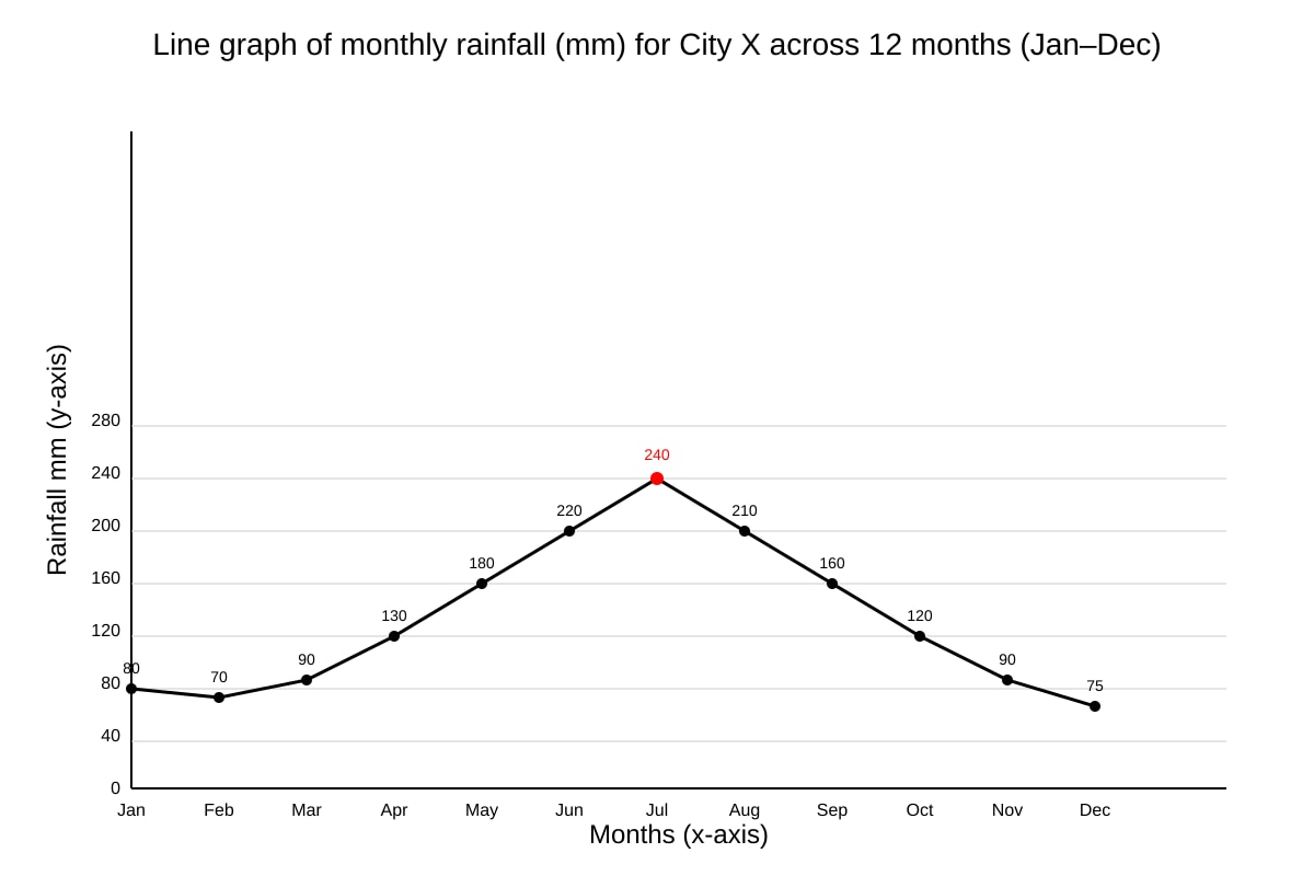
Answer: July, 240 mm. [1 for month, 1 for value]
Teaching note: Read peak from line graph.
7. [2 marks]
Working: (80 + 70 + 90) ÷ 3 = 240 ÷ 3 = 80 mm.
Answer: 80 mm. [1 for sum, 1 for mean]
Teaching note: Mean = total ÷ number of months.
8. [2 marks]
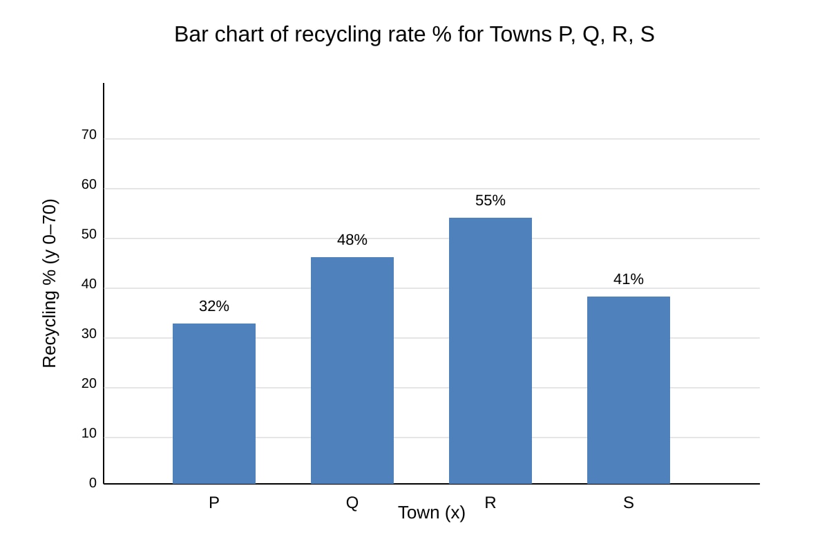
Answer: Town R, 55%. [1 each]
Teaching note: Tallest bar = highest rate.
9. [1 mark]
Answer: River / water body.
Teaching note: Blue line = surface water on maps.
10. [1 mark]
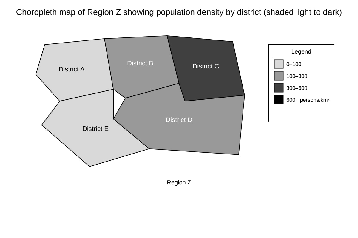
Answer: District C.
Teaching note: Darkest shade = highest density class.
11. [2 marks]
Answer: One limitation: choropleth shows grouped classes, not exact values; e.g., all districts in 300–600 class look same though densities differ. [2 for explanation]
Teaching note: Mention loss of precision.
12. [2 marks]
Working: (150 − 90) ÷ 90 × 100 = 60 ÷ 90 × 100 = 66.7%.
Answer: 66.7% increase. [1 working, 1 answer]
Teaching note: % increase = (new−old)/old ×100.
13. [1 mark]
Answer: Elderly (already given as 5%); if asking missing, total 100% so none missing. If interpreted as category not labelled: elderly.
Teaching note: 40+55+5=100.
Section C: Data Representation and Evaluation
14. [2 marks]
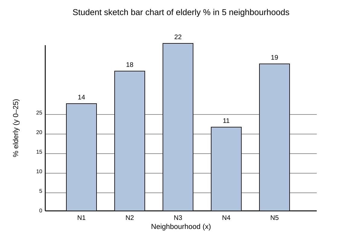
Answer: Bar chart. Reason: compares discrete categories (neighbourhoods) easily. [1 + 1]
Teaching note: Bar for categorical comparison.
15. [2 marks]
Answer: x-label: Neighbourhood; y-label: % elderly (0–25). Bars: N1 14, N2 18, N3 22, N4 11, N5 19. [1 labels, 1 heights]
Teaching note: Sketch must show correct scale.
16. [3 marks]
Mark descriptors:
- 1 mark: dot map shows location of points.
- 2 marks: useful to see spatial pattern of flood depth.
- 3 marks: limitation – does not show depth value clearly without size/colour scale; ruler data may have error ±cm.
Answer: Useful for spatial distribution but limited by lacking precise depth legend.
Teaching note: Evaluate = strength + weakness.
17. [4 marks]
Mark breakdown:
- R1 satellite: visual extent of expansion, landuse change (2)
- R2 table: numerical growth, trend (1)
- Limitation: image no dates; table no location (1)
Answer: Both useful together; image shows where, table shows how much.
Teaching note: Use both sources, weigh.
18. [2 marks]
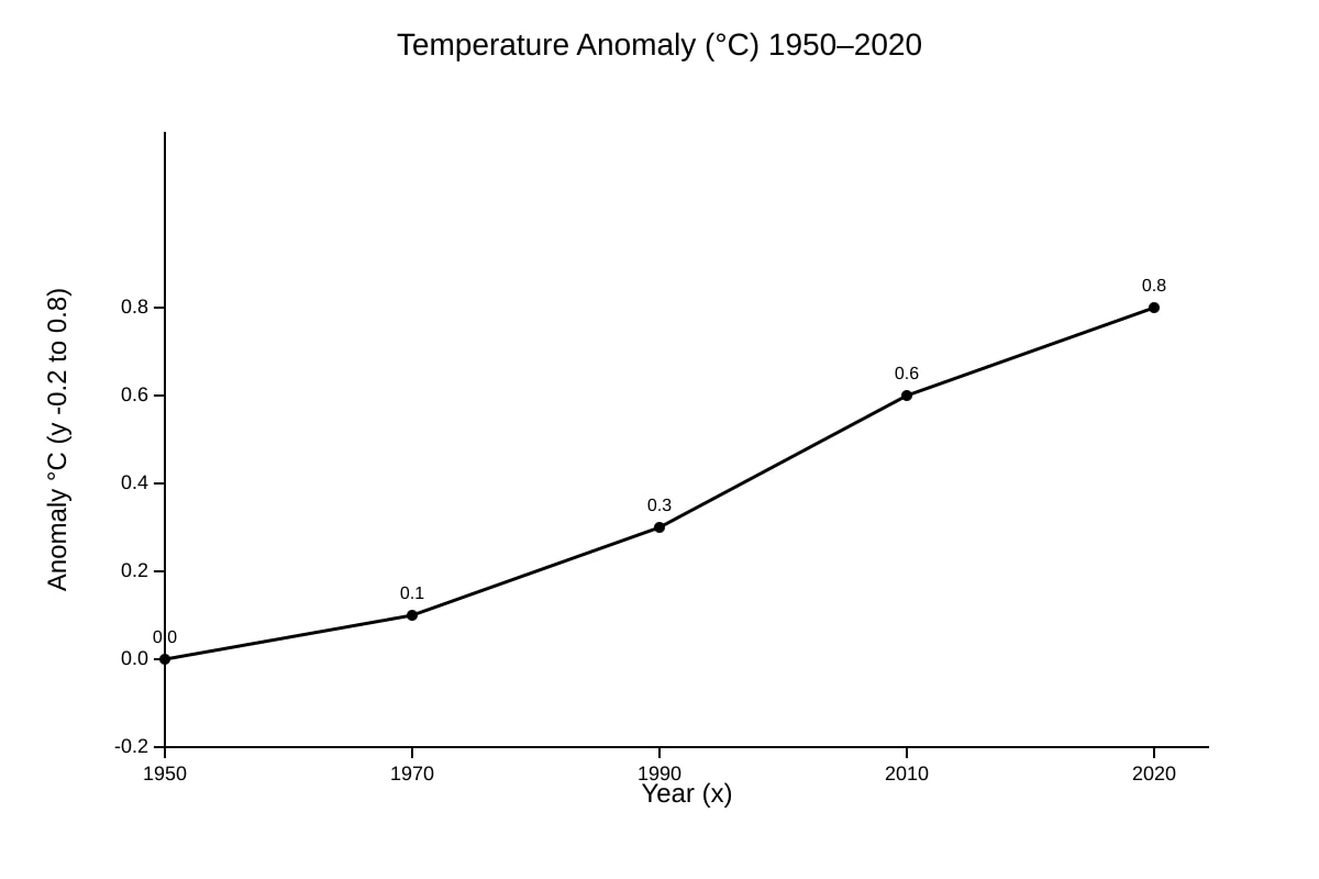
Answer: Trend: steady rise from 0.0 to 0.8 °C. Positive anomaly = warmer than baseline. [1 +1]
Teaching note: Anomaly = deviation from average.
19. [2 marks]
Working: Subtract 1950 value from 2020: 0.8 − 0.0 = 0.8 °C. [2]
Teaching note: Total rise = final − initial.
20. [2 marks]
Answer: Advantage: shows proportion of annual rain per month. Disadvantage: hard to read exact mm, 12 slices cramped. [1+1]
Teaching note: Pie for parts of whole.