A-Level Economics H1 Quiz - Data Response
Name: ___________________________
Class: ___________________________
Date: ___________________________
Score: _______ / 40
Duration: 60 minutes
Total Marks: 40
Topic: Data Response (practice quiz)
Instructions:
- This quiz contains 20 questions based on data-response skills drawn from A-Level H1 Economics case-study patterns.
- Section A: Data Extraction & Comparison (Q1–5)
- Section B: Diagram & Data Interpretation (Q6–10)
- Section C: Source-Based Explanation & Application (Q11–15)
- Section D: Evaluation & Synthesis (Q16–20)
- Use the extracts, tables, and figures provided. Show workings where requested.
- Approved calculator permitted.
Section A: Data Extraction & Comparison (Q1–5)
Extract 1 — Government Education Spending ($ per student, nominal)
| Year | Primary | University |
|---|
| 2015 | 12,400 | 18,900 |
| 2020 | 14,100 | 22,300 |
| 2023 | 15,000 | 24,600 |
Q1. With reference to Extract 1, compare government expenditure per student for primary and university education from 2015 to 2023. [2]
Q2. Describe the trend in university education spending per student from 2015 to 2023. [2]
Extract 2 — Macro Indicators
| Year | Country X Real GDP Growth (%) | Country Y Real GDP Growth (%) |
|---|
| 2019 | 3.2 | 2.1 |
| 2021 | 1.8 | 0.9 |
| 2023 | 2.4 | 1.5 |
Q3. Using Extract 2, compare the real GDP growth rate in Country X and Country Y over 2019–2023. [2]
Q4. With reference to Extract 1, calculate the percentage increase in primary education spending per student from 2015 to 2023. Show your working. [2]
Q5. State one limitation of using nominal spending per student to compare living standards between 2015 and 2023. [2]
Section B: Diagram & Data Interpretation (Q6–10)
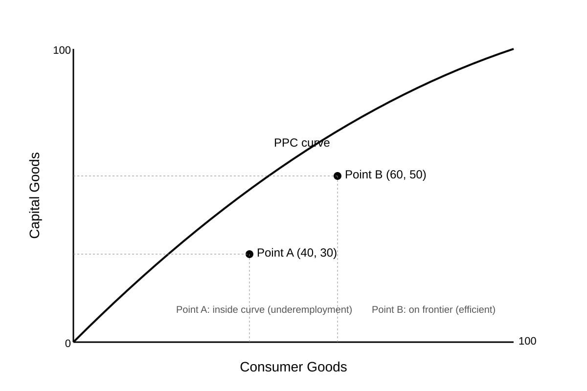
Generated graph for Q6.
Q6. With reference to the PPC diagram, explain what Point A indicates about resource use. [2]
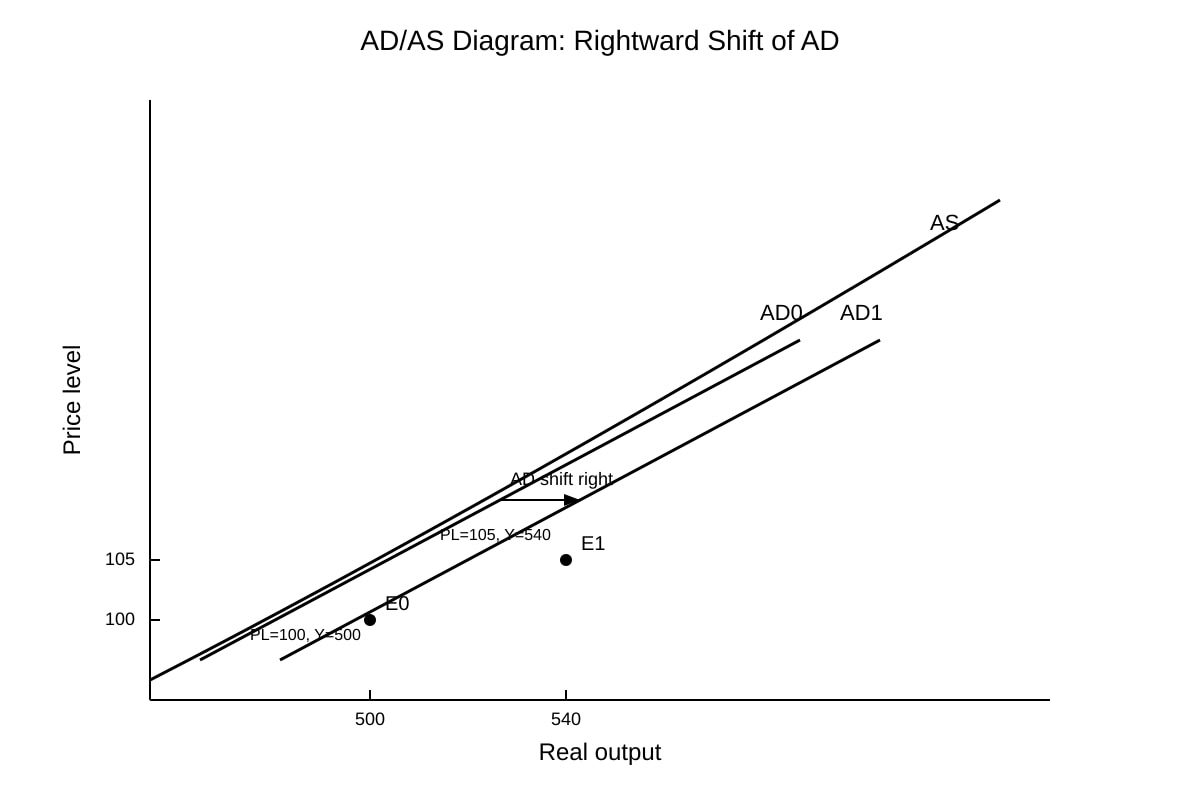
Generated graph for Q7.
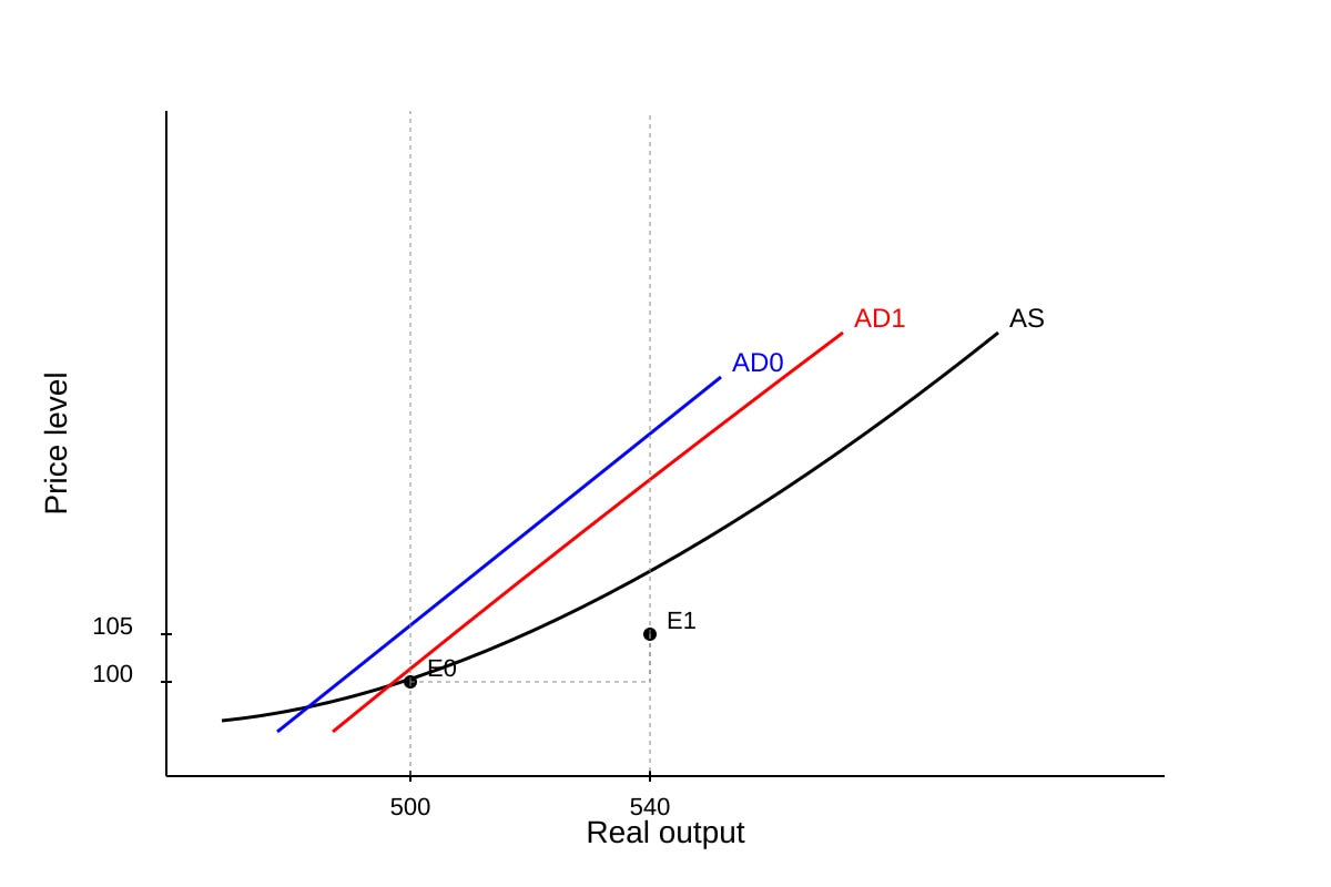
Q7. Using the AD/AS diagram, explain the effect of the rightward AD shift on price level and real output. [2]
Q8. Extract 3 states: "Online retail sales rose 20% when prices fell 5%." With reference to Extract 3, explain the estimated PED value and its meaning. [2]
Extract 3: "A 5% price reduction by online retailers led to a 20% increase in quantity demanded."
Q9. Explain the likely value of PES for preschool services. [2]
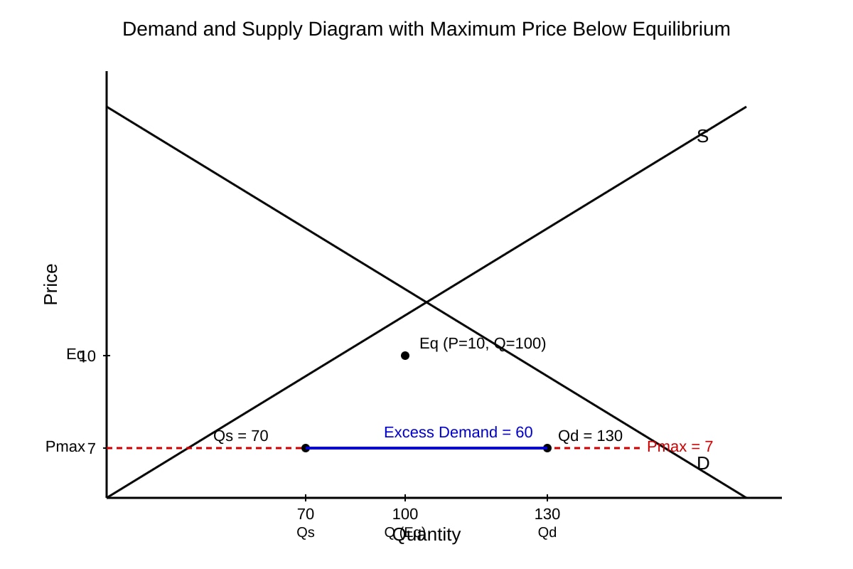
Generated graph for Q10.
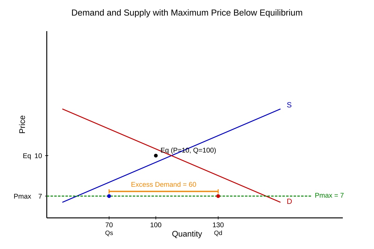
Q10. Using the demand/supply diagram with maximum price, identify the type of imbalance created and its size. [2]
Section C: Source-Based Explanation & Application (Q11–15)
Extract 4: "The government imposed a subsidy on solar panels. Producers received $2 per unit, leading to increased supply and lower market prices. Households adopted solar faster, reducing carbon emissions."
Q11. With reference to Extract 4, explain how the subsidy affects the supply curve and equilibrium price. [3]
Q12. Using Extract 4, explain one positive externality resulting from the policy. [2]
Extract 5: "Country Z's unemployment fell from 6% to 4% while GDP grew 3% annually. However, income inequality widened as high-skilled wages rose faster."
Q13. With reference to Extract 5, discuss whether Country Z's standard of living improved. Use two data points. [3]
Q14. Explain, using a demand/supply diagram, how a tax on cigarettes reduces consumption. [3]
Q15. With reference to Extract 5, explain why the government might still be concerned despite lower unemployment. [2]
Section D: Evaluation & Synthesis (Q16–20)
Q16. Evaluate whether a maximum price on basic food is the best way to help low-income households. Use evidence from Q10 diagram. [4]
Q17. Using Extracts 4 and 5, evaluate the view that environmental subsidies are more effective than GDP growth alone for social welfare. [4]
Q18. Discuss whether PPC analysis shows that Country Z (Extract 5) achieved productive efficiency. [3]
Q19. Evaluate the use of real GDP growth (Extract 2) as a measure of economic progress for Country X. [3]
Q20. Synthesise: Using all extracts, explain how a decision-making approach would weigh costs and benefits of the solar subsidy (Extract 4) versus maximum food price (Q10). [4]
</stage3_quiz_answers_md>
A-Level Economics H1 Quiz - Data Response (Answer Key)
Total Marks: 40
Topic: Data Response
Section A: Answers (Q1–5)
Q1. [2 marks]
Both primary and university spending per student increased from 2015 to 2023. University spending was consistently higher: primary rose from $12,400 to $15,000 (≈21% increase), university from $18,900 to $24,600 (≈30% increase). University increased by a larger margin.
Marking: 1 mark for both increased with values; 1 mark for comparative statement (university higher / rose faster).
Q2. [2 marks]
University spending per student generally increased from $18,900 (2015) to $24,600 (2023), rising steadily across the period with no decline.
Marking: 1 mark direction (increased); 1 mark reference to years/values.
Q3. [2 marks]
Both countries' real GDP growth fell from 2019 to 2021 then recovered by 2023, but Country X consistently grew faster than Country Y (e.g., 3.2% vs 2.1% in 2019; 2.4% vs 1.5% in 2023).
Marking: 1 mark both fell then rose; 1 mark X > Y throughout.
Q4. [2 marks]
% increase = ((15,000 − 12,400) / 12,400) × 100 = (2,600 / 12,400) × 100 ≈ 20.97% ≈ 21%.
Marking: 1 mark correct subtraction and division; 1 mark correct % (20.9–21%).
Q5. [2 marks]
Nominal figures ignore inflation; if prices rose, real spending may be lower than nominal suggests. (Also accept: does not show access/quality.)
Marking: 1 mark identifies inflation issue; 1 mark explains effect on comparison.
Section B: Answers (Q6–10)
Q6. [2 marks]
Point A is inside the PPC, indicating underemployment / inefficient use of resources (not all resources fully used). Economy operates below productive capacity.
Marking: 1 mark inside curve = unemployed resources; 1 mark implication (inefficiency).
Q7. [2 marks]
Rightward AD shift raises price level (100→105) and real output (500→540); demand-pull inflation with growth.
Marking: 1 mark PL up; 1 mark Y up with values.
Q8. [2 marks]
PED = %ΔQd / %ΔP = 20% / (−5%) = −4. |PED|>1 → elastic; demand very responsive to price cut, revenue rises.
Marking: 1 mark calc/value; 1 mark elastic interpretation.
Q9. [2 marks]
PES for preschools likely low (<1): limited physical capacity and time to train staff restricts quick supply response.
Marking: 1 mark low PES; 1 mark justification (staff/capacity).
Q10. [2 marks]
Maximum price below equilibrium creates excess demand (shortage). Size = Qd − Qs = 130 − 70 = 60 units.
Marking: 1 mark excess demand/shortage; 1 mark correct gap 60.
Section C: Answers (Q11–15)
Q11. [3 marks]
Subsidy shifts supply right (costs fall); equilibrium price falls, quantity rises. Producers get $2/unit, pass part to consumers.
Marking: 1 shift S right; 1 price down; 1 quantity up / mechanism.
Q12. [2 marks]
Positive externality: reduced carbon emissions (benefit to society not priced in market).
Marking: 1 externality named; 1 linked to extract.
Q13. [3 marks]
Improved: unemployment 6%→4% (more jobs), GDP +3% (output up). Not fully: inequality widened (distribution worse). Standard of living mixed.
Marking: 1 unemployment data; 1 GDP data; 1 inequality caveat / evaluation.
Q14. [3 marks]
Tax shifts S left, price rises, Q demanded falls. Diagram: S0→S1 up, new Eq at lower Q.
Marking: 1 tax shifts S left; 1 price up; 1 Q down.
Q15. [2 marks]
Widening inequality means gains uneven; low-skilled may not benefit despite overall job growth.
Marking: 1 inequality concern; 1 explanation.
Section D: Answers (Q16–20)
Q16. [4 marks]
Max price (Q10) creates shortage (60 units) → rationing problem, black market risk. Helps affordability but may reduce supply. Better with subsidy? Evaluate trade-off: equity vs efficiency loss.
Marking: 1 shortage from diagram; 1 benefit to poor; 1 cost (inefficiency); 1 judgement.
Q17. [4 marks]
Subsidy (Ext4) cuts emissions (env benefit) + adoption; GDP growth (Ext5) raises output but inequality. Synthesis: subsidy targets externality, GDP alone misses distribution.
Marking: 1 env benefit; 1 GDP limit; 1 comparison; 1 conclusion.
Q18. [3 marks]
PPC not given for Z; falling unemployment + growth suggests move toward frontier but inequality suggests not full welfare efficiency. Inconclusive without PPC.
Marking: 1 unemployment↓; 1 growth; 1 caveat no diagram.
Q19. [3 marks]
Real GDP growth shows X recovering (2.4% 2023) but ignores distribution, env, leisure. Partial progress measure.
Marking: 1 trend; 1 limitation; 1 eval.
Q20. [4 marks]
Decision approach: solar subsidy costs gov but yields emissions + adoption (benefit > cost). Max food price aids poor but shortage cost. Weigh MSB vs MSC; choose mix.
Marking: 1 solar cost/benefit; 1 food price cost/benefit; 1 marginal principle; 1 synthesis.
</stage3_quiz_answers_md>
<stage3_quiz_md>
A-Level Economics H1 Quiz - Data Response
Name: ___________________________
Class: ___________________________
Date: ___________________________
Score: _______ / 40
Duration: 60 minutes
Total Marks: 40
Topic: Data Response (practice quiz)
Instructions:
- This quiz contains 20 questions based on data-response skills drawn from A-Level H1 Economics case-study patterns.
- Section A: Data Extraction & Comparison (Q1–5)
- Section B: Diagram & Data Interpretation (Q6–10)
- Section C: Source-Based Explanation & Application (Q11–15)
- Section D: Evaluation & Synthesis (Q16–20)
- Use the extracts, tables, and figures provided. Show workings where requested.
- Approved calculator permitted.
Section A: Data Extraction & Comparison (Q1–5)
Extract 1 — Government Education Spending ($ per student, nominal)
| Year | Primary | University |
|---|
| 2015 | 12,400 | 18,900 |
| 2020 | 14,100 | 22,300 |
| 2023 | 15,000 | 24,600 |
Q1. With reference to Extract 1, compare government expenditure per student for primary and university education from 2015 to 2023. [2]
Q2. Describe the trend in university education spending per student from 2015 to 2023. [2]
Extract 2 — Macro Indicators
| Year | Country X Real GDP Growth (%) | Country Y Real GDP Growth (%) |
|---|
| 2019 | 3.2 | 2.1 |
| 2021 | 1.8 | 0.9 |
| 2023 | 2.4 | 1.5 |
Q3. Using Extract 2, compare the real GDP growth rate in Country X and Country Y over 2019–2023. [2]
Q4. With reference to Extract 1, calculate the percentage increase in primary education spending per student from 2015 to 2023. Show your working. [2]
Q5. State one limitation of using nominal spending per student to compare living standards between 2015 and 2023. [2]
Section B: Diagram & Data Interpretation (Q6–10)
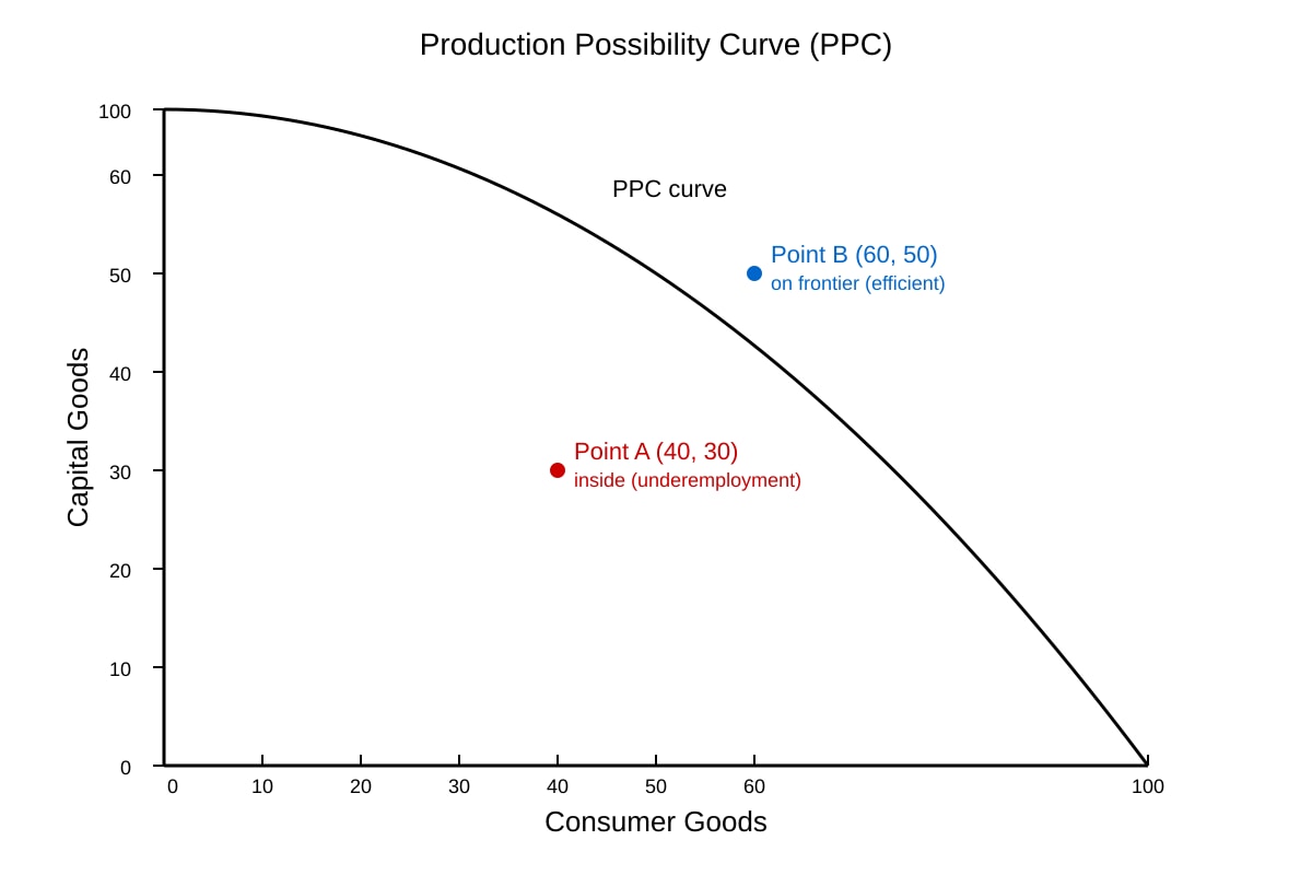
Generated graph for Q6.
Q6. With reference to the PPC diagram, explain what Point A indicates about resource use. [2]
Generated graph for Q7.
Q7. Using the AD/AS diagram, explain the effect of the rightward AD shift on price level and real output. [2]
Q8. Extract 3 states: "Online retail sales rose 20% when prices fell 5%." With reference to Extract 3, explain the estimated PED value and its meaning. [2]
Extract 3: "A 5% price reduction by online retailers led to a 20% increase in quantity demanded."
Q9. Explain the likely value of PES for preschool services. [2]
Generated graph for Q10.
Q10. Using the demand/supply diagram with maximum price, identify the type of imbalance created and its size. [2]
Section C: Source-Based Explanation & Application (Q11–15)
Extract 4: "The government imposed a subsidy on solar panels. Producers received $2 per unit, leading to increased supply and lower market prices. Households adopted solar faster, reducing carbon emissions."
Q11. With reference to Extract 4, explain how the subsidy affects the supply curve and equilibrium price. [3]
Q12. Using Extract 4, explain one positive externality resulting from the policy. [2]
Extract 5: "Country Z's unemployment fell from 6% to 4% while GDP grew 3% annually. However, income inequality widened as high-skilled wages rose faster."
Q13. With reference to Extract 5, discuss whether Country Z's standard of living improved. Use two data points. [3]
Q14. Explain, using a demand/supply diagram, how a tax on cigarettes reduces consumption. [3]
Q15. With reference to Extract 5, explain why the government might still be concerned despite lower unemployment. [2]
Section D: Evaluation & Synthesis (Q16–20)
Q16. Evaluate whether a maximum price on basic food is the best way to help low-income households. Use evidence from Q10 diagram. [4]
Q17. Using Extracts 4 and 5, evaluate the view that environmental subsidies are more effective than GDP growth alone for social welfare. [4]
Q18. Discuss whether PPC analysis shows that Country Z (Extract 5) achieved productive efficiency. [3]
Q19. Evaluate the use of real GDP growth (Extract 2) as a measure of economic progress for Country X. [3]
Q20. Synthesise: Using all extracts, explain how a decision-making approach would weigh costs and benefits of the solar subsidy (Extract 4) versus maximum food price (Q10). [4]